
- SAP Community
- Products and Technology
- Technology
- Technology Blogs by SAP
- Low code clustering with SAP HANA
Technology Blogs by SAP
Learn how to extend and personalize SAP applications. Follow the SAP technology blog for insights into SAP BTP, ABAP, SAP Analytics Cloud, SAP HANA, and more.
Turn on suggestions
Auto-suggest helps you quickly narrow down your search results by suggesting possible matches as you type.
Showing results for
former_member67
Active Participant
Options
- Subscribe to RSS Feed
- Mark as New
- Mark as Read
- Bookmark
- Subscribe
- Printer Friendly Page
- Report Inappropriate Content
10-16-2020
10:38 AM
Would you like to quickly create interactive data analysis applications on with SAP HANA? The Python library streamlit makes it very simple.
This is the second part of two blog posts about low-code creation of interactive data analysis applications on SAP HANA. In this blog post you see how to create an application on SAP HANA that helps you find the appropriate number of clusters.
If you are new to streamlit and SAP HANA, please check the first blog post, which introduces the concept. Both blog posts were written by andreas.forster (Global Center of Excellence, SAP) and dmitrybuslov (Presales, SAP).
When clustering data it is often tricky to configure the clustering algorithms. Even complex clustering algorithms like DBSCAN or Agglomerate Hierarchical Clustering require some parameterisation. In this example we want to cluster the MALL_CUSTOMERS data from the previous blog post with the very popular K-Means clustering algorithm. The standard Euclidian distance is good enough for this case, but SAP HANA would also allow for further distance metrics such as Manhattan distance, Minkowski distance, Chebyshev distance or Cosine distance( check the help for relevant info).
Now we want to answer the question: What is the optimal number of clusters to ask for?
This blog post provides an application to answer this question. The necessary calculations are pushed down to SAP HANA and the Predictive Algorithm Library (PAL).
To implement and run this application, you must have implemented the previous blog post. This means you already have:
Please check with your Account Executive that your SAP HANA license allows such use of your system. And of course this sample is not an official SAP product. Please verify that the code is working as expected.
Let’s check the application functionality and go through the code. As Linus Torvalds said: “Talk is cheap. Show me the code.”
You can implement the code bit by bit as introduced in the following sections. Just create the file pal_cluster_finding.py and add the code snippets to it. For your convenience you can also find the full code at the bottom of this page.
First install additional Python libraries that are needed for this project. Just like in the first project, go into your Python environment and install the plotly-express library.
pip install plotly-express
Open the IDE, for instance Visual Studio.
Select “Create a new project” and select the template “Python Application”.
Project name: pal_cluster_finding.py
Keep the other default values and click “Create”.
When the project opens, verify that the Python environment is set correctly to streamlit, into which the libraries are installed.
Add the following code to pal_cluster_finding.py, which loads the necessary libraries and creates and empty application.
Save the file, go to the Anaconda Prompt and run the file from the streamlit environment:
streamlit run "C:\path\to\the\file\pal_cluster_finding.py"
We have an empty application, that we can now fill with functionality.
Establish a connection to the MALL_CUSTOMERS table in SAP HANA by adding the following lines at the bottom of the pal_cluster_finding.py file.
Obviously, you have to add the logon credentials to your SAP HANA system.
We now have a hana_ml DataFrame pointing to the table that we will cluster.
When we talk about clustering, we have to specify which columns we want to use in the clustering process. Streamlit’s multiselect brings this capability, to prompt the user to select multiple columns. This selector requires 3 pieces of information in the code: The label / description, the columns that can be selected (we know that it could be 1-3 columns from our MALL_CUSTOMERS table) and the default selection.
Add the following code:
Now allow the user to experiment with different numbers of clusters. Create a slider for the user to enter the number. Usually this value is between 2 and 10. Sometimes it is larger than 10, but such clusters are hard to interpret. Later we will see how to find the optimal number of cluster.
And create the clusters with the K-Means algorithms! We will find the optimal number of clusters in next steps.
The clusters have been created. Let’s visualise them with some charts.
st.selectbox gives us a selector to choose the columns for the X and Y axis
plt.scatter plots our selected X and Y values with the color as cluster label.
For putting the maplotlib figure in streamlit we need st.pyplot() – it is like plt.show() but in streamlit)
The clustering clearly found some pattern in the data.
Add another plotting dimension. The interactive 3 D chart brings much better data understanding in this case.
px.scatter_3d for the visualisation and st.plotly_chart for adding that chart in streamlit.
Ok, this part is about the elbow method, which helps finding the optimal number of clusters. The Elbow method is quite a popular technique. The idea is to run the same clustering algorithm on the same data multiple times, but each time with a different number of clusters requested. In our case we run the clustering 8 times, with the cluster count increasing from 2 to 9. For each value in each of the different clusters, we are calculating the sum of squared distances from each point to its cluster’s center (the centroid). Add and run the code. You can then tick the “Calculate elbow?” option in a panel on the left, and the elbow is shown.
We can select the optimal cluster numbers, looking on this chart, usually when it goes to a plateau. When the line is fallen to a stable pattern and increasing the cluster count does not have much of an impact, you have an indicator for the optimal number of clusters.
Silhouette is another option to find the optimal number of clusters. The silhouette is a measure of how close each point in one cluster is located to the points in the neighbouring clusters. The mean of the silhouette values bring us an assumption about comparing 2 models (which one is better). Also, usually the visualization of silhouette values brings some good understanding of the differences between clusters.
In this part of the code we also calculate all possible clusters. In general, this code could be combined with the first part (elbow) to bring better performance, but for better understanding it is split here in 2 parts.
If the shape of the different clusters looks very similar it's a positive indicator. Another element we have to look for is a large average silhouette value.
The last part is a visualization of our raw data, with the rows’ colour indicating to which cluster the row was assigned.
For color selection we need cm.nipy_spectral and for highlighting – style.apply (which is the standard pandas dataframe styling).
And st.table – which adds our dataset to the webapp.
So, our application is ready and we can run it. In case you haven’t started it by now, run this command as shown above.
streamlit run "C:\path\to\the\file\pal_cluster_finding.py"
And here it is in full. Try it and have fun!
This is the second part of two blog posts about low-code creation of interactive data analysis applications on SAP HANA. In this blog post you see how to create an application on SAP HANA that helps you find the appropriate number of clusters.
If you are new to streamlit and SAP HANA, please check the first blog post, which introduces the concept. Both blog posts were written by andreas.forster (Global Center of Excellence, SAP) and dmitrybuslov (Presales, SAP).
When clustering data it is often tricky to configure the clustering algorithms. Even complex clustering algorithms like DBSCAN or Agglomerate Hierarchical Clustering require some parameterisation. In this example we want to cluster the MALL_CUSTOMERS data from the previous blog post with the very popular K-Means clustering algorithm. The standard Euclidian distance is good enough for this case, but SAP HANA would also allow for further distance metrics such as Manhattan distance, Minkowski distance, Chebyshev distance or Cosine distance( check the help for relevant info).
Now we want to answer the question: What is the optimal number of clusters to ask for?
This blog post provides an application to answer this question. The necessary calculations are pushed down to SAP HANA and the Predictive Algorithm Library (PAL).
Prerequisites:
To implement and run this application, you must have implemented the previous blog post. This means you already have:
- SAP HANA with the Predictive Analysis Library
- The table MALL_CUSTOMERS in that SAP HANA
- A Python distribution that already has the libraries hana_ml and streamlit installed. We are using the free “Anaconda Individual Edition”. This environment will execute the Python code.
- An Integrated Development Environment (IDE) in which to write the Python code. This blog post uses the free “Visual Studio Community” release, but you can also use other IDEs.
Please check with your Account Executive that your SAP HANA license allows such use of your system. And of course this sample is not an official SAP product. Please verify that the code is working as expected.
Let’s check the application functionality and go through the code. As Linus Torvalds said: “Talk is cheap. Show me the code.”
You can implement the code bit by bit as introduced in the following sections. Just create the file pal_cluster_finding.py and add the code snippets to it. For your convenience you can also find the full code at the bottom of this page.
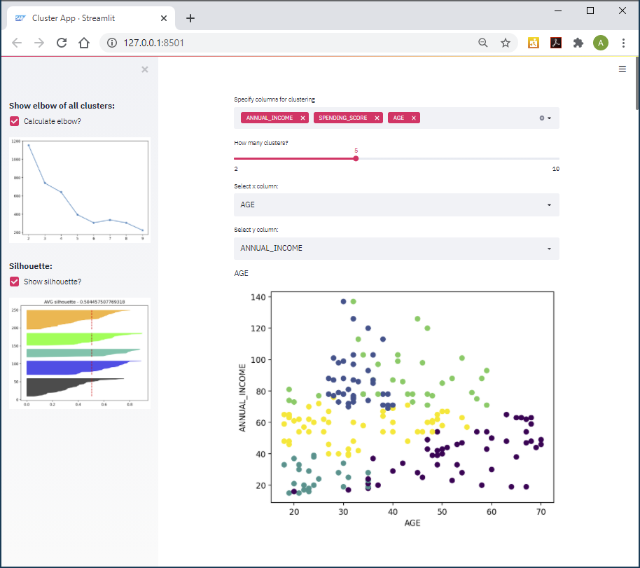
Table of contents:
- Libraries
- Create project
- SAP HANA connection
- Column selector
- Clustering
- 2-Dimensional visualization
- 3-Dimensional visualization
- Selecting the number of clusters – elbow method
- Selecting the number of clusters – silhouette method
- Raw data visualisation
- Running the application
Libraries
First install additional Python libraries that are needed for this project. Just like in the first project, go into your Python environment and install the plotly-express library.
pip install plotly-express
Create project
Open the IDE, for instance Visual Studio.
Select “Create a new project” and select the template “Python Application”.
Project name: pal_cluster_finding.py
Keep the other default values and click “Create”.
When the project opens, verify that the Python environment is set correctly to streamlit, into which the libraries are installed.
Add the following code to pal_cluster_finding.py, which loads the necessary libraries and creates and empty application.
import streamlit as st #import for webapp

import pandas as pd #pandas for data managing in python

import numpy as np #we need numpy for tensor manipulation

import matplotlib.pyplot as plt # we will plot some figures

import matplotlib.cm as cm # with nice colors

import plotly.express as px # and also 3-d charts

import hana_ml.dataframe as dataframe #main dataframe with SAP HANA

from hana_ml.algorithms.pal.clustering import KMeans # our choice of clustering algo

#Title info. st.beta_set_page_config brings us the possibility to set the page title and icon and to define our sidebar and layout.

st.beta_set_page_config(

    page_title="Cluster App",

    page_icon="https://cdn.appythings.nl/wp-content/uploads/2018/06/SAP-logo-icon-PNG-Transparent-Background.png ",

    layout="centered",

    initial_sidebar_state="expanded",

)
Save the file, go to the Anaconda Prompt and run the file from the streamlit environment:
streamlit run "C:\path\to\the\file\pal_cluster_finding.py"
We have an empty application, that we can now fill with functionality.
SAP HANA Connection
Establish a connection to the MALL_CUSTOMERS table in SAP HANA by adding the following lines at the bottom of the pal_cluster_finding.py file.
Obviously, you have to add the logon credentials to your SAP HANA system.
# Reading data

import hana_ml.dataframe as dataframe

conn = dataframe.ConnectionContext(address = '',

                                   port = 0,

                                   user = '',

                                   password = '',

                                   encrypt = 'true',

sslValidateCertificate = 'false')


df = conn.table(table = 'MALL_CUSTOMERS').sort('CUSTOMER_ID', desc = False)
We now have a hana_ml DataFrame pointing to the table that we will cluster.
Column selector
When we talk about clustering, we have to specify which columns we want to use in the clustering process. Streamlit’s multiselect brings this capability, to prompt the user to select multiple columns. This selector requires 3 pieces of information in the code: The label / description, the columns that can be selected (we know that it could be 1-3 columns from our MALL_CUSTOMERS table) and the default selection.
Add the following code:
# Column selector for clustering

cluster_cols = st.multiselect(

    "Specify columns for clustering",

    ['AGE', 'ANNUAL_INCOME', 'SPENDING_SCORE'],

    default=['ANNUAL_INCOME', 'SPENDING_SCORE'],

)

X = df[cluster_cols+['CUSTOMER_ID']]

Clustering
Now allow the user to experiment with different numbers of clusters. Create a slider for the user to enter the number. Usually this value is between 2 and 10. Sometimes it is larger than 10, but such clusters are hard to interpret. Later we will see how to find the optimal number of cluster.
# Cluster count

n_clusters = st.slider('How many clusters?' , 2 ,10, 2)

And create the clusters with the K-Means algorithms! We will find the optimal number of clusters in next steps.
# Cluster

pal_kmeans = KMeans(n_clusters = n_clusters)

labels = pal_kmeans.fit_predict(data = df, key = 'CUSTOMER_ID')
2-Dimensional visualization
The clusters have been created. Let’s visualise them with some charts.
st.selectbox gives us a selector to choose the columns for the X and Y axis
plt.scatter plots our selected X and Y values with the color as cluster label.
For putting the maplotlib figure in streamlit we need st.pyplot() – it is like plt.show() but in streamlit)
# Visualization

selected_x = st.selectbox('Select x column:', ('AGE', 'ANNUAL_INCOME', 'SPENDING_SCORE'))

selected_y = st.selectbox('Select y column:', ('AGE', 'ANNUAL_INCOME', 'SPENDING_SCORE'))

st.write(selected_x)

plt.style.context('seaborn-whitegrid')

plt.scatter(df[[selected_x]].collect()[selected_x],

            df[[selected_y]].collect()[selected_y],

            c=labels[['CLUSTER_ID']].collect()['CLUSTER_ID'])

plt.xlabel(selected_x)

plt.ylabel(selected_y)

st.pyplot()

The clustering clearly found some pattern in the data.
3-Dimensional visualization
Add another plotting dimension. The interactive 3 D chart brings much better data understanding in this case.
px.scatter_3d for the visualisation and st.plotly_chart for adding that chart in streamlit.
# 3d visualization

fig = px.scatter_3d(df.collect(), x='ANNUAL_INCOME', y='SPENDING_SCORE', z='AGE',

              color=labels[['CLUSTER_ID']].collect()['CLUSTER_ID'])

st.plotly_chart(fig, use_container_width=True)
Selecting the number of clusters: elbow method
Ok, this part is about the elbow method, which helps finding the optimal number of clusters. The Elbow method is quite a popular technique. The idea is to run the same clustering algorithm on the same data multiple times, but each time with a different number of clusters requested. In our case we run the clustering 8 times, with the cluster count increasing from 2 to 9. For each value in each of the different clusters, we are calculating the sum of squared distances from each point to its cluster’s center (the centroid). Add and run the code. You can then tick the “Calculate elbow?” option in a panel on the left, and the elbow is shown.
# Sidebar elbow

st.sidebar.subheader('Show elbow of all clusters:')

show_elbow = st.sidebar.checkbox('Calculate elbow?')

if show_elbow:

    res=[]

    num_cluster_ranges=range(2,10)

    for cluster_count in num_cluster_ranges:

        pal_kmeans = KMeans(n_clusters = cluster_count)

        df_labels = pal_kmeans.fit_predict(data = df, key = 'CUSTOMER_ID')

        df_labels = df_labels.select('*', ('DISTANCE*DISTANCE', 'DISTANCE2')) #squere euclidian distance

        count_by_cluster = df_labels.agg([('avg','DISTANCE2','DISTANCE2')])\

                                        .collect()

        res.append(count_by_cluster['DISTANCE2'].values[0])

    plt.plot(num_cluster_ranges,res,marker='*')

    st.sidebar.pyplot()

We can select the optimal cluster numbers, looking on this chart, usually when it goes to a plateau. When the line is fallen to a stable pattern and increasing the cluster count does not have much of an impact, you have an indicator for the optimal number of clusters.
Selecting the number of clusters: silhouette method
Silhouette is another option to find the optimal number of clusters. The silhouette is a measure of how close each point in one cluster is located to the points in the neighbouring clusters. The mean of the silhouette values bring us an assumption about comparing 2 models (which one is better). Also, usually the visualization of silhouette values brings some good understanding of the differences between clusters.
In this part of the code we also calculate all possible clusters. In general, this code could be combined with the first part (elbow) to bring better performance, but for better understanding it is split here in 2 parts.
# Sidebar silhouette

st.sidebar.subheader('Silhouette:')

show_silhouette = st.sidebar.checkbox('Show silhouette?')

if show_silhouette:

    avg_silh_by_cluster = labels.agg([('avg','SLIGHT_SILHOUETTE','SLIGHT_SILHOUETTE')],\

                                           group_by='CLUSTER_ID').collect()

    silhouette_avg = labels.agg([('avg','SLIGHT_SILHOUETTE','SLIGHT_SILHOUETTE')]).collect().values[0][0]

    n_clusters=len(avg_silh_by_cluster)

    y_lower = 10

    for i in range(n_clusters):

        ith_cluster_silhouette_values = labels.filter(f'CLUSTER_ID={i}')[['SLIGHT_SILHOUETTE']]\

                                        .collect()['SLIGHT_SILHOUETTE'].values


        ith_cluster_silhouette_values.sort()


        size_cluster_i = ith_cluster_silhouette_values.shape[0]

        y_upper = y_lower + size_cluster_i


        plt.title(f'AVG silhouette - {silhouette_avg}')

        plt.vlines(silhouette_avg,y_lower,y_upper,color='red',linestyles='--')

        color = cm.nipy_spectral(float(i) / n_clusters)

        plt.fill_betweenx(np.arange(y_lower, y_upper),

                              0, ith_cluster_silhouette_values,

                              facecolor=color, edgecolor=color, alpha=0.7)

        y_lower = y_upper + 10

    st.sidebar.pyplot()

    st.write('Silhouette avg score = ',silhouette_avg)
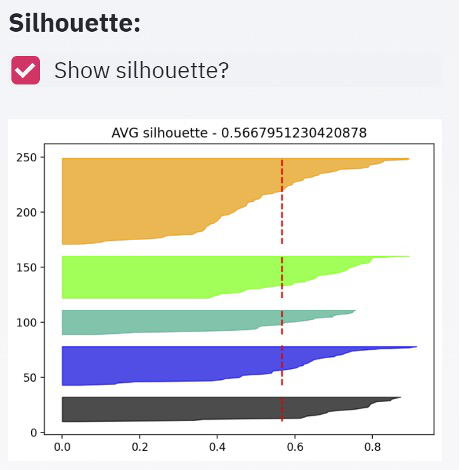
If the shape of the different clusters looks very similar it's a positive indicator. Another element we have to look for is a large average silhouette value.
Raw data visualization
The last part is a visualization of our raw data, with the rows’ colour indicating to which cluster the row was assigned.
For color selection we need cm.nipy_spectral and for highlighting – style.apply (which is the standard pandas dataframe styling).
And st.table – which adds our dataset to the webapp.
# Raw data viz

st.subheader('Data:')


dfn = df.collect()

dfn['Cluster']=labels[['CLUSTER_ID']].collect()['CLUSTER_ID']

highlight_cl = st.checkbox('Highlight clusters',False)

def highlight(s):

    color = cm.nipy_spectral(float(s.Cluster) / n_clusters)

    c1 = cm.colors.to_rgba_array(color)

    c1[0][3]=0.2

    return [f'background-color: {cm.colors.rgb2hex(c1.flatten(),keep_alpha=True)}']*len(dfn.columns)

if highlight_cl:

    st.table(dfn.style.apply(highlight, axis=1))

else:

    st.table(dfn)

Running the application
So, our application is ready and we can run it. In case you haven’t started it by now, run this command as shown above.
streamlit run "C:\path\to\the\file\pal_cluster_finding.py"
And here it is in full. Try it and have fun!
import streamlit as st

import pandas as pd

import numpy as np

import matplotlib.pyplot as plt

import matplotlib.cm as cm

import plotly.express as px

import hana_ml.dataframe as dataframe

from hana_ml.algorithms.pal.clustering import KMeans


#Title info

st.beta_set_page_config(

    page_title="Cluster App",

    page_icon="https://cdn.appythings.nl/wp-content/uploads/2018/06/SAP-logo-icon-PNG-Transparent-Background.png",

    layout="centered",#centered

    initial_sidebar_state="expanded",

)

st.title('Let\'s clustering with SAP HANA PAL...')


#Reading data

conn = dataframe.ConnectionContext(address = 'e1b18bd9-abcc-4a3a-89b0-65b3a7bf1eed.hana.canary-eu10.hanacloud.ondemand.com',

                                   port = 443,

                                   user = '<USERNAME>',

                                   password = '<PASS>',

                                   encrypt = 'true',

                                   sslValidateCertificate='false'

                                  )


df = conn.table(table = 'MALL_CUSTOMERS', schema = 'MLUSER').sort('CUSTOMER_ID', desc = False)


#Columns selector for clustering

cluster_cols = st.multiselect(

    "Which columns select for clustering",

    ['AGE', 'ANNUAL_INCOME', 'SPENDING_SCORE'],

    default=['ANNUAL_INCOME', 'SPENDING_SCORE'],

)

X = df[cluster_cols+['CUSTOMER_ID']]


#Clustering

n_clusters = st.slider('How many clusters?',2,10,2)


pal_kmeans = KMeans(n_clusters = n_clusters)

labels = pal_kmeans.fit_predict(data = df, key = 'CUSTOMER_ID')


# st.table(labels.collect())

# Viz

selected_x = st.selectbox('Select x_column:', ('AGE', 'ANNUAL_INCOME', 'SPENDING_SCORE'))

selected_y = st.selectbox('Select y_column:', ('AGE', 'ANNUAL_INCOME', 'SPENDING_SCORE'))

st.write(selected_x)


plt.style.context('seaborn-whitegrid')

plt.scatter(df[[selected_x]].collect()[selected_x],

            df[[selected_y]].collect()[selected_y],

            c=labels[['CLUSTER_ID']].collect()['CLUSTER_ID'])

plt.xlabel(selected_x)

plt.ylabel(selected_y)

st.pyplot()


# 3d chart viz

fig = px.scatter_3d(df.collect(), x='ANNUAL_INCOME', y='SPENDING_SCORE', z='AGE',

              color=labels[['CLUSTER_ID']].collect()['CLUSTER_ID'])

st.plotly_chart(fig, use_container_width=True)


# #Sidebar elbow

st.sidebar.subheader('Show elbow of all clusters:')

show_elbow = st.sidebar.checkbox('Calculate elbow?')

if show_elbow:

    res=[]

    num_cluster_ranges=range(2,10)

    for cluster_count in num_cluster_ranges:

        pal_kmeans = KMeans(n_clusters = cluster_count)

        df_labels = pal_kmeans.fit_predict(data = df, key = 'CUSTOMER_ID')

        df_labels = df_labels.select('*', ('DISTANCE*DISTANCE', 'DISTANCE2')) #squere euclidian distance

        count_by_cluster = df_labels.agg([('avg','DISTANCE2','DISTANCE2')])\

                                        .collect()

        res.append(count_by_cluster['DISTANCE2'].values[0])

    plt.plot(num_cluster_ranges,res,marker='*')

    st.sidebar.pyplot()

st.sidebar.subheader('Silhouette:')

show_silhouette = st.sidebar.checkbox('Show silhouette?')


#Sidebar silhouette

if show_silhouette:

    avg_silh_by_cluster = labels.agg([('avg','SLIGHT_SILHOUETTE','SLIGHT_SILHOUETTE')],\

                                           group_by='CLUSTER_ID').collect()

    silhouette_avg = labels.agg([('avg','SLIGHT_SILHOUETTE','SLIGHT_SILHOUETTE')]).collect().values[0][0]

    n_clusters=len(avg_silh_by_cluster)

    y_lower = 10

    for i in range(n_clusters):

        ith_cluster_silhouette_values = labels.filter(f'CLUSTER_ID={i}')[['SLIGHT_SILHOUETTE']]\

                                        .collect()['SLIGHT_SILHOUETTE'].values


        ith_cluster_silhouette_values.sort()


        size_cluster_i = ith_cluster_silhouette_values.shape[0]

        y_upper = y_lower + size_cluster_i


        plt.title(f'AVG silhouette - {silhouette_avg}')

        plt.vlines(silhouette_avg,y_lower,y_upper,color='red',linestyles='--')

        color = cm.nipy_spectral(float(i) / n_clusters)

        plt.fill_betweenx(np.arange(y_lower, y_upper),

                              0, ith_cluster_silhouette_values,

                              facecolor=color, edgecolor=color, alpha=0.7)

        y_lower = y_upper + 10

    st.sidebar.pyplot()

    st.write('Silhouette avg score = ',silhouette_avg)


#Row data viz

st.subheader('Data:')


dfn = df.collect()

dfn['Cluster']=labels[['CLUSTER_ID']].collect()['CLUSTER_ID']

highlight_cl = st.checkbox('Highlight cluters',False)

def highlight(s):

    color = cm.nipy_spectral(float(s.Cluster) / n_clusters)

    c1 = cm.colors.to_rgba_array(color)

    c1[0][3]=0.2

    return [f'background-color: {cm.colors.rgb2hex(c1.flatten(),keep_alpha=True)}']*len(dfn.columns)

if highlight_cl:

    st.table(dfn.style.apply(highlight, axis=1))

else:

st.table(dfn)- SAP Managed Tags:
- Machine Learning,
- Python,
- SAP HANA
Labels:
3 Comments
You must be a registered user to add a comment. If you've already registered, sign in. Otherwise, register and sign in.
Labels in this area
-
ABAP CDS Views - CDC (Change Data Capture)
2 -
AI
1 -
Analyze Workload Data
1 -
BTP
1 -
Business and IT Integration
2 -
Business application stu
1 -
Business Technology Platform
1 -
Business Trends
1,661 -
Business Trends
88 -
CAP
1 -
cf
1 -
Cloud Foundry
1 -
Confluent
1 -
Customer COE Basics and Fundamentals
1 -
Customer COE Latest and Greatest
3 -
Customer Data Browser app
1 -
Data Analysis Tool
1 -
data migration
1 -
data transfer
1 -
Datasphere
2 -
Event Information
1,400 -
Event Information
65 -
Expert
1 -
Expert Insights
178 -
Expert Insights
282 -
General
1 -
Google cloud
1 -
Google Next'24
1 -
Kafka
1 -
Life at SAP
784 -
Life at SAP
11 -
Migrate your Data App
1 -
MTA
1 -
Network Performance Analysis
1 -
NodeJS
1 -
PDF
1 -
POC
1 -
Product Updates
4,577 -
Product Updates
330 -
Replication Flow
1 -
RisewithSAP
1 -
SAP BTP
1 -
SAP BTP Cloud Foundry
1 -
SAP Cloud ALM
1 -
SAP Cloud Application Programming Model
1 -
SAP Datasphere
2 -
SAP S4HANA Cloud
1 -
SAP S4HANA Migration Cockpit
1 -
Technology Updates
6,886 -
Technology Updates
408 -
Workload Fluctuations
1
Related Content
- ABAP Cloud Developer Trial 2022 Available Now in Technology Blogs by SAP
- Hack2Build on Business AI – Highlighted Use Cases in Technology Blogs by SAP
- SAP Partners unleash Business AI potential at global Hack2Build in Technology Blogs by SAP
- It’s Official - SAP BTP is Again a Leader in G2’s Reports in Technology Blogs by SAP
- Analyze Expensive ABAP Workload in the Cloud with Work Process Sampling in Technology Blogs by SAP
Top kudoed authors
| User | Count |
|---|---|
| 13 | |
| 11 | |
| 11 | |
| 10 | |
| 9 | |
| 7 | |
| 6 | |
| 5 | |
| 5 | |
| 5 |