
The latest edition of the
SAP Fiori Design Guidelines for web applications is now available, with new content based on SAPUI5 releases 1.78 to 1.80.
New with this edition
Here's a selection of the topics and features that are new with this edition:
Flexible grid
The new
flexible grid article explains how the existing flexible (CSS) grid control works. You can use it as an underlying layer for arranging your content into columns and rows. The layout then adapts automatically to different screen sizes.

Flexible grid layout
Tree toolbar
There’s now a dedicated
tree toolbar guideline for actions that apply to a tree or tree table.
Keyboard shortcuts
On desktop devices you can now render
keyboard shortcuts for a button as a tooltip.

Button with tooltip for shortcut
Avatar badge
You now have the option to show a
badge for clickable avatars. The badge visualizes the action triggered by clicking the avatar, like taking a photo or zooming in.

Avatars with badges
Responsive table
You can configure
auto pop-in mode to hide certain columns, rather than moving all columns to the pop-in area.
Icon tab bar
For the icon tab bar you can create
hierarchies with sub-tabs or nested tabs.
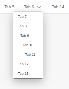
Icon tab bar with nested tabs
List report
A new
Working Modes section describes how to respond when a user makes changes that are inconsistent with the filter criteria.
Visual design
You’ll also notice some small changes to the visual design:
- The asterisk indicating a mandatory field now appears to the right of the field label (formerly on the left).

Mandatory field
- The style of the message icons for error, information, confirmation, and success messages has been adapted.

Latest messaging icons
Updated guidance
Independently of new or changed features, we continually update our design guidance for existing floorplans and UI elements. Some of the topics we’ve addressed include:
Actions in SAP Fiori 3
We’ve enhanced several articles to give you more explicit guidance on where to place actions and how to style them. These include our guidelines for the
footer toolbar and the
toolbar overview.
Mass editing
The guideline for mass editing now includes explicit
text recommendations for different types of input control.
Creating objects
We’ve added new guidance on creating objects in a
list report using a dialog, and on creating sub-objects in an
object page.
New and updated SAP Fiori design stencils
Over 20 new stencils have been added, including the basic dynamic page layout, the wizard floorplan, and AI recommendations.
You can see what’s been added and changed in the respective stencil sets below:
What else has changed?
For a complete overview of all new and updated content, see
What’s New in Guideline Version 1.78 and
What’s New in Guideline Version 1.80.
This post originally appeared on SAP User Experience Community.
