
- SAP Community
- Products and Technology
- Technology
- Technology Blogs by SAP
- User Experience is now part of the SAP EarlyWatch ...
Technology Blogs by SAP
Learn how to extend and personalize SAP applications. Follow the SAP technology blog for insights into SAP BTP, ABAP, SAP Analytics Cloud, SAP HANA, and more.
Turn on suggestions
Auto-suggest helps you quickly narrow down your search results by suggesting possible matches as you type.
Showing results for
Advisor
Options
- Subscribe to RSS Feed
- Mark as New
- Mark as Read
- Bookmark
- Subscribe
- Printer Friendly Page
- Report Inappropriate Content
08-31-2020
10:51 AM
Highly requested and now delivered: In the SAP EarlyWatch Alert Dashboard, that is accessible via SAP for Me, there are now seven new User Experience (UX) charts available which provide you with an overview of your Fiori success metrics. In this article I would like to run you through the new content and explain the diagrams briefly.
Please note: If you can't see the User Experience section at all that could mean that for the monitored system no OData traffic has been detected. If you miss some of the charts could indicate that the minimum system requirements are not met. Please refer to SAP note 2939430.
Within the Dashboard are two help sources available: The Web Assistant, which you can enable via the question mark button in the Launchpad header bar, shows help content as an overlay on top of the application and the [ i ]-icons on the right upper corner of each chart, that leads you to the diagram's KPI catalog.
You can classify the new UX segment in three sections:
With the time traveller UI element on the right upper corner of the User Experience (UX) segment you are able to view information that is even further back.
This section includes the two charts Usable SAPUI5 Applications and Application Components. Both charts give you a picture of how far SAP's Fiori UX Strategy is adopted on the system.
The Usable SAPUI5 Applications chart shows the number of correctly configured UI5 applications for the last five weeks in a timeline chart. The chart legend explains the three lines.
Correctly configured means that the app's ICF service is active, its (leading) OData service is registered in transaction /IWFND/MAINT_SERVICE, a system alias has been assigned, and some additional minor checks where performed successfully. The correct backend configuration cannot be checked since it is app specific.
With the Application Components diagram you figure out to which SAP Application Components the apps belong.
The next two charts provide you with an overview about the OData performance respectively workload. The Top OData Service Calls chart on OData level and the OData Requests chart on system level.
With the perspective switch (dropdown field) on the Top OData Service Calls chart you are able to select between three performance relevant views.
You can also click on the Detail View button on the right upper corner to open the OData Requests detail page.
In the table on the left side of the page you can select and unselect specific OData services to display their timeline on the right side in order to visualize the performance history of the last 14 weeks. However, the time frame period can be adjusted with the date range selection field above the timeline chart.
A click on the OData service name opens the Fiori Apps Reference Library application page of the Fiori app which uses this Odata service. Of course, this works only for SAP standard OData services.
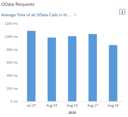
As already mentioned, the OData Requests diagram displays data on system level. On the first view you see the average time of all OData calls in the last five weeks and on the second view, which you can access via the perspective switch, the total number of all OData calls.
The last section consists again of two diagrams and indicates how healthy the OData communication of the system is. The first one Top Gateway Errors is self-explanatory and shows, alterable by the perspective switch, either the five most frequently occurred errors or the top five of errors that affected most users.
This chart is also connected to a detail page which you can reach via the dedicated button. The page lists all Gateway errors of the selected week - you can time travel here, too - and provides detail information. The trend arrows for the fields Number of Occurrences and Distinct Users compare the values of the displayed week with the values of its preceding week.
The second diagram, with the title Gateway Errors, reflects the total number of Gateway errors on system level for the last five weeks.
We actually created it because we figured out that administrators tend to activate Internet Communication Framework (ICF) services which are later not used. However, as mentioned in the SAP S/4HANA Security Guide, you should handle ICF services in a restrictive manner in order to
minimize the attack surface on the web. That's why we compare in the chart the number of activated ICF services within the UI5 repository with the ones of the apps which are configured correctly.
In an ideal system configuration the Activated ICF Services bar should be slightly higher than the Usable Apps bar, since there are some ICF service, like e.g. for Reuse Libraries, which should be enabled and are not directly linked to a Fiori app.
To know which ICF service is unused and are candidates for deactivation you can open the chart's detail page via the dedicated button on the right upper corner.
Per default, the left tab is selected and the page lists all active ICF services within the UI5 repository. You can use the three tabs on the right that serve as filters to gather more information. The services under tab Not Used are the ones you may disable.
Please be careful and double-check the ICF services on your system to prevent switching off Fiori apps that your users actually would like to use.
If the list of unused but active ICF services is long you can use the ICF Mass Processing Tool to deactivate ICF services. How you exactly do this is described in SAP KBA 2989913.
In addition, the new SAP Fiori Statistics overview page card has been released on the SAP EarlyWatch Alert Workspace which provides cross-system information. This card is introduced by this SAP Blog.
If you encounter any strange behavior within the Dashboard, when you think the shown data cannot be correct, or you have an idea to improve the user experience then please don't hesitate to comment on this SAP Blog to let us know. We are delighted to contact you and give our best to improve the EarlyWatch Alert cloud applications.
Please note: If you can't see the User Experience section at all that could mean that for the monitored system no OData traffic has been detected. If you miss some of the charts could indicate that the minimum system requirements are not met. Please refer to SAP note 2939430.
Within the Dashboard are two help sources available: The Web Assistant, which you can enable via the question mark button in the Launchpad header bar, shows help content as an overlay on top of the application and the [ i ]-icons on the right upper corner of each chart, that leads you to the diagram's KPI catalog.
You can classify the new UX segment in three sections:
- UX Adoption
- System Performance
- System Health

With the time traveller UI element on the right upper corner of the User Experience (UX) segment you are able to view information that is even further back.
UX Adoption
This section includes the two charts Usable SAPUI5 Applications and Application Components. Both charts give you a picture of how far SAP's Fiori UX Strategy is adopted on the system.
The Usable SAPUI5 Applications chart shows the number of correctly configured UI5 applications for the last five weeks in a timeline chart. The chart legend explains the three lines.

Correctly configured means that the app's ICF service is active, its (leading) OData service is registered in transaction /IWFND/MAINT_SERVICE, a system alias has been assigned, and some additional minor checks where performed successfully. The correct backend configuration cannot be checked since it is app specific.
With the Application Components diagram you figure out to which SAP Application Components the apps belong.

System Performance
The next two charts provide you with an overview about the OData performance respectively workload. The Top OData Service Calls chart on OData level and the OData Requests chart on system level.
With the perspective switch (dropdown field) on the Top OData Service Calls chart you are able to select between three performance relevant views.

You can also click on the Detail View button on the right upper corner to open the OData Requests detail page.
In the table on the left side of the page you can select and unselect specific OData services to display their timeline on the right side in order to visualize the performance history of the last 14 weeks. However, the time frame period can be adjusted with the date range selection field above the timeline chart.

A click on the OData service name opens the Fiori Apps Reference Library application page of the Fiori app which uses this Odata service. Of course, this works only for SAP standard OData services.
As already mentioned, the OData Requests diagram displays data on system level. On the first view you see the average time of all OData calls in the last five weeks and on the second view, which you can access via the perspective switch, the total number of all OData calls.
System Health
The last section consists again of two diagrams and indicates how healthy the OData communication of the system is. The first one Top Gateway Errors is self-explanatory and shows, alterable by the perspective switch, either the five most frequently occurred errors or the top five of errors that affected most users.

This chart is also connected to a detail page which you can reach via the dedicated button. The page lists all Gateway errors of the selected week - you can time travel here, too - and provides detail information. The trend arrows for the fields Number of Occurrences and Distinct Users compare the values of the displayed week with the values of its preceding week.

The second diagram, with the title Gateway Errors, reflects the total number of Gateway errors on system level for the last five weeks.

And what's about the remaining ICF Security chart?
We actually created it because we figured out that administrators tend to activate Internet Communication Framework (ICF) services which are later not used. However, as mentioned in the SAP S/4HANA Security Guide, you should handle ICF services in a restrictive manner in order to
minimize the attack surface on the web. That's why we compare in the chart the number of activated ICF services within the UI5 repository with the ones of the apps which are configured correctly.
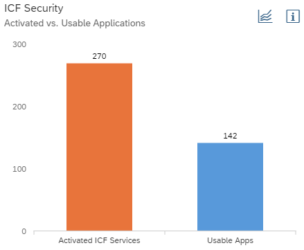
In an ideal system configuration the Activated ICF Services bar should be slightly higher than the Usable Apps bar, since there are some ICF service, like e.g. for Reuse Libraries, which should be enabled and are not directly linked to a Fiori app.
To know which ICF service is unused and are candidates for deactivation you can open the chart's detail page via the dedicated button on the right upper corner.

Per default, the left tab is selected and the page lists all active ICF services within the UI5 repository. You can use the three tabs on the right that serve as filters to gather more information. The services under tab Not Used are the ones you may disable.
Please be careful and double-check the ICF services on your system to prevent switching off Fiori apps that your users actually would like to use.
If the list of unused but active ICF services is long you can use the ICF Mass Processing Tool to deactivate ICF services. How you exactly do this is described in SAP KBA 2989913.
Remarks
In addition, the new SAP Fiori Statistics overview page card has been released on the SAP EarlyWatch Alert Workspace which provides cross-system information. This card is introduced by this SAP Blog.
If you encounter any strange behavior within the Dashboard, when you think the shown data cannot be correct, or you have an idea to improve the user experience then please don't hesitate to comment on this SAP Blog to let us know. We are delighted to contact you and give our best to improve the EarlyWatch Alert cloud applications.
- SAP Managed Tags:
- SAP Fiori for SAP S/4HANA,
- OData,
- Support Services,
- NW ABAP Gateway (OData),
- User Experience,
- SAP EarlyWatch Alert
Labels:
2 Comments
You must be a registered user to add a comment. If you've already registered, sign in. Otherwise, register and sign in.
Labels in this area
-
ABAP CDS Views - CDC (Change Data Capture)
2 -
AI
1 -
Analyze Workload Data
1 -
BTP
1 -
Business and IT Integration
2 -
Business application stu
1 -
Business Technology Platform
1 -
Business Trends
1,658 -
Business Trends
92 -
CAP
1 -
cf
1 -
Cloud Foundry
1 -
Confluent
1 -
Customer COE Basics and Fundamentals
1 -
Customer COE Latest and Greatest
3 -
Customer Data Browser app
1 -
Data Analysis Tool
1 -
data migration
1 -
data transfer
1 -
Datasphere
2 -
Event Information
1,400 -
Event Information
66 -
Expert
1 -
Expert Insights
177 -
Expert Insights
298 -
General
1 -
Google cloud
1 -
Google Next'24
1 -
Kafka
1 -
Life at SAP
780 -
Life at SAP
13 -
Migrate your Data App
1 -
MTA
1 -
Network Performance Analysis
1 -
NodeJS
1 -
PDF
1 -
POC
1 -
Product Updates
4,577 -
Product Updates
344 -
Replication Flow
1 -
RisewithSAP
1 -
SAP BTP
1 -
SAP BTP Cloud Foundry
1 -
SAP Cloud ALM
1 -
SAP Cloud Application Programming Model
1 -
SAP Datasphere
2 -
SAP S4HANA Cloud
1 -
SAP S4HANA Migration Cockpit
1 -
Technology Updates
6,873 -
Technology Updates
421 -
Workload Fluctuations
1
Related Content
- Configure Custom SAP IAS tenant with SAP BTP Kyma runtime environment in Technology Blogs by SAP
- Setup of Synthetic User Monitoring in SAP Cloud ALM in Technology Blogs by Members
- Horizon Theme and Templates for Stories in SAP Analytics Cloud in Technology Blogs by SAP
- Optimized Design Experience in SAP Analytics Cloud - Building Containers in a no code Environment in Technology Blogs by SAP
- Responsive vs. Canvas in SAP Analytics Cloud with Optimized Design Experience in Technology Blogs by Members
Top kudoed authors
| User | Count |
|---|---|
| 38 | |
| 25 | |
| 17 | |
| 13 | |
| 7 | |
| 7 | |
| 7 | |
| 7 | |
| 6 | |
| 6 |