
- SAP Community
- Products and Technology
- Technology
- Technology Blogs by SAP
- Coloring Autobahn sections with SAP Analytics Clou...
Technology Blogs by SAP
Learn how to extend and personalize SAP applications. Follow the SAP technology blog for insights into SAP BTP, ABAP, SAP Analytics Cloud, SAP HANA, and more.
Turn on suggestions
Auto-suggest helps you quickly narrow down your search results by suggesting possible matches as you type.
Showing results for
Advisor
Options
- Subscribe to RSS Feed
- Mark as New
- Mark as Read
- Bookmark
- Subscribe
- Printer Friendly Page
- Report Inappropriate Content
08-20-2020
9:59 PM
In this blog, I'll explain how to color polygons in SAP Analytics Cloud. This is mostly interesting for line geometries in the transportation industry (roads, train lines), utilities and oil & gas.
Basically, we want a colored line on a map, and the color shade should be based on a KPI. This is usually done in a geospatial patform such as ArcGIS. SAP Analytics cloud has geospatial capabilities for heatmaps, flow layers, buble layers but displaying a polygon and coloring it based on a measure is not supported in principle 🙂
blazzabukovec and adem.baykal insisted so we tried something and recorded the video below of a similar visualization using regular SAC components.
There is a background layer representing the sections of highway made from a shape file, and the layer showing the construction which comes from a live SAP HANA connection.
As you can see here, there are multiple layers here.
The easiest one is all autobahns. It is static and not associated with any KPI so a simplee way was to take data from openstreet map, put into a shape file and make the layer with it.
The second layer displays the project id as a number on the map. To realize this, the model for project has a geodimension. To place a label on the map, the only way I came across was to create a bubble layer, make the buble invisible, and increase label font size.
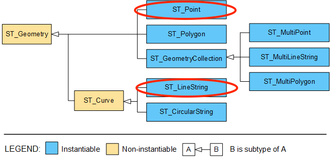
In the world of Geographical Information System (GIS), databases with geospatial capabilities follow approximately the same SQL standard. The highway section pictured above is a geometry of type Line String which is a sub type of the generic Polygon. For reference, you can see all spatial data types here in the documentation.
SAP Analytics cloud can only display polygons if they are in a shapefile or as an Esri ArcGIS layer. To display and color this highway sections based on measures, we'll use a flow layer.
To visualize the Line String geometry in a flow layer, we'll break it down into multiple segment.
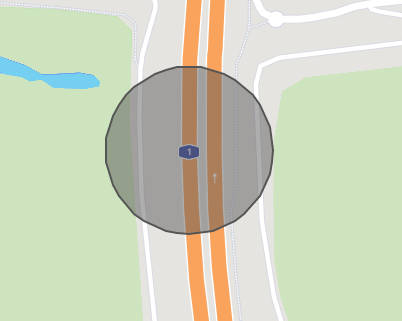
The effect of the curve is created when multiple small straight lines are seen with zooming out
That concept is more visible in geometries like circles:

We'll use HANA SQL geospatial functions to transform the line string into multiple segments.
There is basically two ways to extract individual points from the original line string:
Each approach has benefits and drawbacks. Thousands of segments would affect user experience and require filters to be enforced to maintain acceptable response time.
Using each point creates a curve that is better looking, and it doesn't use any intermediate points if the section is a straight line. However, a curve might be represented by dozens or a hundred points which is too much.
Maybe mathias.kemeter could come up with an adaptative algorithm.
It is required to generate unique identifiers for each point along with the point geometry. Here's a function I used to get this done:
To make it all visible in SAC, you need to create the following models/calc views:
Then you simply need to add a flow layer and select the model associated with CV_FLOW, select the measure to use for coloring the segments and link the models so that user actions on the map impact the charts and vice versa!
Basically, we want a colored line on a map, and the color shade should be based on a KPI. This is usually done in a geospatial patform such as ArcGIS. SAP Analytics cloud has geospatial capabilities for heatmaps, flow layers, buble layers but displaying a polygon and coloring it based on a measure is not supported in principle 🙂
blazzabukovec and adem.baykal insisted so we tried something and recorded the video below of a similar visualization using regular SAC components.
There is a background layer representing the sections of highway made from a shape file, and the layer showing the construction which comes from a live SAP HANA connection.
As you can see here, there are multiple layers here.
The easiest one is all autobahns. It is static and not associated with any KPI so a simplee way was to take data from openstreet map, put into a shape file and make the layer with it.
The second layer displays the project id as a number on the map. To realize this, the model for project has a geodimension. To place a label on the map, the only way I came across was to create a bubble layer, make the buble invisible, and increase label font size.
The last and most interesting layer is the coloring of sections with an active maintenance project. To realize it, we need the geometry for each project. It's important to visualize geospatial queries during development and the tool DBeaver.io helps with the ability to put a tabular result set on a map.

Using DBeaver for geospatial queries
In the world of Geographical Information System (GIS), databases with geospatial capabilities follow approximately the same SQL standard. The highway section pictured above is a geometry of type Line String which is a sub type of the generic Polygon. For reference, you can see all spatial data types here in the documentation.
SAP Analytics cloud can only display polygons if they are in a shapefile or as an Esri ArcGIS layer. To display and color this highway sections based on measures, we'll use a flow layer.
To visualize the Line String geometry in a flow layer, we'll break it down into multiple segment.
The effect of the curve is created when multiple small straight lines are seen with zooming out

That concept is more visible in geometries like circles:
We'll use HANA SQL geospatial functions to transform the line string into multiple segments.
There is basically two ways to extract individual points from the original line string:
- The first is to extract each individual point using the functions ST_PointN to extract a point at a particular index in the collection and ST_NumPoints to know when to stop. Then we make each intermediate point the start and stop of a segment. This gives the path displayed in yellow.
- The second approach is to divide the line into segment of equal size. The function ST_LineInterpolatePoint returns a point locate along the line at a given fraction of the total length.

Each approach has benefits and drawbacks. Thousands of segments would affect user experience and require filters to be enforced to maintain acceptable response time.
Using each point creates a curve that is better looking, and it doesn't use any intermediate points if the section is a straight line. However, a curve might be represented by dozens or a hundred points which is too much.
Maybe mathias.kemeter could come up with an adaptative algorithm.
It is required to generate unique identifiers for each point along with the point geometry. Here's a function I used to get this done:
/**

 * Split linestrings into simple line segments.

 * Useful to have road/rail network into a flow layer in SAP Analytics Cloud.

 */

CREATE OR replace FUNCTION ST_Z_Linestring_to_arcs(

T_IN TABLE(

	LINE_ID   NVARCHAR(64),

	GEOM      ST_Geometry -- must be a ST_Linestring

	)

)

RETURNS TABLE(

	LINE_ID  NVARCHAR(64),

	ARC_ID   INTEGER,

	START_PT ST_POINT,

	END_PT   ST_POINT

)

AS BEGIN


	DECLARE max_pt integer;

	SELECT max(GEOM.ST_NumPoints()) INTO max_pt FROM :T_IN ;


	--List of integers from 1 until the max_pt

	nums = SELECT element_number AS num

		FROM SERIES_GENERATE_INTeger(1,1, :max_pt);


	RETURN SELECT

		LINE_ID,

		n.num AS ARC_ID,

		t.GEOM.ST_PointN(n.num) AS START_PT,

		CASE WHEN n.num < t.GEOM.ST_NumPoints() THEN

			t.GEOM.ST_PointN(n.num) END AS END_PT

	FROM :T_IN t

	  inner JOIN :nums n ON (n.num<=t.GEOM.ST_NumPoints())

	;

END;
To make it all visible in SAC, you need to create the following models/calc views:
- CV_PT_START, a calc view to associate a point id with a point geometry.
- CV_PT_END, a calc view to associate a point id with a point geometry. Use different column names than in CV_PT_START otherwise the flow layer won't accept it.
- CV_FLOW with
- project id to join with maintenance and budget KPI.
- source id, used as the key for a geo dimension pointing to CV_PT_START
- destination id for CV_PT_END
- A static value of 1 defined as a measure
Then you simply need to add a flow layer and select the model associated with CV_FLOW, select the measure to use for coloring the segments and link the models so that user actions on the map impact the charts and vice versa!
- SAP Managed Tags:
- SAP Analytics Cloud,
- Travel and Transportation,
- SAP HANA
Labels:
5 Comments
You must be a registered user to add a comment. If you've already registered, sign in. Otherwise, register and sign in.
Labels in this area
-
ABAP CDS Views - CDC (Change Data Capture)
2 -
AI
1 -
Analyze Workload Data
1 -
BTP
1 -
Business and IT Integration
2 -
Business application stu
1 -
Business Technology Platform
1 -
Business Trends
1,658 -
Business Trends
91 -
CAP
1 -
cf
1 -
Cloud Foundry
1 -
Confluent
1 -
Customer COE Basics and Fundamentals
1 -
Customer COE Latest and Greatest
3 -
Customer Data Browser app
1 -
Data Analysis Tool
1 -
data migration
1 -
data transfer
1 -
Datasphere
2 -
Event Information
1,400 -
Event Information
66 -
Expert
1 -
Expert Insights
177 -
Expert Insights
296 -
General
1 -
Google cloud
1 -
Google Next'24
1 -
Kafka
1 -
Life at SAP
780 -
Life at SAP
13 -
Migrate your Data App
1 -
MTA
1 -
Network Performance Analysis
1 -
NodeJS
1 -
PDF
1 -
POC
1 -
Product Updates
4,577 -
Product Updates
342 -
Replication Flow
1 -
RisewithSAP
1 -
SAP BTP
1 -
SAP BTP Cloud Foundry
1 -
SAP Cloud ALM
1 -
SAP Cloud Application Programming Model
1 -
SAP Datasphere
2 -
SAP S4HANA Cloud
1 -
SAP S4HANA Migration Cockpit
1 -
Technology Updates
6,873 -
Technology Updates
420 -
Workload Fluctuations
1
Related Content
- IoT - Ultimate Data Cyber Security - with Enterprise Blockchain and SAP BTP 🚀 in Technology Blogs by Members
- Replace a Model in the Optimized (Unified) Experience in Technology Blogs by SAP
- SAP Business AI an Introduction in Technology Blogs by Members
- SAP Analytics Cloud's Optimized Design Experience (ODE): New Features and Improvements in Technology Blogs by Members
- OUT NOW: SAP Signavio February 2024 release in Technology Blogs by SAP
Top kudoed authors
| User | Count |
|---|---|
| 36 | |
| 25 | |
| 17 | |
| 13 | |
| 8 | |
| 7 | |
| 7 | |
| 6 | |
| 6 | |
| 6 |