
- SAP Community
- Products and Technology
- Technology
- Technology Blogs by Members
- Charts in SAP Analytical Cloud
Technology Blogs by Members
Explore a vibrant mix of technical expertise, industry insights, and tech buzz in member blogs covering SAP products, technology, and events. Get in the mix!
Turn on suggestions
Auto-suggest helps you quickly narrow down your search results by suggesting possible matches as you type.
Showing results for
former_member58
Participant
Options
- Subscribe to RSS Feed
- Mark as New
- Mark as Read
- Bookmark
- Subscribe
- Printer Friendly Page
- Report Inappropriate Content
08-19-2020
8:07 AM
To visualize the data in more presentable / interactive way, we will prefer charts in BI Analytics.
Here we will explore about ready-made charts available for use in SAC.
In our example, we will use simple data to explore about each chart. Let’s consider sample data provided by SAP “Best Run travel.xlsx”
Excel link to download : https://www.sapanalytics.cloud/wp-content/uploads/2018/02/BestRun.xlsx
URL: https://www.sapanalytics.cloud/

SAC offers various inbuilt charts as ready to use option. Charts are classified into various categories
Let us create simple story board to explore more on charts.
Bar / Column charts are used to compare measures based on dimensions.

This chart is used to show relationship between two measures over period of time.
Mandatory Attributes: At least 1 Measure and 1 dimension is required.
In our example to understand more on this chart, lets pick two measure and one dimension. Here we are picking “Gross Margin” ,“OriginalSalesPrice” as Measures and “Date” as Dimension.
Note that you cannot change horizontal / vertical direction of this chart. By default, it is always vertical representation.
To enable Combination Column and Line Chart, select another Measure in Line Axis. In this case, we are ‘Mileage’ measure as Line Axis.
To show the trends and breakdown of the specific measure w.r.t to dimension.
Mandatory Attributes: At least 1 or more Measure and 1 dimension is required.
In our example, we will use “Gross Margin” , “OriginalSalesPrice” as Measures and “Date” as Dimension and Line Axis is not required for Combined Staked Column chart.
To enable Combined Staked Line chart, add Measure in Line Axis. In our example , we will use “Discount” as Line Axis Measure
It is like Bar / Column chart, but it visualizes the total measure divided into selected measures.
Mandatory Attributes: At least 1 Measure and 1 dimension
In our example, we will use “GrossMargin” , “Discount” as Measures and “Date” as Dimension.
To show positive and negative changes of measure w.r.t dimension along with time interval
Mandatory Attributes: At least 1 Measure and at most 2 dimensions are required
In our example, we will display changes of “Gross Margin” (Measure) w.r.t “Category” dimension with “Date” interval.
To show cumulative series of values, stacked Area chart is used.
Mandatory Attributes: Requires at least 1 Measure
In our example, we will visualize cumulative series of prices for states. “OriginalSalesPrice”, “PriceFixed” , “Discount” are Measures and “StateName” as Dimension is configured in this chart.
To show any correlation in the trend
Mandatory Attributes: Requires at least 1 Measure
In our example, we will visualize the trend for various “Products” (Dimension) over “GrossMargin” and “Discount” as Measures in this chart.
To show variation in the trend over the time period. Filter option to analyze for different interval.
Mandatory Attributes: Requires at least 1 Measure and 1 Time Dimension.
In our example, we will visualize “GrossMargin” (Measure) trend over period of time (“Date” – Dimension)
Box plots show the distribution of data based on a five number summary: minimum, first quartile, median, third quartile, and maximum.
Mandatory Attributes: Requires at least 1 Measure and 1 Aggregation Dimension.
In our example, we will visualize “GrossMargin” & “QuantitySold” (Measure) by “Sales Manager” (Agg.Dimension) for the “ProductCategory” (Dimension)
It shows a large volume of data in readable way with measure values in the chart.
Mandatory Attributes: Requires at least 1 Dimension in X axis and 1 Measure in Color.
In our example, we will visualize “GrossMargin” of each and every “ProductCategory” (Dimension).
It shows comparison between quantitative data (Measures) for various segments
Mandatory Attributes: Requires at least 1 Measure and 1 Aggregation Dimension
In our example, we will visualize “GrossMargin” of each and every “ProductCategory” (Agg. Dimension) by state.
It shows distribution of dimensions and its outliers.
Mandatory Attributes: Requires at least 1 Measure , 2 Dimensions (inclusive of one-color dimension)
In our example, we will visualize “GrossMargin” of each and every “ProductCategory” (Dimension) by “State” in Color dimension.
It is similar to Heat Map but this chart is limited to single measure and dimension.
Mandatory Attributes: Requires at least 1 Measure and 1 Dimension
In our example, we will visualize “GrossMargin” (Measure) achieved by “SalesManager” (Dimension).
Used to identify the correlation between two specific measures
Mandatory Attributes: Requires at least 2 Measures ( X & Y axis) and 2 Dimensions (inclusive of one-color dimension)
In our example, we will visualize “GrossMargin” & “Discount” (Measures) of “ProductCategory” (Dimension) by “State” ( Color Dimension)
Used to identify the correlation between three measures in different axis
Mandatory Attributes: Requires at least 3 Measures ( X & Y axis and Size) and 2 Dimensions (inclusive of one-color dimension)
In our example, we will visualize “GrossMargin” & “Discount” of “SoldQuantities” (Measures) by “ProductCategory” (Dimension) for each “State” ( Color Dimension)
Used to show value of measure based on two dimensions. Use Hover to get detailed information.
Mandatory Attributes: Requires at least 1 Measures and 2 Dimensions (inclusive of one-color dimension)
In our example, we will visualize “GrossMargin” of “ProductCategory” (Dimension) achieved by “SalesManager” ( Color Dimension)
Used to indicate progress over the goals. Before creating this chart, ensure to define thresholds for the measure. Use below link which will guide to create different types of thresholds.
https://www.sapanalytics.cloud/visual-thresholds-reference-lines/
Mandatory Attributes: Requires at least 1 Measures and 2 Dimensions (inclusive of one-color threshold dimension)
In our example, we will visualize “GrossMargin” of achieved by “SalesManager” ( threshold Dimension)
Used to indicate the totals with threshold highlights.
Mandatory Attributes: Requires at least 2 Measures
In our example, we will visualize “GrossMargin” and “QuantitySold” (Measure) in highlighted text
Used to show the percentage of a dimension within a measure. Both Pie / Donut should always add up to 100%
Mandatory Attributes: Requires at least 1 Measure and 1 Color Dimension
Marimekko chart is bar style chart used to communicate two measures using the size of the bar as well as two dimensions by stacking values in a single bar.
Mandatory Attributes: Requires at least 1 Measure (Height) and 1 Dimension
Please note, as per my analysis SAC have not offered option to create custom chart creation option in current release. Hopefully we can expect this option in upcoming releases.
For more styling options for SAC Charts, please visit the below link
https://help.sap.com/viewer/00f68c2e08b941f081002fd3691d86a7/release/en-US/0527de560beb4f0dbced12522...
Hope this article helps !!!
Thanks
Subbu
Here we will explore about ready-made charts available for use in SAC.
In our example, we will use simple data to explore about each chart. Let’s consider sample data provided by SAP “Best Run travel.xlsx”
Excel link to download : https://www.sapanalytics.cloud/wp-content/uploads/2018/02/BestRun.xlsx
Pre-requisites
- Sign-in SAC using your official email address. By default, 30 days trial and can be extended up to 90 days
URL: https://www.sapanalytics.cloud/
- Download the sample excel data and upload it in SAC.
- Navigate to Menu (left side) >> Create >> Model
- Here you can choose any option based on your data source. In our case, we will use sample excel data. So, click on “Import a file from your computer”
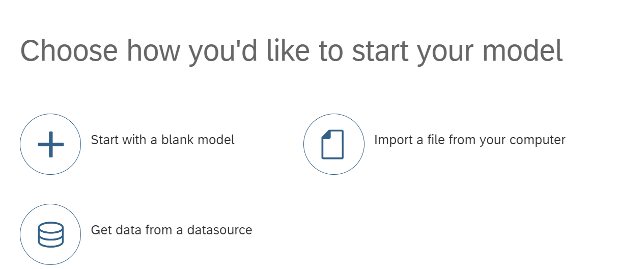


- Once data is uploaded, please click on “Create Model” . SAC will automatically create new model. Save it in a folder by giving name and description.


- New Model is created with sample data successfully.
Exploring charts in SAC
SAC offers various inbuilt charts as ready to use option. Charts are classified into various categories
- Comparison
- Bar / Column chart
- Combination column & line
- Combination Staked Column & Line
- Stacked Bar / Column
- Waterfall
- Trend
- Stacked Area
- Line
- Time Series
- Distribution
- Boxer Plot
- Heat Map
- Histogram
- Radar
- Tree Map
- Correlation
- Scatterplot
- Bubble
- Cluster Bubble
- Indicator
- Numeric Point
- Bullet
- Others
- Pie
- Donut
- Marimekko
Let us create simple story board to explore more on charts.
- Navigate to SAC Menu >> Create >> Story
- To make it simple, let’s use “Add a Canvas Page”
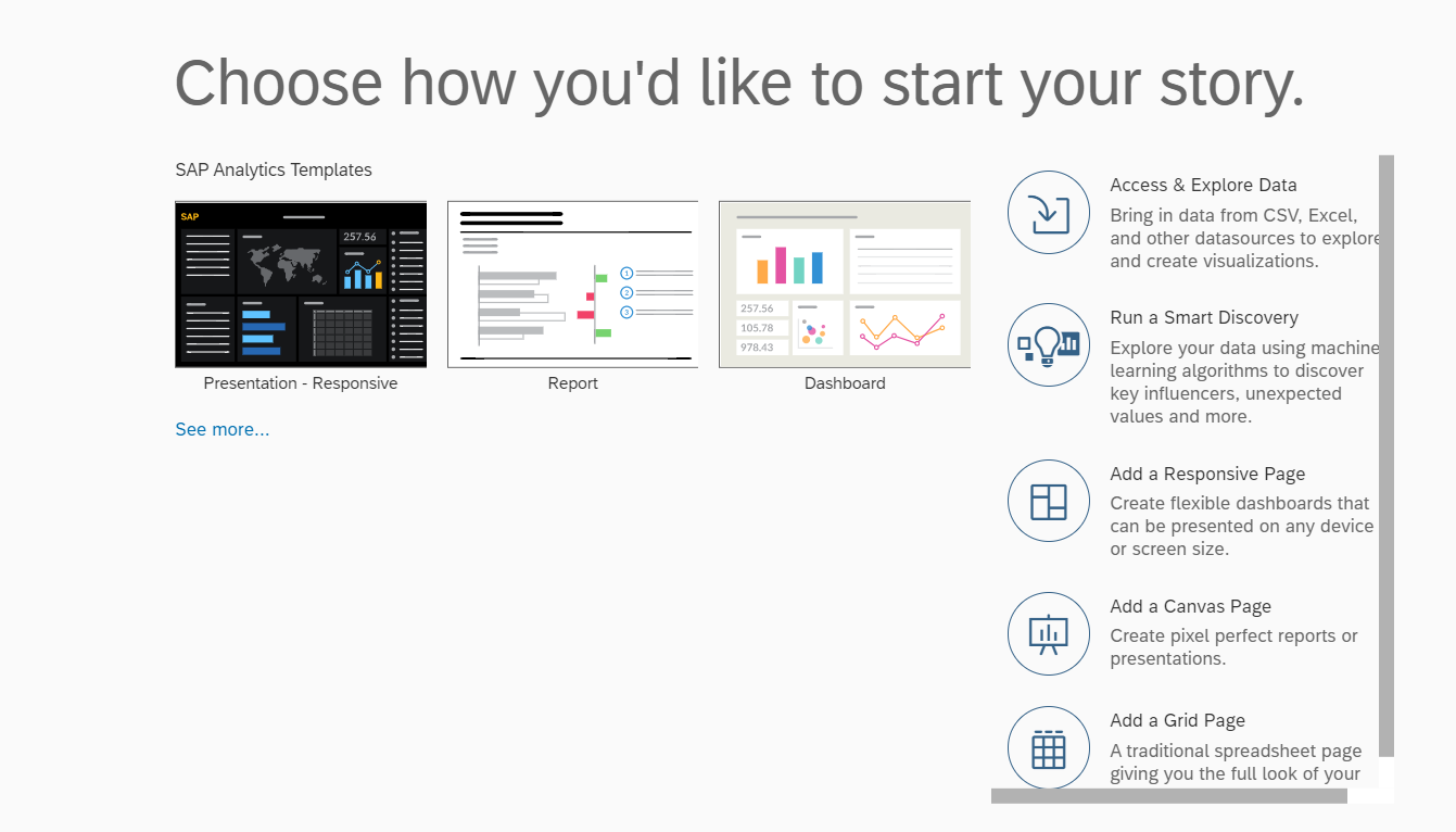
- Click on chart option in Canvas landing page and select your model recently created “Best_Run_Travel_Model”


- A blank canvas page will be loaded with editor options where you can see the categories of available charts in SAC

Comparison category will have following charts
Bar / Column Chart
Bar / Column charts are used to compare measures based on dimensions.
X axis represents Measure / Y axis represents Dimension
Mandatory Attributes: At least 1 Measure and 1 dimension.
In our example lets pick “GrossMargin” from Measure and “StateName” from Dimension dropdown to compare total ticket price for International & Domestic travel.
When Bars ( Measures) are visualized in horizontal direction then it is considered as ‘Bar Chart’.

When Bars (Measures) are visualized in vertical direction then it is considered as ‘Column Chart’.
Combination Column & Line
This chart is used to show relationship between two measures over period of time.
Mandatory Attributes: At least 1 Measure and 1 dimension is required.
In our example to understand more on this chart, lets pick two measure and one dimension. Here we are picking “Gross Margin” ,“OriginalSalesPrice” as Measures and “Date” as Dimension.
Note that you cannot change horizontal / vertical direction of this chart. By default, it is always vertical representation.


To enable Combination Column and Line Chart, select another Measure in Line Axis. In this case, we are ‘Mileage’ measure as Line Axis.

Combination Staked Column & Line
To show the trends and breakdown of the specific measure w.r.t to dimension.
Mandatory Attributes: At least 1 or more Measure and 1 dimension is required.
In our example, we will use “Gross Margin” , “OriginalSalesPrice” as Measures and “Date” as Dimension and Line Axis is not required for Combined Staked Column chart.

To enable Combined Staked Line chart, add Measure in Line Axis. In our example , we will use “Discount” as Line Axis Measure

Stacked Bar / Column
It is like Bar / Column chart, but it visualizes the total measure divided into selected measures.
Mandatory Attributes: At least 1 Measure and 1 dimension
In our example, we will use “GrossMargin” , “Discount” as Measures and “Date” as Dimension.


Waterfall
To show positive and negative changes of measure w.r.t dimension along with time interval
Mandatory Attributes: At least 1 Measure and at most 2 dimensions are required
In our example, we will display changes of “Gross Margin” (Measure) w.r.t “Category” dimension with “Date” interval.

Trend category will have following charts
Stacked Area
To show cumulative series of values, stacked Area chart is used.
Mandatory Attributes: Requires at least 1 Measure
In our example, we will visualize cumulative series of prices for states. “OriginalSalesPrice”, “PriceFixed” , “Discount” are Measures and “StateName” as Dimension is configured in this chart.

Line Chart
To show any correlation in the trend
Mandatory Attributes: Requires at least 1 Measure
In our example, we will visualize the trend for various “Products” (Dimension) over “GrossMargin” and “Discount” as Measures in this chart.

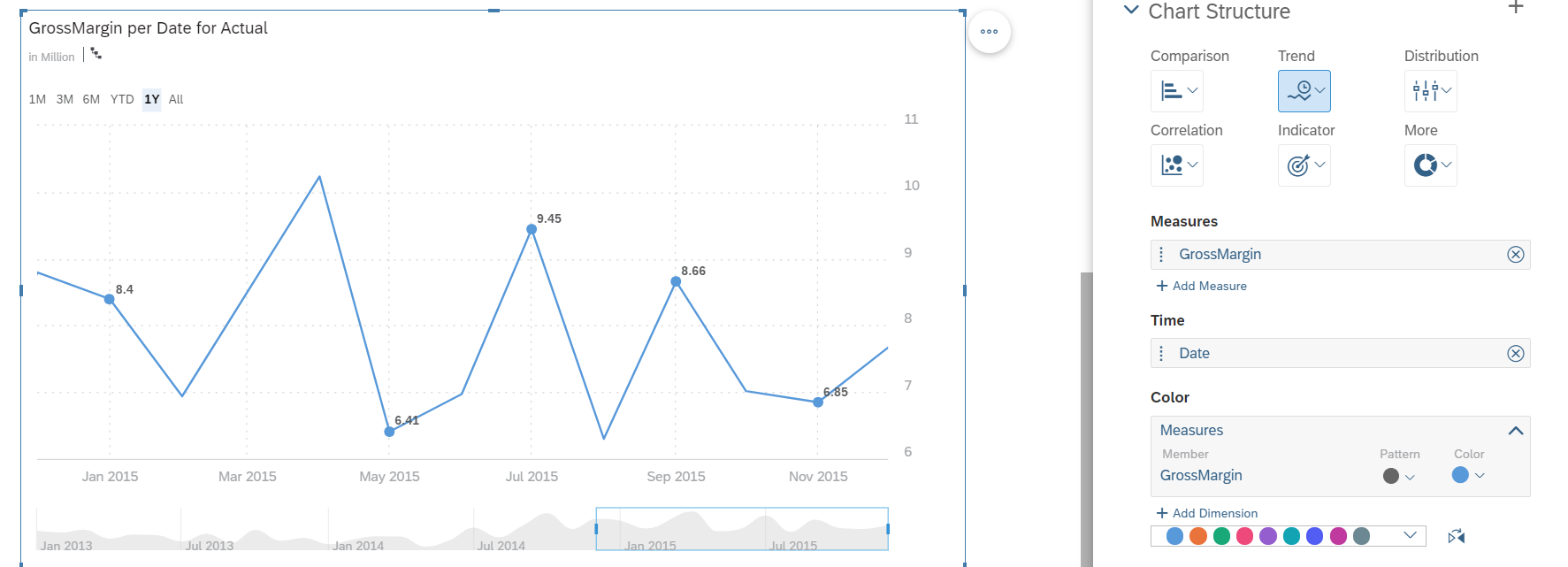
Time Series
To show variation in the trend over the time period. Filter option to analyze for different interval.
Mandatory Attributes: Requires at least 1 Measure and 1 Time Dimension.
In our example, we will visualize “GrossMargin” (Measure) trend over period of time (“Date” – Dimension)
Distribution category will have following charts
Box Plot
Box plots show the distribution of data based on a five number summary: minimum, first quartile, median, third quartile, and maximum.
Mandatory Attributes: Requires at least 1 Measure and 1 Aggregation Dimension.
In our example, we will visualize “GrossMargin” & “QuantitySold” (Measure) by “Sales Manager” (Agg.Dimension) for the “ProductCategory” (Dimension)

Heat Map
It shows a large volume of data in readable way with measure values in the chart.
Mandatory Attributes: Requires at least 1 Dimension in X axis and 1 Measure in Color.
In our example, we will visualize “GrossMargin” of each and every “ProductCategory” (Dimension).

Histogram
It shows comparison between quantitative data (Measures) for various segments
Mandatory Attributes: Requires at least 1 Measure and 1 Aggregation Dimension
In our example, we will visualize “GrossMargin” of each and every “ProductCategory” (Agg. Dimension) by state.

Radar Chart
It shows distribution of dimensions and its outliers.
Mandatory Attributes: Requires at least 1 Measure , 2 Dimensions (inclusive of one-color dimension)
In our example, we will visualize “GrossMargin” of each and every “ProductCategory” (Dimension) by “State” in Color dimension.

Tree Map Chart
It is similar to Heat Map but this chart is limited to single measure and dimension.
Mandatory Attributes: Requires at least 1 Measure and 1 Dimension
In our example, we will visualize “GrossMargin” (Measure) achieved by “SalesManager” (Dimension).

Correlation category will have following charts
Scatter-plot
Used to identify the correlation between two specific measures
Mandatory Attributes: Requires at least 2 Measures ( X & Y axis) and 2 Dimensions (inclusive of one-color dimension)
In our example, we will visualize “GrossMargin” & “Discount” (Measures) of “ProductCategory” (Dimension) by “State” ( Color Dimension)

Bubble
Used to identify the correlation between three measures in different axis
Mandatory Attributes: Requires at least 3 Measures ( X & Y axis and Size) and 2 Dimensions (inclusive of one-color dimension)
In our example, we will visualize “GrossMargin” & “Discount” of “SoldQuantities” (Measures) by “ProductCategory” (Dimension) for each “State” ( Color Dimension)

Cluster Bubble
Used to show value of measure based on two dimensions. Use Hover to get detailed information.
Mandatory Attributes: Requires at least 1 Measures and 2 Dimensions (inclusive of one-color dimension)
In our example, we will visualize “GrossMargin” of “ProductCategory” (Dimension) achieved by “SalesManager” ( Color Dimension)

Indicator category will have following charts
Bullet
Used to indicate progress over the goals. Before creating this chart, ensure to define thresholds for the measure. Use below link which will guide to create different types of thresholds.
https://www.sapanalytics.cloud/visual-thresholds-reference-lines/
Mandatory Attributes: Requires at least 1 Measures and 2 Dimensions (inclusive of one-color threshold dimension)
In our example, we will visualize “GrossMargin” of achieved by “SalesManager” ( threshold Dimension)

Numeric Point
Used to indicate the totals with threshold highlights.
Mandatory Attributes: Requires at least 2 Measures
In our example, we will visualize “GrossMargin” and “QuantitySold” (Measure) in highlighted text

Others category will have following charts
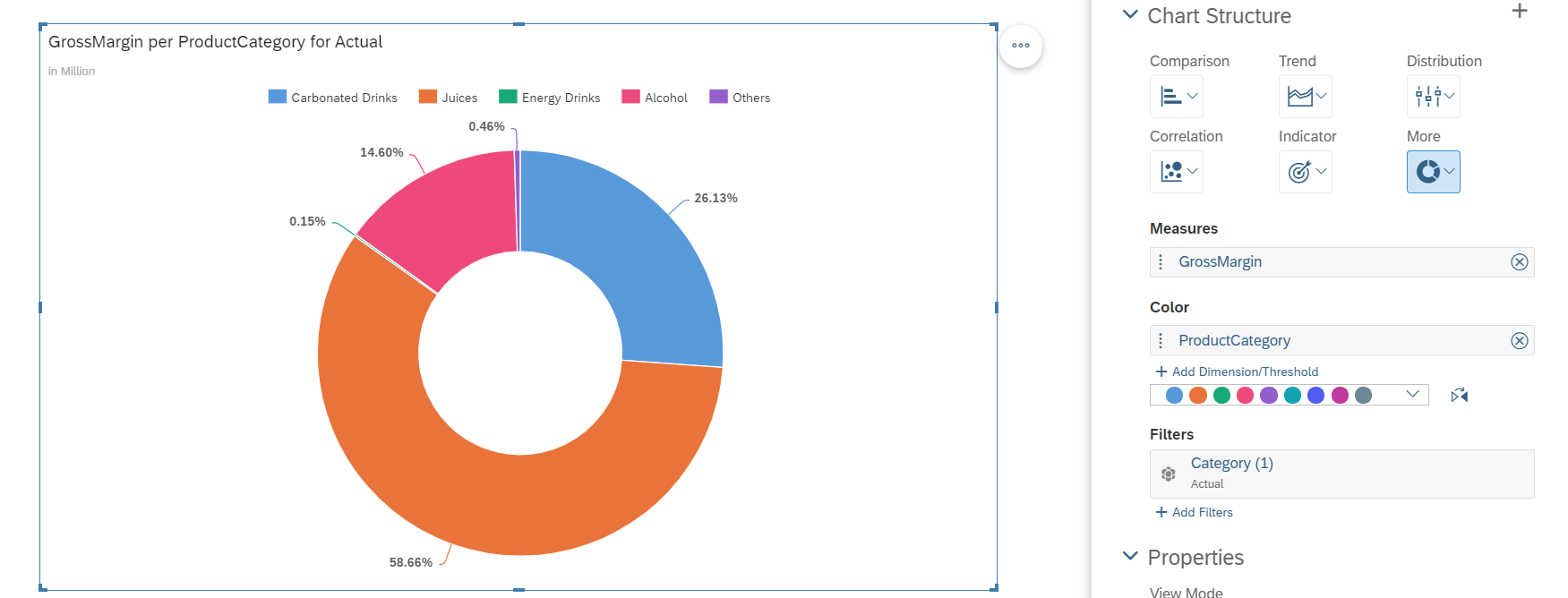
Pie / Donut
Used to show the percentage of a dimension within a measure. Both Pie / Donut should always add up to 100%
Mandatory Attributes: Requires at least 1 Measure and 1 Color Dimension

Marimekko
Marimekko chart is bar style chart used to communicate two measures using the size of the bar as well as two dimensions by stacking values in a single bar.
Mandatory Attributes: Requires at least 1 Measure (Height) and 1 Dimension

Please note, as per my analysis SAC have not offered option to create custom chart creation option in current release. Hopefully we can expect this option in upcoming releases.
For more styling options for SAC Charts, please visit the below link
https://help.sap.com/viewer/00f68c2e08b941f081002fd3691d86a7/release/en-US/0527de560beb4f0dbced12522...
Hope this article helps !!!
Thanks
Subbu
- SAP Managed Tags:
- SAP Analytics Cloud,
- SAP Business Technology Platform
9 Comments
You must be a registered user to add a comment. If you've already registered, sign in. Otherwise, register and sign in.
Labels in this area
-
"automatische backups"
1 -
"regelmäßige sicherung"
1 -
"TypeScript" "Development" "FeedBack"
1 -
505 Technology Updates 53
1 -
ABAP
14 -
ABAP API
1 -
ABAP CDS Views
2 -
ABAP CDS Views - BW Extraction
1 -
ABAP CDS Views - CDC (Change Data Capture)
1 -
ABAP class
2 -
ABAP Cloud
2 -
ABAP Development
5 -
ABAP in Eclipse
1 -
ABAP Platform Trial
1 -
ABAP Programming
2 -
abap technical
1 -
absl
1 -
access data from SAP Datasphere directly from Snowflake
1 -
Access data from SAP datasphere to Qliksense
1 -
Accrual
1 -
action
1 -
adapter modules
1 -
Addon
1 -
Adobe Document Services
1 -
ADS
1 -
ADS Config
1 -
ADS with ABAP
1 -
ADS with Java
1 -
ADT
2 -
Advance Shipping and Receiving
1 -
Advanced Event Mesh
3 -
AEM
1 -
AI
7 -
AI Launchpad
1 -
AI Projects
1 -
AIML
9 -
Alert in Sap analytical cloud
1 -
Amazon S3
1 -
Analytical Dataset
1 -
Analytical Model
1 -
Analytics
1 -
Analyze Workload Data
1 -
annotations
1 -
API
1 -
API and Integration
3 -
API Call
2 -
Application Architecture
1 -
Application Development
5 -
Application Development for SAP HANA Cloud
3 -
Applications and Business Processes (AP)
1 -
Artificial Intelligence
1 -
Artificial Intelligence (AI)
4 -
Artificial Intelligence (AI) 1 Business Trends 363 Business Trends 8 Digital Transformation with Cloud ERP (DT) 1 Event Information 462 Event Information 15 Expert Insights 114 Expert Insights 76 Life at SAP 418 Life at SAP 1 Product Updates 4
1 -
Artificial Intelligence (AI) blockchain Data & Analytics
1 -
Artificial Intelligence (AI) blockchain Data & Analytics Intelligent Enterprise
1 -
Artificial Intelligence (AI) blockchain Data & Analytics Intelligent Enterprise Oil Gas IoT Exploration Production
1 -
Artificial Intelligence (AI) blockchain Data & Analytics Intelligent Enterprise sustainability responsibility esg social compliance cybersecurity risk
1 -
ASE
1 -
ASR
2 -
ASUG
1 -
Attachments
1 -
Authorisations
1 -
Automating Processes
1 -
Automation
1 -
aws
2 -
Azure
1 -
Azure AI Studio
1 -
B2B Integration
1 -
Backorder Processing
1 -
Backup
1 -
Backup and Recovery
1 -
Backup schedule
1 -
BADI_MATERIAL_CHECK error message
1 -
Bank
1 -
BAS
1 -
basis
2 -
Basis Monitoring & Tcodes with Key notes
2 -
Batch Management
1 -
BDC
1 -
Best Practice
1 -
bitcoin
1 -
Blockchain
3 -
BOP in aATP
1 -
BOP Segments
1 -
BOP Strategies
1 -
BOP Variant
1 -
BPC
1 -
BPC LIVE
1 -
BTP
11 -
BTP Destination
2 -
Business AI
1 -
Business and IT Integration
1 -
Business application stu
1 -
Business Application Studio
1 -
Business Architecture
1 -
Business Communication Services
1 -
Business Continuity
1 -
Business Data Fabric
3 -
Business Partner
12 -
Business Partner Master Data
10 -
Business Technology Platform
2 -
Business Trends
1 -
CA
1 -
calculation view
1 -
CAP
3 -
Capgemini
1 -
CAPM
1 -
Catalyst for Efficiency: Revolutionizing SAP Integration Suite with Artificial Intelligence (AI) and
1 -
CCMS
2 -
CDQ
12 -
CDS
2 -
Cental Finance
1 -
Certificates
1 -
CFL
1 -
Change Management
1 -
chatbot
1 -
chatgpt
3 -
CL_SALV_TABLE
2 -
Class Runner
1 -
Classrunner
1 -
Cloud ALM Monitoring
1 -
Cloud ALM Operations
1 -
cloud connector
1 -
Cloud Extensibility
1 -
Cloud Foundry
4 -
Cloud Integration
6 -
Cloud Platform Integration
2 -
cloudalm
1 -
communication
1 -
Compensation Information Management
1 -
Compensation Management
1 -
Compliance
1 -
Compound Employee API
1 -
Configuration
1 -
Connectors
1 -
Consolidation Extension for SAP Analytics Cloud
1 -
Controller-Service-Repository pattern
1 -
Conversion
1 -
Cosine similarity
1 -
cryptocurrency
1 -
CSI
1 -
ctms
1 -
Custom chatbot
3 -
Custom Destination Service
1 -
custom fields
1 -
Customer Experience
1 -
Customer Journey
1 -
Customizing
1 -
cyber security
2 -
Data
1 -
Data & Analytics
1 -
Data Aging
1 -
Data Analytics
2 -
Data and Analytics (DA)
1 -
Data Archiving
1 -
Data Back-up
1 -
Data Governance
5 -
Data Integration
2 -
Data Quality
12 -
Data Quality Management
12 -
Data Synchronization
1 -
data transfer
1 -
Data Unleashed
1 -
Data Value
8 -
database tables
1 -
Datasphere
2 -
datenbanksicherung
1 -
dba cockpit
1 -
dbacockpit
1 -
Debugging
2 -
Delimiting Pay Components
1 -
Delta Integrations
1 -
Destination
3 -
Destination Service
1 -
Developer extensibility
1 -
Developing with SAP Integration Suite
1 -
Devops
1 -
digital transformation
1 -
Documentation
1 -
Dot Product
1 -
DQM
1 -
dump database
1 -
dump transaction
1 -
e-Invoice
1 -
E4H Conversion
1 -
Eclipse ADT ABAP Development Tools
2 -
edoc
1 -
edocument
1 -
ELA
1 -
Embedded Consolidation
1 -
Embedding
1 -
Embeddings
1 -
Employee Central
1 -
Employee Central Payroll
1 -
Employee Central Time Off
1 -
Employee Information
1 -
Employee Rehires
1 -
Enable Now
1 -
Enable now manager
1 -
endpoint
1 -
Enhancement Request
1 -
Enterprise Architecture
1 -
ETL Business Analytics with SAP Signavio
1 -
Euclidean distance
1 -
Event Dates
1 -
Event Driven Architecture
1 -
Event Mesh
2 -
Event Reason
1 -
EventBasedIntegration
1 -
EWM
1 -
EWM Outbound configuration
1 -
EWM-TM-Integration
1 -
Existing Event Changes
1 -
Expand
1 -
Expert
2 -
Expert Insights
1 -
Fiori
14 -
Fiori Elements
2 -
Fiori SAPUI5
12 -
Flask
1 -
Full Stack
8 -
Funds Management
1 -
General
1 -
Generative AI
1 -
Getting Started
1 -
GitHub
8 -
Grants Management
1 -
groovy
1 -
GTP
1 -
HANA
5 -
HANA Cloud
2 -
Hana Cloud Database Integration
2 -
HANA DB
1 -
HANA XS Advanced
1 -
Historical Events
1 -
home labs
1 -
HowTo
1 -
HR Data Management
1 -
html5
8 -
HTML5 Application
1 -
Identity cards validation
1 -
idm
1 -
Implementation
1 -
input parameter
1 -
instant payments
1 -
Integration
3 -
Integration Advisor
1 -
Integration Architecture
1 -
Integration Center
1 -
Integration Suite
1 -
intelligent enterprise
1 -
Java
1 -
job
1 -
Job Information Changes
1 -
Job-Related Events
1 -
Job_Event_Information
1 -
joule
4 -
Journal Entries
1 -
Just Ask
1 -
Kerberos for ABAP
8 -
Kerberos for JAVA
8 -
Launch Wizard
1 -
Learning Content
2 -
Life at SAP
1 -
lightning
1 -
Linear Regression SAP HANA Cloud
1 -
local tax regulations
1 -
LP
1 -
Machine Learning
2 -
Marketing
1 -
Master Data
3 -
Master Data Management
14 -
Maxdb
2 -
MDG
1 -
MDGM
1 -
MDM
1 -
Message box.
1 -
Messages on RF Device
1 -
Microservices Architecture
1 -
Microsoft Universal Print
1 -
Middleware Solutions
1 -
Migration
5 -
ML Model Development
1 -
Modeling in SAP HANA Cloud
8 -
Monitoring
3 -
MTA
1 -
Multi-Record Scenarios
1 -
Multiple Event Triggers
1 -
Neo
1 -
New Event Creation
1 -
New Feature
1 -
Newcomer
1 -
NodeJS
2 -
ODATA
2 -
OData APIs
1 -
odatav2
1 -
ODATAV4
1 -
ODBC
1 -
ODBC Connection
1 -
Onpremise
1 -
open source
2 -
OpenAI API
1 -
Oracle
1 -
PaPM
1 -
PaPM Dynamic Data Copy through Writer function
1 -
PaPM Remote Call
1 -
PAS-C01
1 -
Pay Component Management
1 -
PGP
1 -
Pickle
1 -
PLANNING ARCHITECTURE
1 -
Popup in Sap analytical cloud
1 -
PostgrSQL
1 -
POSTMAN
1 -
Process Automation
2 -
Product Updates
4 -
PSM
1 -
Public Cloud
1 -
Python
4 -
Qlik
1 -
Qualtrics
1 -
RAP
3 -
RAP BO
2 -
Record Deletion
1 -
Recovery
1 -
recurring payments
1 -
redeply
1 -
Release
1 -
Remote Consumption Model
1 -
Replication Flows
1 -
Research
1 -
Resilience
1 -
REST
1 -
REST API
1 -
Retagging Required
1 -
Risk
1 -
Rolling Kernel Switch
1 -
route
1 -
rules
1 -
S4 HANA
1 -
S4 HANA Cloud
1 -
S4 HANA On-Premise
1 -
S4HANA
3 -
S4HANA_OP_2023
2 -
SAC
10 -
SAC PLANNING
9 -
SAP
4 -
SAP ABAP
1 -
SAP Advanced Event Mesh
1 -
SAP AI Core
8 -
SAP AI Launchpad
8 -
SAP Analytic Cloud Compass
1 -
Sap Analytical Cloud
1 -
SAP Analytics Cloud
4 -
SAP Analytics Cloud for Consolidation
2 -
SAP Analytics Cloud Story
1 -
SAP analytics clouds
1 -
SAP BAS
1 -
SAP Basis
6 -
SAP BODS
1 -
SAP BODS certification.
1 -
SAP BTP
20 -
SAP BTP Build Work Zone
2 -
SAP BTP Cloud Foundry
5 -
SAP BTP Costing
1 -
SAP BTP CTMS
1 -
SAP BTP Innovation
1 -
SAP BTP Migration Tool
1 -
SAP BTP SDK IOS
1 -
SAP Build
11 -
SAP Build App
1 -
SAP Build apps
1 -
SAP Build CodeJam
1 -
SAP Build Process Automation
3 -
SAP Build work zone
10 -
SAP Business Objects Platform
1 -
SAP Business Technology
2 -
SAP Business Technology Platform (XP)
1 -
sap bw
1 -
SAP CAP
2 -
SAP CDC
1 -
SAP CDP
1 -
SAP CDS VIEW
1 -
SAP Certification
1 -
SAP Cloud ALM
4 -
SAP Cloud Application Programming Model
1 -
SAP Cloud Integration for Data Services
1 -
SAP cloud platform
8 -
SAP Companion
1 -
SAP CPI
3 -
SAP CPI (Cloud Platform Integration)
2 -
SAP CPI Discover tab
1 -
sap credential store
1 -
SAP Customer Data Cloud
1 -
SAP Customer Data Platform
1 -
SAP Data Intelligence
1 -
SAP Data Migration in Retail Industry
1 -
SAP Data Services
1 -
SAP DATABASE
1 -
SAP Dataspher to Non SAP BI tools
1 -
SAP Datasphere
9 -
SAP DRC
1 -
SAP EWM
1 -
SAP Fiori
2 -
SAP Fiori App Embedding
1 -
Sap Fiori Extension Project Using BAS
1 -
SAP GRC
1 -
SAP HANA
1 -
SAP HCM (Human Capital Management)
1 -
SAP HR Solutions
1 -
SAP IDM
1 -
SAP Integration Suite
9 -
SAP Integrations
4 -
SAP iRPA
2 -
SAP Learning Class
1 -
SAP Learning Hub
1 -
SAP Odata
2 -
SAP on Azure
1 -
SAP PartnerEdge
1 -
sap partners
1 -
SAP Password Reset
1 -
SAP PO Migration
1 -
SAP Prepackaged Content
1 -
SAP Process Automation
2 -
SAP Process Integration
2 -
SAP Process Orchestration
1 -
SAP S4HANA
2 -
SAP S4HANA Cloud
1 -
SAP S4HANA Cloud for Finance
1 -
SAP S4HANA Cloud private edition
1 -
SAP Sandbox
1 -
SAP STMS
1 -
SAP SuccessFactors
2 -
SAP SuccessFactors HXM Core
1 -
SAP Time
1 -
SAP TM
2 -
SAP Trading Partner Management
1 -
SAP UI5
1 -
SAP Upgrade
1 -
SAP Utilities
1 -
SAP-GUI
8 -
SAP_COM_0276
1 -
SAPBTP
1 -
SAPCPI
1 -
SAPEWM
1 -
sapmentors
1 -
saponaws
2 -
SAPS4HANA
1 -
SAPUI5
4 -
schedule
1 -
Secure Login Client Setup
8 -
security
9 -
Selenium Testing
1 -
SEN
1 -
SEN Manager
1 -
service
1 -
SET_CELL_TYPE
1 -
SET_CELL_TYPE_COLUMN
1 -
SFTP scenario
2 -
Simplex
1 -
Single Sign On
8 -
Singlesource
1 -
SKLearn
1 -
soap
1 -
Software Development
1 -
SOLMAN
1 -
solman 7.2
2 -
Solution Manager
3 -
sp_dumpdb
1 -
sp_dumptrans
1 -
SQL
1 -
sql script
1 -
SSL
8 -
SSO
8 -
Substring function
1 -
SuccessFactors
1 -
SuccessFactors Time Tracking
1 -
Sybase
1 -
system copy method
1 -
System owner
1 -
Table splitting
1 -
Tax Integration
1 -
Technical article
1 -
Technical articles
1 -
Technology Updates
1 -
Technology Updates
1 -
Technology_Updates
1 -
Threats
1 -
Time Collectors
1 -
Time Off
2 -
Tips and tricks
2 -
Tools
1 -
Trainings & Certifications
1 -
Transport in SAP BODS
1 -
Transport Management
1 -
TypeScript
2 -
unbind
1 -
Unified Customer Profile
1 -
UPB
1 -
Use of Parameters for Data Copy in PaPM
1 -
User Unlock
1 -
VA02
1 -
Validations
1 -
Vector Database
1 -
Vector Engine
1 -
Visual Studio Code
1 -
VSCode
1 -
Web SDK
1 -
work zone
1 -
workload
1 -
xsa
1 -
XSA Refresh
1
- « Previous
- Next »
Related Content
- SAP Analytics Cloud - Performance statistics in Technology Blogs by SAP
- SAP Analytics Cloud for planning - Resource Issue for Data Action in Technology Q&A
- I cannot cancel an import in SAP Analytics Cloud from SAP Hana. in Technology Q&A
- Consolidation Extension for SAP Analytics Cloud – Automated Eliminations and Adjustments (part 1) in Technology Blogs by Members
- 10+ ways to reshape your SAP landscape with SAP Business Technology Platform – Blog 4 in Technology Blogs by SAP
Top kudoed authors
| User | Count |
|---|---|
| 11 | |
| 10 | |
| 7 | |
| 6 | |
| 4 | |
| 4 | |
| 3 | |
| 3 | |
| 3 | |
| 3 |