
- SAP Community
- Products and Technology
- Technology
- Technology Blogs by SAP
- 5 Ways to Improve Stories for Your Audience in SAP...
Technology Blogs by SAP
Learn how to extend and personalize SAP applications. Follow the SAP technology blog for insights into SAP BTP, ABAP, SAP Analytics Cloud, SAP HANA, and more.
Turn on suggestions
Auto-suggest helps you quickly narrow down your search results by suggesting possible matches as you type.
Showing results for
former_member69
Explorer
Options
- Subscribe to RSS Feed
- Mark as New
- Mark as Read
- Bookmark
- Subscribe
- Printer Friendly Page
- Report Inappropriate Content
08-06-2020
9:34 AM
This a blog post following a webinar presented by Sofiya Muzychko - “Best Practices for Designing Your SAP Analytics Cloud Stories”.
The core objectives of strong data visualization are creating engaging and captivating stories. The primary skill needed to achieve this is to understand your end users and their specific data needs. Here we will provide 5 ways you can improve your stories using SAP Analytics Cloud.
Join the discussion below: Do you have any tips and tricks that you use for strong data visualization?
The prerequisite to the following 5 methods is to understand your audience - think about what data your end users may need and the simplest way you can provide this information.
For a detailed demo on how to apply these improvements in SAP Analytics Cloud watch this digital webcast with product expert Sofiya Muzychko. Discover more tips and hacks on how you can style and improve your stories performance. Join the discussion below and share your tips for strong data visualization!
The core objectives of strong data visualization are creating engaging and captivating stories. The primary skill needed to achieve this is to understand your end users and their specific data needs. Here we will provide 5 ways you can improve your stories using SAP Analytics Cloud.
Join the discussion below: Do you have any tips and tricks that you use for strong data visualization?
The prerequisite to the following 5 methods is to understand your audience - think about what data your end users may need and the simplest way you can provide this information.
- Follow the general best practices in data visualization
- Simplify your data visualization. You may want to start off by removing charts which aren’t very descriptive or telling. Your goal is to tell a story, so try to focus on the message you are trying to tell, while refraining from overwhelming your audience with too many visualizations.
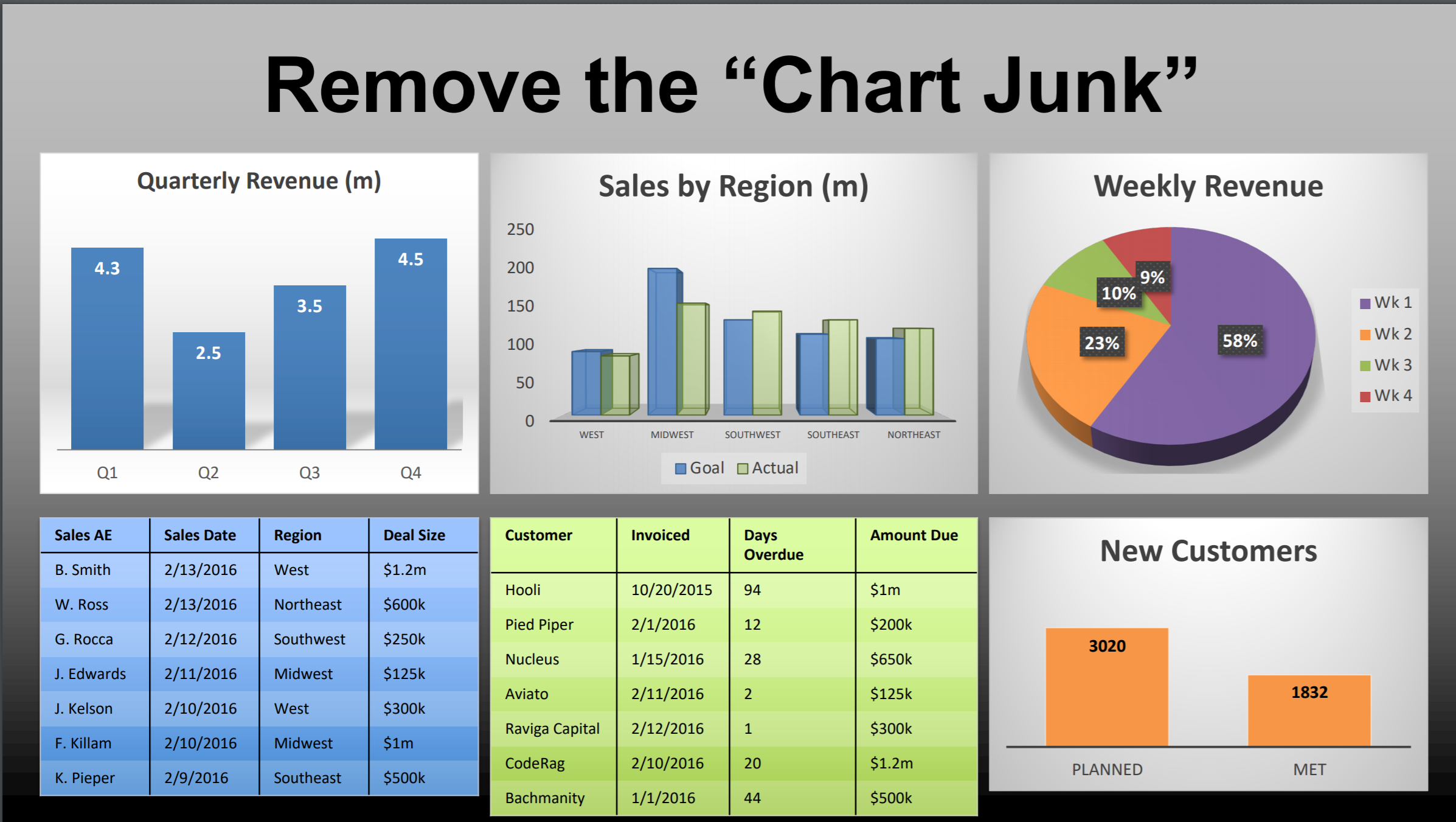
- Remove the “Chart Junk”. Analyse your dashboard and remove parts of your chart that provide an unnecessary level of detail. Depending on your data, this may include removing grid lines, 3D effects and axis labels.
- Use color mindfully. Certain colors can mean something to your audience - red usually indicates a decrease in variance while green indicates an increase. We also want to use neutral colors that are not distracting to the human eye.
- Add context. Thresholds within charts can help your end users understand the data faster and jump to strong conclusions without spending too much time on interpretation. Descriptive titles also add value and help to reduce any audience confusion.

- To learn more about the best practices in data visualization, go to 5:48 minute of the webinar.
- Choose the appropriate chart type for your data
- Understand what you’re trying to tell with your data. For example, if you are trying to compare an element over a specific dimension, a bar chart will be easier for your audience to interpret. Similarly, if you are trying to display a core value, a numeric point will be interpreted faster than a chart. Discover more about understanding your data by visiting 8:55 and 15:10 of the webinar.
- Pie charts are not very informative. Due to the shape of a pie chart, your end users can misinterpret and overestimate the data. In place of a pie chart, a more detailed breakdown can be more insightful.
- Use stacked bar charts, color, and leverage the built-in interactivity. Stacked bar charts and the use of color help to split-up the data and make charts easier to read, without making any changes to the data itself. The built-in interactivity helps your end users compare different rows of data within a bar chart. To learn more, visit minute 34:00 of the webinar.

- Make your bar charts dynamic and enhance their visualization
- Create Input Controls. Input controls hold a lot of storytelling power without making your dashboard too crowded. They allow your end users to analyse the data themselves. Think about your end users and what information may be useful to them as they’re viewing your dashboard. Adding input controls is also helpful to introduce your end users to the dynamic capabilities in SAP Analytics Cloud. Learn more about input controls by visiting minute 42:40 of the webinar.
- Leverage the explorer view and beta table
- Use Explorer View. Sometimes you need to add more detail into your charts without making your dashboard too messy. Explorer view allows you to add a granular level of detail into your charts without affecting your end users viewing experience and retaining the interpretability. Explorer allows you to create any table you’d like using different measures and dimensions.

- Use Beta Tables. Beta tables make your custom table easy to interpret using automatic formatting and offer performance improvements when loading large tables.
- Discover more about Explorer View and Beta Tables, visit 45:50 of the webinar.
- Using styling options to optimize performance
- Use regions when styling. Many times, dashboard designers apply changes by highlighting columns or individual cells - this causes your styling rules to be applied cell-by-cell and decreases the performance of your dashboard. Instead, select a data region (for example, the header region) to apply style changes and improve performance.

- Use hyperlinks. Hyperlinks within your chart will help to add more granular detail for your end users without overwhelming them with too much information. You can apply filters to your hyperlinks to help your end users navigate through your charts more easily and access more detail.
- Learn more about regions and hyperlinks by visiting 49:57 of the webinar.
For a detailed demo on how to apply these improvements in SAP Analytics Cloud watch this digital webcast with product expert Sofiya Muzychko. Discover more tips and hacks on how you can style and improve your stories performance. Join the discussion below and share your tips for strong data visualization!
- SAP Managed Tags:
- SAP Analytics Cloud,
- SAP Data Visualization
Labels:
1 Comment
You must be a registered user to add a comment. If you've already registered, sign in. Otherwise, register and sign in.
Labels in this area
-
ABAP CDS Views - CDC (Change Data Capture)
2 -
AI
1 -
Analyze Workload Data
1 -
BTP
1 -
Business and IT Integration
2 -
Business application stu
1 -
Business Technology Platform
1 -
Business Trends
1,661 -
Business Trends
88 -
CAP
1 -
cf
1 -
Cloud Foundry
1 -
Confluent
1 -
Customer COE Basics and Fundamentals
1 -
Customer COE Latest and Greatest
3 -
Customer Data Browser app
1 -
Data Analysis Tool
1 -
data migration
1 -
data transfer
1 -
Datasphere
2 -
Event Information
1,400 -
Event Information
65 -
Expert
1 -
Expert Insights
178 -
Expert Insights
280 -
General
1 -
Google cloud
1 -
Google Next'24
1 -
Kafka
1 -
Life at SAP
784 -
Life at SAP
11 -
Migrate your Data App
1 -
MTA
1 -
Network Performance Analysis
1 -
NodeJS
1 -
PDF
1 -
POC
1 -
Product Updates
4,577 -
Product Updates
330 -
Replication Flow
1 -
RisewithSAP
1 -
SAP BTP
1 -
SAP BTP Cloud Foundry
1 -
SAP Cloud ALM
1 -
SAP Cloud Application Programming Model
1 -
SAP Datasphere
2 -
SAP S4HANA Cloud
1 -
SAP S4HANA Migration Cockpit
1 -
Technology Updates
6,886 -
Technology Updates
408 -
Workload Fluctuations
1
Related Content
- SAP Analytics Cloud Optimize Story - How to reset input control range date filter in Technology Q&A
- Sneak Peek in to SAP Analytics Cloud release for Q2 2024 in Technology Blogs by SAP
- Deep dive into Q4 2023, What’s New in SAP Cloud ALM for Implementation Blog Series in Technology Blogs by SAP
- Learning Material for - SAC Certification ? in Technology Q&A
- SAP Analytics Cloud Planning - Converting data in Technology Blogs by SAP
Top kudoed authors
| User | Count |
|---|---|
| 13 | |
| 10 | |
| 10 | |
| 9 | |
| 7 | |
| 6 | |
| 5 | |
| 5 | |
| 5 | |
| 4 |