
- SAP Community
- Products and Technology
- Technology
- Technology Blogs by SAP
- Fuzzy matching reimagined with data science - Part...
Technology Blogs by SAP
Learn how to extend and personalize SAP applications. Follow the SAP technology blog for insights into SAP BTP, ABAP, SAP Analytics Cloud, SAP HANA, and more.
Turn on suggestions
Auto-suggest helps you quickly narrow down your search results by suggesting possible matches as you type.
Showing results for
Advisor
Options
- Subscribe to RSS Feed
- Mark as New
- Mark as Read
- Bookmark
- Subscribe
- Printer Friendly Page
- Report Inappropriate Content
07-02-2020
3:22 AM
Ever looked for matches that were less than 100% perfect? Key based matches not working for you? Until a few years ago, fuzzy matching was the only answer we had. Today, data science algorithms are breaching the boundaries of the “possible”. Find out how we used algorithms typically applied to document similarity to solve the traditional fuzzy matching problem using SAP Data Intelligence & SAP Analytics Cloud.
In Part 1 of this blog series we set the context for this problem statement, the pre-processing performed before explaining the models used. In Part 2, we dived into how the results were compiled and enhanced with some help from a data steward. In this final part, we read the datasets written into SAP Analytics Cloud by SAP Data Intelligence and visualise the results. The data steward also gets a chance to play around with the thresholds and observe the effort required if the thresholds were set more or less conservatively.
At the end of Step 03, we observe that we have guests in our Public Files folder - namely datasets for Master & Bridge that have arrived courtesy SAP Data Intelligence.
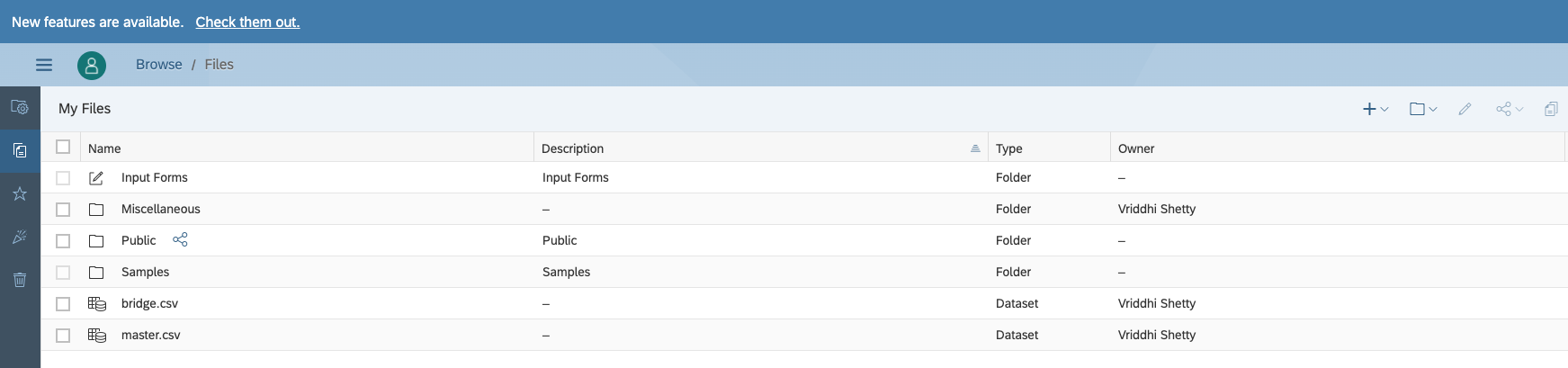
We pick these datasets up and observe if they look good. Indeed, the bridge has groups of profiles identified by Match ID, with the model that was used to identify it, similarity scores where applicable, nature of the source (as the bridge is the source of truth for lineages) and details of the profile, like Name, Gender, Age, Address, etc. We have masked out data in this case in interest of data privacy.
From a technical perspective, this is really old wine in a new bottle. The high level process remains much like what it looked like when we did something very similar about a decade ago. Back then 2 sister companies of a US pharmaceutical were going through a merger and we merged their databases of doctors using erstwhile cutting edge “fuzzy matching”. Today we deploy TF-IDF based models to perform the same task - the only difference is higher efficiency.
From a business perspective, the key value is efficiency that automation invariably ushers in.
These are unusual times, and they are breeding unusual problems. Yet, it must not escape any of us, that we can well tide over these new problems armed with our old tools.
For any questions, do not hesitate to contact us directly at our email addresses below.
In Part 1 of this blog series we set the context for this problem statement, the pre-processing performed before explaining the models used. In Part 2, we dived into how the results were compiled and enhanced with some help from a data steward. In this final part, we read the datasets written into SAP Analytics Cloud by SAP Data Intelligence and visualise the results. The data steward also gets a chance to play around with the thresholds and observe the effort required if the thresholds were set more or less conservatively.
Step 01: Visualise results
At the end of Step 03, we observe that we have guests in our Public Files folder - namely datasets for Master & Bridge that have arrived courtesy SAP Data Intelligence.
We pick these datasets up and observe if they look good. Indeed, the bridge has groups of profiles identified by Match ID, with the model that was used to identify it, similarity scores where applicable, nature of the source (as the bridge is the source of truth for lineages) and details of the profile, like Name, Gender, Age, Address, etc. We have masked out data in this case in interest of data privacy.

The master on the other hand has the golden records or the best profile created from sources that are considered purest from what is available in a group.

Subsequently, we read these datasets into an SAC story, that progresses in a few parts.

The sankey chart created from the R Visualisation object merits a closer look. It indicates how the records have flown through the various models and landed in groups that either require review or don’t (because they are confirmed matches or mismatches). Numbers are dummy and not representative.

In a similar vein, the Venn diagram summarises the overlaps found between the 3 files. Again numbers are dummy and not representative.
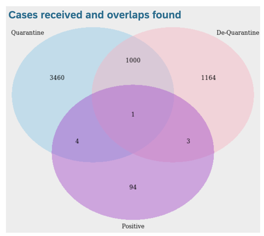
Because we now have a holistic view of the system, in terms of individuals that overlap between positive, quarantine & de-quarantine lists, we can now forecast with a greater degree of confidence how the numbers will look like in the coming weeks. For demo purposes here, we use SAP Analytics Cloud’s in-built forecast feature, but in practice custom forecast algorithms can be built in SAP Data Intelligence and consumed in SAP Analytics Cloud.

From the perspective of data stewards, we may want to cursorily review what the algorithms have automatically deemed as matches and mismatches. The data steward can move the thresholds applied on the similarity scores to break the groups into these 3 buckets. As a result, the thresholds used for segregation in Data Intelligence can be reviewed on an ongoing basis and changed if required. Remember, the broader the range of similarity scores that we deem as requiring review, the more effort will be required from the Data Steward. Ideally we would want to arrive at good enough results from the models, so the groups that require review by the steward are as few as possible. This would save the steward valuable time that can be spent on more productive tasks.

Conclusion
From a technical perspective, this is really old wine in a new bottle. The high level process remains much like what it looked like when we did something very similar about a decade ago. Back then 2 sister companies of a US pharmaceutical were going through a merger and we merged their databases of doctors using erstwhile cutting edge “fuzzy matching”. Today we deploy TF-IDF based models to perform the same task - the only difference is higher efficiency.
- The new models are much faster than fuzzy matching. For our dataset, of about 2500 records in quarantine & de-quarantine lists respectively and about 200 records in the positive list, the fuzzy matching model took about 4 hours to produce results. Both cosine similarity & nearest neighbour model took under a minute to run. The time required will depend to some extent on the nature of the dataset, but as the records increase, the increase in time will not be linear.
- We are able to combine the powers of a couple of different models that tackle the problem using different techniques. Some data manipulation is required to “reconcile” the groups created by competing algorithms, but this can be achieved with a few well defined business rules.
- The results we achieved, are preliminary and demonstrative of the capability of the machine learning models. Further efficiency can be achieved with some hyper parameter tuning
From a business perspective, the key value is efficiency that automation invariably ushers in.
- Less time is required to process the profiles.
- Reducing the manual component decreases possibility of error.
- Officers are now freed up, so they can focus on more business critical tasks.
These are unusual times, and they are breeding unusual problems. Yet, it must not escape any of us, that we can well tide over these new problems armed with our old tools.
For any questions, do not hesitate to contact us directly at our email addresses below.
- SAP Managed Tags:
- SAP Analytics Cloud,
- SAP Data Intelligence
Labels:
2 Comments
You must be a registered user to add a comment. If you've already registered, sign in. Otherwise, register and sign in.
Labels in this area
-
ABAP CDS Views - CDC (Change Data Capture)
2 -
AI
1 -
Analyze Workload Data
1 -
BTP
1 -
Business and IT Integration
2 -
Business application stu
1 -
Business Technology Platform
1 -
Business Trends
1,658 -
Business Trends
93 -
CAP
1 -
cf
1 -
Cloud Foundry
1 -
Confluent
1 -
Customer COE Basics and Fundamentals
1 -
Customer COE Latest and Greatest
3 -
Customer Data Browser app
1 -
Data Analysis Tool
1 -
data migration
1 -
data transfer
1 -
Datasphere
2 -
Event Information
1,400 -
Event Information
66 -
Expert
1 -
Expert Insights
177 -
Expert Insights
299 -
General
1 -
Google cloud
1 -
Google Next'24
1 -
Kafka
1 -
Life at SAP
780 -
Life at SAP
13 -
Migrate your Data App
1 -
MTA
1 -
Network Performance Analysis
1 -
NodeJS
1 -
PDF
1 -
POC
1 -
Product Updates
4,577 -
Product Updates
344 -
Replication Flow
1 -
RisewithSAP
1 -
SAP BTP
1 -
SAP BTP Cloud Foundry
1 -
SAP Cloud ALM
1 -
SAP Cloud Application Programming Model
1 -
SAP Datasphere
2 -
SAP S4HANA Cloud
1 -
SAP S4HANA Migration Cockpit
1 -
Technology Updates
6,873 -
Technology Updates
422 -
Workload Fluctuations
1
Related Content
- SAP Datasphere in Simple terminology, its Strategy and Benefits. in Technology Blogs by Members
- Leveraging Artificial Intelligence in Finance, Supply Chain, and ERP: An In-Depth Guide in Technology Blogs by SAP
- SAUG Conference Brisbane 2023 in Technology Blogs by Members
- The 49ers Turn to Real-time Data to Deliver Superior Home Game Experiences for 70k+ Fans in Technology Blogs by SAP
- Expert Guided Implementation – The Security Optimization Service EGI: Simple and Powerful in Technology Blogs by SAP
Top kudoed authors
| User | Count |
|---|---|
| 40 | |
| 25 | |
| 17 | |
| 13 | |
| 7 | |
| 7 | |
| 7 | |
| 6 | |
| 6 | |
| 6 |