
We’ve updated the
SAP Fiori Design Guidelines for web applications to version 1.76. This version includes features implemented with SAPUI5 releases 1.75 and 1.76, as well as updated guidance for UI elements and patterns.
New with this edition
Launchpad spaces
As of SAPUI5 version 1.75 you can use the new
SAP Fiori launchpad spaces. A space serves as an entry point for a business role and is set to replace the launchpad home page with SAPUI5 version 1.79. Learn more about launchpad spaces, their components, and their use in this new article.

SAP Fiori launchpad spaces - overview
Accessibility in SAP Fiori
This new article provides an overview of
key accessibility requirements. Learn what comes out of the box with the SAPUI5 framework, and what you need to consider when you design and develop SAP Fiori apps.
SAP Fiori design stencils for Adobe XD
As of this release, SAP Fiori design stencils are also available for Adobe XD. You can find them
here.

SAP Fiori design stencils in Adobe XD
Designing intelligent systems – User feedback
A new
user feedback topic looks at the design considerations for collecting user feedback to train machine learning algorithms:
- Should I ask users for feedback or just learn from what they do?
- How can I make sure the feedback I get is specific enough to interpret and use?
- What kind of feedback should I ask for in different scenarios?
- Are users motivated to give feedback when they have the opportunity, or will I need to nudge them to get a response?

User feedback - relative input
All these factors influence the interaction pattern, the choice of control, and the placement of feedback elements on the UI.
At the end of the article, you’ll also find a useful set of starter questions for your user research.
Updated guidelines for UI elements
There have also been some smaller updates to the guidelines for existing UI elements, including the following new features:
Highlighting table items – Additional colors
You can now use an extended set of semantic colors to highlight table rows. This is supported for various tables and lists, such as the
responsive table and
list.
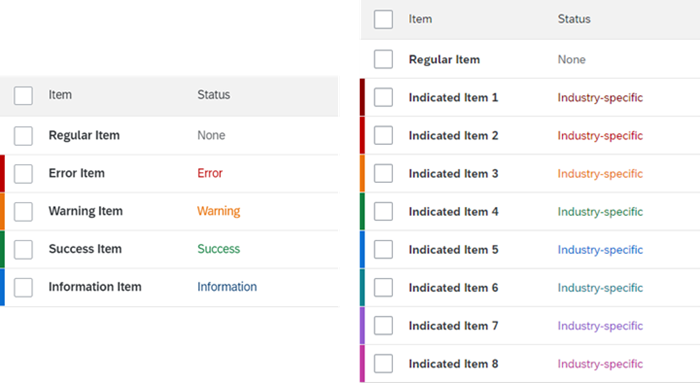
Highlight colors for table rows
New link type – Link with icon
You can now use a
combined icon and link for cases where a familiar icon improves user orientation.

Link with icon
What else is new?
For a complete overview of all new and updated content with this guideline version, see
What’s New in Guideline Version 1.76.
This post originally appeared at https://experience.sap.com/news/sap-fiori-design-guidelines-version-1-76-now-available/.
