
- SAP Community
- Products and Technology
- Technology
- Technology Blogs by SAP
- Image Preview for File Uploader
Technology Blogs by SAP
Learn how to extend and personalize SAP applications. Follow the SAP technology blog for insights into SAP BTP, ABAP, SAP Analytics Cloud, SAP HANA, and more.
Turn on suggestions
Auto-suggest helps you quickly narrow down your search results by suggesting possible matches as you type.
Showing results for
 rahulll
Advisor
Options
- Subscribe to RSS Feed
- Mark as New
- Mark as Read
- Bookmark
- Subscribe
- Printer Friendly Page
- Report Inappropriate Content
06-25-2020
6:26 AM
The idea for this blog post is to create an image previewer which displays an image selected by the user using the File Uploader control. We will have a Generic Tile which will act as the image previewer. Apart from this, we will have a File Uploader and a Label for it. Whenever the user clicks on the tile, we will emulate a click for the label. Since the label is for the File Uploader, it will open the file dialog and allow user to select the image.
This blog post will be divided into two parts.
Part One.
We will use 3 controls for the image preview.
Lets start by adding all these controls in the XML file
Our FileUploader has 5 attributes.
Note: Since sap.ui.unified is not directly available is XML, we need to add the namespace in out XML. This is look something like this: (xmlns:u="sap.ui.unified")
Our next control will be sap.m.Label, this acts as a label for the FileUploader.
Our Label has 2 attributes.
Our last control is the GenericTile. This acts as the image previewer.
Our GenericTile has 4 attributes.
Let's wrap these 3 controls in a VBox. Out final XML will look like this.
Next step is to emulate click for FileUploader when user click on the GenericTile. But before that, I will list down the id and function name for different events/controls which we will be using.
To emulate the click, we will use the .getDomRef()
This code will emulate the click for FIleUploder.
Next, when the user selects an image, we will set the background image of the tile to what the user has selected. This can be done in the change event for FileUploader
Firstly, we check if file has been selected on not. Once the control goes inside the if condition, we get the file in the variable file and from this, we create a DOMString containing a URL representing the object via URL.createObjectURL function.
Finally, we will hide our FileUploader and Label, since we don't directly interact with it. This can be done in out style.css file using the class assigned to both.
Our final output will look like this.
Part Two.
We will update our GenericTile control
We added/ edited some attributes and controls
We will update our onChangeImage Image function.
On Change Image, we now are setting the Edit Icon along with Sub Header to an empty string.
Similarly, we will update our onEditImage function.
Here, if the user press the close icon, we remove the image, else we emulate the FileUploader click.
Lastly, we will add some animation to the tile.
This shows the edit/add icon only on hover.
Our final code snippets:
XML:
Controller:
CSS:
After putting the code together, this is our final output.
We can now change, delete and update the images and in addition to that, we can send our image to the backend system using the upload function of FileUploader control.
Link to GitHub repository here.
Cheers 🙂
This blog post will be divided into two parts.
- The first part covers how to make the image preview tile.
- The second part will cover add a no image preview and an icon
Part One.
We will use 3 controls for the image preview.
- sap.ui.unified.FileUploader
- sap.m.Label
- sap.m.GenericTile
Lets start by adding all these controls in the XML file
<u:FileUploader name="uploadFile" change="onChangeImage" id="fileUploader" class="hiddenControls" fileType="jpg,png,jpeg" sendXHR="true"></u:FileUploader>Our FileUploader has 5 attributes.
- name - Can be anything, If the file has to be send to a back-end system, make sure to change the name as this is the identifier for the file.
- change - Can be anything. This is called when the user changes/ selects an image from local.
- id - Can be anything.
- class - Can be anything. This is specified so that we can add custom CSS later
- fileType - Can be anything. But since we are dealing with images only. We have limited it to jpg, png and jpeg. But we can add more image types.
Note: Since sap.ui.unified is not directly available is XML, we need to add the namespace in out XML. This is look something like this: (xmlns:u="sap.ui.unified")
<mvc:View controllerName="com.sap.image-preview-with-file-uploader.controller.App" xmlns:mvc="sap.ui.core.mvc" displayBlock="true"

	xmlns:u="sap.ui.unified" xmlns="sap.m">
Our next control will be sap.m.Label, this acts as a label for the FileUploader.
<Label labelFor="fileUploader-fu" id="fileUploader-label" class="hiddenControls"></Label>Our Label has 2 attributes.
- labelFor - this should follow the format [FileUploader id]-fu. Since this is a label for the FileUploder, we use specify the id strictly as specified above Why? The DOM reference i.e. the equivalent HTML code of FileUploader will have the id fileUploader-fu (fileUploader being the id specified for the FileUploader control)
- id - Can be anything.
- class - Can be anything. This is specified so that we can add custom CSS later
Our last control is the GenericTile. This acts as the image previewer.
<GenericTile class="imagePreview" scope="Display" press="onEditImage" id="image"></GenericTile>Our GenericTile has 4 attributes.
- class - Can be anything. This is specified so that we can add custom CSS later
- scope - let's set it to Display for now. Later we will change it to Actions. This will help us to add icons on top of image
- press - Can be anything. This is will called when user clicks on the tile
- id- Can be anything
Let's wrap these 3 controls in a VBox. Out final XML will look like this.
<VBox>

    <items>

        <u:FileUploader name="uploadFile" change="onChangeImage" id="fileUploader" fileType="jpg,png,jpeg" sendXHR="true"></u:FileUploader>

        <Label labelFor="fileUploader-fu" id="fileUploader-label"></Label>

        <GenericTile class="imagePreview" scope="Display" press="onEditImage" id="image"></GenericTile>

    </items>

</VBox>
Next step is to emulate click for FileUploader when user click on the GenericTile. But before that, I will list down the id and function name for different events/controls which we will be using.
- onEditImage - function called when user click on the GenericTile
- fileUploader-label - id of the Label
- onChangeImage - function called every-time user selects an image
To emulate the click, we will use the .getDomRef()
onEditImage: function (oEvent) {

    this.getView().byId("fileUploader-label").getDomRef().click();

}
This code will emulate the click for FIleUploder.
Next, when the user selects an image, we will set the background image of the tile to what the user has selected. This can be done in the change event for FileUploader
onChangeImage: function (oEvent) {

    if (oEvent.getSource().oFileUpload.files.length > 0) {

        var file = oEvent.getSource().oFileUpload.files[0];

        var path = URL.createObjectURL(file);

        this.getView().byId("image").setBackgroundImage(path);

    }

}
Firstly, we check if file has been selected on not. Once the control goes inside the if condition, we get the file in the variable file and from this, we create a DOMString containing a URL representing the object via URL.createObjectURL function.
Finally, we will hide our FileUploader and Label, since we don't directly interact with it. This can be done in out style.css file using the class assigned to both.
 .hiddenControls {

     height: 0px;

     overflow: hidden;

 }
Our final output will look like this.

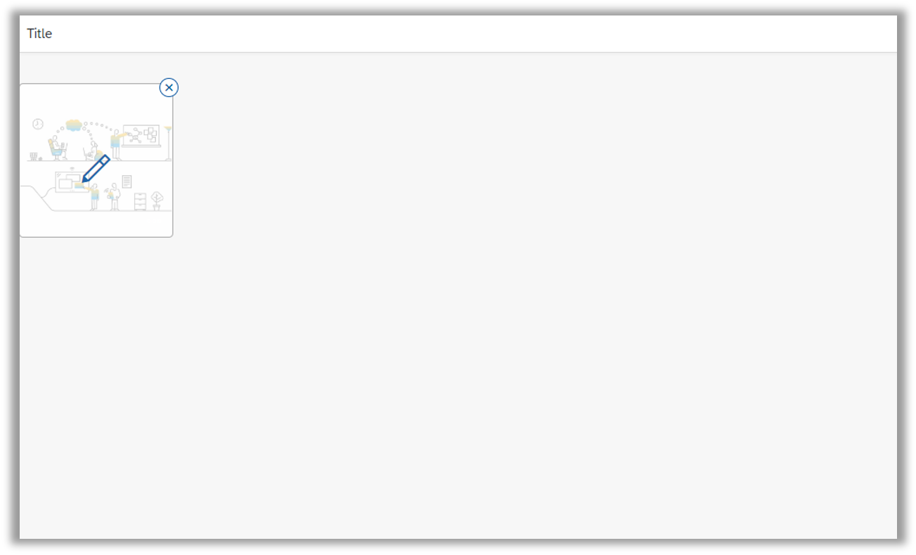
Image Previewer without selection

Image Previewer with selection
Part Two.
We will update our GenericTile control
<GenericTile class="imagePreview" press="onEditImage" id="image" scope="Actions" subheader="No Image Selected">

	<tileContent>

		<TileContent id="iconContent">

			<content>

				<sap.ui.core:Icon xmlns:sap.ui.core="sap.ui.core" src="sap-icon://add" size="2em" id="actionIcon" class="actionIcon"/>

			</content>

		</TileContent>

	</tileContent>

</GenericTile>
We added/ edited some attributes and controls
- scope - we changed the scope from Display to Actions. This will give us a close icon to at top right our our tile, which will help us remove the selected image
- subheader - we added a subheader to tell if any image is selected or not. If yes, we will set this to empty string
- sap.ui.icon.Icon - we added this control so that we have an Add icon when no image is selected. We will change this to Edit icon, once the image is selected
We will update our onChangeImage Image function.
onChangeImage: function (oEvent) {

	if (oEvent.getSource().oFileUpload.files.length > 0) {

		var file = oEvent.getSource().oFileUpload.files[0];

		var path = URL.createObjectURL(file);

		this.getView().byId("image").setBackgroundImage(path);

		this.getView().byId("image").setSubheader("");

		this.getView().byId("actionIcon").setSrc("sap-icon://edit");

	}

}
On Change Image, we now are setting the Edit Icon along with Sub Header to an empty string.
Similarly, we will update our onEditImage function.
onEditImage: function (oEvent) {

	if (oEvent.getParameter("action") === "Press") {

		this.getView().byId("fileUploader-label").getDomRef().click();

	} else if (oEvent.getParameter("action") === "Remove") {

		this.getView().byId("actionIcon").setSrc("sap-icon://add");

		this.getView().byId("image").setSubheader("No Image Selected");

		this.getView().byId("image").setBackgroundImage("");

	}

},
Here, if the user press the close icon, we remove the image, else we emulate the FileUploader click.
Lastly, we will add some animation to the tile.
 .imagePreview {

     text-align: center;

     color: #0854a0;

 }


 .actionIcon {

     opacity: 0;

 }


 .imagePreview:hover .actionIcon {

     opacity: 1;

     transition: all 0.1s ease-in;

     z-index: 9999;

     transform: scale(1.2);

 }
This shows the edit/add icon only on hover.
Our final code snippets:
XML:
<mvc:View xmlns:mvc="sap.ui.core.mvc" xmlns:u="sap.ui.unified" xmlns="sap.m"

	controllerName="com.sap.image-preview-with-file-uploader.controller.App" displayBlock="true">

	<Shell id="shell">

		<App id="app">

			<pages>

				<Page id="page" title="{i18n>title}">

					<content>

						<VBox>

							<items>

								<u:FileUploader name="uploadFile" change="onChangeImage" id="fileUploader" class="hiddenControls" fileType="jpg,png,jpeg" sendXHR="true"/>

								<Label labelFor="fileUploader-fu" id="fileUploader-label" class="hiddenControls"/>

								<GenericTile class="imagePreview" press="onEditImage" id="image" scope="Actions" subheader="No Image Selected">

									<tileContent>

										<TileContent id="iconContent">

											<content>

												<sap.ui.core:Icon xmlns:sap.ui.core="sap.ui.core" src="sap-icon://add" size="2em" id="actionIcon" class="actionIcon"/>

											</content>

										</TileContent>

									</tileContent>

								</GenericTile>

							</items>

						</VBox>

					</content>

				</Page>

			</pages>

		</App>

	</Shell>

</mvc:View>
Controller:
sap.ui.define([

	"sap/ui/core/mvc/Controller"

], function (Controller) {

	"use strict";


	return Controller.extend("com.sap.image-preview-with-file-uploader.controller.App", {

		onInit: function () {


		},

		/*

		 * function called

		 * when tile clicked

		 */

		onEditImage: function (oEvent) {

			if (oEvent.getParameter("action") === "Press") {

				this.getView().byId("fileUploader-label").getDomRef().click();

			} else if (oEvent.getParameter("action") === "Remove") {

				this.getView().byId("actionIcon").setSrc("sap-icon://add");

				this.getView().byId("image").setSubheader("No Image Selected");

				this.getView().byId("image").setBackgroundImage("");

			}

		},

		onChangeImage: function (oEvent) {

			if (oEvent.getSource().oFileUpload.files.length > 0) {

				var file = oEvent.getSource().oFileUpload.files[0];

				var path = URL.createObjectURL(file);

				this.getView().byId("image").setBackgroundImage(path);

				this.getView().byId("image").setSubheader("");

				this.getView().byId("actionIcon").setSrc("sap-icon://edit");

			}

		}

	});

});
CSS:
 .hiddenControls {

     height: 0px;

     overflow: hidden;

 }


 .imagePreview {

     text-align: center;

     color: #0854a0;

 }


 .actionIcon {

     opacity: 0;

 }


 .imagePreview:hover .actionIcon {

     opacity: 1;

     transition: all 0.1s ease-in;

     z-index: 9999;

     transform: scale(1.2);

 }
After putting the code together, this is our final output.
We can now change, delete and update the images and in addition to that, we can send our image to the backend system using the upload function of FileUploader control.
Link to GitHub repository here.
Cheers 🙂
- SAP Managed Tags:
- SAPUI5
Labels:
You must be a registered user to add a comment. If you've already registered, sign in. Otherwise, register and sign in.
Labels in this area
-
ABAP CDS Views - CDC (Change Data Capture)
2 -
AI
1 -
Analyze Workload Data
1 -
BTP
1 -
Business and IT Integration
2 -
Business application stu
1 -
Business Technology Platform
1 -
Business Trends
1,661 -
Business Trends
87 -
CAP
1 -
cf
1 -
Cloud Foundry
1 -
Confluent
1 -
Customer COE Basics and Fundamentals
1 -
Customer COE Latest and Greatest
3 -
Customer Data Browser app
1 -
Data Analysis Tool
1 -
data migration
1 -
data transfer
1 -
Datasphere
2 -
Event Information
1,400 -
Event Information
64 -
Expert
1 -
Expert Insights
178 -
Expert Insights
273 -
General
1 -
Google cloud
1 -
Google Next'24
1 -
Kafka
1 -
Life at SAP
784 -
Life at SAP
11 -
Migrate your Data App
1 -
MTA
1 -
Network Performance Analysis
1 -
NodeJS
1 -
PDF
1 -
POC
1 -
Product Updates
4,577 -
Product Updates
326 -
Replication Flow
1 -
RisewithSAP
1 -
SAP BTP
1 -
SAP BTP Cloud Foundry
1 -
SAP Cloud ALM
1 -
SAP Cloud Application Programming Model
1 -
SAP Datasphere
2 -
SAP S4HANA Cloud
1 -
SAP S4HANA Migration Cockpit
1 -
Technology Updates
6,886 -
Technology Updates
403 -
Workload Fluctuations
1
Related Content
- Installation of Sales cube (0SD_C03) in BW 7.5 version in Technology Blogs by Members
- SAP Datasphere - Space, Data Integration, and Data Modeling Best Practices in Technology Blogs by SAP
- [SAP BTP Onboarding Series] Joule with SFSF – Common Setup Issues in Technology Blogs by SAP
- BTP Mobile Authentication with SAP Build Apps in Technology Blogs by SAP
- Destinations are working in BAS but not in Build Work Zone, advanced edition in Technology Q&A
Top kudoed authors
| User | Count |
|---|---|
| 12 | |
| 10 | |
| 9 | |
| 7 | |
| 7 | |
| 7 | |
| 6 | |
| 6 | |
| 5 | |
| 4 |