
- SAP Community
- Products and Technology
- Technology
- Technology Blogs by SAP
- Forecasting Time Series in COVID-19 Days: Handling...
Technology Blogs by SAP
Learn how to extend and personalize SAP applications. Follow the SAP technology blog for insights into SAP BTP, ABAP, SAP Analytics Cloud, SAP HANA, and more.
Turn on suggestions
Auto-suggest helps you quickly narrow down your search results by suggesting possible matches as you type.
Showing results for
Product and Topic Expert
Options
- Subscribe to RSS Feed
- Mark as New
- Mark as Read
- Bookmark
- Subscribe
- Printer Friendly Page
- Report Inappropriate Content
06-24-2020
7:14 AM
Setting the Scene
In the intro blog, I explained how the spread of COVID-19 impacts the ability of businesses across the world to plan and predict their future.
I described three different scenarios: minor, lasting or major.
I want to cover through concrete examples how these scenarios can be handled today in SAP Analytics Cloud.
For today's episode, I'll start with the scenario corresponding to the minor impact.
Minor Impact Scenario
Here is a quick memory refresh on this scenario.
In this scenario, after a few months, business resumes somehow “as usual”, and impact remains limited to a well-identified period, like it is illustrated in this chart.
The assumption that this “new normal” corresponds to the likely evolution of the previous conditions must be checked thoroughly.
The best practice recommended here consists in filtering out the months or quarters corresponding to the impacted period when creating the time series models.
If we assume that a company’s business is impacted in Q2 and Q3 2020, the corresponding months or quarters will need to be removed from the underlying data foundation used to create the predictive model. In this example, Q4 2020 would be predicted based on a data history ending in Q1 2020.
In the next section of this blog I'll present how you can do this today in SAP Analytics Cloud - using either Smart Predict. In a upcoming blog a similar example scenario will be covered for the time series forecasting capabilities that are being offered in charts.
Case Study
The data source I use as the example is related to the evolution of domestic passenger enplanements in the United States from January 1996 up to February 2020.
The source for the data is the US Department of Transportation, more precisely the Bureau of Transportation Statistics. Source data is provided through this site.
Please note that the scale of the forecasted number (passenger enplanements) is in million per year.
As you can see, during the last third of the year 2001 and the whole year 2002 there was a drop of passenger enplanements due to the 9/11 terrorist attacks and the consequences to domestic passenger traffic in the subsequent months.
When zooming into the period 1996-2004, the specific impact during the years 2001 and 2002 can be viewed more into detail.
In line with what I described in the intro blog, the guidance consists in filtering out the data points corresponding to the disruption period.
I want to illustrate how this effectively improves the accuracy of the predictive forecasts, by comparing the accuracy of a predictive model using unfiltered data and the accuracy of a predictive model using filtered data.
Using Smart Predict - Creating a Baseline Predictive Model using Unfiltered Data
In the first step, I start with a predictive scenario that represents my baseline.
I create a time series predictive scenario using Smart Predict.
I use my magical time travel machine. I travel back in time at the end of year 2002 and I want to forecast the entire year 2003 at monthly level.
I use the raw data from the time series up to end of 2002 and I forecast the whole year 2003 - as you can see my last observation is for end of 2002 and I asked for 12 forecasts ahead.
The range of observations I use to train the predictive model goes from January 1996 up to December 2002. The actual for December 2002 is the last data point that my predictive model is aware of from the overall time series.

I can go one step more and see how the signal was decomposed by Smart Predict into trend, cycles and fluctuations, using the Signal Decomposition representation.
The time series model created by Smart Predict consists of two parts:
The number of passenger enplanements is heavily influenced by the month of the year, enplanements are typically higher in July / August (summer travels) and lower in January / February.
The overall pattern is nicely captured by Smart Predict. Again it can be noticed that the Signal (actuals, green curve) behave quite differently in late 2001 and early 2002 (notice the drop in the green curve above).
I am provided with the predictive forecasts for 2003 and the detected outlier. The difference between what the predictive model forecasted for the month of September 2001 and what actually happened is a difference of 13 million enplanements (30,543 millions vs 43,122 millions).
In few clicks I can create a story to report on actuals (in brown) compared to predictive forecasts (in green). I create a calculated measure which corresponds to the absolute difference between actuals and predictions (in red). I notice higher forecasting errors for the months of June, July, October and December 2003.
Using Smart Predict - Creating a Predictive Model and Filtering Disrupted Months
What I want to do now is create a second time series model and see if filtering helps in reducing the forecasting errors. I want to filter out the values corresponding to the time range September 2001 to April 2002.
There are different ways for me to achieve data filtering. One way consists in modifying my base CSV file before I acquire it into SAP Analytics Cloud.
At the end of day I thought it was cool to give it a try to the new dataset wrangling capabilities that will be made available to our customers in the third quarterly release of SAP Analytics Cloud.
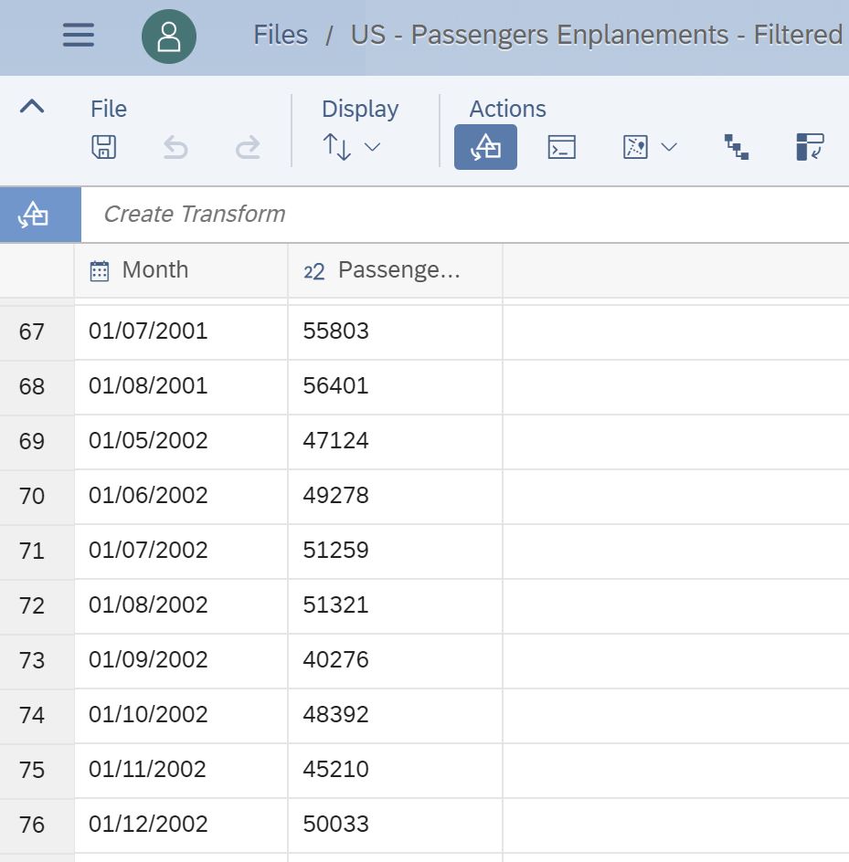
I exclude the specific months (dataset rows) I did not want Smart Predict to consider. As you can see below, the dataset values jumps from August 2001 to May 2002.
Once I have the filtered dataset at hand, generating the predictive forecasts is straightforward. I use similar settings as before, only the underlying data source is changed.
I can examine the new predictive model in the main Forecast page:
I want to understand what the time series model is about. Smart Predict offers a lot of transparency with that regards. A trend and a cycle have been detected - however the trend is no longer flat but rather increasing over time. The cycle is about a recurring pattern for the different months of the year.
I can report actuals, predictions and absolute difference between actuals and predictions in a story.
When summing up the forecasting errors for the period January to December 2003, the error made by the predictive model that is using unfiltered data compared to actuals is 27,5 million.
For the predictive model using filtered data and the same period the total forecasting error is 17,5 million.
The data filtering made it possible to eliminate 36% of the initial predictive model error!
Key Take-Away and Next Steps
My main goal with this blog is to illustrate based on a concrete example how to handle time series forecasting in a minor impact scenario - where after some point the business conditions are back to normal.
This guidance needs to be adapted to the specific operating conditions and evolution of businesses.
Smart Predict provides me with accuracy and transparency for the predictive forecasts. As a end-user I also find in SAP Analytics Cloud what I need to prepare the data for the predictive scenario and report on the predictive scenario outcomes.
In the next blogs, I will explore the lasting & the major disruption scenarios. I am working on this, stay tuned!
You will be able to continue your read on the how-to approach for time series forecasting in charts soon.
Thanks for reading this blog, I hope you enjoyed it as much as I liked creating it!
Kudos to my colleagues Irene Chung, Flavia Moser & Yann le Biannic for their precious help with these how-to blog series.
In the intro blog, I explained how the spread of COVID-19 impacts the ability of businesses across the world to plan and predict their future.
I described three different scenarios: minor, lasting or major.
I want to cover through concrete examples how these scenarios can be handled today in SAP Analytics Cloud.
For today's episode, I'll start with the scenario corresponding to the minor impact.
Minor Impact Scenario
Here is a quick memory refresh on this scenario.

In this scenario, after a few months, business resumes somehow “as usual”, and impact remains limited to a well-identified period, like it is illustrated in this chart.
The assumption that this “new normal” corresponds to the likely evolution of the previous conditions must be checked thoroughly.
The best practice recommended here consists in filtering out the months or quarters corresponding to the impacted period when creating the time series models.
If we assume that a company’s business is impacted in Q2 and Q3 2020, the corresponding months or quarters will need to be removed from the underlying data foundation used to create the predictive model. In this example, Q4 2020 would be predicted based on a data history ending in Q1 2020.
In the next section of this blog I'll present how you can do this today in SAP Analytics Cloud - using either Smart Predict. In a upcoming blog a similar example scenario will be covered for the time series forecasting capabilities that are being offered in charts.
Case Study
The data source I use as the example is related to the evolution of domestic passenger enplanements in the United States from January 1996 up to February 2020.
The source for the data is the US Department of Transportation, more precisely the Bureau of Transportation Statistics. Source data is provided through this site.
Please note that the scale of the forecasted number (passenger enplanements) is in million per year.

As you can see, during the last third of the year 2001 and the whole year 2002 there was a drop of passenger enplanements due to the 9/11 terrorist attacks and the consequences to domestic passenger traffic in the subsequent months.

When zooming into the period 1996-2004, the specific impact during the years 2001 and 2002 can be viewed more into detail.
In line with what I described in the intro blog, the guidance consists in filtering out the data points corresponding to the disruption period.
I want to illustrate how this effectively improves the accuracy of the predictive forecasts, by comparing the accuracy of a predictive model using unfiltered data and the accuracy of a predictive model using filtered data.
Using Smart Predict - Creating a Baseline Predictive Model using Unfiltered Data
In the first step, I start with a predictive scenario that represents my baseline.
I create a time series predictive scenario using Smart Predict.
I use my magical time travel machine. I travel back in time at the end of year 2002 and I want to forecast the entire year 2003 at monthly level.
I use the raw data from the time series up to end of 2002 and I forecast the whole year 2003 - as you can see my last observation is for end of 2002 and I asked for 12 forecasts ahead.

The range of observations I use to train the predictive model goes from January 1996 up to December 2002. The actual for December 2002 is the last data point that my predictive model is aware of from the overall time series.
When looking to the time series models, I notice a few things:
- The accuracy error of the time series model (Horizon-Wide MAPE) is low. In other words the predictive model has a good accuracy level - the estimated error for the predictive forecasts (the 2003 period) is 7.64%.
- The predictive model is facing a hard-time to capture the period that's going from September 2001 till early 2002. I can notice for instance the month of September 2001 has been detected as an outlier (red dot) and also the distance between Actual (green curve) and Forecast (blue curve) for this period.
I can go one step more and see how the signal was decomposed by Smart Predict into trend, cycles and fluctuations, using the Signal Decomposition representation.

The time series model created by Smart Predict consists of two parts:
- a linear trend (actually constant)
- a cycle
The number of passenger enplanements is heavily influenced by the month of the year, enplanements are typically higher in July / August (summer travels) and lower in January / February.
The overall pattern is nicely captured by Smart Predict. Again it can be noticed that the Signal (actuals, green curve) behave quite differently in late 2001 and early 2002 (notice the drop in the green curve above).
I am provided with the predictive forecasts for 2003 and the detected outlier. The difference between what the predictive model forecasted for the month of September 2001 and what actually happened is a difference of 13 million enplanements (30,543 millions vs 43,122 millions).

In few clicks I can create a story to report on actuals (in brown) compared to predictive forecasts (in green). I create a calculated measure which corresponds to the absolute difference between actuals and predictions (in red). I notice higher forecasting errors for the months of June, July, October and December 2003.

Using Smart Predict - Creating a Predictive Model and Filtering Disrupted Months
What I want to do now is create a second time series model and see if filtering helps in reducing the forecasting errors. I want to filter out the values corresponding to the time range September 2001 to April 2002.
There are different ways for me to achieve data filtering. One way consists in modifying my base CSV file before I acquire it into SAP Analytics Cloud.
At the end of day I thought it was cool to give it a try to the new dataset wrangling capabilities that will be made available to our customers in the third quarterly release of SAP Analytics Cloud.
I exclude the specific months (dataset rows) I did not want Smart Predict to consider. As you can see below, the dataset values jumps from August 2001 to May 2002.
Once I have the filtered dataset at hand, generating the predictive forecasts is straightforward. I use similar settings as before, only the underlying data source is changed.

I can examine the new predictive model in the main Forecast page:
- the model accuracy error has reduced - down from 7,64% to 4,33%.
- I can see that the Forecast (blue curve) visually appears to be closer to Actuals (green curve) for the different months of the year 2003.

I want to understand what the time series model is about. Smart Predict offers a lot of transparency with that regards. A trend and a cycle have been detected - however the trend is no longer flat but rather increasing over time. The cycle is about a recurring pattern for the different months of the year.

I can report actuals, predictions and absolute difference between actuals and predictions in a story.

When summing up the forecasting errors for the period January to December 2003, the error made by the predictive model that is using unfiltered data compared to actuals is 27,5 million.
For the predictive model using filtered data and the same period the total forecasting error is 17,5 million.
The data filtering made it possible to eliminate 36% of the initial predictive model error!
Key Take-Away and Next Steps
My main goal with this blog is to illustrate based on a concrete example how to handle time series forecasting in a minor impact scenario - where after some point the business conditions are back to normal.
This guidance needs to be adapted to the specific operating conditions and evolution of businesses.
Smart Predict provides me with accuracy and transparency for the predictive forecasts. As a end-user I also find in SAP Analytics Cloud what I need to prepare the data for the predictive scenario and report on the predictive scenario outcomes.
In the next blogs, I will explore the lasting & the major disruption scenarios. I am working on this, stay tuned!
You will be able to continue your read on the how-to approach for time series forecasting in charts soon.
Thanks for reading this blog, I hope you enjoyed it as much as I liked creating it!
Kudos to my colleagues Irene Chung, Flavia Moser & Yann le Biannic for their precious help with these how-to blog series.
Labels:
You must be a registered user to add a comment. If you've already registered, sign in. Otherwise, register and sign in.
Labels in this area
-
ABAP CDS Views - CDC (Change Data Capture)
2 -
AI
1 -
Analyze Workload Data
1 -
BTP
1 -
Business and IT Integration
2 -
Business application stu
1 -
Business Technology Platform
1 -
Business Trends
1,661 -
Business Trends
87 -
CAP
1 -
cf
1 -
Cloud Foundry
1 -
Confluent
1 -
Customer COE Basics and Fundamentals
1 -
Customer COE Latest and Greatest
3 -
Customer Data Browser app
1 -
Data Analysis Tool
1 -
data migration
1 -
data transfer
1 -
Datasphere
2 -
Event Information
1,400 -
Event Information
64 -
Expert
1 -
Expert Insights
178 -
Expert Insights
273 -
General
1 -
Google cloud
1 -
Google Next'24
1 -
Kafka
1 -
Life at SAP
784 -
Life at SAP
11 -
Migrate your Data App
1 -
MTA
1 -
Network Performance Analysis
1 -
NodeJS
1 -
PDF
1 -
POC
1 -
Product Updates
4,576 -
Product Updates
327 -
Replication Flow
1 -
RisewithSAP
1 -
SAP BTP
1 -
SAP BTP Cloud Foundry
1 -
SAP Cloud ALM
1 -
SAP Cloud Application Programming Model
1 -
SAP Datasphere
2 -
SAP S4HANA Cloud
1 -
SAP S4HANA Migration Cockpit
1 -
Technology Updates
6,886 -
Technology Updates
405 -
Workload Fluctuations
1
Related Content
- 10+ ways to reshape your SAP landscape with SAP BTP - Blog 4 Interview in Technology Blogs by SAP
- 10+ ways to reshape your SAP landscape with SAP Business Technology Platform – Blog 4 in Technology Blogs by SAP
- Understanding AI, Machine Learning and Deep Learning in Technology Blogs by Members
- SAP BTP and Third-Party Cookies Deprecation in Technology Blogs by SAP
- Embrace the Future: Transform and Standardize Operations with Chatbot in Technology Blogs by Members
Top kudoed authors
| User | Count |
|---|---|
| 13 | |
| 10 | |
| 10 | |
| 7 | |
| 7 | |
| 6 | |
| 5 | |
| 5 | |
| 5 | |
| 4 |