
- SAP Community
- Products and Technology
- Technology
- Technology Blogs by SAP
- Classification in SAP Analytics Cloud in Detail
Technology Blogs by SAP
Learn how to extend and personalize SAP applications. Follow the SAP technology blog for insights into SAP BTP, ABAP, SAP Analytics Cloud, SAP HANA, and more.
Turn on suggestions
Auto-suggest helps you quickly narrow down your search results by suggesting possible matches as you type.
Showing results for
Advisor
Options
- Subscribe to RSS Feed
- Mark as New
- Mark as Read
- Bookmark
- Subscribe
- Printer Friendly Page
- Report Inappropriate Content
06-19-2020
5:40 PM

This blog replaces the previous blog I have written about Classification in SAC Smart Predict because we improved the classification algorithm since wave 2021.03 for fast-track customers and for Q2 2021 QRC releases for QRC customers.
In SAP Analytics Cloud (SAC) Smart Predict, you can create three types of predictive scenarios:
- Time Series
- Regression
- Classification
A few months ago, I wrote a blog to detail the steps to create a predictive model from time series data.
Through this blog, I will now explain how to create a classification predictive model. Classification is used to rank a population and assign a probability that an event will happen. For example, who among my customers will react positively to my marketing campaign.
All businesses face questions about upcoming events for their customers, their industrial assets, or their marketing campaigns. Business life is made of events: churn/no churn, failure/no failure, sale/no sale, delay/on time to list the most common. That’s what classification does: it associates to each entity of a population, the probability that an event will happen.
Forecasting values over time is essential and allows to get an estimation of business value evolution. But it brings no information about individual behavior (what is the profile of the churners?). It may also happen that forecasts cannot be produced with time series forecasting algorithms. In this case, classification may be a solution to estimate the rate of a future event.
I first explain the type of problems you can address with a classification predictive model. Then, I take a use case to explain how SAC Smart Predict builds a classification predictive model. Finally, I go through the different tools that help you to assess the accuracy of the predictive model and to decide whether to use it or not.
Which questions? Which data?
Smart Predict Classification can be used to answer questions formed like this:
“Who is likely to <event> with regards to <context>?”
Here are some examples:
- Who is likely to buy this product with regards to buying habits?
- Who has a high probability to fraud with regards to the profile of existing frauds?
- Who has a propensity to churn with regards to the usage of and the satisfaction with the services?
To rank a population, the classification predictive model in Smart Predict generates an equation, which predicts the probability that an event happens. It can address today only binary cases. But before I dig into the details of a classification, I should check whether your data can be used to create a reliable predictive model.
As we saw in this blog, the quality of data is important to build a reliable predictive model. It is necessary to prepare the historical data that best represents your application domain and your predictive goal, as it is used to build the classification predictive model. This means that you must:
- Select a data source.
- Select the variables that best describe your use case. It might be necessary to create new variables with a formula based on existing variables, or to aggregate some variables together. You can do this thanks to your knowledge of the application domain.
Each of these variables must be unique in the dataset.
During the dataset preparation, it can be necessary to filter your data to discard variables that will not help your use case. For example, filtering customers who have already churned is necessary if you want to predict those who might churn. If you keep them, the population will be wrong, and the prediction will be wrong.
Among the variables available in your dataset, there is one which has a specific role: the target variable, which represents the event to be predicted. For example, in the churn detection use case, the target variable is the decision of the customer to churn or stay.
Use case: who could churn?
Let’s take a classic human use case to illustrate explanations of the next sections: A human resources manager would like to improve the human resources policies in his/her company. The goals are:
- Improve employee satisfaction to reduce resignations
- Reduce cost of training and ramp-up of new employees
- Hire better talent.
In the end, the Smart Predict user is able to:
- Understand reasons for disaffection
- Take proactive actions to avoid losing employees
- Find which employees might potentially leave the organization.
The training dataset has 8000 rows and 43 variables to describe the employees. There are several variable types describing historical employees who are still in the company and those who have left the company.
- About the employees: Employee ID, age, job family, location, is he/she a manager or not, salary, …
- About the risk: Is it a critical job role? What’s the risk of loss? What’s the impact of loss? Is he/she is seen as a future leader? …
- About employee performance, his/her performance rating, is he/she seen as a successor, …
- Finally, a last variable mentions if the employee has left the company or not. Its possible values are 1 for an employee who has churned and 0 for those who are still there.
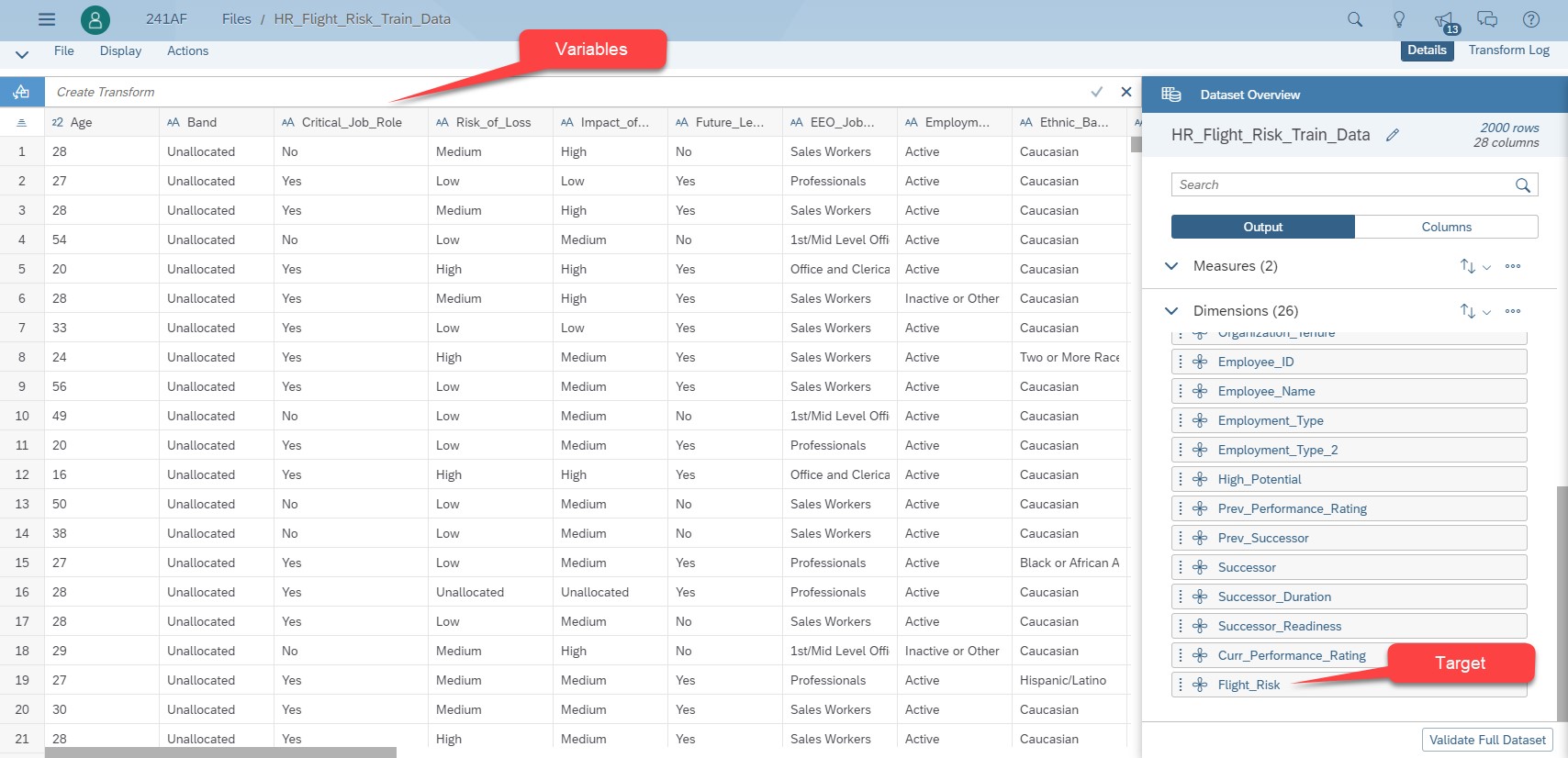
Fig 1: Dataset of the flight risk use case
Classification modeling process
Theoretical explanations about Smart Predict classification
To understand how Smart Predict generates a classification predictive model and what is the information given in the reports, it is necessary to have some theoretical explanations. The purpose is not to give you a formal course, but to expose you to the main principles.
The principle of the classification engine of Smart Predict is to find the best function able to distinguish between examples that belong to a class. If I take the churn use case, the blue function in the figure below separates people who decide to stay (green emoticon) from those who decide to churn (red emoticon). Applying this function to a new customer, I will be able to determine his propensity to churn.
There are customers who are on both sides of the blue function. This means that it is difficult to determine if they will churn or if they will stay. This leads us to ask this question: what is a good model?
A function that perfectly separates churners from the other customers will be a complex function. Such a predictive model overfits and is not able to correctly predict new cases. The predictive model is not robust.
Conversely, if the predictive model is too simple, it underfits. It has a high robustness, but the precision of its predictions is low.
A good predictive model is a compromise between both. By design, the Smart Predict classification process avoid overfitting. I will come back to this later.

Fig 2: Find the best function which is the closest to input values
The classification process of SAC Smart Predict is based on 2 principles:
- Consistency: If the number of cases is large enough, then the error on new cases is identical to the learning error. The predictive model is qualified as robust. It can be trusted when applied to new cases.
- Generalization: It is a supervised method that combined the results of simpler models to get in the end a better prediction than the prediction obtained from one large model.
The process used by SAC Smart Predict to build a classification model is based on the gradient boosting technique.
Gradient boosting assumes that an army composed of a huge number of weak soldiers will always beat a small army of strong soldiers. The process that implements this principle consists of building a series of small, simple, and weak learners that when combined, will do more accurate and robust predictions than a unique strong learner.
The process is iterative. At the beginning, the process randomly splits the training dataset in two parts. 75% of the dataset is used to train the predictive model. This is the estimation dataset. The process uses the remaining 25% to evaluate the predictive model and measures its accuracy and its robustness by comparing the predictions with the actuals.
The first weak learner is simple. It is a decision tree with only one node. This node gives a probability for the predictions. Of course, it makes a lot of errors. The process determines how far predictions are from the truth by calculating the differences between the predictions and the actual values. These differences are called residuals.
The process computes a second learner whose goal is to predict the residuals best. This learner is a decision tree, and the process try to find the tree that best splits the historical dataset. The combination of the first tree with the second gives better predictions, but there are still significant errors. A new set of residuals is calculated. The process builds a third decision tree to best predict residuals. This sequence continues until most of the residuals are explained or the maximum number of trees is reached.
Now let's go into a little bit more detail on what happens inside each iteration. If you prefer, you can jump this section and come back to it later. At the end, I give two references to papers that explain this technique with mathematical details.
From the estimation dataset, the process creates a decision tree having only one node initialized with all the examples of the estimation dataset, and with a default probability for an individual to belong to a class. By default, this probability is 0.5. When an example of the estimation dataset belongs to the class, its probability is 1. It is 0 if it does not belong to the class.
An iteration is composed of three steps:
- At step 1, for each case of the estimation dataset, the process calculates the residuals. A residual is the difference between the predicted value and the actual value of the target for a given individual.
- At step 2, the process calculates the decision tree that predicts the residuals best. As shown in the figure below, the process splits the estimation dataset on each variable. For measures, the splits are based on a threshold. For dimensions, they are based on each dimension value. For each node of a tree, the process computes a quality score called similarity. Then for each tree, the process computes a gain based on the similarity to evaluate the accuracy of the tree. The formulae of similarity and gain are in the figure below.
- At step 3, the process selects the tree with the highest gain for the next iteration. Once done, for each example of the estimation dataset the process calculates a predicted value with its predicted probability.
The next iteration starts here with the calculation of new residuals obtained from the difference between the new predictions and the actuals.
At the end of each iteration, the process checks conditions. If at least one is satisfied the process stops. The final predictive model is the combination of all winner trees until the last iteration. Such conditions are for example: the new residuals become smaller than a limit or the process reaches the maximum number of iterations. The figure below illustrates this process.
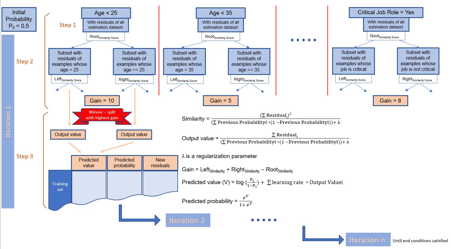
Fig 3: Classification process
An advantage of this process is that it allows you to consider examples having unknown values. For that, at each iteration, the process splits the estimation dataset into two subsets:
- the first subset holds examples with known values of the considered variable and
- the second subset holds examples for which the value of considered variable is unknown.
The process builds candidate decision trees from the subset whose values are known. Then it assigns examples with unknown values to the left node and computes a gain.
The step is done again but this time, examples with unknown values are assigned to the right node. The process calculates a new gain.
At the end, the process keeps only the decision tree with the highest gain. The figure below illustrates this process.

Fig 4: Process to manage unknown values
Specificities of Smart Predict Classification
The classification of SAC Smart Predict has evolved towards a gradient boosting technique to improve the accuracy of a predictive model. But that is not all. One reason is that by design the classification process can find complex interactions between variables to explain the variable to classify. The result is that predictions have a higher confidence.
Furthermore, Smart Predict performs actions automatically for you. There are three advantages:
- You do not have to do it yourself
- Most of the time the actions are done better
- And definitively the action is done faster
One of the automations relates to data encoding. Gradient boosting needs to code data in a certain way. For example, for a dimension that can take three values, the encoding creates three new variables: one variable per value of the dimension but whose value is either 1 or 0. This one hot encoding, as it is named in the literature, is illustrated in the figure below.

Fig 5: Example of dimension encoding
The SAC user does not have to take care of such encoding. SAC Smart Predict does it for you. This is a huge benefit because this task consumes a lot of human energy to encode variables before training a predictive model. If the encoding has errors, the training process can fail or give inaccurate predictions. Once the predictive model is trained, it will be necessary to decode the variables to easily understand the insights.
Thanks to SAC Smart Predict, that saves you a lot of effort and a lot of your time.
The gradient boosting technique has a set of parameters that must be set properly. They influence the quality and the robustness of the predictive model and the speed at which it is built. Finding good values is not easy. This requires a good knowledge of the meaning of each parameter and its influence. In common implementation of the gradient boosting technique, it is necessary to train a predictive model several times with several sets of values for these parameters. Then results are compared, and the best set of values is kept.
We consider that this approach has not to be done by SAC users. We have fine-tuned the parameters to find the set of values that gives the best results in accuracy, robustness, and computation time for a large panel of application domains. For example, the lambda (l) parameter (see fig 3 above), which is a regularization parameter is chosen to reduce the overfitting of the predictive model. There is also the maximum depth of a decision tree which is limited to 4 to avoid spending too much time to get complex trees.
Understand the report of a Smart Predict classification
Build a classification predictive model
In this section, I go back to the use case mentioned above. First, you create a Classification Predictive Scenario named “HR Flight Risk”. In the settings used to build the predictive model, you notice that the training data source is the training dataset. I don’t need to specify the split between training and validation subset. Smart Predict will do the job for me with the default ratio (75% randomly picking for training and the remaining 25% for validation).
The target is the variable “Flight_Risk” where value 1 means “will churn” and value 0 means ‘Will stay”.

Fig 6: Settings of the classification model
Note that some variables are excluded from the analysis:
“Employment Status” because it is highly correlated to the target on the training dataset. This type of variable is called a leaker variable.
“Successor_Readiness” because employees who are listed as inactive are out of the scope of the flight risk study!
Now, I save, and I train the predictive model. After few seconds, Smart Predict has completed the training step. Figure 7 shows the status as well as the performance indicators with this new classification process.

Fig 7: Status and performance indicators with the new classification process
Performance indicators
To assess if a predictive model can be used, we need to know its robustness. This means that the predictive model must be consistent or robust and specific (high quality of the predictions). The robustness is measured by the Prediction Confidence while the quality is measured by the Predictive Power.
These two indicators are computed based on the graph shown in figure 8, which represents how well the « positive » cases are detected.

Fig 8: % of detected target / % population
The X axis stands for the overall population ordered by decreasing score and the Y axis represents the positive cases detected by the corresponding predictive model.
The red line is a random picking. This means that there is no predictive model. On the opposite, the green curve represents a hypothetical perfect predictive model.
The orange and blue curves correspond to two data partitions of the generated model.
Predictive Power measures how close to the perfect model the predictive model is. Area between Validation and Random curves divided by the area between Perfect and Random curves.
Predictive Power = C/(A+B+C)
The role of the Predictive Power is to give an idea of the quality of the predictive model. It is based on the predictions done from the validation dataset. It is the ratio between the number of correct predictions and the number of cases. Its range is between 0 and 1:
- When it takes value of 0, it means that nothing in the validation subset is classified correctly by the predictive model. The quality of the predictive model is bad. You need to rework your data preparation and add variables to your dataset.
- When it takes value of 1, we are exactly at the perfect predictive model. A perfect predictive model is suspicious. It may be a sign that a leak variable is used. You should check if all the influencers can really be used for prediction purposes.
Prediction Confidence expresses the ability to reproduce the same detection with a new dataset. A « validation sample » is necessary to estimate it. Predictive Confidence is equal to one minus area between Validation and Training divided by area between Perfect and Random.
Prediction Confidence =1- B/(A+B+C)
The role of the Prediction Confidence is to measure if the predictive model can do the predictions with the same reliability when new cases arrive. If these new cases look like cases of the training dataset, then the Prediction Confidence will be good. The Prediction Confidence should be as close as possible to 100%. If you want to have a more robust predictive model, you should increase its robustness by adding new rows to your dataset.
Comparison – Figure below shows the values of the performance indicators before the technique of gradient boosting was included in Smart Predict.

Fig 9: Performance indicators before the new classification process.
There is an increase of 24.4% of the Predictive Power. This means that the quality of the predictions will be better as well as the probability associated to the predictions.
The Prediction Confidence is lower. This is not dramatic because with the gradient boosting technique it is not possible to get a kind of threshold as before. We must read this indicator in another way and stop to consider it as a robustness measure in the absolute. It is better to use it to compare the robustness between two predictive models when you re-work your dataset and parameters. Now if there is no increase between two runs, you should consider adding new cases to the training dataset.
Influencers
Another part of the report of a classification is the contributions of variables. They are displayed sorted by decreasing importance. The most contributive ones are the ones that best explain the target. The sum of the contributions equals 100%.

Fig 10: Influencers
For our use case, the age of the employees is the most contributive variable. But let’s continue the analysis of the report.
If you scroll down the previous figure, you will get a detailed report about the influencer contribution.

Fig 11: Grouped Category Influence for Age
This report gives a lot of information as shown in the red bullets. There are 2 main points to look at in this chart:
Variable “Age” influences the target. The graph of figure 10 shows that people between 53 and 70 and people between 21 and 48 have a positive influence on the target. This means that if an employee is in one of these ranges of age, his/her flight risk will be higher than if he/she is in the range ]19, 21]. It corresponds to people who are near retirement (]53, 70]) and very active and senior people (]21, 48]). But can we act on age to avoid flight risk? Or do we want to act to keep some age categories? Let’s examine the variable “Successor”
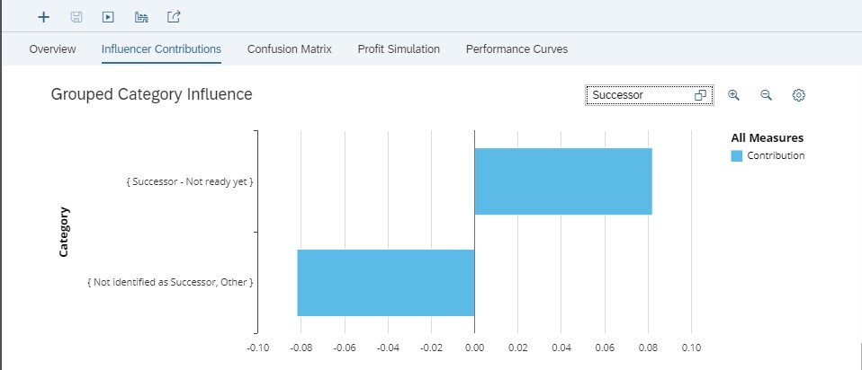
Fig 12: Grouped Category Influence for Successor
When the employee could be a successor but is not still ready to be the successor of another employee (because of the juniority in the position, for example) then the risk of seeing him/her leave is higher. It can be considered as an impact of bad career management.
Conversely, when an employee has not been identified as a successor and for the other values of variable “Successor”, the risk of seeing such employees leave the company is lower.
Finally look at the job family influencer.

Fig 13: Grouped Category Influence for Job Family
It appears that most job families are more likely to be flight risks in comparison to Administrative Support. Conversely, the position of Directors or Senior Manager increases the risk of employee churn compared to other jobs.
Confusion Matrix
Smart Predict also proposes a tool called Confusion Matrix. It helps you navigate in the curve of the percentage of the detected target. You choose a threshold on the percentage of population, and the classification predictive model tells you within this threshold, the percentage of the population who answers positively.
For example, if you select 30% of the employees with the highest attrition probability because your budget is limited, the classification model tells you that within these 30 %, you capture 77.63% of employees who will probably leave. You can focus your actions on reducing the attrition of these. But if you put the threshold at 45%, you will capture 91.51% of employees who will probably leave.

Fig 14: Choose a threshold to evaluable profit.
You can select with the slide bar the 30% of employees with the highest attrition probability and see the percentage of employees you will capture.
Note that you can also do the opposite action and select first the percentage of employees you want to capture and see the percentage of employees to contact with the highest attrition probability.
The confusion matrix will show you the performance of the predictive model by comparing the predicted values of the target with its actual values.
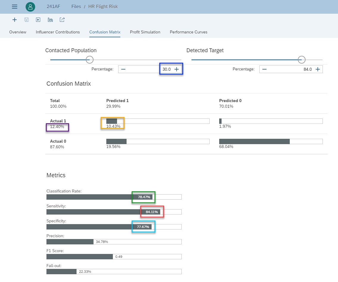
Fig 15: Confusion matrix
I just recall definitions to help you understand how to interpret this confusion matrix. To get all definitions, read the section of the online help.
The main diagonal represents the True Positive and the True Negative. In other words, it is when the Classification predictive model does correct predictions.
- True Positive is when the classification model predicts 1 and it is effectively 1.
- True Negative is when the classification model predicts 0 and it is effectively 0.
The second diagonal represents False Positive and False Negative. In other words, it is when the Classification model does incorrect predictions.
- False Positive is when the classification model predicts 1 but it is in fact 0.
- False Negative is when the classification model predicts 0 but it is in fact 1.
Here is how to read this confusion matrix. When you contact 30% of employees (blue rectangle) with the highest attrition probability, the classification rate is 78.47% (green rectangle). It represents the percentage of employees correctly classified by the predictive model. The percentage of true positive is 10.43% (yellow rectangle) while the percentage of employees who will leave (the actual positive) is 12.4% (purple rectangle). The sensitivity (red rectangle) measures the percentage of employees who will leave that have been correctly classified. Here it is 84.11%
Similarly, the specificity (light blue rectangle) measures the percentage of employees who will stay (actual negative) that have been correctly classified (true negative). Here it is 77.67%.
A quick comparison with the confusion matrix before this updated version of Smart Predict shows that on the same dataset, with the same percentage of the contacted population, performances are better.

Figure 16: Confusion matrix before the new classification process.
For the same percentage of actuals, 12.4%, the percentage of predicted increases of 22.1%. The classification rate, the sensitivity and the specificity have increased respectively of 5.9%, 22.1% and 3.4%. We will see in the next section that has an impact on the profit simulation.
Profit Simulation
Reducing attrition does not come for free and you would like to know the impact and costs of your decisions. This is the goal of the Profit Simulation.
A cost can be associated to each situation. In some use cases, when predictions are incorrect, the cost of a False Negative can be more important than the cost for a False Positive because you lose money. You will not keep a valuable employee, and this is more important than to give motivation to an employee that wants to stay.
The difficulty is to estimate a relevant threshold (30% in our use case). Once you have set the cost of good predictions and the cost when you predict that an employee will effectively leave (yellow rectangle in the figure below), you can use the profit simulation and move the slide bar to change the percentages of contacted employees and detected target.

Fig 17: Profit simulation
The role of the profit simulation is to choose a threshold. One way to choose that threshold is to optimize the profit. In our use case, with these costs, the best profit (click on “Maximize Profit” button) is obtained when you will contact 16.8% of the employees.
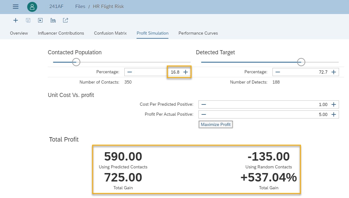
Fig 18: Maximized profit
If we compare this maximized profit with the one obtained before this improvement (see figure below), we see that now the total profit is higher, and we need to contact less customers.

Fig 19: Maximized profit before the new classification process
Using a classification predictive model
Until now, we have seen how SAC Smart Predict builds a classification model and what are the insights provided. How do you interpret and to use this information to better understand data? Now it’s time for you to apply the classification model on your employees to determine those who could leave in a near future. Once you have found those you want to keep, you could decide the best ways to motivate them to stay.
From the human resources use case, the classification predictive model gives the probability of an employee leaving the company. See how this works.
Select a classification model and click on the “Apply” icon. In the dialog you enter:
- The data source. It’s a dataset with the same information as the training dataset but where the values of the target variable (here Flight_Risk) is unknown as this is what you want to predict.
- The output is also a dataset. You give it a name and a location.
- The replicated columns are the variables of the input dataset you want to retrieve in the output dataset.
- To this output, you can add other statistical columns. The minimum to be useful is to add the probability of the predicted category.

Fig 20: Apply a classification model
Once this process is completed, a message is displayed in the status pane.

Fig 21: Classification model has been applied successfully
Let’s now examine the predictions generated in the dataset HR_Flight_Risk_Predictions.
In SAP Analytics Cloud, browse to the location where you have stored this output dataset and open it. The last columns of the dataset contain the predictions.

Fig 22: Output dataset sorted by decreasing prediction probability to flight
While it is great to see each individual employee, it may be easier for us to consume this information through visualizations! To do this, one way is to use directly the output dataset directly in a story. Another way is to create a business intelligence (BI) model on top of the output dataset to use the data in a BI or planning story as shown in figure 23.

Fig 23: Predictions probability of employees to leave shown in a BI story
Conclusion
Congratulations, you have reached the end of this blog. My wish is that I have clarified the way Smart Predict is doing classification, helped you understand the insights provided in the report section and how to use the predictions in a story. I also hope these explanations increase your confidence in the product.
Resources to learn more about Smart Predict.
- Getting Started with Smart Predict
- Get Started with SAP Analytics Cloud
- SAC Smart Predict – What goes on under the hood
- Stochastic Gradient Boosting
- Gradient Boosting In Classification
- Time Series Forecasting in SAP Analytics Cloud Smart Predict in Detail
- Predictive Planning
- Getting Started with Smart Predict: Concepts of Predictive Modeling
Finally, if you enjoyed this post, I’d be grateful if you’d help it spread, comment and like. Thank you!
- SAP Managed Tags:
- SAP Analytics Cloud,
- SAP Analytics Cloud, augmented analytics
Labels:
19 Comments
You must be a registered user to add a comment. If you've already registered, sign in. Otherwise, register and sign in.
Labels in this area
-
ABAP CDS Views - CDC (Change Data Capture)
2 -
AI
1 -
Analyze Workload Data
1 -
BTP
1 -
Business and IT Integration
2 -
Business application stu
1 -
Business Technology Platform
1 -
Business Trends
1,661 -
Business Trends
86 -
CAP
1 -
cf
1 -
Cloud Foundry
1 -
Confluent
1 -
Customer COE Basics and Fundamentals
1 -
Customer COE Latest and Greatest
3 -
Customer Data Browser app
1 -
Data Analysis Tool
1 -
data migration
1 -
data transfer
1 -
Datasphere
2 -
Event Information
1,400 -
Event Information
64 -
Expert
1 -
Expert Insights
178 -
Expert Insights
270 -
General
1 -
Google cloud
1 -
Google Next'24
1 -
Kafka
1 -
Life at SAP
784 -
Life at SAP
11 -
Migrate your Data App
1 -
MTA
1 -
Network Performance Analysis
1 -
NodeJS
1 -
PDF
1 -
POC
1 -
Product Updates
4,578 -
Product Updates
323 -
Replication Flow
1 -
RisewithSAP
1 -
SAP BTP
1 -
SAP BTP Cloud Foundry
1 -
SAP Cloud ALM
1 -
SAP Cloud Application Programming Model
1 -
SAP Datasphere
2 -
SAP S4HANA Cloud
1 -
SAP S4HANA Migration Cockpit
1 -
Technology Updates
6,886 -
Technology Updates
395 -
Workload Fluctuations
1
Related Content
- SAP Sustainability Footprint Management: Q1-24 Updates & Highlights in Technology Blogs by SAP
- Getting ready to start using SAP Focused Run in Technology Blogs by SAP
- Horizon Theme and Templates for Stories in SAP Analytics Cloud in Technology Blogs by SAP
- Responsive vs. Canvas in SAP Analytics Cloud with Optimized Design Experience in Technology Blogs by Members
- Consolidation Extension for SAP Analytics Cloud – Detailed Currency Conversion in Technology Blogs by Members
Top kudoed authors
| User | Count |
|---|---|
| 11 | |
| 10 | |
| 10 | |
| 9 | |
| 8 | |
| 7 | |
| 7 | |
| 7 | |
| 7 | |
| 6 |