

- SAP Community
- Products and Technology
- Technology
- Technology Blogs by SAP
- SAP Analytics Cloud with a Complex R Visualization
Technology Blogs by SAP
Learn how to extend and personalize SAP applications. Follow the SAP technology blog for insights into SAP BTP, ABAP, SAP Analytics Cloud, SAP HANA, and more.
Turn on suggestions
Auto-suggest helps you quickly narrow down your search results by suggesting possible matches as you type.
Showing results for
former_member24
Explorer
Options
- Subscribe to RSS Feed
- Mark as New
- Mark as Read
- Bookmark
- Subscribe
- Printer Friendly Page
- Report Inappropriate Content
06-09-2020
10:50 AM
As a sales engineer tasked with highlighting the value of SAP's platform and technologies to a wide variety of customers across many industries, I'm often asked to respond to a customer's very specific request about our capabilities. I was recently asked to produce a very specific visualization for an SAP Analytics Cloud story. After reviewing the single screen print I was given as the requirement, I quickly realized there were a few mandatory elements no out-of-the-box SAP Analytics Cloud visualization could create.
Here is the final visualization we built in SAP Analytics Cloud that shows some of the unique requirements for this visualization:
This visualization shows the energy usage of a particular customer over a 7 day period. Some things make this visualization a challenge using standard SAP Analytics Cloud tools:
I first tried to replicate the screen print in SAP Analytics Cloud using a standard trend visualization. While I could match some required elements, there were some problems. First, SAP Analytics Cloud does not provide total control of the axes so doing the overnight shading and rotated text was not possible. Second, SAP Analytics Cloud had trouble with the green shading for the peak time of day.

Using multiple axis in a standard SAP Analytics Cloud chart, I could indicate peak and off-peak times but the clean and sharp edges for on-peak times as shown in the requirements were not possible. Notice how the peak times show as rounded domes.
After a bit of research, I decided to use SAP Analytics Cloud's delivered R integration to construct the visualization. Using the delivered R integration capabilities, the completed visualization hit all the requirements, i.e., the overnight shading and crisp lines for peak and off-peak. To build this completed visualization, the R code incrementally builds a plot by adding layers for each element of the visualization one after the another.
The following animation shows how the R code sequentially adds elements to the visualization. The SAP Analytics Cloud user only sees the completed visualization.
The discussion and code below highlight what I learned and how I achieved the final result. While much of this post's example focuses on building the R visualization, there are some very interesting notes about how SAP Analytics Cloud provides data to R and transformations that make the data usable in R plots.
Using the original screen capture, I sat down and eyeballed the values to create an Microsoft Excel spreadsheet to hold the data for this exercise. The goal, of course, was to create a dataset mostly aligned with the provided visualization. To make the SAP Analytics Cloud exercise more realistic, I generated data from September 1, 2019 through October 16, 2019 for 800+ meter readings. The original requirement only showed a few days in September, but I rarely have only the exact data necessary for a specific visualization.
Before anyone asks: Yes, you can build R visualizations using Live Connections. Unfortunately that feature was NOT enabled in my SAP Analytics Cloud tenant.
Later, when attempting to load my data into SAP Analytics Cloud, I learned it is very important for timestamp columns in the Excel workbook to be "properly" formatted. To successfully load timestamps into SAP Analytics Cloud the data must match one of SAP Analytics Cloud's supported formats. In the Excel dataset I created, I formatted the timestamp values to match the first format available in SAP Analytics Cloud.
To properly format the Time column in my data, I simply right-clicked the column heading, i.e., "A" and selected the "Format Cells" menu option.
I developed and used a custom format of "yyyy-mm-dd hh:mm:ss" that matches to a timestamp option in SAP Analytics Cloud. Note: For the time portion of the string, the mm code for minutes must appear immediately after an h or hh code or immediately before the ss code, otherwise Excel displays the month instead of minutes.
I had a number of timestamp format choices, but I simply chose the first matching option. As you can see below, SAP Analytics Cloud provides 6 different formats I could have used.

Before I figured out how the timestamps needed to be formatted, SAP Analytics Cloud only saw invalid dates and not timestamps when I tried to set the dimension type.
Now that I have my data ready to go, I started building my story. To make the exercise easier, I decided to simply import my Excel file directly into a story and not build a model first.

I selected the "Access & Explore Data" option to get started.
Since my Excel file is on my laptop, I selected the "Data uploaded from a file" option.
Using the Select Source File button, I selected my file (rviz-dataset.xlsx) from my local folder.
After uploading the file, SAP Analytics Cloud opens the model builder. SAP Analytics Cloud guessed, incorrectly that the Time dimension was a simple date dimension. At this point, I set my Time column to "Timestamp Dimension." I simply clicked on the "Time" column and set the Type. After a few seconds, SAP Analytics Cloud automatically selected the proper timestamp format.
To continue on to building the R Visualization, click the Story button in the upper-left of the page. The model is processed into the story and will be available for building visualizations.
I developed my R code for this visualization completely inside the SAP Analytics Cloud R Visualization editor. While SAP Analytics Cloud's R tools do not provide every possible development feature you might find in R Studio, e.g., a debugger, the R editor is pretty good. I debugged my code by using tried-and-true "print" statements; classic but still useful.
I inserted an R Visualization on the canvas.
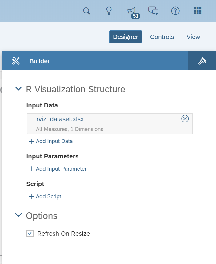
When you add an R Visualization, the first thing you do is add input data. This is a critical step. Whatever input data you select here is sent to the R server everytime the visualization is generated. I wanted to use the data I just loaded, so I click on the Add Input Data option.
SAP Analytics Cloud automatically selected the only loaded model. If my story had more than one model or I wanted a model not currently in the story, I could have simply clicked the edit pencil to make a different choice.
Next I needed to make sure the data sent to R included the timestamp for each meter reading. I opened the Rows selector and selected the Time dimension. As I worked and re-worked my story I quickly found that it was easy to forget to select a dimension for the Rows. When I forgot, SAP Analytics Cloud sent a summary of the meter reading, i.e., a single number.
So, after selecting the time dimension for rows, I clicked the OK button in the lower right corner of the page to set the input data.
Important note: the name of the Input Data is the name of the variable (data frame) that appears when the R script runs. I wanted to change the variable name passed to R because I might want to use the script multiple models and I didn't want to create different versions of the script for each model.
I simply clicked on the title rviz_dataset.xlsx and put in the name I told my script to expect. Again, the important note here is the name you set is the name R will see, even if you leave the default you will get a variable name ending in ".xlsx".
Now I was ready to paste in the R code (see the link at the bottom of this post for the completed R code). I clicked the Add Script button.
In the screen print below, you see my completed code pasted into the Editor panel. After pasting the code, I invoked the script by clicking the Execute button.
After a few moments, the R visualization shows up in the story. This takes longer than I would have thought because of the amount of plotting work going on in the script. As you see, the entire model was handed to R so there are 800+ data points driving the plot.
I did find I needed to adjust the data SAP Analytics Cloud handed to R. Specifically, SAP Analytics Cloud delivers the timestamp values to R as strings, not as R usable timestamps. Also, SAP Analytics Cloud does NOT necessarily provided the data sorted. Using built-in R tools, I simply converted the strings to timestamps and sorted the entire data set.
Another useful note on building R vizualizations is to expand the edit window to see all the development windows at the same time.
In the expanded view, you can see the script, console output, all variables given (Data) and created (Values), and the final output. This view is where I developed most of my script. When I added print statements in the Editor and clicked the Execute button, I could easily see the output of the print statements in the console window.
My goal was to match the original requirement as closely as possible, so I need a filter to show only the specific dates the customer expected to see. I added a page filter on the model I loaded in the story to see just the days in the original requirement, i.e., September 18th through the 25th.
The final story with filter gave me the exact visualization I needed.
By the way, now the R Visualization now builds very quickly because the filter cuts down the number of rows from 800+ to just ~160.
After completing the R script I realized it was not very interactive. It looked good but was really just a picture. Two simple additions to the exisiting script, I was able to add interactivity. I'm not completely satisified with the result, e.g., the "night" labels are no longer veritical. This can be fixed by completely switching the plotting libary from ggplot2 to plotly - which was more work than I needed to be successful.
The first change is simply to add a second plotting library to my script.
Then I wrapped my completed plot with the new rendering engine. So adding one new library at the top and wrapping the last line with the new engine we have some interactivty.
As you can see, now if I float my mouse over the chart, I see some details about the item under the cursor.

Before you ask: NO, the R visualization cannot be used to trigger events in the rest of the story. That type of page element interaction requires an Analytic Application and would likely be easier using other plotting tools than R.
SAP Analytics Cloud's out of the box integration with R is a very powerful tool with a robust development environment. I think the way SAP Analytics Cloud hands the data to R after applying page or story filters on the models makes it easy to create stories spanning both SAP Analytics Cloud and R Visualizations.
Follow us via @Sap and #SAPCommunity
Here is the final visualization we built in SAP Analytics Cloud that shows some of the unique requirements for this visualization:

This visualization shows the energy usage of a particular customer over a 7 day period. Some things make this visualization a challenge using standard SAP Analytics Cloud tools:
- The unique background shading and rotated "night" text indicating the overnight periods, i.e., 8:00 pm to 6:00 am.
- The alternating shading under the trend line between peak and off-peak times. The green areas are peak times of day. Also notice how September 21st and 22nd do not have the green shading. For this requirement, neither Saturday nor Sunday have peak times.
I first tried to replicate the screen print in SAP Analytics Cloud using a standard trend visualization. While I could match some required elements, there were some problems. First, SAP Analytics Cloud does not provide total control of the axes so doing the overnight shading and rotated text was not possible. Second, SAP Analytics Cloud had trouble with the green shading for the peak time of day.
Using multiple axis in a standard SAP Analytics Cloud chart, I could indicate peak and off-peak times but the clean and sharp edges for on-peak times as shown in the requirements were not possible. Notice how the peak times show as rounded domes.
After a bit of research, I decided to use SAP Analytics Cloud's delivered R integration to construct the visualization. Using the delivered R integration capabilities, the completed visualization hit all the requirements, i.e., the overnight shading and crisp lines for peak and off-peak. To build this completed visualization, the R code incrementally builds a plot by adding layers for each element of the visualization one after the another.
The following animation shows how the R code sequentially adds elements to the visualization. The SAP Analytics Cloud user only sees the completed visualization.
The discussion and code below highlight what I learned and how I achieved the final result. While much of this post's example focuses on building the R visualization, there are some very interesting notes about how SAP Analytics Cloud provides data to R and transformations that make the data usable in R plots.
Making the Data
Using the original screen capture, I sat down and eyeballed the values to create an Microsoft Excel spreadsheet to hold the data for this exercise. The goal, of course, was to create a dataset mostly aligned with the provided visualization. To make the SAP Analytics Cloud exercise more realistic, I generated data from September 1, 2019 through October 16, 2019 for 800+ meter readings. The original requirement only showed a few days in September, but I rarely have only the exact data necessary for a specific visualization.
Before anyone asks: Yes, you can build R visualizations using Live Connections. Unfortunately that feature was NOT enabled in my SAP Analytics Cloud tenant.

Later, when attempting to load my data into SAP Analytics Cloud, I learned it is very important for timestamp columns in the Excel workbook to be "properly" formatted. To successfully load timestamps into SAP Analytics Cloud the data must match one of SAP Analytics Cloud's supported formats. In the Excel dataset I created, I formatted the timestamp values to match the first format available in SAP Analytics Cloud.
To properly format the Time column in my data, I simply right-clicked the column heading, i.e., "A" and selected the "Format Cells" menu option.

I developed and used a custom format of "yyyy-mm-dd hh:mm:ss" that matches to a timestamp option in SAP Analytics Cloud. Note: For the time portion of the string, the mm code for minutes must appear immediately after an h or hh code or immediately before the ss code, otherwise Excel displays the month instead of minutes.

I had a number of timestamp format choices, but I simply chose the first matching option. As you can see below, SAP Analytics Cloud provides 6 different formats I could have used.
Before I figured out how the timestamps needed to be formatted, SAP Analytics Cloud only saw invalid dates and not timestamps when I tried to set the dimension type.

Create the Story
Now that I have my data ready to go, I started building my story. To make the exercise easier, I decided to simply import my Excel file directly into a story and not build a model first.
I selected the "Access & Explore Data" option to get started.

Since my Excel file is on my laptop, I selected the "Data uploaded from a file" option.

Using the Select Source File button, I selected my file (rviz-dataset.xlsx) from my local folder.

After uploading the file, SAP Analytics Cloud opens the model builder. SAP Analytics Cloud guessed, incorrectly that the Time dimension was a simple date dimension. At this point, I set my Time column to "Timestamp Dimension." I simply clicked on the "Time" column and set the Type. After a few seconds, SAP Analytics Cloud automatically selected the proper timestamp format.

To continue on to building the R Visualization, click the Story button in the upper-left of the page. The model is processed into the story and will be available for building visualizations.
Adding the R Visualization
I developed my R code for this visualization completely inside the SAP Analytics Cloud R Visualization editor. While SAP Analytics Cloud's R tools do not provide every possible development feature you might find in R Studio, e.g., a debugger, the R editor is pretty good. I debugged my code by using tried-and-true "print" statements; classic but still useful.
I inserted an R Visualization on the canvas.

When you add an R Visualization, the first thing you do is add input data. This is a critical step. Whatever input data you select here is sent to the R server everytime the visualization is generated. I wanted to use the data I just loaded, so I click on the Add Input Data option.

SAP Analytics Cloud automatically selected the only loaded model. If my story had more than one model or I wanted a model not currently in the story, I could have simply clicked the edit pencil to make a different choice.

Next I needed to make sure the data sent to R included the timestamp for each meter reading. I opened the Rows selector and selected the Time dimension. As I worked and re-worked my story I quickly found that it was easy to forget to select a dimension for the Rows. When I forgot, SAP Analytics Cloud sent a summary of the meter reading, i.e., a single number.
So, after selecting the time dimension for rows, I clicked the OK button in the lower right corner of the page to set the input data.
Important note: the name of the Input Data is the name of the variable (data frame) that appears when the R script runs. I wanted to change the variable name passed to R because I might want to use the script multiple models and I didn't want to create different versions of the script for each model.
I simply clicked on the title rviz_dataset.xlsx and put in the name I told my script to expect. Again, the important note here is the name you set is the name R will see, even if you leave the default you will get a variable name ending in ".xlsx".

Now I was ready to paste in the R code (see the link at the bottom of this post for the completed R code). I clicked the Add Script button.

In the screen print below, you see my completed code pasted into the Editor panel. After pasting the code, I invoked the script by clicking the Execute button.

After a few moments, the R visualization shows up in the story. This takes longer than I would have thought because of the amount of plotting work going on in the script. As you see, the entire model was handed to R so there are 800+ data points driving the plot.

I did find I needed to adjust the data SAP Analytics Cloud handed to R. Specifically, SAP Analytics Cloud delivers the timestamp values to R as strings, not as R usable timestamps. Also, SAP Analytics Cloud does NOT necessarily provided the data sorted. Using built-in R tools, I simply converted the strings to timestamps and sorted the entire data set.
library(ggplot2)


# SAP Analytics Cloud sends dates as strings looking

# like: Jan 1, 2019 01:01:01 PM - we need real R dates.


dataSet$Time <- as.POSIXct(dataSet$Time, tz="UTC", format="%b %d, %Y %I:%M:%S %p")


# SAP Analytics Cloud does not necessarily provide the

# data sorted ensure the order of the readings.


dataSet <- dataSet[order(dataSet$Time),]
Another useful note on building R vizualizations is to expand the edit window to see all the development windows at the same time.

In the expanded view, you can see the script, console output, all variables given (Data) and created (Values), and the final output. This view is where I developed most of my script. When I added print statements in the Editor and clicked the Execute button, I could easily see the output of the print statements in the console window.

My goal was to match the original requirement as closely as possible, so I need a filter to show only the specific dates the customer expected to see. I added a page filter on the model I loaded in the story to see just the days in the original requirement, i.e., September 18th through the 25th.
The final story with filter gave me the exact visualization I needed.

By the way, now the R Visualization now builds very quickly because the filter cuts down the number of rows from 800+ to just ~160.
Stretch Goal
After completing the R script I realized it was not very interactive. It looked good but was really just a picture. Two simple additions to the exisiting script, I was able to add interactivity. I'm not completely satisified with the result, e.g., the "night" labels are no longer veritical. This can be fixed by completely switching the plotting libary from ggplot2 to plotly - which was more work than I needed to be successful.
The first change is simply to add a second plotting library to my script.
library(ggplot2)

library(plotly)
Then I wrapped my completed plot with the new rendering engine. So adding one new library at the top and wrapping the last line with the new engine we have some interactivty.
# Render the plot the graph.

ggplotly(p)
As you can see, now if I float my mouse over the chart, I see some details about the item under the cursor.
Before you ask: NO, the R visualization cannot be used to trigger events in the rest of the story. That type of page element interaction requires an Analytic Application and would likely be easier using other plotting tools than R.
Key Takeaways
SAP Analytics Cloud's out of the box integration with R is a very powerful tool with a robust development environment. I think the way SAP Analytics Cloud hands the data to R after applying page or story filters on the models makes it easy to create stories spanning both SAP Analytics Cloud and R Visualizations.
See also:
- SAP Analytics Cloud
- SAP Analytics Cloud Community
- R Code for Visualization
- Dataset for Visualization
- R Packages for SAP Analytics Cloud
Follow us via @Sap and #SAPCommunity
- SAP Managed Tags:
- SAP Analytics Cloud
Labels:
1 Comment
You must be a registered user to add a comment. If you've already registered, sign in. Otherwise, register and sign in.
Labels in this area
-
ABAP CDS Views - CDC (Change Data Capture)
2 -
AI
1 -
Analyze Workload Data
1 -
BTP
1 -
Business and IT Integration
2 -
Business application stu
1 -
Business Technology Platform
1 -
Business Trends
1,658 -
Business Trends
91 -
CAP
1 -
cf
1 -
Cloud Foundry
1 -
Confluent
1 -
Customer COE Basics and Fundamentals
1 -
Customer COE Latest and Greatest
3 -
Customer Data Browser app
1 -
Data Analysis Tool
1 -
data migration
1 -
data transfer
1 -
Datasphere
2 -
Event Information
1,400 -
Event Information
66 -
Expert
1 -
Expert Insights
177 -
Expert Insights
293 -
General
1 -
Google cloud
1 -
Google Next'24
1 -
Kafka
1 -
Life at SAP
780 -
Life at SAP
13 -
Migrate your Data App
1 -
MTA
1 -
Network Performance Analysis
1 -
NodeJS
1 -
PDF
1 -
POC
1 -
Product Updates
4,577 -
Product Updates
340 -
Replication Flow
1 -
RisewithSAP
1 -
SAP BTP
1 -
SAP BTP Cloud Foundry
1 -
SAP Cloud ALM
1 -
SAP Cloud Application Programming Model
1 -
SAP Datasphere
2 -
SAP S4HANA Cloud
1 -
SAP S4HANA Migration Cockpit
1 -
Technology Updates
6,873 -
Technology Updates
417 -
Workload Fluctuations
1
Related Content
- Kyma Integration with SAP Cloud Logging. Part 2: Let's ship some traces in Technology Blogs by SAP
- 10+ ways to reshape your SAP landscape with SAP Business Technology Platform – Blog 4 in Technology Blogs by SAP
- Top Picks: Innovations Highlights from SAP Business Technology Platform (Q1/2024) in Technology Blogs by SAP
- SAP Cloud Integration: Understanding the XML Digital Signature Standard in Technology Blogs by SAP
- Integrate C4P-Resource Management with SAP Analytics Cloud or SAP DataSphere in Technology Blogs by SAP
Top kudoed authors
| User | Count |
|---|---|
| 34 | |
| 25 | |
| 12 | |
| 7 | |
| 7 | |
| 6 | |
| 6 | |
| 6 | |
| 5 | |
| 4 |