The month of May marks another milestone for
Fundamental Library Styles. Version
0.9.0 is out!
The very first thing I would like to mention is that we were able to publish the
UI Kit!. Fundamental Library UI Kit is ready-to-use, state-of-the-art drafts of SAP layouts, patterns and components in Sketch. It contains all the components that are migrated to the latest Fiori 3 specs. In the next version we will create a dedicated page where we will share more details. If you want to download it you can do it from the website or from
here. We hope to engage more with UX designers and get their feedback. Give it a try and let us know if you have any suggestion or idea.

Here is the list of the components that are freshly released or updated to match and follow the latest Fiori 3 designs:
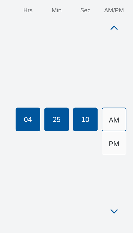
Time and Time Picker
The
Time component is used to select a time value. It would be rare to see this component used alone. Usually it is used in
Time Picker.
The Time Picker component is an opinionated component composed of 3 other components(input-group, popover, and time) The component itself doesn't contain any specific CSS on its own. The time picker allows the user to select a localized time. It can be used with touch, mouse, or keyboard input. The time picker can be used if you want the user to select a time, time range(one time picker can be used to set the starting time and a second one to set the end time), detailed duration (such as 1 minute, and 30 seconds).
The time picker comes with a cozy mode and a compact mode. In the compact mode, the time input field and the button are smaller than in the cozy mode. In the compact mode, there are also arrows that the user can click or tap to set hours, minutes, and so on.

Time Picker input field and drop-down button
Time Picker expanded.
Message Toast
Message Toast is a small, non-disruptive popup for success messages that disappears automatically after a few seconds. Use this component when you want to display short messages, avoid interrupting the user while they are performing an action, or confirm a successful action.
The message toast fades in and out automatically. The timing and duration of the message toast is defined by the app.
To make the toast message easy to scan, keep the text as short as possible. Remember that the user will not have time to take in very much detail.
Do not use the word “successfully” in the message text. This is implicit in a success message.

Byline and Selection List features
The List component had been released in previous released, but we added few features in the current release:
- Navigation - a small arrow appears on the far right, indicating that clicking would navigate. If only a subset of the list items are navigable you should indicate those by displaying a navigation arrow. Do not show arrows if all items are navigable. In this case use a Standard List with Navigation

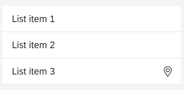
List where all items are navigable
- Action List Item - this item control lets the user trigger actions directly from a list. It is used mainly within dialog boxes and popovers.

Menu Shortcuts
The Menu component had been previously released. In the current version 0.9 we included the shortcut add-on:

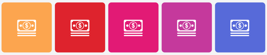
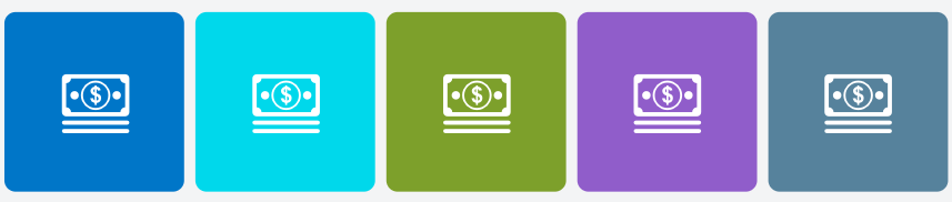
Avatar
The Avatar component is displaying images. These can be user profiles, user initials, placeholders, icons, or business-related images, such as product images.
We support 5 different sizes:

Instead of icon you can use initials:

Avatar can be rendered in square and in circle:

You can use a background image to fill the avatar:

The avatar can be with a transparent background:

Accent colors can be set as a background color:
A zoom icon can be added to the bottom right/left corner:


The full release notes can be find
here.
More cool and new things to come. We are more than excited to keep this momentum.
Stay tuned for more updates. Want to read more blog posts about Fundamental Library? Check these
out.
Feel free to raise any questions or try our libraries in case you didn’t have a chance.


