
- SAP Community
- Products and Technology
- Enterprise Resource Planning
- ERP Blogs by Members
- Embedded Analytics in Action...Analytical List Pag...
Enterprise Resource Planning Blogs by Members
Gain new perspectives and knowledge about enterprise resource planning in blog posts from community members. Share your own comments and ERP insights today!
Turn on suggestions
Auto-suggest helps you quickly narrow down your search results by suggesting possible matches as you type.
Showing results for
Vijay
Active Contributor
Options
- Subscribe to RSS Feed
- Mark as New
- Mark as Read
- Bookmark
- Subscribe
- Printer Friendly Page
- Report Inappropriate Content
04-13-2020
10:52 PM
Hello Everyone. In my earlier blog Change for Good…Analytics with S/4HANA 1909 we saw that, with 1909, we have a new app called "Manage KPI & Reports" and it will replace the existing KPI and Report designer apps.
We have lot of very good blogs showing how to create Analytical List page report using Fiori element and WebIde and lot of annotations for.e.g. look at this wonderful blog from prasita.prabhakaran.
In this blog, i will show you how to create similar ALP report with Smart visual filters, KPI Tags etc. using "Manage KPI & Reports" app and with much less effort..sounds exciting?? ..i felt the same :).
Lets do some action...
Once you have added the role , you will see the below App. Click to open It.
On the landing page, you will see KPI & Reports filter at the top left corner. Click on Reports.
Next, Select Create=>Analytical List Page as highlighted below.
Maintain Report Title, Subtitle and other details and click on Activate.
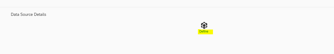
So we have created the report template with basic details. Lets move further. Select the Define link under Data source details section.
Select the CDS view and the associated OData Service and Entity.
For this demo, i selected the standard CDS view "C_OVERDUEPO" for Overdue Purchase Order details and the associated standard OData service.
The chart will be added with one of the measure from the selected CDS view.
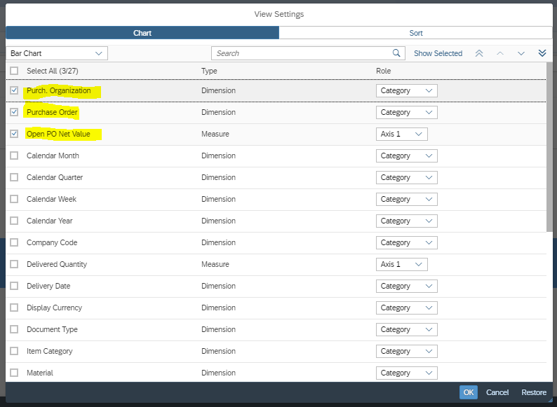
Click on settings to select required dimensions and measures as per need. Lets say we want to see the Open PO net value by Purchase Oder number and Purchase Organisation.
The updated chart will be displayed. Note, that the data displayed here is only dummy data. Actual data will be visible on actual app execution.
Now if we want different chart type, click on the graph icon on the right corner to select as per your choice.
And the chart will change with PO numbers and PORG with their respective open Net value.
Scroll down to the Table section and click on settings icon to select the required fields to be displayed in Table under the chart.
And we should see the table with selected fields and dummy data
Activate the report and pass on the Transport request details in the popup.
So, to this point we have Created the report with chart and Table to be displayed with dettails from the selected CDS view and ODATA service. Next, lets create some Smart Visual filters.
Go to the "Input Parameters and filters and click on "Visual Filters" icon
Click on "+" to create one and pass on the Chart Type,measure and dimension details. We could also specify here how we want the data to be sorted.
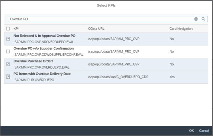
Moving on, lets add some KPI Tags also. Go to the KPI tags section and click on "+" icon.
All the existing KPIs will be listed and we can select what we want. Here , i searched for KPIs related to Overdue POs.
With this we are done with creation of Visual Filters and KPI tags. Activate the report.
Last step we are left with is the creation of the App Tile. Select the "Application" tab at the top.
Click on Add tile.
Fill in the Details like, App Title, subtitle, Catalog, Semantic tag , action etc and save.
With this we are done with the ALP app creation. Now is the time to test it ... Are you ready for it?
Go to the Fiori launchpad , search for the app and add it you the required group. I have added it to my home group as shown below.
Click on the app to run it...and here we have the view of the final app.. Wonderful..isn't it?
If we select a specific Item on the visual filter , the rest of the data in underlying Chart , Table and KPI tag gets automatically filters. Here i selected PO "4500000003" on the visual filter and you can see the refined data underneath.
Similarly, if I click on the KPI tag (Non filterable), it shows the KPI card as shown below.
With this we have come to an end . Hope this will help you to create wonderful ALP apps and that too with ease.
Thank You!
Keep learning and keep sharing!!
Vijay
We have lot of very good blogs showing how to create Analytical List page report using Fiori element and WebIde and lot of annotations for.e.g. look at this wonderful blog from prasita.prabhakaran.
In this blog, i will show you how to create similar ALP report with Smart visual filters, KPI Tags etc. using "Manage KPI & Reports" app and with much less effort..sounds exciting?? ..i felt the same :).
Lets do some action...
| Role required to be able to access the app is SAP_BR_ANALYTICS_SPECIALIST |
Once you have added the role , you will see the below App. Click to open It.

On the landing page, you will see KPI & Reports filter at the top left corner. Click on Reports.

Next, Select Create=>Analytical List Page as highlighted below.

Maintain Report Title, Subtitle and other details and click on Activate.

So we have created the report template with basic details. Lets move further. Select the Define link under Data source details section.
Select the CDS view and the associated OData Service and Entity.
For this demo, i selected the standard CDS view "C_OVERDUEPO" for Overdue Purchase Order details and the associated standard OData service.

The chart will be added with one of the measure from the selected CDS view.

Click on settings to select required dimensions and measures as per need. Lets say we want to see the Open PO net value by Purchase Oder number and Purchase Organisation.
The updated chart will be displayed. Note, that the data displayed here is only dummy data. Actual data will be visible on actual app execution.
Now if we want different chart type, click on the graph icon on the right corner to select as per your choice.

And the chart will change with PO numbers and PORG with their respective open Net value.

Scroll down to the Table section and click on settings icon to select the required fields to be displayed in Table under the chart.
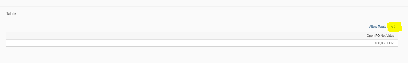

And we should see the table with selected fields and dummy data

Activate the report and pass on the Transport request details in the popup.

So, to this point we have Created the report with chart and Table to be displayed with dettails from the selected CDS view and ODATA service. Next, lets create some Smart Visual filters.
Go to the "Input Parameters and filters and click on "Visual Filters" icon

Click on "+" to create one and pass on the Chart Type,measure and dimension details. We could also specify here how we want the data to be sorted.

Click ok to see the visual filter .Similarly we can add more if needed.I have added 3 in this case.

Moving on, lets add some KPI Tags also. Go to the KPI tags section and click on "+" icon.

All the existing KPIs will be listed and we can select what we want. Here , i searched for KPIs related to Overdue POs.
With this we are done with creation of Visual Filters and KPI tags. Activate the report.

Last step we are left with is the creation of the App Tile. Select the "Application" tab at the top.

Click on Add tile.

Fill in the Details like, App Title, subtitle, Catalog, Semantic tag , action etc and save.

With this we are done with the ALP app creation. Now is the time to test it ... Are you ready for it?
| As we have already linked the App tile to the Catalog and catalog should already included in a role ans the same should be assigned to the user. |
Go to the Fiori launchpad , search for the app and add it you the required group. I have added it to my home group as shown below.

Click on the app to run it...and here we have the view of the final app.. Wonderful..isn't it?

If we select a specific Item on the visual filter , the rest of the data in underlying Chart , Table and KPI tag gets automatically filters. Here i selected PO "4500000003" on the visual filter and you can see the refined data underneath.

Similarly, if I click on the KPI tag (Non filterable), it shows the KPI card as shown below.

With this we have come to an end . Hope this will help you to create wonderful ALP apps and that too with ease.
Thank You!
Keep learning and keep sharing!!
Vijay
- SAP Managed Tags:
- SAP S/4HANA,
- SAP S/4HANA Embedded Analytics
13 Comments
You must be a registered user to add a comment. If you've already registered, sign in. Otherwise, register and sign in.
Labels in this area
-
"mm02"
1 -
A_PurchaseOrderItem additional fields
1 -
ABAP
1 -
ABAP Extensibility
1 -
ACCOSTRATE
1 -
ACDOCP
1 -
Adding your country in SPRO - Project Administration
1 -
Advance Return Management
1 -
AI and RPA in SAP Upgrades
1 -
Approval Workflows
1 -
ARM
1 -
ASN
1 -
Asset Management
1 -
Associations in CDS Views
1 -
auditlog
1 -
Authorization
1 -
Availability date
1 -
Azure Center for SAP Solutions
1 -
AzureSentinel
2 -
Bank
1 -
BAPI_SALESORDER_CREATEFROMDAT2
1 -
BRF+
1 -
BRFPLUS
1 -
Bundled Cloud Services
1 -
business participation
1 -
Business Processes
1 -
CAPM
1 -
Carbon
1 -
Cental Finance
1 -
CFIN
1 -
CFIN Document Splitting
1 -
Cloud ALM
1 -
Cloud Integration
1 -
condition contract management
1 -
Connection - The default connection string cannot be used.
1 -
Custom Table Creation
1 -
Customer Screen in Production Order
1 -
Data Quality Management
1 -
Date required
1 -
Decisions
1 -
desafios4hana
1 -
Developing with SAP Integration Suite
1 -
Direct Outbound Delivery
1 -
DMOVE2S4
1 -
EAM
1 -
EDI
2 -
EDI 850
1 -
EDI 856
1 -
edocument
1 -
EHS Product Structure
1 -
Emergency Access Management
1 -
Energy
1 -
EPC
1 -
Financial Operations
1 -
Find
1 -
FINSSKF
1 -
Fiori
1 -
Flexible Workflow
1 -
Gas
1 -
Gen AI enabled SAP Upgrades
1 -
General
1 -
generate_xlsx_file
1 -
Getting Started
1 -
HomogeneousDMO
1 -
IDOC
2 -
Integration
1 -
learning content
2 -
LogicApps
2 -
low touchproject
1 -
Maintenance
1 -
management
1 -
Material creation
1 -
Material Management
1 -
MD04
1 -
MD61
1 -
methodology
1 -
Microsoft
2 -
MicrosoftSentinel
2 -
Migration
1 -
MRP
1 -
MS Teams
2 -
MT940
1 -
Newcomer
1 -
Notifications
1 -
Oil
1 -
open connectors
1 -
Order Change Log
1 -
ORDERS
2 -
OSS Note 390635
1 -
outbound delivery
1 -
outsourcing
1 -
PCE
1 -
Permit to Work
1 -
PIR Consumption Mode
1 -
PIR's
1 -
PIRs
1 -
PIRs Consumption
1 -
PIRs Reduction
1 -
Plan Independent Requirement
1 -
Premium Plus
1 -
pricing
1 -
Primavera P6
1 -
Process Excellence
1 -
Process Management
1 -
Process Order Change Log
1 -
Process purchase requisitions
1 -
Product Information
1 -
Production Order Change Log
1 -
Purchase requisition
1 -
Purchasing Lead Time
1 -
Redwood for SAP Job execution Setup
1 -
RISE with SAP
1 -
RisewithSAP
1 -
Rizing
1 -
S4 Cost Center Planning
1 -
S4 HANA
1 -
S4HANA
3 -
Sales and Distribution
1 -
Sales Commission
1 -
sales order
1 -
SAP
2 -
SAP Best Practices
1 -
SAP Build
1 -
SAP Build apps
1 -
SAP Cloud ALM
1 -
SAP Data Quality Management
1 -
SAP Maintenance resource scheduling
2 -
SAP Note 390635
1 -
SAP S4HANA
2 -
SAP S4HANA Cloud private edition
1 -
SAP Upgrade Automation
1 -
SAP WCM
1 -
SAP Work Clearance Management
1 -
Schedule Agreement
1 -
SDM
1 -
security
2 -
Settlement Management
1 -
soar
2 -
SSIS
1 -
SU01
1 -
SUM2.0SP17
1 -
SUMDMO
1 -
Teams
2 -
User Administration
1 -
User Participation
1 -
Utilities
1 -
va01
1 -
vendor
1 -
vl01n
1 -
vl02n
1 -
WCM
1 -
X12 850
1 -
xlsx_file_abap
1 -
YTD|MTD|QTD in CDs views using Date Function
1
- « Previous
- Next »
Related Content
- Building Low Code Extensions with Key User Extensibility in SAP S/4HANA and SAP Build in Enterprise Resource Planning Blogs by SAP
- fiscal year and standard year in the same model in SAP Analytics Cloud in Enterprise Resource Planning Q&A
- The Role of SAP Business AI in the Chemical Industry. Overview in Enterprise Resource Planning Blogs by SAP
- BAdI for generating embedded XML files for e-invoices not released for Germany? in Enterprise Resource Planning Q&A
- Futuristic Aerospace or Defense BTP Data Mesh Layer using Collibra, Next Labs ABAC/DAM, IAG and GRC in Enterprise Resource Planning Blogs by Members
Top kudoed authors
| User | Count |
|---|---|
| 3 | |
| 2 | |
| 2 | |
| 2 | |
| 2 | |
| 2 | |
| 2 | |
| 2 | |
| 1 |