
- SAP Community
- Products and Technology
- CRM and Customer Experience
- CRM and CX Blogs by SAP
- Styling Forms - Enable Multi-Column Fields Using F...
CRM and CX Blogs by SAP
Stay up-to-date on the latest developments and product news about intelligent customer experience and CRM technologies through blog posts from SAP experts.
Turn on suggestions
Auto-suggest helps you quickly narrow down your search results by suggesting possible matches as you type.
Showing results for
 Arne_Manthey
Advisor
Options
- Subscribe to RSS Feed
- Mark as New
- Mark as Read
- Bookmark
- Subscribe
- Printer Friendly Page
- Report Inappropriate Content
02-13-2020
9:04 AM
Introduction
If you create a standard form in SAP Marketing Cloud all fields are laid out in single column vertical arrangement. If you use such a form on a wide-screen layout (desktop browser) a lot of space is wasted. It would be better to be able to arrange some fields side-by-side. If you have a lot of checkbox fields, it would be good to align them horizontally rather than vertically.
Preface
Before you read any further please also read the related post 'Styling Forms – Introduction' because it explains a lot of the basics. That post also includes links to other posts of my CSS series. Another recommended post is 'Styling Landing Pages with CSS' which explains all the options to use CSS in a Landing Page.
Important Note: Also please note that all CSS code I present here come without warranty - you need to try out for yourself and test everything thoroughly - especially for multiple screen sizes, devices or browsers! I would also recommend that you ensure you have a good understanding of HTML and CSS.
To familiarize yourself with the concept of CSS Flexbox, I recommend some articles on the web:
- https://www.quackit.com/css/flexbox/tutorial/nested_flex_containers.cfm
- https://css-tricks.com/snippets/css/a-guide-to-flexbox/
- https://internetingishard.com/html-and-css/flexbox/
Also, it's a good idea to check the global compatibility of flex on caniuse.com.
Applying the CSS
You have two options to for applying CSS styling to your form:
- Assign an external CSS file to your form in the form settings.
- Embed the form in a landing page and use the inline CSS editor for your styling definition
In each case, you need to assign CSS classes to your text elements in the form to be able to address those elements specifically in your CSS style definition.
Multi-Column Fields Using Flexbox
Preconditions
The setup I describe in the following sections is based on a form with the indentation option disabled:

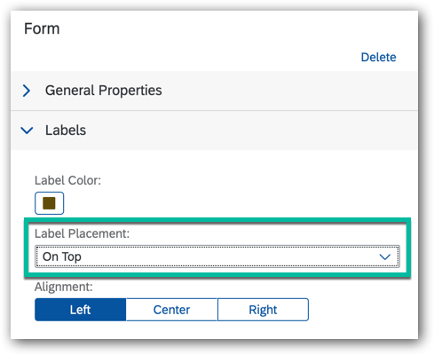
If you want to achieve a similar design but with the labels to the left of the fields, you'll need to investigate on your own and only use the following example as a starting point. Also, if you plan to embed the form in a landing page, you need to apply the label placement 'On Top':
Maximize Width of Input Fields
The first thing to take care of is the general width of the input fields. We need to make sure that they all span 100% of the available width. Additionally, I tried to ensure that all dropdown fields have the same height as the normal input fields:
.sapCpInputWidget .sapCpInput    { width: 100%; }

.sapCpInputWidget .sapCpDropDown { width: 100%; height: 38px; }

.sapCpNoteWidget  .sapCpTextArea { width: 100%;	}
The result looks like this:
Set Up Flexbox
The next thing we need to do is to change the display mode of the form layout to use the flex model and adapt some settings. Additionally, we need to make some basic setup of the single elements (widgets):
.sapCpLayout {

	display: flex;

	flex-flow: wrap;

	min-height: unset;

}

.sapCpWidget {

	flex-basis: 100%;

	width: 100%;

	margin-top: 8px;

}
This will not change anything in the form though. The next thing we need to do is introduce some custom CSS classes which we can assign to the different fields:
.sapCpContentPage:not(.sapCpContentPageEditable) .inline80,

.W2L-Fields-Wrapper .inline80 {

    flex: 1 3 80%;

    min-width: 150px;

}

.sapCpContentPage:not(.sapCpContentPageEditable) .inline70,

.W2L-Fields-Wrapper .inline70 {

    flex: 1 1 70%;

    min-width: 150px;

}

.sapCpContentPage:not(.sapCpContentPageEditable) .inline50,

.W2L-Fields-Wrapper .inline50 {

     flex: 1 3 50%;

    min-width: 150px;

}

.sapCpContentPage:not(.sapCpContentPageEditable) .inline30,

.W2L-Fields-Wrapper .inline30 {

    flex: 1 1 30%;

    min-width: 150px;

}

.sapCpContentPage:not(.sapCpContentPageEditable) .inline20,

.W2L-Fields-Wrapper .inline20 {

    flex: 1 1 20%;

    min-width: 150px;

}
Note that I have applied the safety prefixes here to avoid those settings are only being effective in the form display mode or in the final landing page. Otherwise, the editor would be completely messed up and you wouldn't be able to re-arrange fields or even create new ones.
Each class has a suffix indicating the width percentage which such a field would normally have. Please note that this width will only be applied if the surrounding elements and the total screen width allow it. It could also be placed as a single field on one line, even with a width setting smaller than 100%. This is the intended behavior and it also allows a good responsiveness for mobile devices.
The class 'inline50' can be used for fields that have the same width and are supposed to be next to each other. This gives you some useful combinations like 'inline80' and 'inline20' for a combination of street and house number, or 'inline30' and 'inline70' for a combination of postal code and city.
The last useful class, 'inline', is for a larger number of checkboxes which are supposed to line up horizontally:
.sapCpContentPage:not(.sapCpContentPageEditable) .inline,

.W2L-Fields-Wrapper .inline {

    flex-basis: 150px;

    	flex-shrink: 1;

}
As explained in my introductory post, you now have to assign the appropriate classes to the fields:

Example
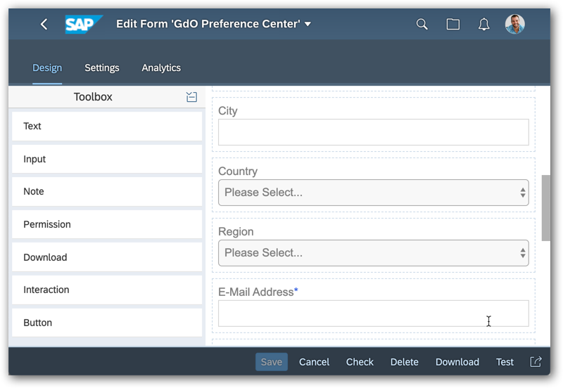
In the following example, I have set up a form with the following fields including the class assignment:
| Field | Class |
| Text: 'Personal Data' | |
| First Name | inline50 |
| Last Name | inline50 |
| Street | inline80 |
| House Number | inline20 |
| Postal Code | inline30 |
| City | inline70 |
| Country | inline50 |
| Region | inline50 |
| E-mail Address | inline50 |
| Mobile Phone | inline50 |
| Text: 'Newsletter' | |
| Subscription: 'Coffee' | inline |
| Subscription: 'Chocolate' | inline |
| Text: 'Permissions' | |
| Permission: Email | inline |
| Permission: Text Message | inline |
| Permission: Phone | inline |
| Permission: Facebook | inline |
| Submit Button |
After applying the style to the form and switching to display mode, the form looks like this:

Or if you embed the form in a landing page, you get the same results:

Please note that you might get some weird arrangements of the fields for some screen widths. I experienced cases where the street number and the postal code were suddenly on one line. But in general, I find that this style works pretty well. However, please remember my statement at the beginning that you are responsible for thoroughly testing the outcome.
Finally, I'll show you how the same style will look on a mobile device:

In this last code snippet, I give you the complete style sheet, including comments to copy:
/******************************************************************************************

	General comments:


	- Prefix .sapCpContentPage:not(.sapCpContentPageEditable)

		This disables the styles for the edit mode in the Form editor to avoid any

		interference with the editor functionality (e.g. drag&drop)


	- Prefix .W2L-Fields-Wrapper

		This enables the styles if used/displayed as embedded form inside a Landing Page


	- If you use a form embedded in a Landing Page it is recommended to set the parameter

		"Label Placement" to "On Top" for best results


	- The section "Fields width = 100%" is only needed to see a nice preview in the Forms

		app. In the embedded form in a Landing Page the same is achieved with the

		parameter "Label Placement" = "On Top"


    - To enable form fields you need to add a CSS class in the "Advanced Properties"

      section:

      - inline20, inline30, inline50, inline70, inline80:

         The number indicates the percentage of the width to use

      - inline:

         For checkboxes with a fixed width


******************************************************************************************/


/******************************************************************************************

	Fields width = 100%

******************************************************************************************/

/*

	This makes all fields fill 100% of the width.

*/


/*--- Text Input Fields ---*/

.sapCpInputWidget .sapCpInput {

	width: 100%;

}


/*--- Dropdown Fields ---*/

.sapCpInputWidget .sapCpDropDown {

	width: 100%;

	height: 38px;

}


/*--- Note Field ---*/

.sapCpNoteWidget .sapCpTextArea {

	width: 100%;

}


/******************************************************************************************

	Switch to Flex Display Model

 ******************************************************************************************/


/*----------------------------------------------------------------------------------------

	Set default to flex and width 100%

  ----------------------------------------------------------------------------------------*/

.sapCpLayout {

	display: flex;

	flex-flow: wrap;

	min-height: unset;

}

.sapCpWidget {

	flex-basis: 100%;

	width: 100%;

	margin-top: 8px;

}


/*-----------------------------------------------------------------------------------------

	Custom classes 'inline##' for different widths

  -----------------------------------------------------------------------------------------*/

.sapCpContentPage:not(.sapCpContentPageEditable) .inline80,

.W2L-Fields-Wrapper .inline80 {

    flex: 1 3 80%;

    min-width: 150px;

}

.sapCpContentPage:not(.sapCpContentPageEditable) .inline70,

.W2L-Fields-Wrapper .inline70 {

    flex: 1 1 70%;

    min-width: 150px;

}

.sapCpContentPage:not(.sapCpContentPageEditable) .inline50,

.W2L-Fields-Wrapper .inline50 {

     flex: 1 3 50%;

    min-width: 150px;

}

.sapCpContentPage:not(.sapCpContentPageEditable) .inline30,

.W2L-Fields-Wrapper .inline30 {

    flex: 1 1 30%;

    min-width: 150px;

}

.sapCpContentPage:not(.sapCpContentPageEditable) .inline20,

.W2L-Fields-Wrapper .inline20 {

    flex: 1 1 20%;

    min-width: 150px;

}


/*-----------------------------------------------------------------------------------------

	Custom class 'inline' for checkbox elements

  -----------------------------------------------------------------------------------------*/

.sapCpContentPage:not(.sapCpContentPageEditable) .inline,

.W2L-Fields-Wrapper .inline {

    flex-basis: 160px;

    	flex-shrink: 1;

}
Conclusion
After reading this post, you should be able to build forms with a more flexible layout and fields that align horizontally.
If you are looking for more posts on this topic please check the link list of other posts of my CSS series in my initial post 'Styling Forms – Introduction'.
- SAP Managed Tags:
- SAP Marketing Cloud
Labels:
3 Comments
You must be a registered user to add a comment. If you've already registered, sign in. Otherwise, register and sign in.
Labels in this area
-
Business Trends
270 -
Business Trends
10 -
chitchat
1 -
customerexperience
1 -
Event Information
256 -
Event Information
17 -
Expert Insights
30 -
Expert Insights
48 -
Life at SAP
133 -
Life at SAP
1 -
Product Updates
666 -
Product Updates
24 -
SAP HANA Service
1 -
SAPHANACloud
1 -
SAPHANAService
1 -
Technology Updates
453 -
Technology Updates
15
Top kudoed authors
| User | Count |
|---|---|
| 4 | |
| 2 | |
| 2 | |
| 1 | |
| 1 | |
| 1 | |
| 1 | |
| 1 | |
| 1 | |
| 1 |