
- SAP Community
- Products and Technology
- Technology
- Technology Blogs by SAP
- Your first SAP Analytics Cloud Custom Widget - Int...
Technology Blogs by SAP
Learn how to extend and personalize SAP applications. Follow the SAP technology blog for insights into SAP BTP, ABAP, SAP Analytics Cloud, SAP HANA, and more.
Turn on suggestions
Auto-suggest helps you quickly narrow down your search results by suggesting possible matches as you type.
Showing results for
 david_stocker
Advisor
Options
- Subscribe to RSS Feed
- Mark as New
- Mark as Read
- Bookmark
- Subscribe
- Printer Friendly Page
- Report Inappropriate Content
01-27-2020
1:57 PM
As of the current release of SAP Analytics cloud, custom widgets are available. With the announcement, I promised a tutorial on how to build a widget. Let’s do this!
Note! You can jump to any post in the series from the agenda, below.
We’ll be creating a very simple KPI tile. It will have a configurable text field, that can be set from the design panel. So far, so TextField. The standard text field’s font can only be set in the design panel. We’ll build a tile with dynamic styling. In the name of simplicity, we’ll only implement a minimal suite of styling options; specifically, by altering the HTML header tag of our text label.
Why a widget that already (more or less) exists in the standard product? Firstly, it is just about as simple as widgets get, allowing us to concentrate on the workflow and development process. Secondly, the standard KPI tile is too complex and takes up too much screen from some uses. Lastly, being able to style text and KPI tiles on the fly would be nice. The series will work as follows:
Together, the results will look something like this…
A widget has at least two parts and possibly up to four.
At runtime, the URL that the browser needs to get the web components from is passed to the browser, which then requests the JavaScript file from its host web server.

In principle, you can write your entire widget from scratch. You could also modify an existing project. I’ve created a template project for speeding this process up. It is available on my personal github profile, here. It contains minimal stubs for the metadata JSON, a main sheet web component stub and a design panel web component stub. It is a github template repository, so you can easily create a new project from it.
Have a look at rename_me_i_am_a_template.json
The first few items are self explanatory and you can do what you will. The “name” and “description” elements determine what the designer sees in the widget palette. A couple of the single field elements are of special note:
In this file, you’ll define the web component template and you implement your custom tag. The Javascript class that you’ll implement will extend is HTML Element.
Have a look at the hardcoded template.
The string that currently has the style tag is going to go into the shadow DOM. Right now, it is just an empty css styling tag. This is your HTML document, which you can work with . It can be hardcoded (here in this string) or dynamic, or a hybrid. In initial exercises, you’ll hardcode your shadow DOM and later you’ll manipulate it dynamically.
Have a look in the custom elements definition.
I’d first like to draw your attention to the first parameter, which reads 'com-sap-sample-template'. This is the name of the HTML tag that you are implementing and if you look at a running app in the browser’s developer tools, that’s the tag you’ll see. Note! We don’t do it in this tutorial, but for productive widgets, we recommend that you add the major version number to the end to differentiate simultaneously installed major version releases.
Now look at the method definitions inside. There are certain methods that you can implement to respond to system life cycle callbacks.
You might notice something with the styling panel template code.
It is basically the same thing as the main webcomponent. It only differs in that the HTML tag is different and the onCustomWidgetResize() callback is missing. Note! If you implement both styling and builder panels, make sure that the tags are unique.
This is a tour of the template and the basic pattern that custom widgets will use. Next time, we'll take this template and get it into SAP Analytics Cloud as a custom widget.
Note! You can jump to any post in the series from the agenda, below.
We’ll be creating a very simple KPI tile. It will have a configurable text field, that can be set from the design panel. So far, so TextField. The standard text field’s font can only be set in the design panel. We’ll build a tile with dynamic styling. In the name of simplicity, we’ll only implement a minimal suite of styling options; specifically, by altering the HTML header tag of our text label.
Why a widget that already (more or less) exists in the standard product? Firstly, it is just about as simple as widgets get, allowing us to concentrate on the workflow and development process. Secondly, the standard KPI tile is too complex and takes up too much screen from some uses. Lastly, being able to style text and KPI tiles on the fly would be nice. The series will work as follows:
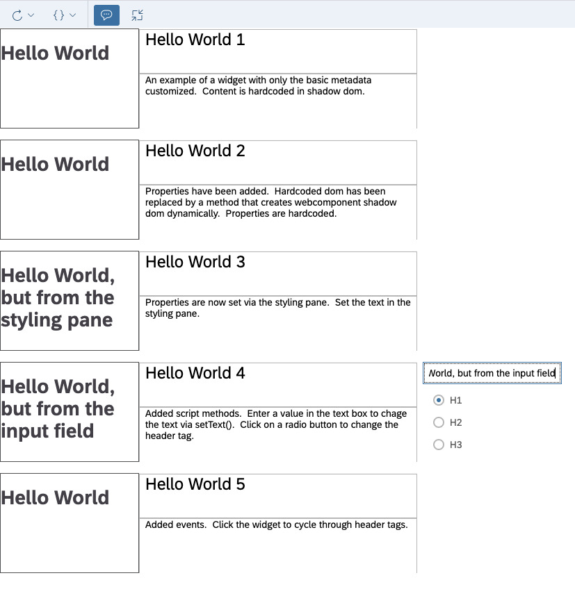
- Step 0 (this post) - We’ll be taking a 10,000 ft view of the widget and walking through their structure.
- Step 1 – We’ll do the bare minimum required to get a widget into an app. It won’t do anything, but you’ll have a widget. The content will be hardcoded into the shadow DOM. It won’t actually DO much, but this exercise will demonstrate the boilerpate and workflow that every widget needs.
- Step 2 – You’ll make slight edits in preparation for later changes. You’ll still be showing the same hardcoded HTML, but you’ll be doing it from JavaScript and be ready to start making it dynamic.
- Step 3 – You’ll set up an input field for the text field in the styling panel. With this, you will learn what is required to make your widget configurable in the styling and builder panels.
Step 4 – You add a script API, which will be able to set the header tag (h1-h3), get the current hX tag and set the text value via script. With this, you will learn how to create API methods that do and don’t have input parameters and also set up ones that return a value. - Step 5 – You’ll let the viewer cycle through the hX tags when the widget is clicked. With this, you’ll learn how to declare scripting events and how to tie browser events to script events.
Together, the results will look something like this…
The Structure of a Widget
A widget has at least two parts and possibly up to four.
- Metadata – A JSON file, which is uploaded to the tenant. It defines everything that SAC needs to know about a widget; how it is identified, its properties, events, methods, and where the web component implementation can be found. This file is required.
- The “main” web component - A JavaScript file, containing the implementation of the of the web component in the application canvas. This file is required and needs to be visible to the end user, as their browser will be told to fetch it when this widget is encountered in an app. Where it is hosted is up to the developer. E.g. a partner or community member implementing it for use by many customers may want to host it on their favorite cloud platform, while a customer implementing a widget for internal use might just want to run a Node.js server with htttp-server to host it internally.
- An optional “styling” web component – If you elect to extend the styling pane, this Javascript file is where you’d define the content that you’ll be adding to the styling pane. The styling pane can be synchronised with the widget properties.
- An optional “builder” web component – Like the styling web component, but for the builder panel. Having both options lets you allocate your design panel widget configuration tasks to the panel that fits best.
At runtime, the URL that the browser needs to get the web components from is passed to the browser, which then requests the JavaScript file from its host web server.
The Custom Widget Start Template
In principle, you can write your entire widget from scratch. You could also modify an existing project. I’ve created a template project for speeding this process up. It is available on my personal github profile, here. It contains minimal stubs for the metadata JSON, a main sheet web component stub and a design panel web component stub. It is a github template repository, so you can easily create a new project from it.
- rename_me_i_am_a_template.json – this is your metadata file. You will of course want to rename it.
- webcomponent.js – this is your main sheet web component.
- aps_webcomponent.js – this is a stub web component for the builder or styling pane. APS is short for “Additional Properties Sheet”. Those of you with experience building custom components for Design Studio and Lumira Designer may recognise this term. The areas of the builder and styling pane that you can work in are functionally similar to the additional properties sheet of Lumira Designer.
The Metadata Structure
Have a look at rename_me_i_am_a_template.json
{

	"name": "Hello World",

	"description": "Custom Widget Template",

	"eula": "",

	"vendor": "Who created me?",

	"license": "",

	"id": "com.sap.sample.template.0",

	"newInstancePrefix": "WidetTemplate",

	"version": "0.0.1",

	"icon": "data:image/png;base64,iVBORw0KGgoAAAANSUhEUgAAABAAAAAQCAMAAAAoLQ9TAAAAA3NCSVQICAjb4U/gAAAAb1BMVEX///+ZmZl4dXdBPj9hYGGOjpE6ODo8OjwvLC0lISIpJSaMiooyLzH/cjMxLi9GREb/ZSk2MzV9fX1MSks4NjcrJyn/WR9ycnJRT1AtKiv/TRVdXF1ra2v7VCfJyMk+PD6tra+rqqtUUlU0MTNqaGpjxDg2AAAAAXRSTlMAQObYZgAAAAlwSFlzAAAOxAAADsQBlSsOGwAAAKhJREFUGNM9z9EagiAMBeDpEGkWNAGhqFTq/Z8xwK/+q7PtZgeg6npEMcBPJ0d1Kmg6ZnFGRZcLESnR7tpoouuVSCPPZYHWee+XxTsrvQeYQrwV97tL5uZigMeoqucTUSnWEVBX4fWaW2BYz1W3bXsLDPldcD8MoYZ3glmMjNbGLJk5igDgnLTGHazdAPo1Gdms2bZXhRmbMuNR5rNWJuX075sMYg57jV94IQ2Xqt1atQAAAABJRU5ErkJggg==",

	"webcomponents": [

    ],

	"properties": {

	},

	"methods": {

	},

	"events": {

	}

}
The first few items are self explanatory and you can do what you will. The “name” and “description” elements determine what the designer sees in the widget palette. A couple of the single field elements are of special note:
- “id” – In principle, you can put anything here that you want. This is the technical identifier for the widget. It is a good best practice to tack the major version on to the end. This way, if you ship a major version upgrade, users can run them side by side and they won’t interfere with each other.
- “newInstancePrefix” – This determines the default ID of the widget. So if you leave it as “WidgetTemplate”, your widgets will be called “WidgetTemplate_01”, “WidgetTemplate_02”, etc.
- “icon” – This is the URL pointing to the icon image. This could be a URL, such as http://somewhere/something.png. Alternatively, it could also be a Data URL, which packs the icon image encoding right into the URL and no hosting is needed. The template uses a Data URL to show how they are crafted.
- The webcomponents element contains the metadata that the widget needs for accessing and using the web component JavaScript files. In the course of this tutorial series, you will add two child elements to this element.
- The properties element is where your properties will go.
- The methods element is where the script API method definitions will go. All widgets have a handful of standard script methods. This element allows you to define the script commands that you want to have available to your widget.
- The events method defines the script events that you’ll want your widget to have.
The web component structure
In this file, you’ll define the web component template and you implement your custom tag. The Javascript class that you’ll implement will extend is HTML Element.
Have a look at the hardcoded template.
    let tmpl = document.createElement('template');

    tmpl.innerHTML = `

      <style>

      </style>

    `;
The string that currently has the style tag is going to go into the shadow DOM. Right now, it is just an empty css styling tag. This is your HTML document, which you can work with . It can be hardcoded (here in this string) or dynamic, or a hybrid. In initial exercises, you’ll hardcode your shadow DOM and later you’ll manipulate it dynamically.
Have a look in the custom elements definition.
(function()  {

    let tmpl = document.createElement('template');

    tmpl.innerHTML = `

        <h1>Hello World</h1>

    `;


    customElements.define('com-sap-sample-helloworld1', class HelloWorld1 extends HTMLElement {


		constructor() {

			super();

			this._shadowRoot = this.attachShadow({mode: "open"});

            this._shadowRoot.appendChild(tmpl.content.cloneNode(true));

		}


        //Fired when the widget is added to the html DOM of the page

        connectedCallback(){

        }


         //Fired when the widget is removed from the html DOM of the page (e.g. by hide)

        disconnectedCallback(){


        }


         //When the custom widget is updated, the Custom Widget SDK framework executes this function first

		onCustomWidgetBeforeUpdate(oChangedProperties) {


		}


        //When the custom widget is updated, the Custom Widget SDK framework executes this function after the update

		onCustomWidgetAfterUpdate(oChangedProperties) {

            this.redraw();

        }


        //When the custom widget is removed from the canvas or the analytic application is closed

        onCustomWidgetDestroy(){

        }


        //When the custom widget is resized on the canvas, the Custom Widget SDK framework executes the following JavaScript function call on the custom widget

        // Commented out by default

        /*

        onCustomWidgetResize(width, height){

        }

        */


        redraw(){}

    });

})();
I’d first like to draw your attention to the first parameter, which reads 'com-sap-sample-template'. This is the name of the HTML tag that you are implementing and if you look at a running app in the browser’s developer tools, that’s the tag you’ll see. Note! We don’t do it in this tutorial, but for productive widgets, we recommend that you add the major version number to the end to differentiate simultaneously installed major version releases.
Now look at the method definitions inside. There are certain methods that you can implement to respond to system life cycle callbacks.
- constructor() – this is a standard web components callback and is called once, at initial widget instantiation. In our template, it is where we attach out template to the shadow DOM. Later on, we’ll do a bit more housekeeping here.
- connectedCallback() – this a standard web components callback and is fired whenever the widget is added to the HTML DOM. It should not be confused with the constructor(), which is fired the first time only. This callback is fired every time. So if the page where your widget lives is brought into focus and the widget is added to the DOM, this event will fire.
- disconnectedCallback() – is fired when the widget is deleted from the DOM; such as when the panel that is lives in is closed, the user switched to another page, etc.
- onCustomWidgetBeforeUpdate() and onCustomWidgetAfterUpdate() – these callbacks fire when properties are changed (via script or via panel). One of the events is obviously executed before the property change is applied and the other after the change happens.
- onCustomWidgetBeforeUpdate(oChangedProperties) - When properties are changed, this callback is called BEFORE they are actually changed.
- onCustomWidgetAfterUpdate(oChangedProperties) - When properties are changed, this callback is called AFTER they are actually changed.
- onCustomWidgetDestroy() – the mirror image of constructor().
- onCustomWidgetResize(width, height) – this callback is fired whenever the widget is resized when it is active. So if it is currently hidden when the sheet is resized for example, it won’t fire. You may want to re-check dimensions in the connectedCallback event as well(). If you don't need it, we suggest commenting it out to save CPU. If it is enabled, SAP Analytics cloud will track DOM size changes and call this method as needed.
- redraw() – this method is not a custom widget framework callback. I included a stub to this method in the template, because this is the pattern that I use in my own widgets. There are many callbacks that could trigger re-rendering; so I centralise the redraw in a single method and call that method whenever I need to update the widget in the canvas.
Styling Panel Web Component Structure
You might notice something with the styling panel template code.
(function() {

	let template = document.createElement("template");

	template.innerHTML = `

		<style>

		</style>

	`;


	class HelloWorldAps extends HTMLElement {

		constructor() {

			super();

			this._shadowRoot = this.attachShadow({mode: "open"});

			this._shadowRoot.appendChild(template.content.cloneNode(true));

		}


        //Fired when the widget is added to the html DOM of the page

        connectedCallback(){

            this.redraw();

        }


         //Fired when the widget is removed from the html DOM of the page (e.g. by hide)

        disconnectedCallback(){


        }


         //When the custom widget is updated, the Custom Widget SDK framework executes this function first

		onCustomWidgetBeforeUpdate(oChangedProperties) {


		}


        //When the custom widget is updated, the Custom Widget SDK framework executes this function after the update

		onCustomWidgetAfterUpdate(oChangedProperties) {


        }


        //When the custom widget is removed from the canvas or the analytic application is closed

        onCustomWidgetDestroy(){


        }


        redraw(


        );


	}


customElements.define("com-sap-sample-template'-aps", HelloWorldAps);

})();
It is basically the same thing as the main webcomponent. It only differs in that the HTML tag is different and the onCustomWidgetResize() callback is missing. Note! If you implement both styling and builder panels, make sure that the tags are unique.
This is a tour of the template and the basic pattern that custom widgets will use. Next time, we'll take this template and get it into SAP Analytics Cloud as a custom widget.
- SAP Managed Tags:
- SAP Analytics Cloud,
- SAP Analytics Cloud, analytics designer
Labels:
8 Comments
You must be a registered user to add a comment. If you've already registered, sign in. Otherwise, register and sign in.
Labels in this area
-
ABAP CDS Views - CDC (Change Data Capture)
2 -
AI
1 -
Analyze Workload Data
1 -
BTP
1 -
Business and IT Integration
2 -
Business application stu
1 -
Business Technology Platform
1 -
Business Trends
1,661 -
Business Trends
87 -
CAP
1 -
cf
1 -
Cloud Foundry
1 -
Confluent
1 -
Customer COE Basics and Fundamentals
1 -
Customer COE Latest and Greatest
3 -
Customer Data Browser app
1 -
Data Analysis Tool
1 -
data migration
1 -
data transfer
1 -
Datasphere
2 -
Event Information
1,400 -
Event Information
64 -
Expert
1 -
Expert Insights
178 -
Expert Insights
273 -
General
1 -
Google cloud
1 -
Google Next'24
1 -
Kafka
1 -
Life at SAP
784 -
Life at SAP
11 -
Migrate your Data App
1 -
MTA
1 -
Network Performance Analysis
1 -
NodeJS
1 -
PDF
1 -
POC
1 -
Product Updates
4,577 -
Product Updates
324 -
Replication Flow
1 -
RisewithSAP
1 -
SAP BTP
1 -
SAP BTP Cloud Foundry
1 -
SAP Cloud ALM
1 -
SAP Cloud Application Programming Model
1 -
SAP Datasphere
2 -
SAP S4HANA Cloud
1 -
SAP S4HANA Migration Cockpit
1 -
Technology Updates
6,886 -
Technology Updates
402 -
Workload Fluctuations
1
Related Content
- SAC Custom Widget for Uploading a load file(.xls) customization using Data Import API in Technology Q&A
- What’s New in SAP Analytics Cloud Release 2024.08 in Technology Blogs by SAP
- SAP Successfactors Implementation and Maintenance in Projects in 2024 in Technology Blogs by Members
- Sneak Peek in to SAP Analytics Cloud release for Q2 2024 in Technology Blogs by SAP
- Deep dive into Q4 2023, What’s New in SAP Cloud ALM for Implementation Blog Series in Technology Blogs by SAP
Top kudoed authors
| User | Count |
|---|---|
| 12 | |
| 9 | |
| 7 | |
| 7 | |
| 7 | |
| 7 | |
| 6 | |
| 6 | |
| 6 | |
| 4 |