Introduction
With November 2019 (1911) release, HTML5 client is discontinued. Business users and key user now need to use the Fiori Client UI (aka Responsive UI – RUI).
The transition was announced earlier. Over the course of few releases this year, multiple features of key user adaptation were released.
In this blog, I shall dig deep into what’s available for Key Users in Fiori Client, how it differs from earlier HTML5 client, limitations and new upcoming features in the next release.
Note: I will be using the term Key User and Administrators inter changeably.
You can also just to further parts of blogs using the following links.
https://blogs.sap.com/2019/11/15/key-user-extensi…ri-client-part-2/
https://blogs.sap.com/2019/11/15/key-user-extensi…ri-client-part-3/
https://blogs.sap.com/2019/11/15/key-user-extensi…ri-client-part-4/
Switch on adaptation
The first change that you, as a key user would notice is that the adaptation needs to be switch on in individual tenants. This setting is required to “protect” certain tenants like productive tenants, from unwanted key user changes. Customers can decide which tenant in their landscape is the primary tenant for key user changes and can use the Transport Management feature to move the changes from this tenant.
You can switch on adaptation in Fiori under User Profile à Settings


Once you have switched on adaptation, refresh the browser and you will see a new option under user profile to Start Adaptation.
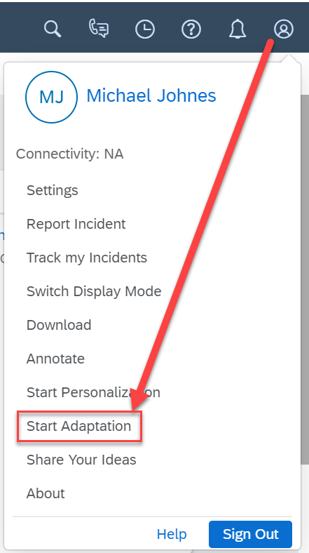
Note: If you don’t see the ‘Start Adaptation’ option, most likely your user had a PDI work center assigned to its role. You need to remove the work center assignment from the user’s role to be able to use adaptation.
Navigation in the Side Panel
Once you start adaptation, you see the next significant change which is the side panel navigation on the right hand side of the screen. You will also see a red border with a icon around the list if you are on the Data Set (OWL) screen or around the tabs if you are on the Details (Thing Inspector) screen.
The red border with the

icon indicates the current selection of screen element and any change would apply to the selected screen element. You can also select another section with the blue border by clicking on the

icon and make changes to that screen element. For example, you select the

around header or the products table to make changes.

You can use the

to navigate further into the other sections within the header.

The other short cut is to right click on the field and then directly jump to the field level configuration.
Next two parts of blog contain various how-to guides to perform different tasks as a key user.


