
- SAP Community
- Products and Technology
- Technology
- Technology Blogs by Members
- How can I use weather data in SAP Analytics Cloud?
Technology Blogs by Members
Explore a vibrant mix of technical expertise, industry insights, and tech buzz in member blogs covering SAP products, technology, and events. Get in the mix!
Turn on suggestions
Auto-suggest helps you quickly narrow down your search results by suggesting possible matches as you type.
Showing results for
former_member25
Explorer
Options
- Subscribe to RSS Feed
- Mark as New
- Mark as Read
- Bookmark
- Subscribe
- Printer Friendly Page
- Report Inappropriate Content
10-18-2019
10:25 PM
Since nearly all businesses understand that weather influences their business, a frequent question arises: How can I load weather data into SAP Analytics Cloud and use it to better analyze my business data? The benefits of finding weather correlations with business data are obvious – intelligent inventory management, better logistics planning, timely advertising opportunities, and dynamic human resource scheduling just to name a few. However, the process of getting, cleaning, loading, and updating weather data in a business intelligence system has traditionally been daunting. In this article, we’ll show you the benefits of using weather analysis with business data and walk you step-by-step through the process of getting weather data blended with your business data.
Although it is possible to obtain and process weather data yourself using various governmental and commercial sources from around the world, using an integrated weather data API is a far easier, less risky, and less costly option. Weather data APIs represents the state of the art in weather data for business analysts in several ways. They provide a single, high-performance API to access both historical weather and weather forecasts globally. This allows you to use a single infrastructure and single API to access data for business locations both around the corner and on the other side of the world. Compiling both historical weather sources and worldwide weather forecasts is a difficult challenge. So most homegrown and lesser solutions don’t provide historical weather data at all. However, since historical weather is the key to finding patterns and correlations, a data source that fails to provide historical data is much less useful in business intelligence and analyst application. So, selecting a source such as Visual Crossing Weather that can be a "one stop shop" for all of your weather data needs, bring immediate value to any weather project.
In addition, other weather data sources can be difficult by requiring users to download and parse extremely large datasets in order to analyze a few specific locations. And even then, the data user is often responsible for finding the best weather station nearest to the desired business location. It is an open secret in the weather data world that weather reporting stations frequently go offline for periods while others report conflicting data. Full-function weather APIs such as Visual Crossing Weather, Weather Underground, and Open Weather Map cleans and filters the data and then uses interpolation algorithms to find the best weather match for any given location. Stations that don’t report in a given period are automatically filtered out. Stations reporting erroneous or internally conflicting data are automatically corrected or homogenized based on reasonable norms and by comparison with other local stations.
Depending upon your business having a variety of weather metrics is often important as well. Weather APIs such Weather provides not only traditional weather metrics such as temperature and rainfall, but also some that are less common but have high business value. Metrics such as heat index can often influence the actions of customers involved in physical activity. If your weather interests include more sky-dependent activities, then metrics such as cloud cover and precipitation coverage may be important. In short, having a large variant of weather metrics allows you analyze your business in relation to any of these metrics and intelligently determine which ones have the most impact for you.
The first step in using a weather API is to create a weather query. In this example, we will use the Visual Crossing Weather data to provide the weather data. You will need to identify the locations for which you need weather analysis and the time period that matches your business data. As an example, we’ll consider demo data built around the sales data of a worldwide ice cream vendor. This sample data contains sales information for twenty-three leading cities around the globe for the year 2018. You can download the example data at the end of this article and follow along as you read if you wish.
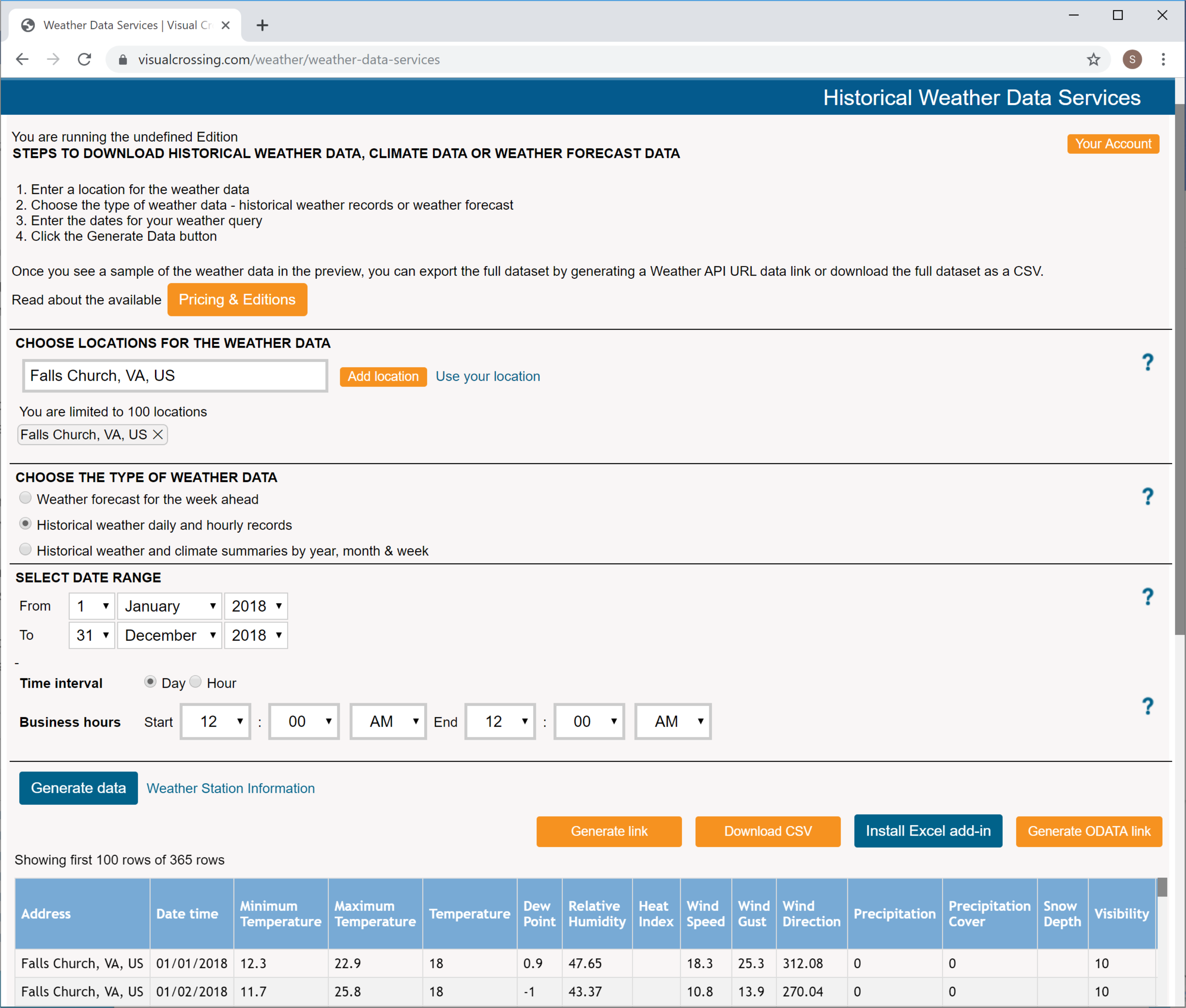
If you are following along using the Visual Crossing Weather query page you will first need to log in. If you don’t already have an account you can sign up for a free trial. Simply click on the “Sign up” link in the upper right. You can then enter the locations for your weather query. In this example we will enter the locations for our cities. Luckily, we only need to do this one time, since we can rerun the same query as many times as desired after we have defined it. Likewise, we will enter the date range that we wish to analyze. For our example data, the starting date is January 1, 2018 and the ending date December 31, 2018. For the other options, we can accept the defaults because we want to fetch historical results and have the data aggregated at the daily level. For a more sophisticated analysis we may want to consider setting specific business hours for filtering the weather records. However, since our later analysis below is going to be based primarily on the daily heat index, setting custom business hours isn’t necessary for our simple example.
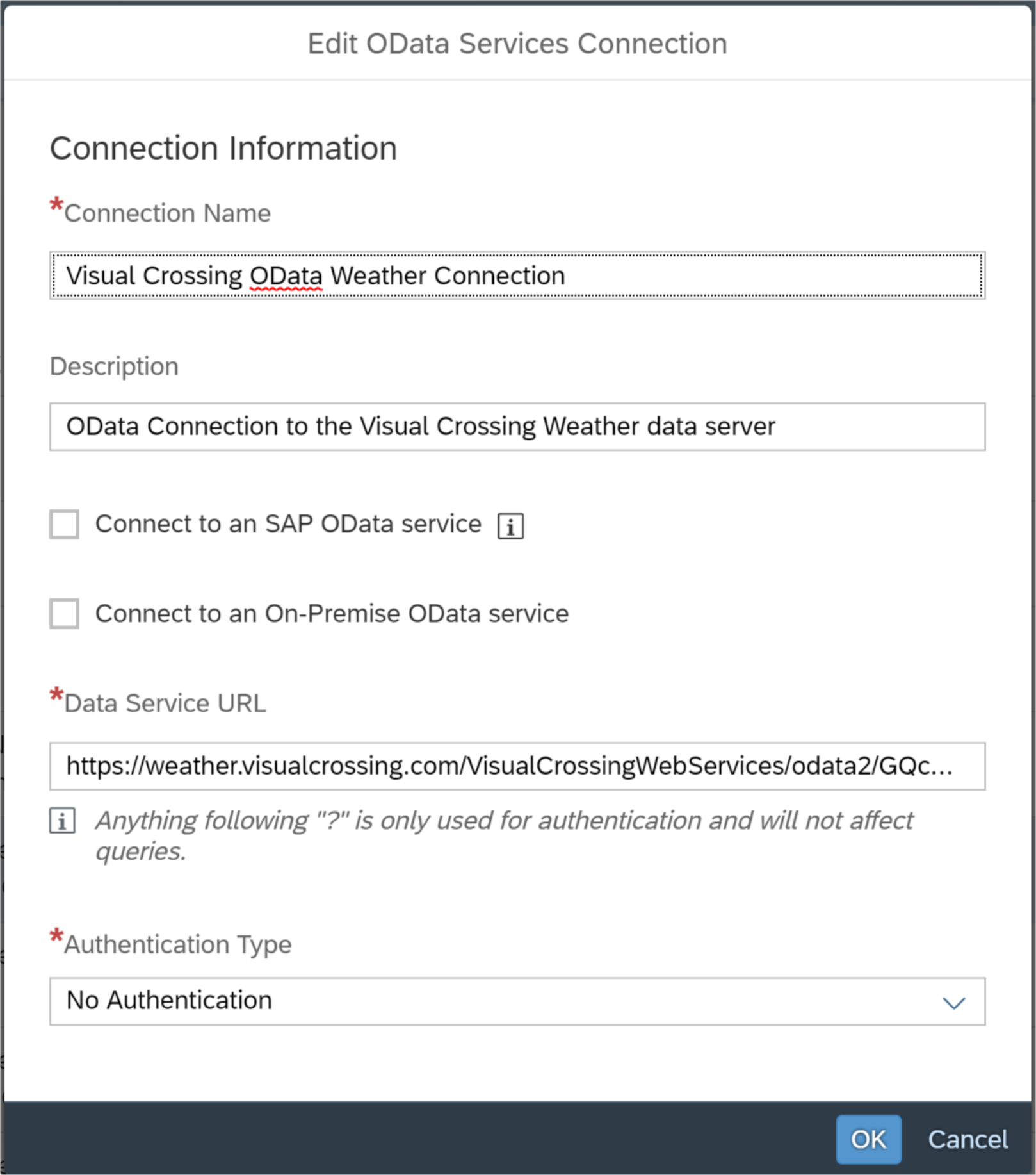
Once we have formulated our query, we can test it by clicking on the “Generate data” button near the bottom of the page. This button will run the query and show a preview of the output data in a new grid at the bottom of the page. If the preview looks to be correct, we are ready to copy it for inclusion in SAC. To do so, simply click on the “Generate OData” option above the sample grid and in the popup window click “Copy to clipboard” to copy the query string. Our query is now ready to use directly in SAC.
The second step of the configuration process is to create a new Data Model that combines both the weather data and the business data into a single Data Model. It is worth noting here that there are various ways to set up and join data weather data with your business data in SAC. In this example, we will discuss the most robust option, and that option is creating a joined Data Model. A primary advantage of this approach is that once the joined model is created, it can be reused in any Story, Analytic Application, or Digital Boardroom application by any author. However, there are other configuration options that may be useful depending upon the application and desired use case. For example, you can choose to import the weather data as a stand-alone Data Model where this new Data Model contains no business data and only weather data. You can then use the data merging functionality in an SAC story to build the combined dataset. For the sake of this example, we will showcase using a single, merged Data Model option, but you may want to consider all of the options when designing a production application.
Begin this step by asking SAC to create a new Data Model base on the OData Connection that we created above. SAC will ask about the columns that you want to import in your query. For this example, you can select all of the columns for ease or filter down to only the Location and Heat Index columns since those are the ones that we will be using to create our example Story below. While you are still experimenting with weather data, I would recommend that you select all of the weather data columns. However, when you are making production applications, it is typically better to filter the number of columns to reduce the overhead of carrying around unused data.
Once in the SAC Model editor, you will see a preview of the weather data that was loaded from your query. This data will match the preview grid that you saw in the Visual Crossing query editor. In order to join in the sample ice sream sales business data, select the Combine Data option from the Actions toolbar. In the real world, we would already have business data available and modeled in SAC. So in that case we would select the Data Model containing the business data that wish to analyze. However, in this article we will use sample data. You can find a link to this data at the bottom of this article. If you are following along, download the file to your local computer. Then select the option to load the data from a local file and point SAC at that newly downloaded file.
SAC will now show the Combine Data settings page. This is the page where we tell SAC how to do the join between the business data and the weather data. There are two key columns to match in this example. The first is “Address”. Select that in both datasets and SAC will wire the join and signal its approval in the preview window on the right. The second matching column is “Date Time”. Select that in both datasets and SAC will again signal its approval.

If you look at the grid at the bottom of the Combine Data settings page, you will see that SAC has now created the useful dataset that we desire. That is, we have weather conditions and ice cream sales by date joined together on the same grid. The final step is to tell SAC how to aggregate the metrics on our combined dataset. This is required because SAC defaults to doing “sum” aggregations for all values. This works fine for values such as our ice cream sales metric that we want to add together when shown over multiple areas or times. However, sums do not make sense for certain weather metrics. For example, the sum of heat index over times or locations is meaningless. In this example, we want to show the average when aggregated. It is worth noting, however, that in some analysis use cases we may want to aggregate based on other functions such as “maximum” or “minimum”. So, in your production application, think carefully about how your users will want to see any given weather metric aggregated and make sure that you select the appropriate aggregation function.
To affect this change from “sum” to “average”, simple go into the metric lists for this Model. You will see all of the available metrics including both the weather metrics and the ice cream sales. In our example Story we will be working with Heat Index. So, select the Heat Index metric and set it to have an Exceptional Aggregation type of “Average”. Optionally, if you wish to explore this dataset beyond the example in this article, you can also modify the other appropriate weather metrics to aggregate to Average as well. Note also that you can go back and edit this Model and change the aggregation functions at any time.
Finish the process by hitting the Combine button, and SAC will return to the Model editor. And then finish this step by giving your new Model a name and saving it.
After laying the infrastructure, we are now ready to make a Story to show our business data combined with weather. Just like the creation of any other SAC Story, simply go into the Story creator and select as the data source the combined Data Model that you just created. First, we’ll make a line graph that shows how ice cream sales vary around the world based on the daily heat index. For this example we chose heat index based on the logic that people’s desire for ice cream is directly related to how hot the day feels to them. Thus, since heat index combines both temperature and humidity, it is a great metric to describe how hot people perceive the day to be.
To complete this example, add a line graph to your new Story. For the Left Y-axis select the Heat Index metric. For the Right Y-axis select the Ice Cream Sale metric. For the Dimension, select the Address. You may also want to change the color scheme to make the two lines more distinct. SAC will show a graph like the one below.

From this graph you can see a basic correlation between ice cream sales and the heat index in our sample data cities. If you would like to analyze this data further by individual date, you can add the Date Time Dimension to the graph. However, if you do that directly the X-axis of our graph will become unreadable due to the large number of dates in 2018. To fix this, simply add a location or a date filter to the Story. Of course, this is just the beginning of the Story options that we can consider when presenting this data. At this point you are limited only by the Story controls in SAC and your own imagination. You can make all manner of complex Stories and Applications.

I hope that this article is just the beginning of your weather exploration. If you want to explore the sample data more, you can start by experimenting with weather metrics other than heat index. Is there a relationship between ice cream sales and precipitation, for example? However, the real value begins when you use your own business data to find weather correlations. Doing this is just as easy as following the example above, and following this article should have given you to knowledge and confidence needed. Simply create a weather query, create an SAC Connection based on the Visual Crossing Weather URL, create a Data Model based on that connection, and then join in your business data. Follow this simple process and you will be analyzing your business data with weather metrics in a matter of minutes.
If you have questions or run into trouble with your weather project, I’ll be happy to help. Post your questions and comments below or send me an email. Whether you are using Visual Crossing weather or another service, I’m sure that adding weather data into SAP Analytics Cloud will bring significant value to your business analysis.
Link to the data used in this article http://www.visualcrossing.com/weather/SampleData/Worldwide_Cities_Daily_BI_Data.xlsx
State of the Art Weather Data
Although it is possible to obtain and process weather data yourself using various governmental and commercial sources from around the world, using an integrated weather data API is a far easier, less risky, and less costly option. Weather data APIs represents the state of the art in weather data for business analysts in several ways. They provide a single, high-performance API to access both historical weather and weather forecasts globally. This allows you to use a single infrastructure and single API to access data for business locations both around the corner and on the other side of the world. Compiling both historical weather sources and worldwide weather forecasts is a difficult challenge. So most homegrown and lesser solutions don’t provide historical weather data at all. However, since historical weather is the key to finding patterns and correlations, a data source that fails to provide historical data is much less useful in business intelligence and analyst application. So, selecting a source such as Visual Crossing Weather that can be a "one stop shop" for all of your weather data needs, bring immediate value to any weather project.
In addition, other weather data sources can be difficult by requiring users to download and parse extremely large datasets in order to analyze a few specific locations. And even then, the data user is often responsible for finding the best weather station nearest to the desired business location. It is an open secret in the weather data world that weather reporting stations frequently go offline for periods while others report conflicting data. Full-function weather APIs such as Visual Crossing Weather, Weather Underground, and Open Weather Map cleans and filters the data and then uses interpolation algorithms to find the best weather match for any given location. Stations that don’t report in a given period are automatically filtered out. Stations reporting erroneous or internally conflicting data are automatically corrected or homogenized based on reasonable norms and by comparison with other local stations.
Depending upon your business having a variety of weather metrics is often important as well. Weather APIs such Weather provides not only traditional weather metrics such as temperature and rainfall, but also some that are less common but have high business value. Metrics such as heat index can often influence the actions of customers involved in physical activity. If your weather interests include more sky-dependent activities, then metrics such as cloud cover and precipitation coverage may be important. In short, having a large variant of weather metrics allows you analyze your business in relation to any of these metrics and intelligently determine which ones have the most impact for you.
Implementation for SAP Analytics Cloud Users
The first step in using a weather API is to create a weather query. In this example, we will use the Visual Crossing Weather data to provide the weather data. You will need to identify the locations for which you need weather analysis and the time period that matches your business data. As an example, we’ll consider demo data built around the sales data of a worldwide ice cream vendor. This sample data contains sales information for twenty-three leading cities around the globe for the year 2018. You can download the example data at the end of this article and follow along as you read if you wish.
Weather API Query Page
If you are following along using the Visual Crossing Weather query page you will first need to log in. If you don’t already have an account you can sign up for a free trial. Simply click on the “Sign up” link in the upper right. You can then enter the locations for your weather query. In this example we will enter the locations for our cities. Luckily, we only need to do this one time, since we can rerun the same query as many times as desired after we have defined it. Likewise, we will enter the date range that we wish to analyze. For our example data, the starting date is January 1, 2018 and the ending date December 31, 2018. For the other options, we can accept the defaults because we want to fetch historical results and have the data aggregated at the daily level. For a more sophisticated analysis we may want to consider setting specific business hours for filtering the weather records. However, since our later analysis below is going to be based primarily on the daily heat index, setting custom business hours isn’t necessary for our simple example.
Once we have formulated our query, we can test it by clicking on the “Generate data” button near the bottom of the page. This button will run the query and show a preview of the output data in a new grid at the bottom of the page. If the preview looks to be correct, we are ready to copy it for inclusion in SAC. To do so, simply click on the “Generate OData” option above the sample grid and in the popup window click “Copy to clipboard” to copy the query string. Our query is now ready to use directly in SAC.
SAP Analytics Cloud OData Connection Configuration Page
The second step of the configuration process is to create a new Data Model that combines both the weather data and the business data into a single Data Model. It is worth noting here that there are various ways to set up and join data weather data with your business data in SAC. In this example, we will discuss the most robust option, and that option is creating a joined Data Model. A primary advantage of this approach is that once the joined model is created, it can be reused in any Story, Analytic Application, or Digital Boardroom application by any author. However, there are other configuration options that may be useful depending upon the application and desired use case. For example, you can choose to import the weather data as a stand-alone Data Model where this new Data Model contains no business data and only weather data. You can then use the data merging functionality in an SAC story to build the combined dataset. For the sake of this example, we will showcase using a single, merged Data Model option, but you may want to consider all of the options when designing a production application.
Begin this step by asking SAC to create a new Data Model base on the OData Connection that we created above. SAC will ask about the columns that you want to import in your query. For this example, you can select all of the columns for ease or filter down to only the Location and Heat Index columns since those are the ones that we will be using to create our example Story below. While you are still experimenting with weather data, I would recommend that you select all of the weather data columns. However, when you are making production applications, it is typically better to filter the number of columns to reduce the overhead of carrying around unused data.
Once in the SAC Model editor, you will see a preview of the weather data that was loaded from your query. This data will match the preview grid that you saw in the Visual Crossing query editor. In order to join in the sample ice sream sales business data, select the Combine Data option from the Actions toolbar. In the real world, we would already have business data available and modeled in SAC. So in that case we would select the Data Model containing the business data that wish to analyze. However, in this article we will use sample data. You can find a link to this data at the bottom of this article. If you are following along, download the file to your local computer. Then select the option to load the data from a local file and point SAC at that newly downloaded file.
SAC will now show the Combine Data settings page. This is the page where we tell SAC how to do the join between the business data and the weather data. There are two key columns to match in this example. The first is “Address”. Select that in both datasets and SAC will wire the join and signal its approval in the preview window on the right. The second matching column is “Date Time”. Select that in both datasets and SAC will again signal its approval.
SAC Combine Data Configuration Page
If you look at the grid at the bottom of the Combine Data settings page, you will see that SAC has now created the useful dataset that we desire. That is, we have weather conditions and ice cream sales by date joined together on the same grid. The final step is to tell SAC how to aggregate the metrics on our combined dataset. This is required because SAC defaults to doing “sum” aggregations for all values. This works fine for values such as our ice cream sales metric that we want to add together when shown over multiple areas or times. However, sums do not make sense for certain weather metrics. For example, the sum of heat index over times or locations is meaningless. In this example, we want to show the average when aggregated. It is worth noting, however, that in some analysis use cases we may want to aggregate based on other functions such as “maximum” or “minimum”. So, in your production application, think carefully about how your users will want to see any given weather metric aggregated and make sure that you select the appropriate aggregation function.
To affect this change from “sum” to “average”, simple go into the metric lists for this Model. You will see all of the available metrics including both the weather metrics and the ice cream sales. In our example Story we will be working with Heat Index. So, select the Heat Index metric and set it to have an Exceptional Aggregation type of “Average”. Optionally, if you wish to explore this dataset beyond the example in this article, you can also modify the other appropriate weather metrics to aggregate to Average as well. Note also that you can go back and edit this Model and change the aggregation functions at any time.
Finish the process by hitting the Combine button, and SAC will return to the Model editor. And then finish this step by giving your new Model a name and saving it.
Story Time
After laying the infrastructure, we are now ready to make a Story to show our business data combined with weather. Just like the creation of any other SAC Story, simply go into the Story creator and select as the data source the combined Data Model that you just created. First, we’ll make a line graph that shows how ice cream sales vary around the world based on the daily heat index. For this example we chose heat index based on the logic that people’s desire for ice cream is directly related to how hot the day feels to them. Thus, since heat index combines both temperature and humidity, it is a great metric to describe how hot people perceive the day to be.
To complete this example, add a line graph to your new Story. For the Left Y-axis select the Heat Index metric. For the Right Y-axis select the Ice Cream Sale metric. For the Dimension, select the Address. You may also want to change the color scheme to make the two lines more distinct. SAC will show a graph like the one below.
SAC Story with simple line graph
From this graph you can see a basic correlation between ice cream sales and the heat index in our sample data cities. If you would like to analyze this data further by individual date, you can add the Date Time Dimension to the graph. However, if you do that directly the X-axis of our graph will become unreadable due to the large number of dates in 2018. To fix this, simply add a location or a date filter to the Story. Of course, this is just the beginning of the Story options that we can consider when presenting this data. At this point you are limited only by the Story controls in SAC and your own imagination. You can make all manner of complex Stories and Applications.
Where Do You Go From Here?
I hope that this article is just the beginning of your weather exploration. If you want to explore the sample data more, you can start by experimenting with weather metrics other than heat index. Is there a relationship between ice cream sales and precipitation, for example? However, the real value begins when you use your own business data to find weather correlations. Doing this is just as easy as following the example above, and following this article should have given you to knowledge and confidence needed. Simply create a weather query, create an SAC Connection based on the Visual Crossing Weather URL, create a Data Model based on that connection, and then join in your business data. Follow this simple process and you will be analyzing your business data with weather metrics in a matter of minutes.
If you have questions or run into trouble with your weather project, I’ll be happy to help. Post your questions and comments below or send me an email. Whether you are using Visual Crossing weather or another service, I’m sure that adding weather data into SAP Analytics Cloud will bring significant value to your business analysis.
Link to the data used in this article http://www.visualcrossing.com/weather/SampleData/Worldwide_Cities_Daily_BI_Data.xlsx
- SAP Managed Tags:
- SAP Analytics Cloud,
- SAP BusinessObjects Design Studio,
- SAP Data Visualization
6 Comments
You must be a registered user to add a comment. If you've already registered, sign in. Otherwise, register and sign in.
Labels in this area
-
"automatische backups"
1 -
"regelmäßige sicherung"
1 -
505 Technology Updates 53
1 -
ABAP
14 -
ABAP API
1 -
ABAP CDS Views
2 -
ABAP CDS Views - BW Extraction
1 -
ABAP CDS Views - CDC (Change Data Capture)
1 -
ABAP class
2 -
ABAP Cloud
2 -
ABAP Development
5 -
ABAP in Eclipse
1 -
ABAP Platform Trial
1 -
ABAP Programming
2 -
abap technical
1 -
access data from SAP Datasphere directly from Snowflake
1 -
Access data from SAP datasphere to Qliksense
1 -
Accrual
1 -
action
1 -
adapter modules
1 -
Addon
1 -
Adobe Document Services
1 -
ADS
1 -
ADS Config
1 -
ADS with ABAP
1 -
ADS with Java
1 -
ADT
2 -
Advance Shipping and Receiving
1 -
Advanced Event Mesh
3 -
AEM
1 -
AI
7 -
AI Launchpad
1 -
AI Projects
1 -
AIML
9 -
Alert in Sap analytical cloud
1 -
Amazon S3
1 -
Analytical Dataset
1 -
Analytical Model
1 -
Analytics
1 -
Analyze Workload Data
1 -
annotations
1 -
API
1 -
API and Integration
3 -
API Call
2 -
Application Architecture
1 -
Application Development
5 -
Application Development for SAP HANA Cloud
3 -
Applications and Business Processes (AP)
1 -
Artificial Intelligence
1 -
Artificial Intelligence (AI)
4 -
Artificial Intelligence (AI) 1 Business Trends 363 Business Trends 8 Digital Transformation with Cloud ERP (DT) 1 Event Information 462 Event Information 15 Expert Insights 114 Expert Insights 76 Life at SAP 418 Life at SAP 1 Product Updates 4
1 -
Artificial Intelligence (AI) blockchain Data & Analytics
1 -
Artificial Intelligence (AI) blockchain Data & Analytics Intelligent Enterprise
1 -
Artificial Intelligence (AI) blockchain Data & Analytics Intelligent Enterprise Oil Gas IoT Exploration Production
1 -
Artificial Intelligence (AI) blockchain Data & Analytics Intelligent Enterprise sustainability responsibility esg social compliance cybersecurity risk
1 -
ASE
1 -
ASR
2 -
ASUG
1 -
Attachments
1 -
Authorisations
1 -
Automating Processes
1 -
Automation
1 -
aws
2 -
Azure
1 -
Azure AI Studio
1 -
B2B Integration
1 -
Backorder Processing
1 -
Backup
1 -
Backup and Recovery
1 -
Backup schedule
1 -
BADI_MATERIAL_CHECK error message
1 -
Bank
1 -
BAS
1 -
basis
2 -
Basis Monitoring & Tcodes with Key notes
2 -
Batch Management
1 -
BDC
1 -
Best Practice
1 -
bitcoin
1 -
Blockchain
3 -
BOP in aATP
1 -
BOP Segments
1 -
BOP Strategies
1 -
BOP Variant
1 -
BPC
1 -
BPC LIVE
1 -
BTP
11 -
BTP Destination
2 -
Business AI
1 -
Business and IT Integration
1 -
Business application stu
1 -
Business Architecture
1 -
Business Communication Services
1 -
Business Continuity
1 -
Business Data Fabric
3 -
Business Partner
12 -
Business Partner Master Data
10 -
Business Technology Platform
2 -
Business Trends
1 -
CA
1 -
calculation view
1 -
CAP
2 -
Capgemini
1 -
Catalyst for Efficiency: Revolutionizing SAP Integration Suite with Artificial Intelligence (AI) and
1 -
CCMS
2 -
CDQ
12 -
CDS
2 -
Cental Finance
1 -
Certificates
1 -
CFL
1 -
Change Management
1 -
chatbot
1 -
chatgpt
3 -
CL_SALV_TABLE
2 -
Class Runner
1 -
Classrunner
1 -
Cloud ALM Monitoring
1 -
Cloud ALM Operations
1 -
cloud connector
1 -
Cloud Extensibility
1 -
Cloud Foundry
3 -
Cloud Integration
6 -
Cloud Platform Integration
2 -
cloudalm
1 -
communication
1 -
Compensation Information Management
1 -
Compensation Management
1 -
Compliance
1 -
Compound Employee API
1 -
Configuration
1 -
Connectors
1 -
Conversion
1 -
Cosine similarity
1 -
cryptocurrency
1 -
CSI
1 -
ctms
1 -
Custom chatbot
3 -
Custom Destination Service
1 -
custom fields
1 -
Customer Experience
1 -
Customer Journey
1 -
Customizing
1 -
Cyber Security
2 -
Data
1 -
Data & Analytics
1 -
Data Aging
1 -
Data Analytics
2 -
Data and Analytics (DA)
1 -
Data Archiving
1 -
Data Back-up
1 -
Data Governance
5 -
Data Integration
2 -
Data Quality
12 -
Data Quality Management
12 -
Data Synchronization
1 -
data transfer
1 -
Data Unleashed
1 -
Data Value
8 -
database tables
1 -
Datasphere
2 -
datenbanksicherung
1 -
dba cockpit
1 -
dbacockpit
1 -
Debugging
2 -
Delimiting Pay Components
1 -
Delta Integrations
1 -
Destination
3 -
Destination Service
1 -
Developer extensibility
1 -
Developing with SAP Integration Suite
1 -
Devops
1 -
Digital Transformation
1 -
Documentation
1 -
Dot Product
1 -
DQM
1 -
dump database
1 -
dump transaction
1 -
e-Invoice
1 -
E4H Conversion
1 -
Eclipse ADT ABAP Development Tools
2 -
edoc
1 -
edocument
1 -
ELA
1 -
Embedded Consolidation
1 -
Embedding
1 -
Embeddings
1 -
Employee Central
1 -
Employee Central Payroll
1 -
Employee Central Time Off
1 -
Employee Information
1 -
Employee Rehires
1 -
Enable Now
1 -
Enable now manager
1 -
endpoint
1 -
Enhancement Request
1 -
Enterprise Architecture
1 -
ETL Business Analytics with SAP Signavio
1 -
Euclidean distance
1 -
Event Dates
1 -
Event Driven Architecture
1 -
Event Mesh
2 -
Event Reason
1 -
EventBasedIntegration
1 -
EWM
1 -
EWM Outbound configuration
1 -
EWM-TM-Integration
1 -
Existing Event Changes
1 -
Expand
1 -
Expert
2 -
Expert Insights
1 -
Fiori
14 -
Fiori Elements
2 -
Fiori SAPUI5
12 -
Flask
1 -
Full Stack
8 -
Funds Management
1 -
General
1 -
Generative AI
1 -
Getting Started
1 -
GitHub
8 -
Grants Management
1 -
groovy
1 -
GTP
1 -
HANA
5 -
HANA Cloud
2 -
Hana Cloud Database Integration
2 -
HANA DB
1 -
HANA XS Advanced
1 -
Historical Events
1 -
home labs
1 -
HowTo
1 -
HR Data Management
1 -
html5
8 -
idm
1 -
Implementation
1 -
input parameter
1 -
instant payments
1 -
integration
3 -
Integration Advisor
1 -
Integration Architecture
1 -
Integration Center
1 -
Integration Suite
1 -
intelligent enterprise
1 -
Java
1 -
job
1 -
Job Information Changes
1 -
Job-Related Events
1 -
Job_Event_Information
1 -
joule
4 -
Journal Entries
1 -
Just Ask
1 -
Kerberos for ABAP
8 -
Kerberos for JAVA
8 -
Launch Wizard
1 -
Learning Content
2 -
Life at SAP
1 -
lightning
1 -
Linear Regression SAP HANA Cloud
1 -
local tax regulations
1 -
LP
1 -
Machine Learning
2 -
Marketing
1 -
Master Data
3 -
Master Data Management
14 -
Maxdb
2 -
MDG
1 -
MDGM
1 -
MDM
1 -
Message box.
1 -
Messages on RF Device
1 -
Microservices Architecture
1 -
Microsoft Universal Print
1 -
Middleware Solutions
1 -
Migration
5 -
ML Model Development
1 -
Modeling in SAP HANA Cloud
8 -
Monitoring
3 -
MTA
1 -
Multi-Record Scenarios
1 -
Multiple Event Triggers
1 -
Neo
1 -
New Event Creation
1 -
New Feature
1 -
Newcomer
1 -
NodeJS
1 -
ODATA
2 -
OData APIs
1 -
odatav2
1 -
ODATAV4
1 -
ODBC
1 -
ODBC Connection
1 -
Onpremise
1 -
open source
2 -
OpenAI API
1 -
Oracle
1 -
PaPM
1 -
PaPM Dynamic Data Copy through Writer function
1 -
PaPM Remote Call
1 -
PAS-C01
1 -
Pay Component Management
1 -
PGP
1 -
Pickle
1 -
PLANNING ARCHITECTURE
1 -
Popup in Sap analytical cloud
1 -
PostgrSQL
1 -
POSTMAN
1 -
Process Automation
2 -
Product Updates
4 -
PSM
1 -
Public Cloud
1 -
Python
4 -
Qlik
1 -
Qualtrics
1 -
RAP
3 -
RAP BO
2 -
Record Deletion
1 -
Recovery
1 -
recurring payments
1 -
redeply
1 -
Release
1 -
Remote Consumption Model
1 -
Replication Flows
1 -
Research
1 -
Resilience
1 -
REST
1 -
REST API
1 -
Retagging Required
1 -
Risk
1 -
Rolling Kernel Switch
1 -
route
1 -
rules
1 -
S4 HANA
1 -
S4 HANA Cloud
1 -
S4 HANA On-Premise
1 -
S4HANA
3 -
S4HANA_OP_2023
2 -
SAC
10 -
SAC PLANNING
9 -
SAP
4 -
SAP ABAP
1 -
SAP Advanced Event Mesh
1 -
SAP AI Core
8 -
SAP AI Launchpad
8 -
SAP Analytic Cloud Compass
1 -
Sap Analytical Cloud
1 -
SAP Analytics Cloud
4 -
SAP Analytics Cloud for Consolidation
1 -
SAP Analytics Cloud Story
1 -
SAP analytics clouds
1 -
SAP BAS
1 -
SAP Basis
6 -
SAP BODS
1 -
SAP BODS certification.
1 -
SAP BTP
20 -
SAP BTP Build Work Zone
2 -
SAP BTP Cloud Foundry
5 -
SAP BTP Costing
1 -
SAP BTP CTMS
1 -
SAP BTP Innovation
1 -
SAP BTP Migration Tool
1 -
SAP BTP SDK IOS
1 -
SAP Build
11 -
SAP Build App
1 -
SAP Build apps
1 -
SAP Build CodeJam
1 -
SAP Build Process Automation
3 -
SAP Build work zone
10 -
SAP Business Objects Platform
1 -
SAP Business Technology
2 -
SAP Business Technology Platform (XP)
1 -
sap bw
1 -
SAP CAP
1 -
SAP CDC
1 -
SAP CDP
1 -
SAP Certification
1 -
SAP Cloud ALM
4 -
SAP Cloud Application Programming Model
1 -
SAP Cloud Integration for Data Services
1 -
SAP cloud platform
8 -
SAP Companion
1 -
SAP CPI
3 -
SAP CPI (Cloud Platform Integration)
2 -
SAP CPI Discover tab
1 -
sap credential store
1 -
SAP Customer Data Cloud
1 -
SAP Customer Data Platform
1 -
SAP Data Intelligence
1 -
SAP Data Services
1 -
SAP DATABASE
1 -
SAP Dataspher to Non SAP BI tools
1 -
SAP Datasphere
9 -
SAP DRC
1 -
SAP EWM
1 -
SAP Fiori
2 -
SAP Fiori App Embedding
1 -
Sap Fiori Extension Project Using BAS
1 -
SAP GRC
1 -
SAP HANA
1 -
SAP HCM (Human Capital Management)
1 -
SAP HR Solutions
1 -
SAP IDM
1 -
SAP Integration Suite
9 -
SAP Integrations
4 -
SAP iRPA
2 -
SAP Learning Class
1 -
SAP Learning Hub
1 -
SAP Odata
2 -
SAP on Azure
1 -
SAP PartnerEdge
1 -
sap partners
1 -
SAP Password Reset
1 -
SAP PO Migration
1 -
SAP Prepackaged Content
1 -
SAP Process Automation
2 -
SAP Process Integration
2 -
SAP Process Orchestration
1 -
SAP S4HANA
2 -
SAP S4HANA Cloud
1 -
SAP S4HANA Cloud for Finance
1 -
SAP S4HANA Cloud private edition
1 -
SAP Sandbox
1 -
SAP STMS
1 -
SAP SuccessFactors
2 -
SAP SuccessFactors HXM Core
1 -
SAP Time
1 -
SAP TM
2 -
SAP Trading Partner Management
1 -
SAP UI5
1 -
SAP Upgrade
1 -
SAP-GUI
8 -
SAP_COM_0276
1 -
SAPBTP
1 -
SAPCPI
1 -
SAPEWM
1 -
sapmentors
1 -
saponaws
2 -
SAPUI5
4 -
schedule
1 -
Secure Login Client Setup
8 -
security
9 -
Selenium Testing
1 -
SEN
1 -
SEN Manager
1 -
service
1 -
SET_CELL_TYPE
1 -
SET_CELL_TYPE_COLUMN
1 -
SFTP scenario
2 -
Simplex
1 -
Single Sign On
8 -
Singlesource
1 -
SKLearn
1 -
soap
1 -
Software Development
1 -
SOLMAN
1 -
solman 7.2
2 -
Solution Manager
3 -
sp_dumpdb
1 -
sp_dumptrans
1 -
SQL
1 -
sql script
1 -
SSL
8 -
SSO
8 -
SuccessFactors
1 -
SuccessFactors Time Tracking
1 -
Sybase
1 -
system copy method
1 -
System owner
1 -
Table splitting
1 -
Tax Integration
1 -
Technical article
1 -
Technical articles
1 -
Technology Updates
1 -
Technology Updates
1 -
Technology_Updates
1 -
Threats
1 -
Time Collectors
1 -
Time Off
2 -
Tips and tricks
2 -
Tools
1 -
Trainings & Certifications
1 -
Transport in SAP BODS
1 -
Transport Management
1 -
TypeScript
1 -
unbind
1 -
Unified Customer Profile
1 -
UPB
1 -
Use of Parameters for Data Copy in PaPM
1 -
User Unlock
1 -
VA02
1 -
Vector Database
1 -
Vector Engine
1 -
Visual Studio Code
1 -
VSCode
1 -
Web SDK
1 -
work zone
1 -
workload
1 -
xsa
1 -
XSA Refresh
1
- « Previous
- Next »
Related Content
- Top Picks: Innovations Highlights from SAP Business Technology Platform (Q1/2024) in Technology Blogs by SAP
- What’s New in SAP Analytics Cloud Release 2024.08 in Technology Blogs by SAP
- SAP Analytics Cloud Planning Data Action Advance Formula in Technology Q&A
- ad-hoc analysis on BW Querys in SAP Analytics Cloud on iOS mobile devices in Technology Q&A
- SAP Analytics Cloud Optimize Story - How to reset input control range date filter in Technology Q&A
Top kudoed authors
| User | Count |
|---|---|
| 8 | |
| 8 | |
| 7 | |
| 6 | |
| 5 | |
| 4 | |
| 4 | |
| 4 | |
| 3 | |
| 3 |