
- SAP Community
- Products and Technology
- Technology
- Technology Blogs by SAP
- Data Discovery is Dead (as we know it) Part 2
Technology Blogs by SAP
Learn how to extend and personalize SAP applications. Follow the SAP technology blog for insights into SAP BTP, ABAP, SAP Analytics Cloud, SAP HANA, and more.
Turn on suggestions
Auto-suggest helps you quickly narrow down your search results by suggesting possible matches as you type.
Showing results for
Employee
Options
- Subscribe to RSS Feed
- Mark as New
- Mark as Read
- Bookmark
- Subscribe
- Printer Friendly Page
- Report Inappropriate Content
10-04-2019
12:21 PM
Results from a Machine Learning Driven Data Discovery Approach
Now let’s contrast our manual visualization based approach from Part 1 to the results we would get from a SAP Analytics Cloud’s (SAC's) machine learning (ML) approach to data discovery. SAC has a feature called Smart Predict which is a ML powered Predictive Automation approach. What's great about SAC is that it combines BI, Planning and Predictive in one solution. This means you can derive precise machine learning insights from your data and then create a tangible set of concrete actions and track progress to plan in one single application.
First, let’s create a ‘Predictive Scenario’ in SAC:

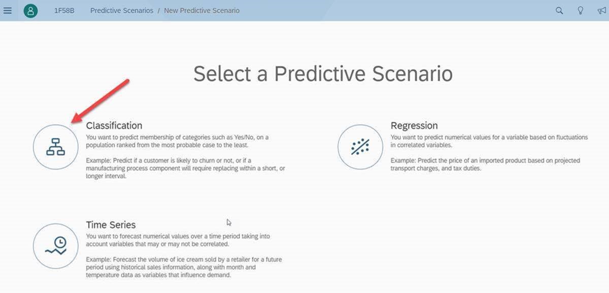
Since our target question is, 'which employees left the company (versus stayed) and why', we select ‘Classification’ because the target values are categorical in nature and unordered (like a 'dimension'). In contrast, Regression analysis, which is very similar to Classification analysis, would be applied to a 'measure' or range of values that are continuous values or ordered (i.e. if we were asking the question, 'what is influencing Working Hours Per Week'):
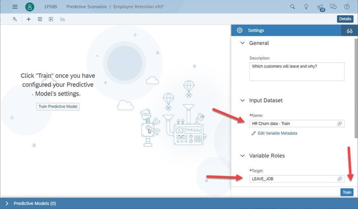
We will point SAC Smart Predict to the same data we did the manual/visual data discovery from and also tell Smart Predict which column of data is our ‘Target’. The target is the column of data that flags the behavior we want to learn about, in this case, when an employee leaves the company (versus staying with the company). The arrows show us what is needed to evaluate the data:
Step 1: Input Dataset: ‘HR Churn data – Train’
Step 2: Choose the Target: ‘LEAVE_JOB’
Step 3: Click on the ‘Train’ button to kick off the automated ML driven data discovery process
The Results
Within seconds (sometimes within minutes based on the volume and width of data) our predictive automation process has completed. The Smart Predict 'Classification' algorithm ‘Trained’ itself on this data, with the Target in mind, and now we get to see what it learned, if anything.
The very first thing we want to look at is how well the data describes why employees are leaving:

The ‘Predictive Power’ represents how well the descriptive data tells the Employee Turnover story The descriptive data would be all the columns of data that are not the Target. In this case we see a Predictive Power of 87.15%. That's really good! It means we can trust the results because our Classification algorithm has found that certain attributes or behaviors in the data mostly happen when someone leaves the company.
Note: If ‘Predictive Power’ had been in the 15% range then this would tell us that the descriptive columns don’t tell us what is happening with Turnover. In that case we would look for other attributes, columns or 'features' about the employee that could tell us why and then we would run it again to see if the accuracy had improved. Having a low Predictive Power can also be good to know as it would save us a lot of time that would have been spent building visuals that may be misinterpreted.
Now that we know we are looking at the right data, let’s look at why employees are leaving.
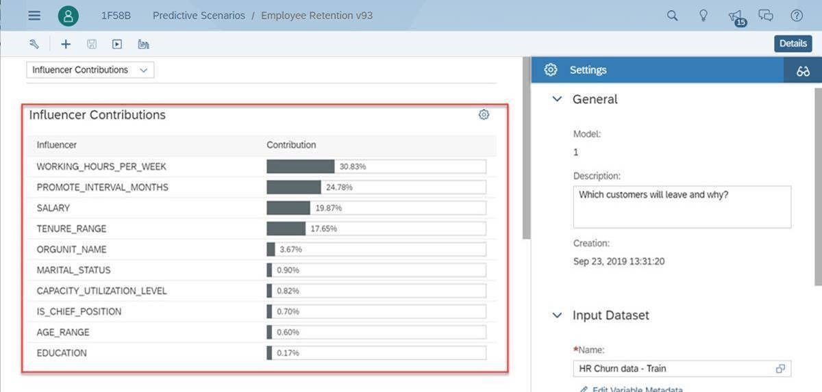
Influencer Contributions
Smart Predict opens the box and sows us a list of contributing columns to employee turnover in order of most contributing to least contributing. It's called 'explain-ability' and not all ML tools do this but it's a very important aspect of the process which is to know 'what' ML found and 'why' in contributes to our target. Also note that these influencers are another thing we can’t get out of manual data discovery. Smart Predict has found that ‘Working Hours Per Week’ is the biggest influencer to employee turnover followed by ‘Promotion Interval by Month’, ‘Salary’ and then ‘Tenure’.
Now, remember our Story Board of findings that we built based off our manual visualization attempt? The ‘Influencer Contributions’ take this a step further and tells us how each of these employee characteristics influence Employee Turnover, but in ranked order. It’s a very precise and mathematically validated list of the KPI’s we should be paying attention to. No human can produce these results with a manual visualization tool.
Also notice how the top three contributions where not in our original data discovery because they were measures. Without doing anything extra, our automated ML included these into the analysis. Bonus!!
Going Deeper
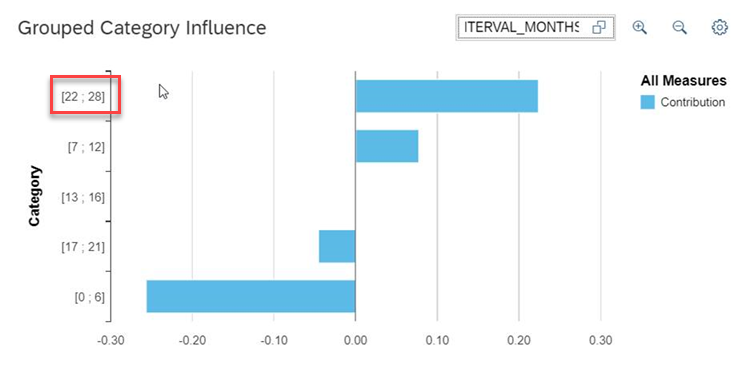
SAP’s ML approach takes the ‘Influencer Contributions’ to the next level and tells us, not only which KPI's to focus on but also, what ranges of values in each column influence the target behavior (Employee Turnover). For example:
Influencer #1: Working Hours Per Week - With ‘Working Hours Per Week’ we see that employees that work, on average, 43.8 to 48 hours every week are at the most at risk of leaving.
See below: Everything to the right of the 0.00 is an influencer to leave and to the left of the 0.00 is an influencer to stay. From Top to Bottom, the top range is considered the ‘at risk’ behavior and as you go towards the bottom you see the 'buckets' of hours that represent employees most likely to stay. So we get both sides of the coin!
Note: What human would come up with ranges like this? 43.8 to 48 hours per week? Only a ML approach would see patterns in the data so precisely.

Influencer #2: Promotion Interval – We see below, employees that have not been promoted in 22 to 28 months are most likely to leave. 0 to 6 months most likely to stay. Now, imagine you are working 43.8 to 48 hours of overtime AND have not been promoted in 22 to 28 months! That’s a double whammy! Our ML model will now add up all these influencing factors and score each employee individually on their likelihood of leaving based on their unique situation at the company. This new column of information will be added to our original data as a % probability of leaving. What’s really neat is that we can now sort our employees by who is most likely to leave or most likely to stay.
Yet another thing a manual visualization approach can’t provide.
Results Summary
With the help of ML we now know:
What’s next? Taking Precise Action
Now that we have our results leveraging predictive automation, how do we move forward with some tangible next steps and actions? We will use something called a ‘Profit Simulation’ which is built in to SAC Smart Predict.
What we are going to do here is apply some monetary numbers, in dollars, to the employee turnover situation. If we know we avoid $10,000 in cost (rehiring and retraining fees) by investing $1,000 to retain an employee, how far down that list of employees (ranked now by most likely to leave) should we invest that $1,000 dollars? Let’s enter the values and then hit the Maximize Profit button and find out.

According to this, if we spend $1k on the top 19.7% of our employees most likely to leave (186 at risk x $1,000 = $186,000) then we will expect to prevent 85.5% of our potential employee turnover (73 x $10,000 = $730,000). Maximize Profit represents the most profitable outcome.
By investing just $186,000 on 186 at risk employee we can expect to save $730,000 in rehiring/retraining cost which translates to a profit of $544,000!
How easy would it be to come up with that precise of an ROI with a manual data discovery tool? Is it even possible? I'm not sure I could do that without Smart Predict.

Profit Simulation Summary
In conclusion of our Profit Simulation, we can now present our findings and ROI back to upper management to get approval for the new employee retention program. Also, since we have BI, Planning and Predictive in the same solution, we can spread that $186k of cost and the expected benefits of avoiding $730k worth of rehiring costs over the next 6 to 12 months and track our progress to actuals! All this from a single web browser. Pretty cool, right?

Overall Key Takeaways
What do we want to remember from this exercise?

Welcome to a new way of doing things!
Now let’s contrast our manual visualization based approach from Part 1 to the results we would get from a SAP Analytics Cloud’s (SAC's) machine learning (ML) approach to data discovery. SAC has a feature called Smart Predict which is a ML powered Predictive Automation approach. What's great about SAC is that it combines BI, Planning and Predictive in one solution. This means you can derive precise machine learning insights from your data and then create a tangible set of concrete actions and track progress to plan in one single application.
First, let’s create a ‘Predictive Scenario’ in SAC:
Since our target question is, 'which employees left the company (versus stayed) and why', we select ‘Classification’ because the target values are categorical in nature and unordered (like a 'dimension'). In contrast, Regression analysis, which is very similar to Classification analysis, would be applied to a 'measure' or range of values that are continuous values or ordered (i.e. if we were asking the question, 'what is influencing Working Hours Per Week'):
We will point SAC Smart Predict to the same data we did the manual/visual data discovery from and also tell Smart Predict which column of data is our ‘Target’. The target is the column of data that flags the behavior we want to learn about, in this case, when an employee leaves the company (versus staying with the company). The arrows show us what is needed to evaluate the data:
Step 1: Input Dataset: ‘HR Churn data – Train’
Step 2: Choose the Target: ‘LEAVE_JOB’
Step 3: Click on the ‘Train’ button to kick off the automated ML driven data discovery process
The Results
Within seconds (sometimes within minutes based on the volume and width of data) our predictive automation process has completed. The Smart Predict 'Classification' algorithm ‘Trained’ itself on this data, with the Target in mind, and now we get to see what it learned, if anything.
The very first thing we want to look at is how well the data describes why employees are leaving:
The ‘Predictive Power’ represents how well the descriptive data tells the Employee Turnover story The descriptive data would be all the columns of data that are not the Target. In this case we see a Predictive Power of 87.15%. That's really good! It means we can trust the results because our Classification algorithm has found that certain attributes or behaviors in the data mostly happen when someone leaves the company.
Note: If ‘Predictive Power’ had been in the 15% range then this would tell us that the descriptive columns don’t tell us what is happening with Turnover. In that case we would look for other attributes, columns or 'features' about the employee that could tell us why and then we would run it again to see if the accuracy had improved. Having a low Predictive Power can also be good to know as it would save us a lot of time that would have been spent building visuals that may be misinterpreted.
Now that we know we are looking at the right data, let’s look at why employees are leaving.
Influencer Contributions
Smart Predict opens the box and sows us a list of contributing columns to employee turnover in order of most contributing to least contributing. It's called 'explain-ability' and not all ML tools do this but it's a very important aspect of the process which is to know 'what' ML found and 'why' in contributes to our target. Also note that these influencers are another thing we can’t get out of manual data discovery. Smart Predict has found that ‘Working Hours Per Week’ is the biggest influencer to employee turnover followed by ‘Promotion Interval by Month’, ‘Salary’ and then ‘Tenure’.
Now, remember our Story Board of findings that we built based off our manual visualization attempt? The ‘Influencer Contributions’ take this a step further and tells us how each of these employee characteristics influence Employee Turnover, but in ranked order. It’s a very precise and mathematically validated list of the KPI’s we should be paying attention to. No human can produce these results with a manual visualization tool.
Also notice how the top three contributions where not in our original data discovery because they were measures. Without doing anything extra, our automated ML included these into the analysis. Bonus!!
Going Deeper
SAP’s ML approach takes the ‘Influencer Contributions’ to the next level and tells us, not only which KPI's to focus on but also, what ranges of values in each column influence the target behavior (Employee Turnover). For example:
Influencer #1: Working Hours Per Week - With ‘Working Hours Per Week’ we see that employees that work, on average, 43.8 to 48 hours every week are at the most at risk of leaving.
See below: Everything to the right of the 0.00 is an influencer to leave and to the left of the 0.00 is an influencer to stay. From Top to Bottom, the top range is considered the ‘at risk’ behavior and as you go towards the bottom you see the 'buckets' of hours that represent employees most likely to stay. So we get both sides of the coin!
Note: What human would come up with ranges like this? 43.8 to 48 hours per week? Only a ML approach would see patterns in the data so precisely.
Influencer #2: Promotion Interval – We see below, employees that have not been promoted in 22 to 28 months are most likely to leave. 0 to 6 months most likely to stay. Now, imagine you are working 43.8 to 48 hours of overtime AND have not been promoted in 22 to 28 months! That’s a double whammy! Our ML model will now add up all these influencing factors and score each employee individually on their likelihood of leaving based on their unique situation at the company. This new column of information will be added to our original data as a % probability of leaving. What’s really neat is that we can now sort our employees by who is most likely to leave or most likely to stay.
Yet another thing a manual visualization approach can’t provide.
Results Summary
With the help of ML we now know:
- How well the data tells our Employee Turnover story.
- Out of the 10 columns we analyzed, which employee characteristics we should monitor first.
- Out of those top KPI’s when should we turn that KPI Red Yellow or Green based on risky behaviors.
- The precise probability of how likely each employee is to leave.
What’s next? Taking Precise Action
Now that we have our results leveraging predictive automation, how do we move forward with some tangible next steps and actions? We will use something called a ‘Profit Simulation’ which is built in to SAC Smart Predict.
What we are going to do here is apply some monetary numbers, in dollars, to the employee turnover situation. If we know we avoid $10,000 in cost (rehiring and retraining fees) by investing $1,000 to retain an employee, how far down that list of employees (ranked now by most likely to leave) should we invest that $1,000 dollars? Let’s enter the values and then hit the Maximize Profit button and find out.
According to this, if we spend $1k on the top 19.7% of our employees most likely to leave (186 at risk x $1,000 = $186,000) then we will expect to prevent 85.5% of our potential employee turnover (73 x $10,000 = $730,000). Maximize Profit represents the most profitable outcome.
By investing just $186,000 on 186 at risk employee we can expect to save $730,000 in rehiring/retraining cost which translates to a profit of $544,000!
How easy would it be to come up with that precise of an ROI with a manual data discovery tool? Is it even possible? I'm not sure I could do that without Smart Predict.
Profit Simulation Summary
In conclusion of our Profit Simulation, we can now present our findings and ROI back to upper management to get approval for the new employee retention program. Also, since we have BI, Planning and Predictive in the same solution, we can spread that $186k of cost and the expected benefits of avoiding $730k worth of rehiring costs over the next 6 to 12 months and track our progress to actuals! All this from a single web browser. Pretty cool, right?
Overall Key Takeaways
What do we want to remember from this exercise?
- Manual data discovery is no longer a trusted way to gain insights
- Predictive Automation / Automated Data Discovery Powered by Machine Learning is a far superior way at getting to the insights:
- Faster and Easier
- More Precise
- More Scalable Across a Wider Range of Information
- ML does not have to be just for data scientists – With SAC Predictive Automation Smart Features anyone can shift to this new way of thinking
Welcome to a new way of doing things!
Labels:
7 Comments
You must be a registered user to add a comment. If you've already registered, sign in. Otherwise, register and sign in.
Labels in this area
-
ABAP CDS Views - CDC (Change Data Capture)
2 -
AI
1 -
Analyze Workload Data
1 -
BTP
1 -
Business and IT Integration
2 -
Business application stu
1 -
Business Technology Platform
1 -
Business Trends
1,661 -
Business Trends
88 -
CAP
1 -
cf
1 -
Cloud Foundry
1 -
Confluent
1 -
Customer COE Basics and Fundamentals
1 -
Customer COE Latest and Greatest
3 -
Customer Data Browser app
1 -
Data Analysis Tool
1 -
data migration
1 -
data transfer
1 -
Datasphere
2 -
Event Information
1,400 -
Event Information
65 -
Expert
1 -
Expert Insights
178 -
Expert Insights
280 -
General
1 -
Google cloud
1 -
Google Next'24
1 -
Kafka
1 -
Life at SAP
784 -
Life at SAP
11 -
Migrate your Data App
1 -
MTA
1 -
Network Performance Analysis
1 -
NodeJS
1 -
PDF
1 -
POC
1 -
Product Updates
4,577 -
Product Updates
330 -
Replication Flow
1 -
RisewithSAP
1 -
SAP BTP
1 -
SAP BTP Cloud Foundry
1 -
SAP Cloud ALM
1 -
SAP Cloud Application Programming Model
1 -
SAP Datasphere
2 -
SAP S4HANA Cloud
1 -
SAP S4HANA Migration Cockpit
1 -
Technology Updates
6,886 -
Technology Updates
407 -
Workload Fluctuations
1
Related Content
- Analyze Expensive ABAP Workload in the Cloud with Work Process Sampling in Technology Blogs by SAP
- Introducing Blog Series of SAP Signavio Process Insights, discovery edition – An in-depth exploratio in Technology Blogs by SAP
- Switch on gCTS (for existing packages) in Technology Blogs by SAP
- Unify your process and task mining insights: How SAP UEM by Knoa integrates with SAP Signavio in Technology Blogs by SAP
- When to Use Multi-Off in 3SL in Technology Blogs by SAP
Top kudoed authors
| User | Count |
|---|---|
| 13 | |
| 10 | |
| 9 | |
| 7 | |
| 6 | |
| 5 | |
| 5 | |
| 5 | |
| 5 | |
| 4 |