
- SAP Community
- Products and Technology
- Technology
- Technology Blogs by SAP
- Data Discovery is Dead (as we know it) Part 1
Technology Blogs by SAP
Learn how to extend and personalize SAP applications. Follow the SAP technology blog for insights into SAP BTP, ABAP, SAP Analytics Cloud, SAP HANA, and more.
Turn on suggestions
Auto-suggest helps you quickly narrow down your search results by suggesting possible matches as you type.
Showing results for
Employee
Options
- Subscribe to RSS Feed
- Mark as New
- Mark as Read
- Bookmark
- Subscribe
- Printer Friendly Page
- Report Inappropriate Content
10-04-2019
12:19 PM
The difference between making a good business decision based on things as they are and a bad business decision based on misinformation can lead to sleepless nights for that decision maker. Even worse, making a decision on information we think is credible but is not! The way we have been using visualizations to perform data discovery and get insights to drive business decisions has fundamentally changed for the better and once you start adopting this better approach you will probably never go back to the old approach again. But seeing is believing, right?
A Walk Down Memory Lane
My first job out of college was in the analytics space as a report developer. Creating reports to get insights was a very IT intensive function and required a lot of manual work and managing a backlog of requests. I had to be very particular about creating the content and how I interpreted the requirements coming from the business (which would frequently change). Also, there wasn’t really an option to ‘slice and dice’ the data very well. Self-Service Reporting and then Data Discovery tools came along and made investigating business questions easier and more visual. As a result, business users who had direct knowledge of the intricacies of the business could now investigate, discover and then create their own content on the fly, without my help. Just drag, drop, slice, dice and drill!
The ‘Aha’ Moment
Some years back I was trying to make sense of how Predictive and Machine Learning could improve my ability to gain answers from my data. I didn’t have a data science background but I was really good at working with data and building visual content that seemed compelling. That’s when I had a big ‘Aha’ moment. Not just a ‘leap forward across a ditch’ moment. This was like learning I could ‘get in to a jet and fly across the Pacific Ocean’ kind of a moment! A mentor of mine who was familiar with SAP’s predictive automation technology showed me how to use a ‘click’ based predictive automation approach to do my data discovery. This is what I learned:
- Predictive Automation could not only do my data discovery for me, but actually do it in a far superior way.
- I thought I was getting reliable intelligence before with my ‘manual’ visualization building data discovery tool. But what I actually realized is that it did not matter how pretty, how multi-faceted or how dynamic my visualization tool was. No matter how many times I sliced, diced, pivoted or drilled in to that data, I was still unable to see things as they truly were. Until now.

Manual Data Discovery vs. Data Discovery Led by Machine Learning
While all the previous approaches (self-service reporting and visualization based data discovery solutions) have moved the ball forward in terms of getting the insights in to decision makers hands faster, none of them come close to what machine learning or predictive automation can do. Machine Learning can uncover the direct correlations to our business questions within the data and then recommend what to do next. After all, isn’t that what BI is all about? Getting to the answers to our business questions and then formulating a plan to take action? Gartner talks about this. In the next 5 to 10 years it will be hard to find anyone that is doing data discovery the old manual way. My goal here is to help YOU have that ‘Aha’ moment too. Because until you see the difference it can be hard to comprehend.

Data Discovery is still a very manual approach to looking for answers. It has a major flaw. Data Discovery requires human eyes to see and interpret what we see visually. But the problem is, what we see in a visualization isn’t presenting the whole picture. We (humans) can’t really see data in a comprehensive way like mathematical functions and computers can. We can’t see correlations between multiple data elements and multiple visuals very well. This realization only came to me after seeing the results from a Classification algorithm in SAP’s predictive automation suite. Classification is one of the most popular approaches to use ML to get insights from and it’s a great place to start because you can ask it questions similar to what we do with a traditional data discovery tool.
An Example of Manual Data Discovery: Employee Turnover
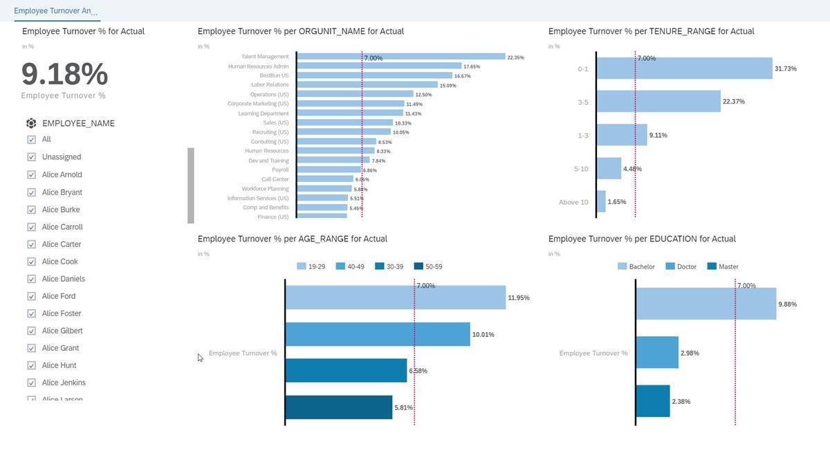
Let’s take a look at and example with Employee Turnover where Employee Turnover % has been increasing over time. This is the spark that causes us to ask the discovery questions, which employees will turnover and why? If we were going to get answers to these questions in the ‘manual’ way we might open a visualization tool and look at Turnover % in as many ways as we can, like this:
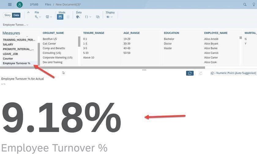
Overall Employee Turnover % - 9.18% is higher than our normal 7% turnover rate
Now Let’s Slice, Dice & Discover
A popular approach to investigating a question is to pick the measure (in this case Turnover %) and then create as many visualizations on key employee characteristics as the user thinks might be causing the problem. Data sets can have hundreds of columns of data so the end user, knowing they can't look at all of them, picks characteristics that he or she 'thinks' could be causing the issue. This is where human bias can come it. In this case we look a a hand full of characteristics.
(Organizational Unit) – If we pivot Employee Turnover % to Org Unit Name we can see many organizations with higher than average employee turnover rates, here. Is there a certain organization we need to focus on? Sure. We can focus on the top five or so.

(Company Tenure) – We can see some tenure groups with higher than average employee turnover in the 0 – 1 category. Is Tenure the problem or Organizational Unit?

(Age Range) – Now we can see certain age groups with higher turnover. Note that these age ranges are man-made and not ML driven because someone decided to break them up based on 10 year buckets. More on that later but is a person’s age a big contributor to the increase in turnover?

Presenting our Findings in a Story – If we put all this together in a Story it feels like we have some significant insights. But do we have a complete picture? Which of these Employee Turnover areas is influencing overall turnover the most? What would we recommend as next steps?
Missing Information & Human Bias
See the image below and look at the Measures on the left. What about Salary? Working Hours Per Week? Promotion Interval / Months Since Last Promoted? Training Hours Per Month? These Measures (Sums, Counts, Averages, etc.) would need to be added to our visualizations similar to the Dimensions we looked at (Org Name, Tenure, Age Range, Education) in order to create a more complete picture. This will take even more time. Another thing that looks funny is Age Range. How do we know those buckets (19-29, 30-39, etc.) even make sense to how turnover is happening? Setting up a grouping just because we like even 10 year increments is not a good way to group people. There are many ways to do that but we would be guessing as to if there is any significance to employee turnover. Wouldn't it be more interesting if the data and the targeted behavior dictated what those groupings are?

There are still many unanswered questions here and a lot of work that still needs to be done and even then I'm not sure we would have a complete picture. But our predictive automation approach can answers these questions very precisely and also very very quickly! To see the difference read Data Discovery is Dead (as we know it) Part 2.
Jason White
SAP Global Center of Excellence, Predictive Automation and Machine Learning
Labels:
3 Comments
You must be a registered user to add a comment. If you've already registered, sign in. Otherwise, register and sign in.
Labels in this area
-
ABAP CDS Views - CDC (Change Data Capture)
2 -
AI
1 -
Analyze Workload Data
1 -
BTP
1 -
Business and IT Integration
2 -
Business application stu
1 -
Business Technology Platform
1 -
Business Trends
1,661 -
Business Trends
88 -
CAP
1 -
cf
1 -
Cloud Foundry
1 -
Confluent
1 -
Customer COE Basics and Fundamentals
1 -
Customer COE Latest and Greatest
3 -
Customer Data Browser app
1 -
Data Analysis Tool
1 -
data migration
1 -
data transfer
1 -
Datasphere
2 -
Event Information
1,400 -
Event Information
65 -
Expert
1 -
Expert Insights
178 -
Expert Insights
280 -
General
1 -
Google cloud
1 -
Google Next'24
1 -
Kafka
1 -
Life at SAP
784 -
Life at SAP
11 -
Migrate your Data App
1 -
MTA
1 -
Network Performance Analysis
1 -
NodeJS
1 -
PDF
1 -
POC
1 -
Product Updates
4,577 -
Product Updates
330 -
Replication Flow
1 -
RisewithSAP
1 -
SAP BTP
1 -
SAP BTP Cloud Foundry
1 -
SAP Cloud ALM
1 -
SAP Cloud Application Programming Model
1 -
SAP Datasphere
2 -
SAP S4HANA Cloud
1 -
SAP S4HANA Migration Cockpit
1 -
Technology Updates
6,886 -
Technology Updates
408 -
Workload Fluctuations
1
Related Content
- Analyze Expensive ABAP Workload in the Cloud with Work Process Sampling in Technology Blogs by SAP
- Introducing Blog Series of SAP Signavio Process Insights, discovery edition – An in-depth exploratio in Technology Blogs by SAP
- Switch on gCTS (for existing packages) in Technology Blogs by SAP
- Unify your process and task mining insights: How SAP UEM by Knoa integrates with SAP Signavio in Technology Blogs by SAP
- When to Use Multi-Off in 3SL in Technology Blogs by SAP
Top kudoed authors
| User | Count |
|---|---|
| 13 | |
| 11 | |
| 10 | |
| 9 | |
| 9 | |
| 7 | |
| 6 | |
| 5 | |
| 5 | |
| 5 |