It can be difficult to keep an eye on the memory consumption of all your SAP HANA systems in your landscape. There is a new overview and visualization available now.
SAP has released two new forecasts for the memory consumption for an SAP HANA database:
- Main memory consumption forecast
- Data footprint forecast
Both features are integrated in the
SAP EarlyWatch Alert Workspace since 19th of September and are available for customers with a support level of at least SAP Enterprise Support.
Main Memory Consumption Forecast
The summary of this forecast is displayed on a new card. It shows the number of systems that will reach the memory limit in a specific time interval.
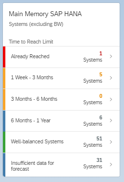
Besides the time intervals two additional categories are listed:
- Well-balanced systems: The memory consumption of these systems show either a decreasing, stable, or slightly increasing trend. The limit may not be reached in the next 12 month.
- Insufficient data for forecast: The memory consumption data covers less than 70% of the last 3 months. A forecast is avoided because with insufficient data this will have no good accuracy.
A drill-down can be done by clicking on a line with a category on the card or by clicking on the header of the card to get all categories on one screen.

This screen shows a list of SAP HANA systems sorted by the "Prediction: Worst-Case Date" ascending. This date indicates when the memory consumption of the index server SAP HANA system may reach the effective allocation limit with a high risk of an out-of-memory dump.
The table also includes additional information regarding the current state of the memory consumption:
- Out-of-Memory Dumps Latest Report: The number of OOM dumps per week for the last time frame measured by the SAP EarlyWatch Alert.
- Column Unloads Latest Report: The number of column unloads per week.
By clicking on one line in the table a chart opens up that shows the historic memory consumption and the prediction.

The solid blue line shows the maximum memory consumption of the index server per day. Peaks typically indicate a high memory consumption caused by SQL statements or delta merges.
The dotted lines show the forecast: mean, upper 80% and lower 80% and a "Forecast adjusted" line. This line takes the highest peak in the time series into account and adds its height to the mean forecast. This is only done when there are significant peaks that might happen any time in the future again.
If you have done a root cause analysis and you are sure that this high peak will not happen again, you can adjust the forecast by selecting a different time frame for the historic data points. This selection is taken into account for the prediction.
You select the data points that should be included in the forecast calculation with click and drawing a rectangle with the mouse. After that use the button with the calculator symbol for an ad hoc calculation of the forecast. If you are satisfied with the resulting forecast you can save the data selection for future automatic calculations, that are done every time a new measured data point is added.
Data Footprint Forecast
The data footprint forecast takes a closer look at the SAP HANA memory areas that are allocated by the database. Coming from the screen with the index server memory forecast you can simply click on "Analyze Memory Consumption" in the upper right corner.

The following screen shows the memory allocation by area (column store, row store, statement execution, system, monitoring) over time on an hourly basis. If enough data for a forecast is available a switch for data footprint forecast is available:

If you switch on the forecast, the estimated growth for the next 12 month for column store and row store is displayed in light-blue compared to the historic growth in solid blue:

You can extend the forecast chart with a slider to the next 48 month. The data can be exported after changing from chart view to table view with the button on the right side:

Instead of exporting the data, you can also share a link to the application with the envelope button in the upper right corner. This opens an email template with context information and a link to this chart that can be used by recipients that have an S-User to logon to SAP ONE Support Launchpad.
Summary
The main memory forecast can be used to identify systems that may be affected by a memory bottleneck and may suffer from performance degradation or even out-of-memory dumps. A detailed analysis is required which memory areas and allocators are consuming how much memory, see also SAP Note
1999997 .
The data footprint forecast helps to identify systems, that need to be looked at from data volume management perspective. Because you want to avoid, that the sum of column and row store tables exceeds 50% of the global allocation limit.
The visualization of the historic and predicted consumption of memory can help to make clear that an action plan is needed.
