
- SAP Community
- Products and Technology
- Technology
- Technology Blogs by Members
- The ABAP Detective Forms A Pythonic Quest: Part 2
Technology Blogs by Members
Explore a vibrant mix of technical expertise, industry insights, and tech buzz in member blogs covering SAP products, technology, and events. Get in the mix!
Turn on suggestions
Auto-suggest helps you quickly narrow down your search results by suggesting possible matches as you type.
Showing results for
JimSpath
Active Contributor
Options
- Subscribe to RSS Feed
- Mark as New
- Mark as Read
- Bookmark
- Subscribe
- Printer Friendly Page
- Report Inappropriate Content
08-11-2019
3:43 PM
After inscribing the first set of case notes in the Pythonic Forms tale, I leaned back in my worn-out office chair, put a few bits on the benchmark fire, and considered the next chapter. It must include a view from the user perspective, not their experience as such, as who can inhabit another's mind, but their feedback and their commentary. To protect the innocent, I won't reveal who said what.
Fewer mug shots, er, screen shots, this episode. A few though.
The goals of a digital form to replace a paper workflow process (see which) was to cut down on data retyping, standardize categories, and have more accurate records. People's work was not supposed to be interrupted, though in any change there could be resistance. That turned out to be an understatement.
With a newly minted PDF digital document in the arsenal, I thought I'd deputize veterans of this particular event management task. The total pool of candidates was between 10 and 20 and it didn't make sense to blast notes to all of them. It also didn't seem likely to produce balanced feedback with only one or two testers.
Stop me if you've never asked for volunteers.
My first inkling of trouble was the length of one response. You know you're in trouble when the answer isn't "sure, what do you need?". I'll spare the gory details, just summarize with the psychological profile of people who claim to be helping but only if they write the ticket must be fascinating. I chalked that one up to "prefers to not change". Less charitably, does not want to be involved.
The next candidate had a different reaction, or I'd probably be forced to rethink the priorities and approach for the whole idea. There were thoughtful questions, comments, and suggestions for improvement. Useful in the context of time required for updates, level of effort on my part, and whether I could make the fixes with my current skills. Questions about how to use the new form were answered in some cases with "add metadata" in the transmission document, er, cover letter. In other words, a little scope creep, or perhaps just do the best you can. This feedback and forth gave me more confidence I was on the right trail. Saying we need this and I like it are great morale boosters.
The last candidate seemed ideal. An engineer/architect with experience and a range of interests. As it turned out, the communications were not ideal, or maybe my expectations were too high. Instead of feedback on details such as field size, content, order, and appearance, this interaction was going to be about document distribution and collection.
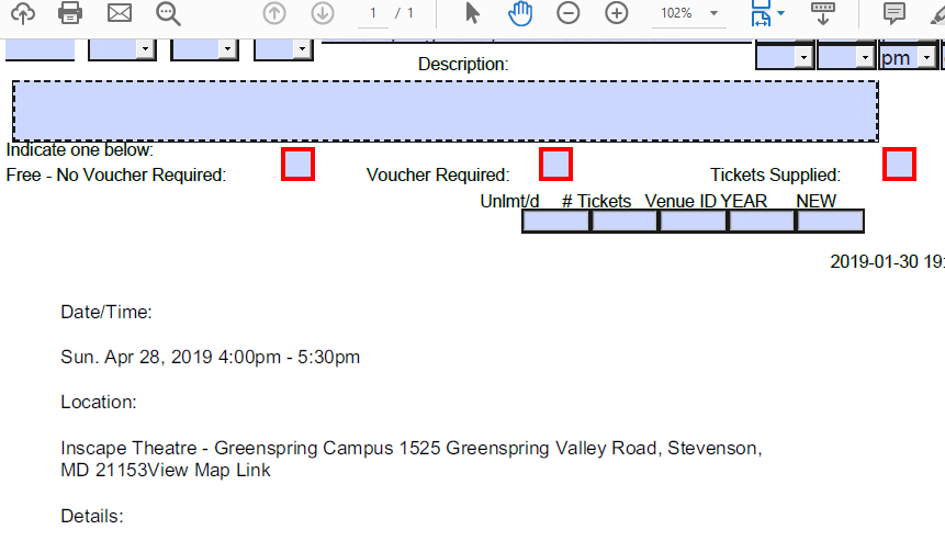
As described in Chapter 1, a saved form may be larger than the original, may have a different identification (fingerprint) pattern, and needs to be named appropriately. Send out "document_001", get back "document_001_saved", or something like that. One venue may have several scheduled events; the single original blank fill-in form could be used for multiple events by saving each as a new document. Including the first event date seemed a good naming scheme.
In an attempt to cut down on email and improve our ability to track progress, I decided a shared Google drive was in order. That tool is well-designed, easy to use for the barely tech savvy, and should have been a problem solver. It wasn't.
First, I didn't want to use my personal account; I wanted the organization to host the content themselves, so I wouldn't be the guy holding the bag when the lights went out (not the bag man, see). Candidate 3 wasn't able to share their folder, and when I hosted the documents, there was continual confusion about what was updated and where. I've gotten used to the clarity of Dropbox communications (so-and-so changed these files this week). Not sure why Google wasn't getting the message across the all points bulletin. We ended up resorting to emails saying "I updated the shared folder" which went against the original idea of fewer emails.
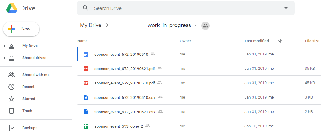
Second, generating the forms was meant to be a simple, periodic process that would replace, or supplement, the old method of printing and copying paper forms. However, the entire set needed to be broken into smaller sets, and different people would manage their own sets. I worked out batch commands to create a few forms at a time that could then be moved to a Google drive folder. Again, not highly technical but the publication needed to be communicated, and the instructions tailored to those (volunteers, all) who were to use the forms. I also set myself up as the sole content provider, and made a mental note to create a simple menu driven app.
Third, not enough testing. Or fence-posting. Or something. The new process went off the rails, as they do sometimes, when the main end user tried to update the PDF forms without having a PC or Mac with the software tools I had expected. Android phones and Chromebooks are wonderful, for many tasks. Just not this one. Early in the form redesign brainstorming, the decision was between online web forms, and offline PDF. There were pluses and minuses for both approaches, and in the end, the decision was made using my favorite Mae West quote, "Between two evils, I generally like to pick the one I never tried before." [ en.wikiquote.org/wiki/Mae_West ].

I wanted to test with PC users, Mac users, and, well, that's all I considered. I have an Android tablet, so I could have looked for an app there and verified whether editing a fill-in form was going to work on that platform. But I don't have a Chromebook, and hadn't considered anyone using that platform in this effort. Short-sighted on my part, with unfortunate consequences.
The biggest complaint about the digital form was the size of the description field. On a paper copy, someone could write in the margin, on the back, or on another sheet of paper if there was more to say. In the PDF form, the size was stuck where I poured it. While I intended the second edition to have a larger space, the first version ended up with a single line that would "scroll" left and right as more text was entered. Terrible user experience, and I should not have let it out the door like that. But we were still testing, and I hoped the rough interface would be tolerated for the sake of progress.
Rich text field in test mode:


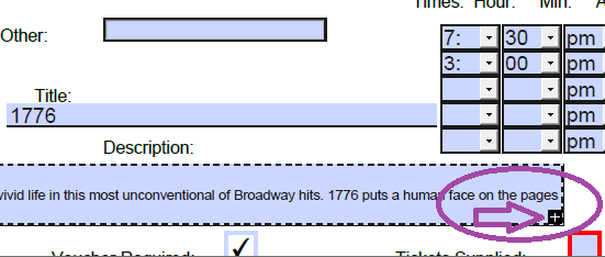
In fairness, the one-line form text field was a fix for the issue I hit trying to allow for formatting (bold, underscore, italics) and fonts with a Rich Text variation that ended up hugely inflating the resulting saved file. I had traded off one issue (an internal IT one) for another (an external user interface one). Sound familiar?

The event calendars that these forms populate are published quarterly, so there were deadlines to preparing and sharing the forms. With other organization conditions not relevant here, I managed to push out between 10 and 25 percent of the total to be processed. That was probably a good range for the first version, with the plan being to take the feedback from the user tests and the actual "production" returns to build the second edition after the quarterly publication was drafted (and proofread).
The failure, which it's fair to call it, was the return content from the Chromebook edits. The forms came back as PDFs not Word or other file types, but the carefully laid out PDF field forms were mostly empty. In particular, the description, the longest text content and the most important to the publication readers, was empty. That intended text was embedded in a text box. And I'm not (still) even sure how it was done. It'a a mystery. I knew one can add highlighting and other annotations to PDFs but this was a surprise.
End result: more work, rather than less. And more versions to be accommodated in the flow.
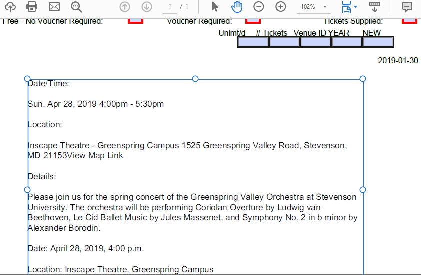
I knew when I reviewed the returned forms that the poor choice of a small text entry area had pushed the users to be creative in completing their part; while the show must go on, fixes were needed. Or workarounds, given the deadlines. And to make it more challenging, the newly created text box didn't act as one might expect on a digital form. When you clicked on it, nothing happened. Like having no shells in the chamber. Me, being the hard-boiled detective sort, quickly realized that a double-click would open up the text box for your basic open and shut case of copy and paste. Or was it a triple-click. I got lucky (punk).
We can't all be ABAP Detectives, though, can we? Some of us are going to be Floyd Thursbys, or Lew Archers, er Miles Archers. When the other office volunteers attempted to pull data off the missing event forms, they got stuck. Explaining a double-click over the phone ended up with static.
The workaround was for me to parse the resulting forms at home, copy out the text field, paste it into an email, and send it to the data entry people. Hardly the smooth automatic data collection and digital paste up I had envisioned.
Lessons learned: get more testers, write/talk more documentation, get management on-board. You know, the usual suspects. Even if the organization decides not to move forward with a digital transformation step, the ground work has been laid on how it could be done. I've learned quite a bit about PDF form management along the way, and have new ideas on how to produce better forms.
Here are screenshots of the next version, in progress (note the "tool-tip" floater):

Revised version, again allowing rich text content (with resulting large file size):
Next Episode: The ABAP Detective Goes Back to the (Database) Dictionary, in which we will dive into the form creation, design decisions on field size/layout, and a few tricks of the PDF trade. I said I'd talk about those topics in this chapter, but instead concentrated on the user experience and change control.
Fewer mug shots, er, screen shots, this episode. A few though.
The goals of a digital form to replace a paper workflow process (see which) was to cut down on data retyping, standardize categories, and have more accurate records. People's work was not supposed to be interrupted, though in any change there could be resistance. That turned out to be an understatement.
With a newly minted PDF digital document in the arsenal, I thought I'd deputize veterans of this particular event management task. The total pool of candidates was between 10 and 20 and it didn't make sense to blast notes to all of them. It also didn't seem likely to produce balanced feedback with only one or two testers.
Stop me if you've never asked for volunteers.
My first inkling of trouble was the length of one response. You know you're in trouble when the answer isn't "sure, what do you need?". I'll spare the gory details, just summarize with the psychological profile of people who claim to be helping but only if they write the ticket must be fascinating. I chalked that one up to "prefers to not change". Less charitably, does not want to be involved.
The next candidate had a different reaction, or I'd probably be forced to rethink the priorities and approach for the whole idea. There were thoughtful questions, comments, and suggestions for improvement. Useful in the context of time required for updates, level of effort on my part, and whether I could make the fixes with my current skills. Questions about how to use the new form were answered in some cases with "add metadata" in the transmission document, er, cover letter. In other words, a little scope creep, or perhaps just do the best you can. This feedback and forth gave me more confidence I was on the right trail. Saying we need this and I like it are great morale boosters.
The last candidate seemed ideal. An engineer/architect with experience and a range of interests. As it turned out, the communications were not ideal, or maybe my expectations were too high. Instead of feedback on details such as field size, content, order, and appearance, this interaction was going to be about document distribution and collection.
As described in Chapter 1, a saved form may be larger than the original, may have a different identification (fingerprint) pattern, and needs to be named appropriately. Send out "document_001", get back "document_001_saved", or something like that. One venue may have several scheduled events; the single original blank fill-in form could be used for multiple events by saving each as a new document. Including the first event date seemed a good naming scheme.
In an attempt to cut down on email and improve our ability to track progress, I decided a shared Google drive was in order. That tool is well-designed, easy to use for the barely tech savvy, and should have been a problem solver. It wasn't.
First, I didn't want to use my personal account; I wanted the organization to host the content themselves, so I wouldn't be the guy holding the bag when the lights went out (not the bag man, see). Candidate 3 wasn't able to share their folder, and when I hosted the documents, there was continual confusion about what was updated and where. I've gotten used to the clarity of Dropbox communications (so-and-so changed these files this week). Not sure why Google wasn't getting the message across the all points bulletin. We ended up resorting to emails saying "I updated the shared folder" which went against the original idea of fewer emails.
Second, generating the forms was meant to be a simple, periodic process that would replace, or supplement, the old method of printing and copying paper forms. However, the entire set needed to be broken into smaller sets, and different people would manage their own sets. I worked out batch commands to create a few forms at a time that could then be moved to a Google drive folder. Again, not highly technical but the publication needed to be communicated, and the instructions tailored to those (volunteers, all) who were to use the forms. I also set myself up as the sole content provider, and made a mental note to create a simple menu driven app.
Third, not enough testing. Or fence-posting. Or something. The new process went off the rails, as they do sometimes, when the main end user tried to update the PDF forms without having a PC or Mac with the software tools I had expected. Android phones and Chromebooks are wonderful, for many tasks. Just not this one. Early in the form redesign brainstorming, the decision was between online web forms, and offline PDF. There were pluses and minuses for both approaches, and in the end, the decision was made using my favorite Mae West quote, "Between two evils, I generally like to pick the one I never tried before." [ en.wikiquote.org/wiki/Mae_West ].
I wanted to test with PC users, Mac users, and, well, that's all I considered. I have an Android tablet, so I could have looked for an app there and verified whether editing a fill-in form was going to work on that platform. But I don't have a Chromebook, and hadn't considered anyone using that platform in this effort. Short-sighted on my part, with unfortunate consequences.
The biggest complaint about the digital form was the size of the description field. On a paper copy, someone could write in the margin, on the back, or on another sheet of paper if there was more to say. In the PDF form, the size was stuck where I poured it. While I intended the second edition to have a larger space, the first version ended up with a single line that would "scroll" left and right as more text was entered. Terrible user experience, and I should not have let it out the door like that. But we were still testing, and I hoped the rough interface would be tolerated for the sake of progress.
Rich text field in test mode:
In fairness, the one-line form text field was a fix for the issue I hit trying to allow for formatting (bold, underscore, italics) and fonts with a Rich Text variation that ended up hugely inflating the resulting saved file. I had traded off one issue (an internal IT one) for another (an external user interface one). Sound familiar?
The event calendars that these forms populate are published quarterly, so there were deadlines to preparing and sharing the forms. With other organization conditions not relevant here, I managed to push out between 10 and 25 percent of the total to be processed. That was probably a good range for the first version, with the plan being to take the feedback from the user tests and the actual "production" returns to build the second edition after the quarterly publication was drafted (and proofread).
The failure, which it's fair to call it, was the return content from the Chromebook edits. The forms came back as PDFs not Word or other file types, but the carefully laid out PDF field forms were mostly empty. In particular, the description, the longest text content and the most important to the publication readers, was empty. That intended text was embedded in a text box. And I'm not (still) even sure how it was done. It'a a mystery. I knew one can add highlighting and other annotations to PDFs but this was a surprise.
End result: more work, rather than less. And more versions to be accommodated in the flow.
I knew when I reviewed the returned forms that the poor choice of a small text entry area had pushed the users to be creative in completing their part; while the show must go on, fixes were needed. Or workarounds, given the deadlines. And to make it more challenging, the newly created text box didn't act as one might expect on a digital form. When you clicked on it, nothing happened. Like having no shells in the chamber. Me, being the hard-boiled detective sort, quickly realized that a double-click would open up the text box for your basic open and shut case of copy and paste. Or was it a triple-click. I got lucky (punk).
We can't all be ABAP Detectives, though, can we? Some of us are going to be Floyd Thursbys, or Lew Archers, er Miles Archers. When the other office volunteers attempted to pull data off the missing event forms, they got stuck. Explaining a double-click over the phone ended up with static.
The workaround was for me to parse the resulting forms at home, copy out the text field, paste it into an email, and send it to the data entry people. Hardly the smooth automatic data collection and digital paste up I had envisioned.
Lessons learned: get more testers, write/talk more documentation, get management on-board. You know, the usual suspects. Even if the organization decides not to move forward with a digital transformation step, the ground work has been laid on how it could be done. I've learned quite a bit about PDF form management along the way, and have new ideas on how to produce better forms.
Here are screenshots of the next version, in progress (note the "tool-tip" floater):
Revised version, again allowing rich text content (with resulting large file size):
Next Episode: The ABAP Detective Goes Back to the (Database) Dictionary, in which we will dive into the form creation, design decisions on field size/layout, and a few tricks of the PDF trade. I said I'd talk about those topics in this chapter, but instead concentrated on the user experience and change control.
- SAP Managed Tags:
- SAP Interactive Forms by Adobe
1 Comment
You must be a registered user to add a comment. If you've already registered, sign in. Otherwise, register and sign in.
Labels in this area
-
"automatische backups"
1 -
"regelmäßige sicherung"
1 -
505 Technology Updates 53
1 -
ABAP
14 -
ABAP API
1 -
ABAP CDS Views
2 -
ABAP CDS Views - BW Extraction
1 -
ABAP CDS Views - CDC (Change Data Capture)
1 -
ABAP class
2 -
ABAP Cloud
2 -
ABAP Development
5 -
ABAP in Eclipse
1 -
ABAP Platform Trial
1 -
ABAP Programming
2 -
abap technical
1 -
access data from SAP Datasphere directly from Snowflake
1 -
Access data from SAP datasphere to Qliksense
1 -
Accrual
1 -
action
1 -
adapter modules
1 -
Addon
1 -
Adobe Document Services
1 -
ADS
1 -
ADS Config
1 -
ADS with ABAP
1 -
ADS with Java
1 -
ADT
2 -
Advance Shipping and Receiving
1 -
Advanced Event Mesh
3 -
AEM
1 -
AI
7 -
AI Launchpad
1 -
AI Projects
1 -
AIML
9 -
Alert in Sap analytical cloud
1 -
Amazon S3
1 -
Analytical Dataset
1 -
Analytical Model
1 -
Analytics
1 -
Analyze Workload Data
1 -
annotations
1 -
API
1 -
API and Integration
3 -
API Call
2 -
Application Architecture
1 -
Application Development
5 -
Application Development for SAP HANA Cloud
3 -
Applications and Business Processes (AP)
1 -
Artificial Intelligence
1 -
Artificial Intelligence (AI)
4 -
Artificial Intelligence (AI) 1 Business Trends 363 Business Trends 8 Digital Transformation with Cloud ERP (DT) 1 Event Information 462 Event Information 15 Expert Insights 114 Expert Insights 76 Life at SAP 418 Life at SAP 1 Product Updates 4
1 -
Artificial Intelligence (AI) blockchain Data & Analytics
1 -
Artificial Intelligence (AI) blockchain Data & Analytics Intelligent Enterprise
1 -
Artificial Intelligence (AI) blockchain Data & Analytics Intelligent Enterprise Oil Gas IoT Exploration Production
1 -
Artificial Intelligence (AI) blockchain Data & Analytics Intelligent Enterprise sustainability responsibility esg social compliance cybersecurity risk
1 -
ASE
1 -
ASR
2 -
ASUG
1 -
Attachments
1 -
Authorisations
1 -
Automating Processes
1 -
Automation
1 -
aws
2 -
Azure
1 -
Azure AI Studio
1 -
B2B Integration
1 -
Backorder Processing
1 -
Backup
1 -
Backup and Recovery
1 -
Backup schedule
1 -
BADI_MATERIAL_CHECK error message
1 -
Bank
1 -
BAS
1 -
basis
2 -
Basis Monitoring & Tcodes with Key notes
2 -
Batch Management
1 -
BDC
1 -
Best Practice
1 -
bitcoin
1 -
Blockchain
3 -
BOP in aATP
1 -
BOP Segments
1 -
BOP Strategies
1 -
BOP Variant
1 -
BPC
1 -
BPC LIVE
1 -
BTP
11 -
BTP Destination
2 -
Business AI
1 -
Business and IT Integration
1 -
Business application stu
1 -
Business Architecture
1 -
Business Communication Services
1 -
Business Continuity
1 -
Business Data Fabric
3 -
Business Partner
12 -
Business Partner Master Data
10 -
Business Technology Platform
2 -
Business Trends
1 -
CA
1 -
calculation view
1 -
CAP
2 -
Capgemini
1 -
Catalyst for Efficiency: Revolutionizing SAP Integration Suite with Artificial Intelligence (AI) and
1 -
CCMS
2 -
CDQ
12 -
CDS
2 -
Cental Finance
1 -
Certificates
1 -
CFL
1 -
Change Management
1 -
chatbot
1 -
chatgpt
3 -
CL_SALV_TABLE
2 -
Class Runner
1 -
Classrunner
1 -
Cloud ALM Monitoring
1 -
Cloud ALM Operations
1 -
cloud connector
1 -
Cloud Extensibility
1 -
Cloud Foundry
3 -
Cloud Integration
6 -
Cloud Platform Integration
2 -
cloudalm
1 -
communication
1 -
Compensation Information Management
1 -
Compensation Management
1 -
Compliance
1 -
Compound Employee API
1 -
Configuration
1 -
Connectors
1 -
Conversion
1 -
Cosine similarity
1 -
cryptocurrency
1 -
CSI
1 -
ctms
1 -
Custom chatbot
3 -
Custom Destination Service
1 -
custom fields
1 -
Customer Experience
1 -
Customer Journey
1 -
Customizing
1 -
Cyber Security
2 -
Data
1 -
Data & Analytics
1 -
Data Aging
1 -
Data Analytics
2 -
Data and Analytics (DA)
1 -
Data Archiving
1 -
Data Back-up
1 -
Data Governance
5 -
Data Integration
2 -
Data Quality
12 -
Data Quality Management
12 -
Data Synchronization
1 -
data transfer
1 -
Data Unleashed
1 -
Data Value
8 -
database tables
1 -
Datasphere
2 -
datenbanksicherung
1 -
dba cockpit
1 -
dbacockpit
1 -
Debugging
2 -
Delimiting Pay Components
1 -
Delta Integrations
1 -
Destination
3 -
Destination Service
1 -
Developer extensibility
1 -
Developing with SAP Integration Suite
1 -
Devops
1 -
Digital Transformation
1 -
Documentation
1 -
Dot Product
1 -
DQM
1 -
dump database
1 -
dump transaction
1 -
e-Invoice
1 -
E4H Conversion
1 -
Eclipse ADT ABAP Development Tools
2 -
edoc
1 -
edocument
1 -
ELA
1 -
Embedded Consolidation
1 -
Embedding
1 -
Embeddings
1 -
Employee Central
1 -
Employee Central Payroll
1 -
Employee Central Time Off
1 -
Employee Information
1 -
Employee Rehires
1 -
Enable Now
1 -
Enable now manager
1 -
endpoint
1 -
Enhancement Request
1 -
Enterprise Architecture
1 -
ETL Business Analytics with SAP Signavio
1 -
Euclidean distance
1 -
Event Dates
1 -
Event Driven Architecture
1 -
Event Mesh
2 -
Event Reason
1 -
EventBasedIntegration
1 -
EWM
1 -
EWM Outbound configuration
1 -
EWM-TM-Integration
1 -
Existing Event Changes
1 -
Expand
1 -
Expert
2 -
Expert Insights
1 -
Fiori
14 -
Fiori Elements
2 -
Fiori SAPUI5
12 -
Flask
1 -
Full Stack
8 -
Funds Management
1 -
General
1 -
Generative AI
1 -
Getting Started
1 -
GitHub
8 -
Grants Management
1 -
groovy
1 -
GTP
1 -
HANA
5 -
HANA Cloud
2 -
Hana Cloud Database Integration
2 -
HANA DB
1 -
HANA XS Advanced
1 -
Historical Events
1 -
home labs
1 -
HowTo
1 -
HR Data Management
1 -
html5
8 -
idm
1 -
Implementation
1 -
input parameter
1 -
instant payments
1 -
integration
3 -
Integration Advisor
1 -
Integration Architecture
1 -
Integration Center
1 -
Integration Suite
1 -
intelligent enterprise
1 -
Java
1 -
job
1 -
Job Information Changes
1 -
Job-Related Events
1 -
Job_Event_Information
1 -
joule
4 -
Journal Entries
1 -
Just Ask
1 -
Kerberos for ABAP
8 -
Kerberos for JAVA
8 -
Launch Wizard
1 -
Learning Content
2 -
Life at SAP
1 -
lightning
1 -
Linear Regression SAP HANA Cloud
1 -
local tax regulations
1 -
LP
1 -
Machine Learning
2 -
Marketing
1 -
Master Data
3 -
Master Data Management
14 -
Maxdb
2 -
MDG
1 -
MDGM
1 -
MDM
1 -
Message box.
1 -
Messages on RF Device
1 -
Microservices Architecture
1 -
Microsoft Universal Print
1 -
Middleware Solutions
1 -
Migration
5 -
ML Model Development
1 -
Modeling in SAP HANA Cloud
8 -
Monitoring
3 -
MTA
1 -
Multi-Record Scenarios
1 -
Multiple Event Triggers
1 -
Neo
1 -
New Event Creation
1 -
New Feature
1 -
Newcomer
1 -
NodeJS
1 -
ODATA
2 -
OData APIs
1 -
odatav2
1 -
ODATAV4
1 -
ODBC
1 -
ODBC Connection
1 -
Onpremise
1 -
open source
2 -
OpenAI API
1 -
Oracle
1 -
PaPM
1 -
PaPM Dynamic Data Copy through Writer function
1 -
PaPM Remote Call
1 -
PAS-C01
1 -
Pay Component Management
1 -
PGP
1 -
Pickle
1 -
PLANNING ARCHITECTURE
1 -
Popup in Sap analytical cloud
1 -
PostgrSQL
1 -
POSTMAN
1 -
Process Automation
2 -
Product Updates
4 -
PSM
1 -
Public Cloud
1 -
Python
4 -
Qlik
1 -
Qualtrics
1 -
RAP
3 -
RAP BO
2 -
Record Deletion
1 -
Recovery
1 -
recurring payments
1 -
redeply
1 -
Release
1 -
Remote Consumption Model
1 -
Replication Flows
1 -
Research
1 -
Resilience
1 -
REST
1 -
REST API
1 -
Retagging Required
1 -
Risk
1 -
Rolling Kernel Switch
1 -
route
1 -
rules
1 -
S4 HANA
1 -
S4 HANA Cloud
1 -
S4 HANA On-Premise
1 -
S4HANA
3 -
S4HANA_OP_2023
2 -
SAC
10 -
SAC PLANNING
9 -
SAP
4 -
SAP ABAP
1 -
SAP Advanced Event Mesh
1 -
SAP AI Core
8 -
SAP AI Launchpad
8 -
SAP Analytic Cloud Compass
1 -
Sap Analytical Cloud
1 -
SAP Analytics Cloud
4 -
SAP Analytics Cloud for Consolidation
1 -
SAP Analytics Cloud Story
1 -
SAP analytics clouds
1 -
SAP BAS
1 -
SAP Basis
6 -
SAP BODS
1 -
SAP BODS certification.
1 -
SAP BTP
20 -
SAP BTP Build Work Zone
2 -
SAP BTP Cloud Foundry
5 -
SAP BTP Costing
1 -
SAP BTP CTMS
1 -
SAP BTP Innovation
1 -
SAP BTP Migration Tool
1 -
SAP BTP SDK IOS
1 -
SAP Build
11 -
SAP Build App
1 -
SAP Build apps
1 -
SAP Build CodeJam
1 -
SAP Build Process Automation
3 -
SAP Build work zone
10 -
SAP Business Objects Platform
1 -
SAP Business Technology
2 -
SAP Business Technology Platform (XP)
1 -
sap bw
1 -
SAP CAP
1 -
SAP CDC
1 -
SAP CDP
1 -
SAP Certification
1 -
SAP Cloud ALM
4 -
SAP Cloud Application Programming Model
1 -
SAP Cloud Integration for Data Services
1 -
SAP cloud platform
8 -
SAP Companion
1 -
SAP CPI
3 -
SAP CPI (Cloud Platform Integration)
2 -
SAP CPI Discover tab
1 -
sap credential store
1 -
SAP Customer Data Cloud
1 -
SAP Customer Data Platform
1 -
SAP Data Intelligence
1 -
SAP Data Services
1 -
SAP DATABASE
1 -
SAP Dataspher to Non SAP BI tools
1 -
SAP Datasphere
9 -
SAP DRC
1 -
SAP EWM
1 -
SAP Fiori
2 -
SAP Fiori App Embedding
1 -
Sap Fiori Extension Project Using BAS
1 -
SAP GRC
1 -
SAP HANA
1 -
SAP HCM (Human Capital Management)
1 -
SAP HR Solutions
1 -
SAP IDM
1 -
SAP Integration Suite
9 -
SAP Integrations
4 -
SAP iRPA
2 -
SAP Learning Class
1 -
SAP Learning Hub
1 -
SAP Odata
2 -
SAP on Azure
1 -
SAP PartnerEdge
1 -
sap partners
1 -
SAP Password Reset
1 -
SAP PO Migration
1 -
SAP Prepackaged Content
1 -
SAP Process Automation
2 -
SAP Process Integration
2 -
SAP Process Orchestration
1 -
SAP S4HANA
2 -
SAP S4HANA Cloud
1 -
SAP S4HANA Cloud for Finance
1 -
SAP S4HANA Cloud private edition
1 -
SAP Sandbox
1 -
SAP STMS
1 -
SAP SuccessFactors
2 -
SAP SuccessFactors HXM Core
1 -
SAP Time
1 -
SAP TM
2 -
SAP Trading Partner Management
1 -
SAP UI5
1 -
SAP Upgrade
1 -
SAP-GUI
8 -
SAP_COM_0276
1 -
SAPBTP
1 -
SAPCPI
1 -
SAPEWM
1 -
sapmentors
1 -
saponaws
2 -
SAPUI5
4 -
schedule
1 -
Secure Login Client Setup
8 -
security
9 -
Selenium Testing
1 -
SEN
1 -
SEN Manager
1 -
service
1 -
SET_CELL_TYPE
1 -
SET_CELL_TYPE_COLUMN
1 -
SFTP scenario
2 -
Simplex
1 -
Single Sign On
8 -
Singlesource
1 -
SKLearn
1 -
soap
1 -
Software Development
1 -
SOLMAN
1 -
solman 7.2
2 -
Solution Manager
3 -
sp_dumpdb
1 -
sp_dumptrans
1 -
SQL
1 -
sql script
1 -
SSL
8 -
SSO
8 -
SuccessFactors
1 -
SuccessFactors Time Tracking
1 -
Sybase
1 -
system copy method
1 -
System owner
1 -
Table splitting
1 -
Tax Integration
1 -
Technical article
1 -
Technical articles
1 -
Technology Updates
1 -
Technology Updates
1 -
Technology_Updates
1 -
Threats
1 -
Time Collectors
1 -
Time Off
2 -
Tips and tricks
2 -
Tools
1 -
Trainings & Certifications
1 -
Transport in SAP BODS
1 -
Transport Management
1 -
TypeScript
1 -
unbind
1 -
Unified Customer Profile
1 -
UPB
1 -
Use of Parameters for Data Copy in PaPM
1 -
User Unlock
1 -
VA02
1 -
Vector Database
1 -
Vector Engine
1 -
Visual Studio Code
1 -
VSCode
1 -
Web SDK
1 -
work zone
1 -
workload
1 -
xsa
1 -
XSA Refresh
1
- « Previous
- Next »
Related Content
- Learning from Labeled Anomalies for Efficient Anomaly Detection using Python Machine Learning Client for SAP HANA in Technology Blogs by SAP
- Outlier Detection with One-class Classification using Python Machine Learning Client for SAP HANA in Technology Blogs by SAP
- Anomaly Detection in Time-Series using Seasonal Decomposition in Python Machine Learning Client for SAP HANA in Technology Blogs by SAP
- Outlier Detection by Clustering using Python Machine Learning Client for SAP HANA in Technology Blogs by SAP
- Outlier Detection using Statistical Tests in Python Machine Learning Client for SAP HANA in Technology Blogs by SAP
Top kudoed authors
| User | Count |
|---|---|
| 8 | |
| 8 | |
| 7 | |
| 6 | |
| 5 | |
| 4 | |
| 4 | |
| 4 | |
| 3 | |
| 3 |