In recent times we are hearing more and more about the Intelligent Enterprise. The immensity of this topic can be intimidating and overwhelming at first. The truth is that if we strive for Intelligent Enterprise, we need to start small. A landmark firs steps towards achieving this ambitious goal are the
UI5 integration cards. Let me explain why.
Cards are not just Controls
Integration cards are a design pattern that displays the most concise pieces of information in a limited-space container and can be integrated into one home page, following SAP Fiori 3 design. Using cards your users get direct insights without the need to leave the current screen, and then choose further navigation options. Developing cards is different than dealing with other UI5 controls, as a card developer only needs to configure a descriptor and will get fully functional and reusable card as result.
Cards allow you to create and share content in an
easy,
declarative, and
consistent way.
Why declarative?
All you need to shape a card is a descriptor (manifest.json) file. It specifies card type and structure, data sources, actions, and any other configurations. Rendering and behavior are derived by the designated card types (more on this later). Integration cards are self-contained, which means that everything needed to render the card and make it actionable is described in the manifest.json file. With the current SAPUI5-based offering the rendering and behavior are pre-built according to designated card types. It is possible to use the same descriptor and provide your own rendering and behavior for any other UI technology, where appropriate.
Why consistent?
Once configured, cards can be reused not only within UI5 applications, they can also be integrated with other products, whether it’s SAP or not. This brings real consistency across your products. It is worth noting that for cross-product consumption cards do rely on so called ‘host configuration´ - the service that is capable to resolve and make data accessible across product boundaries. What is more, integration cards comply with all SAP product standards, among which SAP Fiori design language and customer theming, and accessibility.
What makes them easy to work with?
There are only two things necessary to get cards working:
- Define the cards manifest.json file, or get one already configured
- Consume the card in your site
You can easily embed the card into your application, dashboard, or any HTML page, depending on your use case. A variety of card types can be configured by a simple JSON configuration (schema) without the need to write code for the UI rendering. In this way, even users without programming skills are enabled to create new cards and consume them, according to their special needs.
Card Types
As mentioned before the rendering and behavior of cards can be controlled by the designated card type. Each card is designed in a different style and contains various content formats. For the time being the following card types are available:
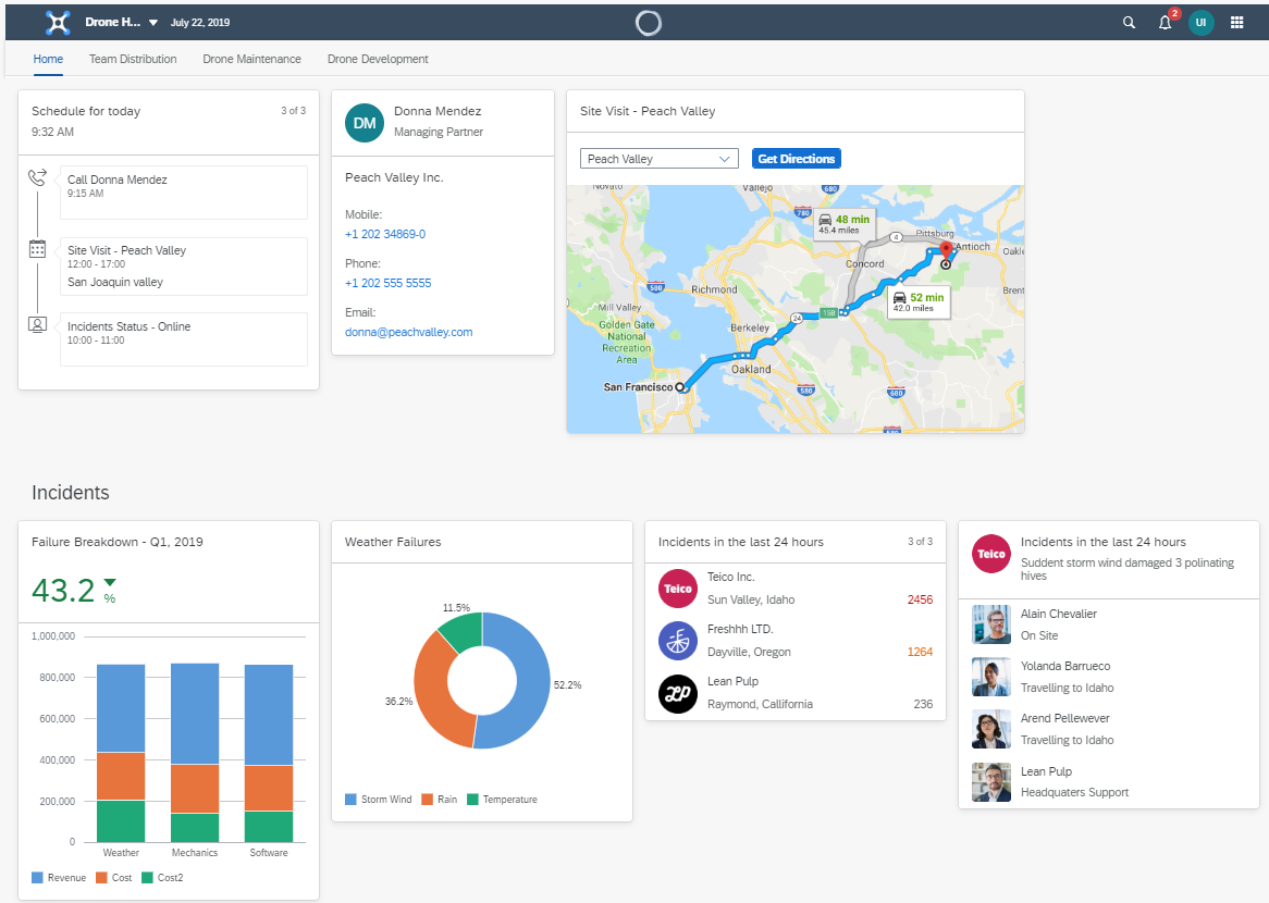
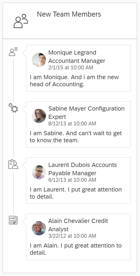
List Card
This card allows you to display multiple items of all kind in a list.

Table Card
Use this card to display multiple items in a tabular form.

Object Card
This type of card can be used to display information about any kind of object. The data can be structured in so-called groups. Each group can contain as much items as needed.

Analytical Card
As the name implies the analytical card type is good for visualizing analytical data in chart format. They support line, stacked bar, stacked column, and donut charts
Note that the analytical card is using sap.viz.ui5.controls.VizFrame charts, which are part of SAPUI5.

Timeline Card
If you need to display any time-related content, the timeline card is the type of choice.
Note that the timeline card is using the sap.suite.ui.commons.Timeline control which is part of SAPUI5.
Component Card
With this card type, you can display a whole UI5 Component as content, which allows huge flexibility. Considering the general purpose of the cards (to represent most important assets of a particular business object in a limited size UI element), it is not recommended to have very complex designs and heavy application-like interactions implemented in this card.

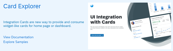
Using the
Card Explorer tool, you can explore and learn more about the integration cards. Check out the documentation to get familiar with the cards and play around with the examples where you can change them on the fly. You can find the Card Explorer in the tools section of the Demo Kit, or simply follow the link:
Card Explorer.
Stay tuned to get more information about card’s host environment, design time, layout and real-world integration examples.
More information
Also you can check out the official documentation about integration cards in the Demo Kit:
Cards, and the
API Reference.
