Every amazing digital experience must seamlessly present business content across multiple devices. Users are at their desk one moment and on their mobile device the next. They expect a delightful user experience in their apps. Based on its design language,
SAP Fiori for Android is the clear choice for SAP mobile customers demanding a consistently exceptional user experience.
Let’s take a look at some brand-new
SAP Fiori for Android user interface components that will certainly excite you.
Collection View
The
collection view arranges images, text, or icons in a highly visual, grid layout (container), which makes it easy for users to preview content at-a-glance. The collection view is available for both phone and tablet devices. With a simple swipe, mobile users can see more cells in the collection.

Do users want to dig deeper to see more details on a cell? All they have to do is tap the object. For example, selecting the asset below shows more details.

Headers Types
SAP Fiori for Android has several types of headers to ensure a consistent and clear user experience in all apps. Two header types are available for mobile and tablet:
Caption Headers (mobile) and
Data Table Headers (tablet only).
Caption Header
A
caption header is simple word or phrase that describes the purpose of the section contents. These headers make it easy to understand the purpose of the content. For example,
Favorite Jobs and
Reminders below are both clear and simple.

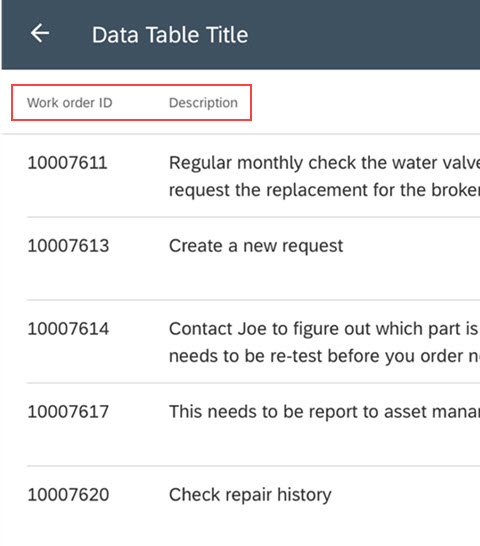
Data Table Header
A
data table header (tablet only) labels columns in the Data Table view just below the app bar. For example,
Work order ID and
Description tell users what content is in each column.
Footers
SAP Fiori for Android also has footers for both tablet and mobile that display a description, label, or button at the bottom of the page. There are four footer types that can be used for various purposes. Let’s take a look at them.
Persistent Footers with Buttons
A
persistent footer with buttons includes one or more buttons with actions for the user to select. In this example, the buttons
Cancel and
Done give users a clear message. They are either done, or they can cancel this action.

Attributes
An
attribute has a text label and its attribute that gives users more information about the content. In this example, if the user selects
SEE ALL (2) they will see 2 more Favorite Jobs that aren’t shown here.

Titles
A
title shows simple, read-only text showing status or indicating action. In this example,
COMPLETE is the read-only title text at the footer that indicates this task is complete.

Helper Text
Helper text provides simple and informative text to help the user. The helper text below tells users
Your job step is up-to-date.

Sound exciting? Well, check out the resources below to learn more!
*Header and Footer designs are not included in the SAP Fiori for Android Software Development Kit (SDK) yet, but are available in the SAP Fiori for Android stencils.
Resources
SAP Fiori for Android Stencils: Download the recently updated stencils with all the new components and enhancements for this release, including collection view, footer, header, list picker form cell, and text inputs.
SAP Fiori for Android Guidelines: The complete design guidelines for SAP Fiori for Android.
What’s New in Fiori for Android: More information on what’s new in the latest release of SAP Fiori for Android.
If you found this blog interesting, be sure to read more about
designing beautiful mobile apps with SAP Fiori for Android.
