

- SAP Community
- Products and Technology
- Technology
- Technology Blogs by SAP
- Web Dynpro ABAP on a Touch Device
Technology Blogs by SAP
Learn how to extend and personalize SAP applications. Follow the SAP technology blog for insights into SAP BTP, ABAP, SAP Analytics Cloud, SAP HANA, and more.
Turn on suggestions
Auto-suggest helps you quickly narrow down your search results by suggesting possible matches as you type.
Showing results for
 Sabine_Kissner
Advisor
Options
- Subscribe to RSS Feed
- Mark as New
- Mark as Read
- Bookmark
- Subscribe
- Printer Friendly Page
- Report Inappropriate Content
06-06-2019
3:21 PM
Introduction
As of SAP_UI 7.54 (1909) WDA is touch-enabled.
You can now optimize your older applications, or build new ones, providing a significantly better user experience on touch devices.
In this blog I will share some thoughts on how to improve your existing applications. As an example, I will use a Web Dynpro application first delivered with SAP_BASIS 7.02 - now 10 years old!
Preconditions and Theme Support
Touch support will only be available for the themes SAP Belize (technical name SAP_BELIZE) and SAP Quartz (technical name SAP_FIORI_3).
Both themes use the same control sizes on touch devices and desktops – the only difference is the greater row height in tables.
There are no other preconditions. The applications will automatically be displayed in touch mode on supported touch devices, independent of the embedding environment (SAP Fiori Launchpad, direct call, etc.).
In touch mode, your users are provided with touch gestures, and the controls are rendered in a touch-friendly design; for example, the resize handles are bigger and easier to grab.
You can find further details in the SAP Note 2700517.
End-user View
| Touch Gesture / Keyboard | Use |
| TAP | Acts like the LEFT MOUSE CLICK on desktop (set the cursor, activate a button or select a checkbox) |
| LONG TAP (PRESS & HOLD) | Opens the context menu; now also shows the tooltip and functions activated ON HOVER or ON DOUBLECLICK |
| SWIPE (one finger) | Lets you SCROLL through content and tables, item list box, message area, and formatted text edit |
| SWIPE (two finger) | Lets you SCROLL through complete years in the date navigator |
| DRAG and DROP (one finger) | For the RESIZE handle in tables, message area, splitter, and for DRAG & DROP of table columns and other scenarios |
| KEYBOARD | Keyboard displayed only if the user taps an editable field; it’s never displayed automatically after navigation or popups |
Utility Methods
To make the screen device-dependent in your code, you need to find out first where the application is running.
To do this, we added some utility methods. We extended the client information to show on which device the application is running. Interface IF_WD_CLIENT_INFORMATION now offers the following methods:
- Method GET_DEVICE_TYPE returns DESKTOP / TABLET / PHONE / COMBI
- Method GET_INTERACTION_TYPE returns TOUCH / KEYBOARD
The interface is available via CL_WD_CLIENT_INFORMATION=>GET_CLIENT_INFORMATION().
Interaction type TOUCH gives the user the touchable UR controls, such as the special context menu or the bigger splitter handle, etc.
Call the methods in WDDOINIT of your component (or anywhere else):
try.

  wd_assist->m_device = cl_wd_client_information=>get_client_information(

                            )->if_wd_client_information~get_device_type( ).

catch cx_wdr_client_inspector.

  wd_assist->m_device = if_wd_client_information=>e_device_type-desktop.

endtry.
Code-based Optimization
Our example is demo application ‘s_epm_wd_po_list’ that uses a demo data model of the purchase order.
We will concentrate on three screens:
- The table on the initial screen
- The detail data of the main editing screen
- The item list of the purchase order showing some pictures


As it looks quite old-fashioned with the small font size and hard contrasts, let’s first switch to our FIORI theme SAP_BELIZE. Now see how the three screens on the desktop look:


Optimize Wide Tables
If we call the application on a tablet, the initial screen looks like this:
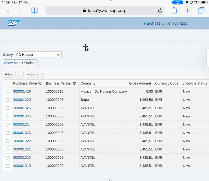
A horizontal scrollbar is displayed (the table doesn’t resize according to the browser size), meaning that you would then have to scroll to see the message area. This is something you definitely want to avoid.
Using the desktop, the user can increase the browser size but on the mobile device there is no such option.
You can do two things to overcome this problem:
1.
Customize the table and activate horizontal scrolling. But this setting is also chosen on the desktop browser.

2.
Change the table setting in the component to be dependent on the device type or the interaction type.
In WDDOMODIFYVIEW of your table view, add:
if first_time = abap_true.
if cl_wd_client_information=>get_client_information(
)->if_wd_client_information~get_interaction_type( )=
if_wd_client_information=>e_interaction_type-touch.
data(lo_table) = cast cl_wd_table( view->get_element( 'TABLE' ) ).
lo_table->set_column_resize_mode(
cl_Wd_table=>e_column_resize_mode-preserve_other_column_widths ).
lo_table->set_fixed_table_layout( abap_true ).
endif.
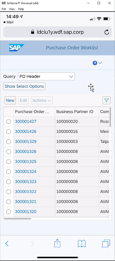
endif.This results in the following screen on the tablet. Note that the message area can be seen immediately and the buttons on the right can be used directly.

On a cell phone it looks like this:
Optimize Group Layout
Our second screen on the tablet looks like this:

The view uses a two-column layout with a matrix layout. As the label wrapping has been switched on all texts are fully visible. There is only a slight drawback regarding the overall alignment of several containers. The values of the ‘General Data’ and ‘Business Partner’ group are no longer aligned.
The same screen on a cell phone is displayed with the horizontal scrollbar as the group container doesn't wrap:

To overcome this, we have two options:
- Dependent on the device type, switch to a one-column matrix layout
- Change the matrix layout to a responsive tile layout. Since this layout adapts to the available browser size, this example shows a one-column layout on phone and a two-column layout on tablet. The width for wrapping is defined by the minimal cell width. Use the parameter allowedColCounts to define the number of columns you want to display.
Now we see one column on the phone and two columns on the tablet:


Optimize Table Layout
The third screen displays a big image in a table. On a tablet it looks like this:

In this case the image blows up the row height and the other columns become very narrow.
We can change the table settings to see the horizontal scrollbar (as on the first screen).
To avoid the immense row height, we can make the image resizable up to 8em. This will also look better on a desktop. You can do this with the following code:
try.

  if cl_wd_client_information=>get_client_information(

        )->if_wd_client_information~get_interaction_type( )

     = if_wd_client_information=>e_interaction_type-touch.

    data(lo_image) = cast cl_wd_image( view->get_element( exporting id =

                                                     'TCI_PRODUCT_IMAGE' ) ).

    lo_image->set_stretchmode( cl_wd_image=>e_stretchmode-fit ).

    lo_image->set_height( '8em' ).

  endif.

  catch cx_wd_client_information.

endtry.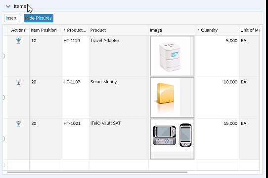
The available space is still not used in the best way - there is a lot of unused space in the table rows.
We can improve this further by using a cTable with increased row height and the multi-cell editor that allows you to display several UI elements within one column.
To use the multi-cell editor in the cTable you need to insert a cell variant of type cTableMultiCellEditor, and add the different cell editors and separators for a line break.


This looks much better and we even got rid of the horizontal scrollbar in the table; the user sees the whole row immediately.
For the phone, we can improve this even further by reducing the columns and adding the information to the multi-editor column:
try.

  if cl_wd_client_information=>get_client_information( )-

                >if_wd_client_information~get_device_type( )

                          = if_wd_client_information=>e_device_type-phone.

    data(lo_c_table) = cast cl_wd_c_table( view->get_element( exporting id = 'CTABLE' ) ).

    lo_c_table->set_row_height( '250' ).

    data(lo_tv) = cast cl_wd_text_view( view->get_element( exporting id = 'PH_LBL_QUAN' ) ).

    lo_tv->set_visible( cl_wd_uielement=>e_visible-visible ).

    lo_tv = cast cl_wd_text_view( view->get_element( exporting id = 'PH_UNIT' ) ).

    lo_tv->set_visible( cl_wd_uielement=>e_visible-visible ).

    data(lo_input) = cast cl_wd_input_field( view->get_element( exporting id = 'PH_QUANTITY' ) ).

    lo_input->set_visible( cl_wd_uielement=>e_visible-visible ).

    lo_tv = cast cl_wd_text_view( view->get_element( exporting id = 'PH_LBL_AMOUNT' ) ).

    lo_tv->set_visible( cl_wd_uielement=>e_visible-visible ).

    lo_tv = cast cl_wd_text_view( view->get_element( exporting id = 'PH_CURR' ) ).

    lo_tv->set_visible( cl_wd_uielement=>e_visible-visible ).

    lo_tv = cast cl_wd_text_view( view->get_element( exporting id = 'PH_AMOUNT' ) ).

    lo_tv->set_visible( cl_wd_uielement=>e_visible-visible ).

    "add separators

    data(lr_ct_mltedtr_cell) = cast cl_wd_c_tbl_multi_editor_cell( view->get_element( exporting

                              id = 'PROD_MULTI' ) ).

    do 4 times.

      " 6 and 8,  11 and 13

      case sy-index.

        when 1. data(lv_idx_2) = 6.

        when 2. lv_idx_2 = 8.

        when 3. lv_idx_2 = 11.

        when 4. lv_idx_2 = 13.

      endcase.

      data(lr_ct_mltedtrcll_sep) = cl_wd_c_tbl_mlt_edtr_cell_sep=>new_c_tbl_mlt_edtr_cell_sep(

                   exporting

                     id   = |SEPARATOR_{ lv_idx_2 }|

                     view = view  ).

      lr_ct_mltedtr_cell->add_editor(

              exporting

                index      = lv_idx_2

                the_editor = lr_ct_mltedtrcll_sep ).

    enddo.

    "remove other column

    data(lo_col) = cast cl_wd_c_table_column( view->get_element( exporting id = 'TC_QUANTITY' ) ).

    lo_col->set_visible( cl_wd_uielement=>e_visible-none ).

    lo_col = cast cl_wd_c_table_column( view->get_element( exporting id = 'TC_AMOUNT' ) ).

    lo_col->set_visible( cl_wd_uielement=>e_visible-none ).

  endif.

  catch cx_wd_client_information.

endtry.
Using this code, the table on a phone looks like this:

Summary
With the new touch-enabled themes, Web Dynpro applications will run automatically on touch devices without further coding changes; each control is optimized for touch gestures.
However, you can provide a better user experience for applications designed for big screens with minor coding changes.
When improving Web Dynpro applications for touch devices, keep three things in mind:
- Avoid the horizontal scroll bar
Use responsive layouts like tile layout or re-arrange containers dependent on the device type
- Avoid texts that are cut off (showing an ellipsis)
Use label wrapping and horizontal scrollbars in tables.
- Show related information together on one screen
Use the multi-cell editor to view the whole row without swiping. Resize big controls like images wherever possible.
With just a small effort not only can you improve the usability on a touch device but you might even make the application look better on a desktop!
- SAP Managed Tags:
- UI Floorplan Manager for Web Dynpro ABAP,
- UI Web Dynpro ABAP
Labels:
3 Comments
You must be a registered user to add a comment. If you've already registered, sign in. Otherwise, register and sign in.
Labels in this area
-
ABAP CDS Views - CDC (Change Data Capture)
2 -
AI
1 -
Analyze Workload Data
1 -
BTP
1 -
Business and IT Integration
2 -
Business application stu
1 -
Business Technology Platform
1 -
Business Trends
1,658 -
Business Trends
91 -
CAP
1 -
cf
1 -
Cloud Foundry
1 -
Confluent
1 -
Customer COE Basics and Fundamentals
1 -
Customer COE Latest and Greatest
3 -
Customer Data Browser app
1 -
Data Analysis Tool
1 -
data migration
1 -
data transfer
1 -
Datasphere
2 -
Event Information
1,400 -
Event Information
66 -
Expert
1 -
Expert Insights
177 -
Expert Insights
293 -
General
1 -
Google cloud
1 -
Google Next'24
1 -
Kafka
1 -
Life at SAP
780 -
Life at SAP
13 -
Migrate your Data App
1 -
MTA
1 -
Network Performance Analysis
1 -
NodeJS
1 -
PDF
1 -
POC
1 -
Product Updates
4,577 -
Product Updates
340 -
Replication Flow
1 -
RisewithSAP
1 -
SAP BTP
1 -
SAP BTP Cloud Foundry
1 -
SAP Cloud ALM
1 -
SAP Cloud Application Programming Model
1 -
SAP Datasphere
2 -
SAP S4HANA Cloud
1 -
SAP S4HANA Migration Cockpit
1 -
Technology Updates
6,873 -
Technology Updates
417 -
Workload Fluctuations
1
Related Content
- Enter the era of spatial computing for enterprise with SAP Build Code in Technology Blogs by SAP
- Know Your Unknown Customer and Improve Customer Experience! in Technology Blogs by Members
- Can I extend a certain app? With Clean Core? How? in Technology Blogs by SAP
- Mock Server configuration in SAP UI5 Application. in Technology Blogs by Members
- SAP Fiori for SAP S/4HANA - How to make a SAP Fiori app or GUI transaction available on your launchpad in Technology Blogs by SAP
Top kudoed authors
| User | Count |
|---|---|
| 34 | |
| 25 | |
| 13 | |
| 7 | |
| 7 | |
| 6 | |
| 6 | |
| 6 | |
| 5 | |
| 4 |