
- SAP Community
- Products and Technology
- Technology
- Technology Blogs by SAP
- Get Ready for SAP Fiori 3
Technology Blogs by SAP
Learn how to extend and personalize SAP applications. Follow the SAP technology blog for insights into SAP BTP, ABAP, SAP Analytics Cloud, SAP HANA, and more.
Turn on suggestions
Auto-suggest helps you quickly narrow down your search results by suggesting possible matches as you type.
Showing results for
 Margot
Product and Topic Expert
Options
- Subscribe to RSS Feed
- Mark as New
- Mark as Read
- Bookmark
- Subscribe
- Printer Friendly Page
- Report Inappropriate Content
05-25-2019
2:59 PM

Plenty has already been written about SAP Fiori 3 – the reimagined design, the new concepts and integration aspects. Let’s turn the talk into action: With UI5 1.65, we have made major design elements of SAP Fiori 3 available for you!
SAP Fiori 3 in a Nutshell
SAP Fiori 3 is SAP’s new target design system, which evolves the SAP Fiori design for all SAP products to fully support the Intelligent Suite, running on any device. It has been defined jointly with all the various SAP product units. They took SAP Fiori 2.0 as a starting point and established which aspects would need to be added to best support them all.
In addition to a new theme with a fresh, modern look and feel, the design of the home pages was revised. A further part is that natural language interaction and machine intelligence will become key part of the experience by integrating them into the foundation of the design.
Design Meets Technology: UI5 as an Enabler for SAP Fiori 3
As UI5 is the technology of choice for enterprise-ready SAP Fiori apps, we made every effort to provide out-of-the-box technical assets that empower customers and partners to enable the SAP Fiori 3 design system. In real terms this means UI5 delivers the SAP Fiori 3 design through the following assets, available as of UI5 1.65: Theming, Cards & Layouting, as well as Shell Bar.
Theming
Each design evolution goes along with a new styling. Therefore, the new SAP Fiori 3 theme is now available with UI5. It is called SAP Quartz Light. It is simple and minimalist, making it easy for customers to theme it to their brand.

Like all UI5 themes, the new SAP Quartz Light theme can be rendered in compact density suitable for desktop devices, as well as cozy density, which provides optimized spacing for touch devices. The size of the controls in cozy mode was reduced a bit for the SAP Quartz Light theme, which on the one hand fulfills the new UX consistency metrics, and on the other hand allows more information to be displayed on the available view port.
Cards & Layouting
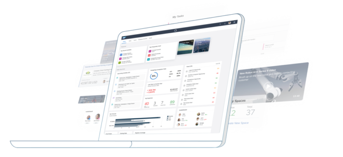
One of the most requested new aspects was being able to provide more information on home pages, which the design and now also UI5 is supporting via cards.
Cards can be integrated into the Central Home and allow you to create custom pages. In addition to the title and a short description of the app, they also show a preview of the information the end user can find in the specific app. UI5 provides six predefined types of these “Integration Cards”, each designed in a different style and contains various content formats:
- Object Card
- Table Card
- List Card
- Timeline Card (not available in OpenUI5)
- Analytical Card (not available in OpenUI5)
- Component Card
With Integration Cards, you can choose between several predefined visualizations. The benefit of using Integration Cards is that each card has its own configuration file (manifest.json), which can be bound to different data sources, following a declarative approach. All Integration Card types can be found under the sap.ui.integration.widgets.Card namespace.

For UI5 apps that don’t require an individual configuration for each card, UI5 provides a standard card control calls sap.f.Card. Its header design is predefined, and its content aggregation allows the app to build any cards’ content via embedding different UI5 controls.

If you want to find out more how the Cards work, you can check the documentation.
For more convenience and to achieve out-of-the-box responsiveness and flexibility while implementing an SAP Fiori 3 home page, UI5 also provided the CSS Grid layout a while ago. This is a two-dimensional layout control based on the native browser CSS display grid, which can handle both columns and rows and properly accommodate Cards.
Shell Bar
In addition to the new Quartz theme, a new shell header bar has been aligned to be a best fit for all SAP products, and to be as simple as possible.
To benefit from this new shell header bar design of SAP Fiori 3 also on your custom home page, UI5 provides the fully-fledged Shell Bar control as an independent unit, a horizontal bar control that holds multiple child controls and is used as an application shell header.
Adopting SAP Fiori 3
The good news is that SAP Fiori 3 is basically technically compatible with Fiori 2.0, so most apps will continue working from a runtime point of view without any problems. Just switch on the new by setting the theme to “sap_fiori_3” and off we go!
Granted: Some minor changes have been made to the theme metrics. This means that if you have built your own custom UI5 controls, you will need to verify that they still work and look fine. The same applies if you use a custom CSS or a runtime CSS converter such as lessify – you will need to test and probably adapt a few things. Here are some pointers:
- Try to use theme parameters instead of hard-coded colors.
- Check the cozy mode since the controls’ metrics for cozy mode are smaller now, allowing e.g. more lines in a table.
And another tip to bring to a close: In case you created your own custom theme on top of Belize with the UI theme designer, you will need to redo it on top of the SAP Quartz Light theme.
Cards, CSSGrid layout and the Shell Bar are still virgin, but released and to yours disposition. Assemble them in your apps, create new one and let us know how they are doing. Feedback and comments are very welcome!
Related Information:
- UI5con@SAP 2019 session recording: Fiori 3 with UI5 and UI5 Web Components
- UI5con@SAP 2019 session recording: Integrating Applications with Cards
- SAP Fiori - How It Started and Where It's Going
- SAP Fiori 3: first parts available for SAPUI5 developers
- Did you notice the first steps of SAP Fiori 3 in your SAP Fiori launchpad?
- What's New in UI5 1.65
- What's New in UI5 1.64
- SAPUI5 Road Map

- SAP Managed Tags:
- SAP Fiori,
- JavaScript,
- Open Source,
- SAPUI5
Labels:
23 Comments
You must be a registered user to add a comment. If you've already registered, sign in. Otherwise, register and sign in.
Labels in this area
-
ABAP CDS Views - CDC (Change Data Capture)
2 -
AI
1 -
Analyze Workload Data
1 -
BTP
1 -
Business and IT Integration
2 -
Business application stu
1 -
Business Technology Platform
1 -
Business Trends
1,658 -
Business Trends
91 -
CAP
1 -
cf
1 -
Cloud Foundry
1 -
Confluent
1 -
Customer COE Basics and Fundamentals
1 -
Customer COE Latest and Greatest
3 -
Customer Data Browser app
1 -
Data Analysis Tool
1 -
data migration
1 -
data transfer
1 -
Datasphere
2 -
Event Information
1,400 -
Event Information
66 -
Expert
1 -
Expert Insights
177 -
Expert Insights
296 -
General
1 -
Google cloud
1 -
Google Next'24
1 -
Kafka
1 -
Life at SAP
780 -
Life at SAP
13 -
Migrate your Data App
1 -
MTA
1 -
Network Performance Analysis
1 -
NodeJS
1 -
PDF
1 -
POC
1 -
Product Updates
4,577 -
Product Updates
342 -
Replication Flow
1 -
RisewithSAP
1 -
SAP BTP
1 -
SAP BTP Cloud Foundry
1 -
SAP Cloud ALM
1 -
SAP Cloud Application Programming Model
1 -
SAP Datasphere
2 -
SAP S4HANA Cloud
1 -
SAP S4HANA Migration Cockpit
1 -
Technology Updates
6,873 -
Technology Updates
420 -
Workload Fluctuations
1
Related Content
- sap.ui.RichTextEditor conflicting with sap cap application validation message popup in Technology Q&A
- ABAP RAP - Service Binding is not getting refreshed automatically after change in CDS Entities in Technology Q&A
- Start page of SAP Signavio Process Insights, discovery edition, the 4 pillars and documentation in Technology Blogs by SAP
- SAP Cloud Identity Services - Identity Authentication with sap ecc in Technology Q&A
- Demystifying the Common Super Domain for SAP Mobile Start in Technology Blogs by SAP
Top kudoed authors
| User | Count |
|---|---|
| 37 | |
| 25 | |
| 17 | |
| 13 | |
| 7 | |
| 7 | |
| 7 | |
| 6 | |
| 6 | |
| 6 |