
- SAP Community
- Products and Technology
- Technology
- Technology Blogs by SAP
- Your Guide to Time Series Forecasting in SAP Analy...
Technology Blogs by SAP
Learn how to extend and personalize SAP applications. Follow the SAP technology blog for insights into SAP BTP, ABAP, SAP Analytics Cloud, SAP HANA, and more.
Turn on suggestions
Auto-suggest helps you quickly narrow down your search results by suggesting possible matches as you type.
Showing results for
Employee
Options
- Subscribe to RSS Feed
- Mark as New
- Mark as Read
- Bookmark
- Subscribe
- Printer Friendly Page
- Report Inappropriate Content
04-12-2019
3:04 PM
Time series forecasting allows you make confident decisions on time series data by predicting future values based on the historical values. Time series data is data that contains a value over time, for instance revenue by month or call volume by week. In SAP Analytics Cloud you can add easily add a forecast to a time series chart, line chart or planning version.
This blog explains how time series forecasting in SAP Analytics Cloud works and answers some frequently asked questions. This is the first in a series of blogs that will explain what is behind the Augmented BI features in SAP Analytics Cloud.
To add a forecast to a chart you simply need to select the forecasting option on the chart as shown. The options available differ based on the chart type and these differences are described when applicable below.

With a time-series, line chart or planning grid, a user can choose between several techniques – Automatic forecasting, Triple Exponential Smoothing and Linear Regression to aid in their decision-making process.
As Linear Regression and Triple Exponential Smoothing are standard well understood techniques we focus on the details of Automatic forecasting here.
The Automatic Forecasting in SAP Analytics Cloud performs advanced statistical analysis to generate forecasts by analyzing trends, fluctuations and seasonality. The forecasting function uses SAP’s proprietary time series technology to analyze historical time series data.
The algorithm works by analyzing the historical data to identify the existing patterns in the data and then using those patterns, projects the future values. The data is analyzed for several different components.
The algorithm will not find all three components in the data, quite often one or two of the components will be detected and these will be used to generate forecasts. The algorithm uses the patterns found in the data to predict the values for future periods.
A more technical description of the algorithm is that the signal is decomposed into additive components as follows:
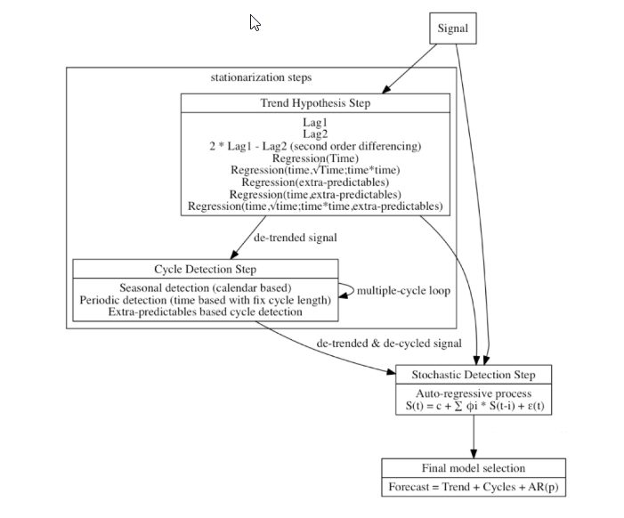
The tool evaluates automatically various combinations of trends, cycles and fluctuations. Eventually it selects the combination that gives the best forecast accuracy. The overall process is represented in the following diagram:
For you to confidently base a decision on a forecast you need to understand the forecast quality. The quality of the forecast is provided in two easily understood ways.
The forecast quality is expressed in terms of a simple 0 to 5 rating where 5 is a very good forecast. The quality can be seen by clicking on the forecast link at the top of chart. In Figure 3 the details of the forecast are shown, and the 5/5 rating can be seen. A natural language explanation of the quality can also be seen by selecting the > to the right of the rating and as you can see this quality is rated as very high.

The 0 to 5 rating is based on a standard statistical quality measure of a forecast known as Mean Absolute Percentage Error or MAPE. The MAPE is expressed as a value between 0 and 1 with a high-quality forecast having a MAPE close to 0. The mapping of MAPE to our rating is as follows:

In addition to the model quality, a confidence interval which corresponds to the upper and lower limit with respect to the forecasted value (shown as a shaded area) is provided.
The forecasted value is a point estimate of the best guess at a given period, for instance Revenue for January. The confidence interval, whose width is twice the standard error of the forecasted values, provides an upper and lower expectation for the forecasted value. By default, the 95% confidence interval is used, allowing the user to be 95% confident that the actual value will lie within the interval.
A narrow confidence indicates a smaller possible range of values around the predicted value and hence a more confident forecast.
You can specify several options when generating a forecast.
There are three algorithms available for Time Series Forecasting in SAP Analytics cloud, Automatic Forecast, Linear Regression and Triple Exponential Smoothing as is shown in Figure 1.
There are two additional forecasting options available: Forecast Periods and Additional Forecast Inputs.

Forecast periods allows you to specify the number of periods for which you wish to generate a forecast. To provide a useful forecast, we limit the number of forecasts available based on the actual data. The number of forecasts offered is calculated as shown.

As an example, if I have monthly sales figures for 48 months the number of forecasts offered is: (48 - 😎 ÷ 4 = 10
Additional Forecast Inputs can be used by the Automatic Forecast algorithm to improve the accuracy of the Forecast. They are calculated measures, measure input controls or additional measures from your data model that you want to consider when creating a forecast. The option of using additional inputs is only available for Time Series Charts. Values for selected measures must be available for the historical periods and for the future periods for which you wish to forecast. For example, if I am forecasting my Total expected Revenue and I want to include No of Customer Meetings as shown in Figure 4. I must have historical values for No of Customer Meetings and future values for No of Customer Meetings for the number of forecast periods selected. Additional Forecast Inputs may improve the accuracy of the forecast, but this is not always the case as if the additional inputs do not improve the quality of the model they will not be used.
The data source support varies depending on the feature usage. The following table summarizes this:

The system configuration setting Live Data Models: Enable Smart Grouping and predictive forecasting in Time Series controls enabling forecasting for Time Series Charts and Line Charts on live data connections for a tenant.
This blog explains how time series forecasting in SAP Analytics Cloud works and answers some frequently asked questions. This is the first in a series of blogs that will explain what is behind the Augmented BI features in SAP Analytics Cloud.
Get started today with your free trial for SAP Analytics Cloud. Sign up now.
How does Time Series Forecasting in SAP Analytics Cloud work?
To add a forecast to a chart you simply need to select the forecasting option on the chart as shown. The options available differ based on the chart type and these differences are described when applicable below.
With a time-series, line chart or planning grid, a user can choose between several techniques – Automatic forecasting, Triple Exponential Smoothing and Linear Regression to aid in their decision-making process.
As Linear Regression and Triple Exponential Smoothing are standard well understood techniques we focus on the details of Automatic forecasting here.
The Automatic Forecasting in SAP Analytics Cloud performs advanced statistical analysis to generate forecasts by analyzing trends, fluctuations and seasonality. The forecasting function uses SAP’s proprietary time series technology to analyze historical time series data.
What is the technology behind SAP Analytics Cloud's Automatic Forecast?
The algorithm works by analyzing the historical data to identify the existing patterns in the data and then using those patterns, projects the future values. The data is analyzed for several different components.
- The data is analyzed for an underlying trend, is the data trending up or down over time and is that trend linear or polynomial. A linear trend increases or decreases along a line and in contrast a polynomial trend follows a curve.
- The second component identified is cycles in the data, does the data repeat every 10 days, every 3 months, at Christmas every year or at the then end or each fiscal quarter. More than one cycle can be identified in the data.
- Finally, when the trend and the cycles are accounted for, the remaining data is analyzed to see if a pattern can be found.
The algorithm will not find all three components in the data, quite often one or two of the components will be detected and these will be used to generate forecasts. The algorithm uses the patterns found in the data to predict the values for future periods.
A more technical description of the algorithm is that the signal is decomposed into additive components as follows:
Signal = Trend + Cycles + Fluctuation + Residual
The tool evaluates automatically various combinations of trends, cycles and fluctuations. Eventually it selects the combination that gives the best forecast accuracy. The overall process is represented in the following diagram:
How do I determine the quality of the forecast?
For you to confidently base a decision on a forecast you need to understand the forecast quality. The quality of the forecast is provided in two easily understood ways.
The forecast quality is expressed in terms of a simple 0 to 5 rating where 5 is a very good forecast. The quality can be seen by clicking on the forecast link at the top of chart. In Figure 3 the details of the forecast are shown, and the 5/5 rating can be seen. A natural language explanation of the quality can also be seen by selecting the > to the right of the rating and as you can see this quality is rated as very high.
The 0 to 5 rating is based on a standard statistical quality measure of a forecast known as Mean Absolute Percentage Error or MAPE. The MAPE is expressed as a value between 0 and 1 with a high-quality forecast having a MAPE close to 0. The mapping of MAPE to our rating is as follows:
In addition to the model quality, a confidence interval which corresponds to the upper and lower limit with respect to the forecasted value (shown as a shaded area) is provided.
The forecasted value is a point estimate of the best guess at a given period, for instance Revenue for January. The confidence interval, whose width is twice the standard error of the forecasted values, provides an upper and lower expectation for the forecasted value. By default, the 95% confidence interval is used, allowing the user to be 95% confident that the actual value will lie within the interval.
A narrow confidence indicates a smaller possible range of values around the predicted value and hence a more confident forecast.
What options do I have to customize the Forecast?
You can specify several options when generating a forecast.
There are three algorithms available for Time Series Forecasting in SAP Analytics cloud, Automatic Forecast, Linear Regression and Triple Exponential Smoothing as is shown in Figure 1.
- Automatic Forecast is a process that evaluates several algorithms and models and uses a combined model that performs best as is described above.
- Linear Regression forces the model to be a linear regression on time.
- Triple Exponential Smoothing forces the model to be a Triple Exponential Smoothing model. The parameters that control the algorithm are automatically tuned to minimize the error.
There are two additional forecasting options available: Forecast Periods and Additional Forecast Inputs.
Forecast periods allows you to specify the number of periods for which you wish to generate a forecast. To provide a useful forecast, we limit the number of forecasts available based on the actual data. The number of forecasts offered is calculated as shown.
As an example, if I have monthly sales figures for 48 months the number of forecasts offered is: (48 - 😎 ÷ 4 = 10
Additional Forecast Inputs can be used by the Automatic Forecast algorithm to improve the accuracy of the Forecast. They are calculated measures, measure input controls or additional measures from your data model that you want to consider when creating a forecast. The option of using additional inputs is only available for Time Series Charts. Values for selected measures must be available for the historical periods and for the future periods for which you wish to forecast. For example, if I am forecasting my Total expected Revenue and I want to include No of Customer Meetings as shown in Figure 4. I must have historical values for No of Customer Meetings and future values for No of Customer Meetings for the number of forecast periods selected. Additional Forecast Inputs may improve the accuracy of the forecast, but this is not always the case as if the additional inputs do not improve the quality of the model they will not be used.
What data sources are supported?
The data source support varies depending on the feature usage. The following table summarizes this:
The system configuration setting Live Data Models: Enable Smart Grouping and predictive forecasting in Time Series controls enabling forecasting for Time Series Charts and Line Charts on live data connections for a tenant.
Labels:
You must be a registered user to add a comment. If you've already registered, sign in. Otherwise, register and sign in.
Labels in this area
-
ABAP CDS Views - CDC (Change Data Capture)
2 -
AI
1 -
Analyze Workload Data
1 -
BTP
1 -
Business and IT Integration
2 -
Business application stu
1 -
Business Technology Platform
1 -
Business Trends
1,661 -
Business Trends
88 -
CAP
1 -
cf
1 -
Cloud Foundry
1 -
Confluent
1 -
Customer COE Basics and Fundamentals
1 -
Customer COE Latest and Greatest
3 -
Customer Data Browser app
1 -
Data Analysis Tool
1 -
data migration
1 -
data transfer
1 -
Datasphere
2 -
Event Information
1,400 -
Event Information
65 -
Expert
1 -
Expert Insights
178 -
Expert Insights
280 -
General
1 -
Google cloud
1 -
Google Next'24
1 -
Kafka
1 -
Life at SAP
784 -
Life at SAP
11 -
Migrate your Data App
1 -
MTA
1 -
Network Performance Analysis
1 -
NodeJS
1 -
PDF
1 -
POC
1 -
Product Updates
4,577 -
Product Updates
330 -
Replication Flow
1 -
RisewithSAP
1 -
SAP BTP
1 -
SAP BTP Cloud Foundry
1 -
SAP Cloud ALM
1 -
SAP Cloud Application Programming Model
1 -
SAP Datasphere
2 -
SAP S4HANA Cloud
1 -
SAP S4HANA Migration Cockpit
1 -
Technology Updates
6,886 -
Technology Updates
408 -
Workload Fluctuations
1
Related Content
- New Machine Learning features in SAP HANA Cloud in Technology Blogs by SAP
- Kyma Integration with SAP Cloud Logging. Part 2: Let's ship some traces in Technology Blogs by SAP
- Getting time dimension in SAC from HANA cloud as a data source in Technology Q&A
- 10+ ways to reshape your SAP landscape with SAP BTP - Blog 4 Interview in Technology Blogs by SAP
- 10+ ways to reshape your SAP landscape with SAP Business Technology Platform – Blog 4 in Technology Blogs by SAP
Top kudoed authors
| User | Count |
|---|---|
| 13 | |
| 10 | |
| 10 | |
| 7 | |
| 6 | |
| 5 | |
| 5 | |
| 5 | |
| 4 | |
| 4 |