
- SAP Community
- Products and Technology
- Technology
- Technology Blogs by SAP
- Working with Cards on UI5 1.62
Technology Blogs by SAP
Learn how to extend and personalize SAP applications. Follow the SAP technology blog for insights into SAP BTP, ABAP, SAP Analytics Cloud, SAP HANA, and more.
Turn on suggestions
Auto-suggest helps you quickly narrow down your search results by suggesting possible matches as you type.
Showing results for
former_member59
Participant
Options
- Subscribe to RSS Feed
- Mark as New
- Mark as Read
- Bookmark
- Subscribe
- Printer Friendly Page
- Report Inappropriate Content
03-11-2019
5:54 AM
If you've already navigated through SAP Fiori Design Guidelines you probably have already bumped into the Overview Page concept, a page supposed to be the entry point to a user, having all the information and actions he or she daily needs. Until now, this layout was only available in Fiori Elements, those data-driven generated applications, but now, in UI5 1.62 version, we have the opportunity to develop our own pages using Cards that are the OVP layout basis. Currently, this component has really confusing documentation, so I thought I could share with you what I've found and show you how to create a simple application using them.
All code shown here is available in my Github repo.
So, first of all, I created a simple blank UI5 app to start with. Inside our main page, to display Cards, we can use sap.f.CardContainer as an aggregator (this component doesn't have documentation yet, but is used in some samples). Then, we can define as many Cards as we want, like this:
Ok, if you try to run this app, you'll see that the page is still blank. So, let's take a look a the Card properties:

Height and width are self-explanatory, but this manifest was my main problem when trying to develop cards. Type any doesn't help too, we have no idea what to put in here. So, there are some samples with examples of how to define a manifest, but I'll compile here everything that is possible.
First of all, the manifest is simply a JSON file you can define within your files structure. It always starts like this:
And you define all the properties inside this object. Currently, you can create List or Analytical cards, so I'll show you which properties you can use in each of them.
The default header has these options:
It generates this card:

I couldn't really make backgroundColor and color work, but the options are there, maybe I'm missing something.
The numeric header has these options:
And it looks like this:
For the numeric header, we can fetch data, but I'll talk about this later.
On List cards, we define where the data comes from and how it should be shown for each item in the list. For hardcoded data, you can define it like this:
And it looks like this:

Of course, you won't always use data defined like this. If you have an API endpoint to fetch data from, you can use the request property, instead of json:
Inside request, the only required property is url, so only use the other ones if needed.
With this structure, you can already do a lot with lists (visually, at least), but some main features are still missing, like setting an onClick callback for the items.
Header works exactly the same for both types of cards.
As stated in Fiori Guidelines for Analytical Cards:
Its structure is as follow:
The result is this chart:

Of course, the data can be fetched from an API as shown before.
So, as of this version, that's all we can achieve using cards. Personally, this is an exciting addition, and I'm looking forward to the next steps and types of Cards we'll be able to use in the future. Information on how to set the manifests to the model and for the complete code, head to my Github repo.
All code shown here is available in my Github repo.
So, first of all, I created a simple blank UI5 app to start with. Inside our main page, to display Cards, we can use sap.f.CardContainer as an aggregator (this component doesn't have documentation yet, but is used in some samples). Then, we can define as many Cards as we want, like this:
<mvc:View controllerName="card-blog.Sample.controller.Dashboard"

	xmlns:mvc="sap.ui.core.mvc" displayBlock="true"

	xmlns="sap.m"

	xmlns:f="sap.f"

	xmlns:w="sap.ui.integration.widgets"

	xmlns:core="sap.ui.core">

	<Shell id="shell">

		<App id="app">

			<pages>

				<Page id="page"

							title="{i18n>pageTitle}">

					<content>

						<f:CardContainer>

							<w:Card />

						</f:CardContainer>

					</content>

				</Page>

			</pages>

		</App>

	</Shell>

</mvc:View>
Ok, if you try to run this app, you'll see that the page is still blank. So, let's take a look a the Card properties:
Height and width are self-explanatory, but this manifest was my main problem when trying to develop cards. Type any doesn't help too, we have no idea what to put in here. So, there are some samples with examples of how to define a manifest, but I'll compile here everything that is possible.
First of all, the manifest is simply a JSON file you can define within your files structure. It always starts like this:
"sap.card": {

  "type": "List" //or Analytical

  ...

}
And you define all the properties inside this object. Currently, you can create List or Analytical cards, so I'll show you which properties you can use in each of them.
List Card
Header
Default
The default header has these options:
{

  "ListDefaultHeader": {

    "sap.card": {

      "type": "List",

      "header": {

        "title": "Title",

        "subTitle": "Subtitle",

        "icon": {

          "src": "sap-icon://accept",

          "alt": "AltIcon",

          "shape": "Circle",

          "text": "IconText",

          "backgroundColor": "green",

          "color": "#fff"

        },

        "status": {

          "text": "status"

        }

      }

    }

  }

}
It generates this card:
I couldn't really make backgroundColor and color work, but the options are there, maybe I'm missing something.
Numeric
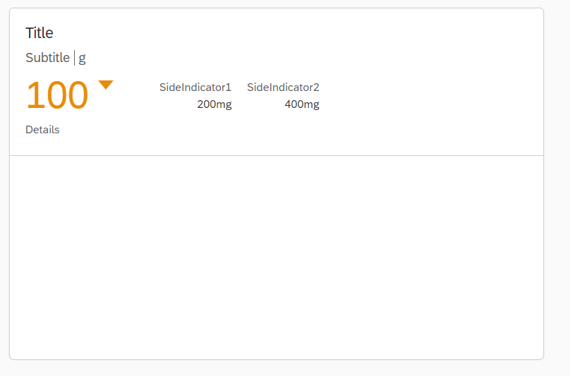
The numeric header has these options:
"ListNumericHeader": {

    "sap.card": {

      "type": "List",

      "header": {

        "title": "Title",

        "subTitle": "Subtitle",

        "type": "Numeric",

        "unitOfMeasurement": "g",

        "mainIndicator": {

          "number": "100",

          "trend": "Down", //Down, None or Up

          "state": "Critical" //Critical, Error, Good or Neutral

        },

        "details": "Details",

        "sideIndicators": [

          {

            "title": "SideIndicator1",

            "number": "200",

            "unit": "mg"

          },

          {

            "title": "SideIndicator2",

            "number": "400",

            "unit": "mg"

          }

        ]

      }

    }

  }
And it looks like this:
For the numeric header, we can fetch data, but I'll talk about this later.
Content
On List cards, we define where the data comes from and how it should be shown for each item in the list. For hardcoded data, you can define it like this:
"content": {

        "data": {

          "json": [

              {

                "title": "Item1 Title",

                "description": "Item1 Description",

                "info": "Item1 Info",

                "state": "Error"

              },

              {

                "title": "Item2 Title",

                "description": "Item2 Description",

                "info": "Item2 Info",

                "state": "Warning"

              },

              {

                "title": "Item3 Title",

                "description": "Item3 Description",

                "info": "Item3 Info",

                "state": "Success"

              }

            ]

        },

        "item": {

          "title": {

            "label": "TitleLabel",

            "value": "{title}"

          },

          "description": {

            "label": "DescLabel",

            "value": "{description}"

          },

          "info": {

            "label": "InfoLabel",

            "value": "{info}",

            "state": "{state}" //Error, Success, Warning or None

          },

          "highlight": "{state}", //Error, Success, Warning, None or Information

          "icon": {

            "src": "sap-icon://action",

            "alt": "AltIcon",

            "shape": "Circle", //Square or Circle

            "text": "IconText",

            "backgroundColor": "green",

            "color": "#fff"

          }

        }

      }
And it looks like this:
Of course, you won't always use data defined like this. If you have an API endpoint to fetch data from, you can use the request property, instead of json:
"data": {

  "request": {

    "mode": "cors", //no-cors, same-origin or cors

    "method": "GET", //GET or POST

    "parameters": {

      "type": "1"

    },

    "headers": {

      "x-csrf-token": "123456789"

    },

    "url": "https://urltest.com/test"

  },

  "path": "/Items"

}
Inside request, the only required property is url, so only use the other ones if needed.
With this structure, you can already do a lot with lists (visually, at least), but some main features are still missing, like setting an onClick callback for the items.
Analytical Card
Header
Header works exactly the same for both types of cards.
Content
As stated in Fiori Guidelines for Analytical Cards:
The analytical card is used for data visualization. It consists of two areas – a header area (either a standard header or a KPI header) and a chart area with a visual representation of the data.
Its structure is as follow:
"content": {

  "data": {

    "json": [

        {

          "Dimension": "Dimension1",

          "Measure": 1

        },

        {

          "Dimension": "Dimension2",

          "Measure": 2

        },

        {

          "Dimension": "Dimension3",

          "Measure": 3

        }

      ]

  },

  "chartType": "Line", //Line, StackedColumn, StackedBar or Donut

  "legend": {

    "visible": true,

    "position": "Top", //Top, Bottom, Left, Right

    "alignment": "Center" //TopLeft, Center

  },

  "plotArea": {

    "dataLabel": {

      "visible": true,

      "showTotal": true

    },

    "categoryAxisText": {

      "visible": true

    },

    "valueAxisText": {

      "visible": true

    }

  },

  "title": {

    "visible": true,

    "text": "Chart title",

    "alignment": "Left" //Left, Center, Right

  },

  "measureAxis": "valueAxis",

  "dimensionAxis": "categoryAxis",

  "dimensions": [

    {

      "label": "Dimension1",

      "value": "{Dimension}"

    }

  ],

  "measures": [

    {

      "label": "Measure1",

      "value": "{Measure}"

    }

  ]

}
The result is this chart:
Of course, the data can be fetched from an API as shown before.
So, as of this version, that's all we can achieve using cards. Personally, this is an exciting addition, and I'm looking forward to the next steps and types of Cards we'll be able to use in the future. Information on how to set the manifests to the model and for the complete code, head to my Github repo.
- SAP Managed Tags:
- SAPUI5
Labels:
27 Comments
You must be a registered user to add a comment. If you've already registered, sign in. Otherwise, register and sign in.
Labels in this area
-
ABAP CDS Views - CDC (Change Data Capture)
2 -
AI
1 -
Analyze Workload Data
1 -
BTP
1 -
Business and IT Integration
2 -
Business application stu
1 -
Business Technology Platform
1 -
Business Trends
1,658 -
Business Trends
92 -
CAP
1 -
cf
1 -
Cloud Foundry
1 -
Confluent
1 -
Customer COE Basics and Fundamentals
1 -
Customer COE Latest and Greatest
3 -
Customer Data Browser app
1 -
Data Analysis Tool
1 -
data migration
1 -
data transfer
1 -
Datasphere
2 -
Event Information
1,400 -
Event Information
66 -
Expert
1 -
Expert Insights
177 -
Expert Insights
293 -
General
1 -
Google cloud
1 -
Google Next'24
1 -
Kafka
1 -
Life at SAP
780 -
Life at SAP
13 -
Migrate your Data App
1 -
MTA
1 -
Network Performance Analysis
1 -
NodeJS
1 -
PDF
1 -
POC
1 -
Product Updates
4,577 -
Product Updates
341 -
Replication Flow
1 -
RisewithSAP
1 -
SAP BTP
1 -
SAP BTP Cloud Foundry
1 -
SAP Cloud ALM
1 -
SAP Cloud Application Programming Model
1 -
SAP Datasphere
2 -
SAP S4HANA Cloud
1 -
SAP S4HANA Migration Cockpit
1 -
Technology Updates
6,873 -
Technology Updates
419 -
Workload Fluctuations
1
Related Content
- Cap list output from query not working in Technology Q&A
- Add React app to SAP Build Workzone in Technology Q&A
- On Uploading PDF or PPt File Getting 403 Error Forbidden in Technology Q&A
- Consuming SAP with SAP Build Apps - Mobile Apps for iOS and Android in Technology Blogs by SAP
- Demystifying the Common Super Domain for SAP Mobile Start in Technology Blogs by SAP
Top kudoed authors
| User | Count |
|---|---|
| 36 | |
| 25 | |
| 16 | |
| 13 | |
| 7 | |
| 7 | |
| 6 | |
| 6 | |
| 6 | |
| 6 |