
- SAP Community
- Products and Technology
- Enterprise Resource Planning
- ERP Blogs by Members
- PlanViz Analysis on CDS views
Enterprise Resource Planning Blogs by Members
Gain new perspectives and knowledge about enterprise resource planning in blog posts from community members. Share your own comments and ERP insights today!
Turn on suggestions
Auto-suggest helps you quickly narrow down your search results by suggesting possible matches as you type.
Showing results for
former_member36
Explorer
Options
- Subscribe to RSS Feed
- Mark as New
- Mark as Read
- Bookmark
- Subscribe
- Printer Friendly Page
- Report Inappropriate Content
12-31-2018
10:06 PM
The Plan Visualizer or PlanViz tool in SAP HANA is the primary tool to understand query runtime performance.
Steps to Analyze the planViz:
1) First, goto ST05 and activate the trace.

2) Now from Hana Studio, execute the CDS view on which you want to check the performance.

3) After sucessfully executed the CDS view in Hana Studio, deactivate the Trace that was enabled before.
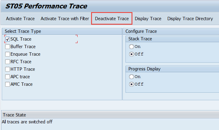
4) Click on the Display Trace.
5) Now select the row which the statement is reading from CDS view.

6) Now goto Edit -> Display Executive Plan -> For Recorded Statement (F9)

6) now click on Executive Trace button

7) Save the file with extension .plv

8) Now goto HanaStudio to open the .plv file.

9) In the overwiew, you can also check the information in the different tabs Timeline ,Operator List, Table used , Performance trace , Network to find more information about the execution.
The network traffic in PlanViz gives you the inter-node data transfer during query execution.
Things like large joins of tables that are located on different nodes require data transfer between those nodes. And this this takes more time to perform the same operation in main memory on a single node, you will see longer execution times for such queries on multi-node systems.
Mapping the Information Model to PlanViz
To get to an understanding of what is happening in PlanViz, it is usually a good idea to map the single operations of the information model to the PlanViz output.
You can click on the ‘Executed Plan’ to go to the details of the execution. You can drill down in detail to see the execution steps.
You Can see the filter conditions applied on the table.

Every box in the PlanViz output represents a so-called plan operator (POP). The names of the plan operators provide a hint as to which execution engine processes them. POP names starting with CE are executed in the calculation engine, those starting with BW are executed in the OLAP engine, and those starting with JE are executed in the join engine.
In the PlanViz display, data flows from bottom to top. That is, our query result is at the top of the view and the actual data retrieval from database tables is at the bottom. The plan operators in between represent the transformations needed in order to get from the data in the tables to the desired output of the data model. In the modeler interface for calculation views, the data flow direction is also from bottom up.
If there are parallel process running it will also show the process running in parallel in separate boxes. This is very important when you have a complex plan and you want to understand if the processes are running in parallel or not. In my current example I do not have parallel process , but in most scenarios you will see parallel process running in different parallel boxes.
As our example is rather simple, the mapping is not too difficult. In the calculation view, we have the result node (implicitly containing a projection), an aggregation, and a filter on top of a join of data retrieved from two analytic views.
By hovering over any of the boxes, a Details pop-up window appears that contains information on the specific box.
The Exclusive Time in the node refers the time taken to execute a single operation. The Exclusive Time in the Join(JECreateNTuple) node is 0.1 ms . The Inclusive Time is the time taken to execute the complete operation including the time of the children operators and excluding compile time. The information provided on the node helps to understand the performance of the executed operations.
If you have a very big PlanViz you can do a Show critical path only to understand the important execution and focus your analysis to those boxes.

You can also use ‘Show Critical Path Only’ by right click and select.

This graphic is a very powerful tool for studying performance of queries on SAP HANA databases. You can explore the graphic further, for example, you can expand, collapse, or rearrange nodes on the screen. You can also save the graphic as an image or XML file, for example, so you can submit it as part of a support query.
Steps to Analyze the planViz:
1) First, goto ST05 and activate the trace.
2) Now from Hana Studio, execute the CDS view on which you want to check the performance.
3) After sucessfully executed the CDS view in Hana Studio, deactivate the Trace that was enabled before.
4) Click on the Display Trace.
5) Now select the row which the statement is reading from CDS view.
6) Now goto Edit -> Display Executive Plan -> For Recorded Statement (F9)
6) now click on Executive Trace button
7) Save the file with extension .plv
8) Now goto HanaStudio to open the .plv file.
9) In the overwiew, you can also check the information in the different tabs Timeline ,Operator List, Table used , Performance trace , Network to find more information about the execution.
The network traffic in PlanViz gives you the inter-node data transfer during query execution.
Things like large joins of tables that are located on different nodes require data transfer between those nodes. And this this takes more time to perform the same operation in main memory on a single node, you will see longer execution times for such queries on multi-node systems.
Mapping the Information Model to PlanViz
To get to an understanding of what is happening in PlanViz, it is usually a good idea to map the single operations of the information model to the PlanViz output.
You can click on the ‘Executed Plan’ to go to the details of the execution. You can drill down in detail to see the execution steps.
You Can see the filter conditions applied on the table.
Every box in the PlanViz output represents a so-called plan operator (POP). The names of the plan operators provide a hint as to which execution engine processes them. POP names starting with CE are executed in the calculation engine, those starting with BW are executed in the OLAP engine, and those starting with JE are executed in the join engine.
In the PlanViz display, data flows from bottom to top. That is, our query result is at the top of the view and the actual data retrieval from database tables is at the bottom. The plan operators in between represent the transformations needed in order to get from the data in the tables to the desired output of the data model. In the modeler interface for calculation views, the data flow direction is also from bottom up.
If there are parallel process running it will also show the process running in parallel in separate boxes. This is very important when you have a complex plan and you want to understand if the processes are running in parallel or not. In my current example I do not have parallel process , but in most scenarios you will see parallel process running in different parallel boxes.
As our example is rather simple, the mapping is not too difficult. In the calculation view, we have the result node (implicitly containing a projection), an aggregation, and a filter on top of a join of data retrieved from two analytic views.
By hovering over any of the boxes, a Details pop-up window appears that contains information on the specific box.
The Exclusive Time in the node refers the time taken to execute a single operation. The Exclusive Time in the Join(JECreateNTuple) node is 0.1 ms . The Inclusive Time is the time taken to execute the complete operation including the time of the children operators and excluding compile time. The information provided on the node helps to understand the performance of the executed operations.
If you have a very big PlanViz you can do a Show critical path only to understand the important execution and focus your analysis to those boxes.
You can also use ‘Show Critical Path Only’ by right click and select.
This graphic is a very powerful tool for studying performance of queries on SAP HANA databases. You can explore the graphic further, for example, you can expand, collapse, or rearrange nodes on the screen. You can also save the graphic as an image or XML file, for example, so you can submit it as part of a support query.
- SAP Managed Tags:
- SAP S/4HANA
6 Comments
You must be a registered user to add a comment. If you've already registered, sign in. Otherwise, register and sign in.
Labels in this area
-
"mm02"
1 -
A_PurchaseOrderItem additional fields
1 -
ABAP
1 -
ABAP Extensibility
1 -
ACCOSTRATE
1 -
ACDOCP
1 -
Adding your country in SPRO - Project Administration
1 -
Advance Return Management
1 -
AI and RPA in SAP Upgrades
1 -
Approval Workflows
1 -
ARM
1 -
ASN
1 -
Asset Management
1 -
Associations in CDS Views
1 -
auditlog
1 -
Authorization
1 -
Availability date
1 -
Azure Center for SAP Solutions
1 -
AzureSentinel
2 -
Bank
1 -
BAPI_SALESORDER_CREATEFROMDAT2
1 -
BRF+
1 -
BRFPLUS
1 -
Bundled Cloud Services
1 -
business participation
1 -
Business Processes
1 -
CAPM
1 -
Carbon
1 -
Cental Finance
1 -
CFIN
1 -
CFIN Document Splitting
1 -
Cloud ALM
1 -
Cloud Integration
1 -
condition contract management
1 -
Connection - The default connection string cannot be used.
1 -
Custom Table Creation
1 -
Customer Screen in Production Order
1 -
Data Quality Management
1 -
Date required
1 -
Decisions
1 -
desafios4hana
1 -
Developing with SAP Integration Suite
1 -
Direct Outbound Delivery
1 -
DMOVE2S4
1 -
EAM
1 -
EDI
2 -
EDI 850
1 -
EDI 856
1 -
edocument
1 -
EHS Product Structure
1 -
Emergency Access Management
1 -
Energy
1 -
EPC
1 -
Financial Operations
1 -
Find
1 -
FINSSKF
1 -
Fiori
1 -
Flexible Workflow
1 -
Gas
1 -
Gen AI enabled SAP Upgrades
1 -
General
1 -
generate_xlsx_file
1 -
Getting Started
1 -
HomogeneousDMO
1 -
IDOC
2 -
Integration
1 -
Learning Content
2 -
LogicApps
2 -
low touchproject
1 -
Maintenance
1 -
management
1 -
Material creation
1 -
Material Management
1 -
MD04
1 -
MD61
1 -
methodology
1 -
Microsoft
2 -
MicrosoftSentinel
2 -
Migration
1 -
MRP
1 -
MS Teams
2 -
MT940
1 -
Newcomer
1 -
Notifications
1 -
Oil
1 -
open connectors
1 -
Order Change Log
1 -
ORDERS
2 -
OSS Note 390635
1 -
outbound delivery
1 -
outsourcing
1 -
PCE
1 -
Permit to Work
1 -
PIR Consumption Mode
1 -
PIR's
1 -
PIRs
1 -
PIRs Consumption
1 -
PIRs Reduction
1 -
Plan Independent Requirement
1 -
Premium Plus
1 -
pricing
1 -
Primavera P6
1 -
Process Excellence
1 -
Process Management
1 -
Process Order Change Log
1 -
Process purchase requisitions
1 -
Product Information
1 -
Production Order Change Log
1 -
Purchase requisition
1 -
Purchasing Lead Time
1 -
Redwood for SAP Job execution Setup
1 -
RISE with SAP
1 -
RisewithSAP
1 -
Rizing
1 -
S4 Cost Center Planning
1 -
S4 HANA
1 -
S4HANA
3 -
Sales and Distribution
1 -
Sales Commission
1 -
sales order
1 -
SAP
2 -
SAP Best Practices
1 -
SAP Build
1 -
SAP Build apps
1 -
SAP Cloud ALM
1 -
SAP Data Quality Management
1 -
SAP Maintenance resource scheduling
2 -
SAP Note 390635
1 -
SAP S4HANA
2 -
SAP S4HANA Cloud private edition
1 -
SAP Upgrade Automation
1 -
SAP WCM
1 -
SAP Work Clearance Management
1 -
Schedule Agreement
1 -
SDM
1 -
security
2 -
Settlement Management
1 -
soar
2 -
SSIS
1 -
SU01
1 -
SUM2.0SP17
1 -
SUMDMO
1 -
Teams
2 -
User Administration
1 -
User Participation
1 -
Utilities
1 -
va01
1 -
vendor
1 -
vl01n
1 -
vl02n
1 -
WCM
1 -
X12 850
1 -
xlsx_file_abap
1 -
YTD|MTD|QTD in CDs views using Date Function
1
- « Previous
- Next »
Related Content
- Custom Authorization for Profit Center Hierarchy in Group Reporting in Enterprise Resource Planning Blogs by SAP
- Memory Usage Statistics in Enterprise Resource Planning Q&A
- How to design sales prices in SAP S/4HANA and be ready for future innovations in Enterprise Resource Planning Blogs by SAP
- How to design sales prices in SAP S/4HANA and be ready for future innovations in Enterprise Resource Planning Blogs by SAP
- Readiness for Universal Parallel Accounting in Enterprise Resource Planning Blogs by SAP
Top kudoed authors
| User | Count |
|---|---|
| 6 | |
| 2 | |
| 2 | |
| 2 | |
| 2 | |
| 2 | |
| 2 | |
| 1 | |
| 1 | |
| 1 |