

- SAP Community
- Products and Technology
- Technology
- Technology Blogs by SAP
- Unveiling Key User Tools in SAP Fiori Elements - O...
Technology Blogs by SAP
Learn how to extend and personalize SAP applications. Follow the SAP technology blog for insights into SAP BTP, ABAP, SAP Analytics Cloud, SAP HANA, and more.
Turn on suggestions
Auto-suggest helps you quickly narrow down your search results by suggesting possible matches as you type.
Showing results for
former_member10
Contributor
Options
- Subscribe to RSS Feed
- Mark as New
- Mark as Read
- Bookmark
- Subscribe
- Printer Friendly Page
- Report Inappropriate Content
10-31-2018
8:14 AM
Motivation
As we already know Overview Pages plays a key role in the overall information architecture. And thus user adaptation is a highly desirable feature.
Basic code-less enhancements like change of card title/sub-tile or to adding of a "Frequently used apps" cards are missing as of now . Coded enhancements available are decoupled from the original app . They are not completely upgrade safe and come with an additional cost of adaptation and and obvious increased cost of ownership .
To address these, Overview Pages supports user interface adaptation starting SAPUI5 version 1.58.2. This is available for Key users with special roles assigned. The Key user has the capability of making additional customisations to an OVP app related to the following features, which can then be published and then made available to all users.
Prerequisite
The Key user requires the role SAP_UI_FLEX_KEY_USER to be assigned for using this feature. This can be assigned using SU01 in the required system. For cloud systems the user is FlexKeyUser. More info on this can be found here.
Features
For a Key user the following set of features are available in the UI Adaptation Mode.
To enable UI Adaptation Mode
Click on the Me Area àAdapt UI

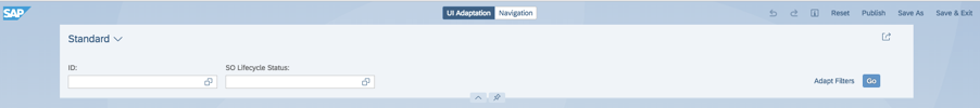
The selected mode "UI Adaptation" is displayed on top of the screen as follows:
You can now proceed to make use of the user adaptation features available in OVP.
On click of a card a context menu is shown as follows:

On click of the ellipsis or a right click of the card results in the following options to be shown:

Hide Card
This gives a provision to hide cards on initial load by the Key user. The cards will continue show up in the Manage Cards section and the end user will be able to view them later.
Add Card
In case there are cards hidden the context menu (when clicked on a card or when clicked on the empty space on screen) provides an option to show the hidden card.


Add card allows the Key user to search from the list of available cards and add them back into the overview page
Edit Card

Edit card provides the following list of features, including a quick preview of the changes done
Card Title, Subtitle are editable.
Dynamic subtitle can be switched on/off. When switched on it will show the list of values based on HeaderInfo annotation already available for the given OVP application.

KPI Header can be switched on/off. When switched on it will allow details of KPI Value and KPI Description to be added
KPI Value shows a list of DataPoint annotations available for the Entity set associated with the current card. The names shown are title provided for the DataPoint Annotation. If this is not present the qualifier is shown along with “No label defined” on the UI
KPI Description can be edited
View By shows a list of PresentationVariant annotations available for the Entity set associated with the current card. The names shown are text provided for the PresentationVariant Annotation. If this is not present the qualifier is shown along with “No label defined” on the UI
Filter By shows a list of SelectionVariant annotations available for the Entity set associated with the current card. The names shown are text provided for the SelectionVariant Annotation. If this is not present the qualifier is shown along with “No label defined” on the UI
View Fields By is a list of LineItem annotations available for the Entity set associated with the current card. The value help shows a list of options along with fields information for each of the LineItem annotations (labels provided for the dataFields/dataPoints within the LineItem Annotation).
Navigate To is a list of navigation options available within Identification annotations for the Entity set associated with the current card, based on its priority. The names shown are labels provided for the DataFieldForIntentBasedNavigation/DataFieldWithURL based on priority within the Identification Annotation. If this is not present the qualifier is shown along with “No label defined” on the UI
In case of Chart Cards:
Type of Chart is a list of Chart annotations available for the Entity set associated with the current card. The names shown are descriptions provided for the Chart Annotation. If this is not present the qualifier is shown along with “No label defined” on the UI. Note that based on the annotations used. SelectionPresentationVariant and KPIAnnotation are also used in certain cases. The settings will vary accordingly.
In case of List cards there are additional options as follows to set the type of List:

Add View
Add view provides an option to add a view switch to the current card

View Name is editable, rest of the fields are same as the ones available in Edit Card. To edit the basic properties of the card select the “Basic Card Attributes” option as shown below:

Delete View
In case of cards which have view switch, there is a provision to delete those.
Modify Card Size(only for apps that are already using Resizable Layout)
Resizing
By default resizing is enabled for all cards in Overview Pages. Switching this toggle to off will disable resizing for the selected card

Number of Columns
Change the number of columns for the selected card

Number of Rows
Change the number of rows for the selected card
Below is an example for cards like List and Table type.
Below is an example for cards like Analytical and Link List type.

Save
The changes made to the card can be saved
Cancel
Cancel reverts the current set of changes for the given card
Reset Card
Reset takes the card back to the last published state.
Copy Card
Makes a copy of the selected card. To denote that it is a copy of an existing card “Copy” is shown in UI Adaptation Mode.
Create Link List Card
This allows the Key user to add a New static link list card

Card Title and Subtitle are same as in Edit Card. Display Type for the Link list card can be set as List or Carousel. Data for each line item to be shown on the Link list card can be added with the following information:
Link Title, Subtitle can be entered. Link To can be a URL or Application. In case of Application, Key user is presented with a list of applications currently registered with FLP.
Create KPI Card
This allows the Key user to add a New KPI card, by selecting a Smart Business KPI if it exists in the current system
Click on Add KPI Card

KPI can be searched from the list of Smart Business KPIs available in the current system and selected. Card Title and Subtitle can be entered.

Cut
Simulation of Drag Card
Paste
Simulation of Drop Card
Publish
This allows the Key user to publish the set of changes to be visible for all end users. This also requires a Transport Request to be provided.
Save & Exit
Save the current set of changes
Reset
Reset all the UI changes like Hide/Show, View Switch & Cut&Paste back to the initially delivered state and other changes back to last published state.
Best Practices
To make the UI Adaptation Mode more user friendly application areas are to maintain labels for annotations as follows
Annotation | Property |
|---|---|
PresentationVariant | text |
SelectionVariant | text |
DataPoint | title |
IdentificationAnnotation | The label is displayed based on the priority set in the DataFieldForIntentBasedNavigation/DataFieldWithURL property |
| ChartAnnotation | description |
May the Force be with the Key User!
We look forward to your queries and comments on this feature.
- SAP Managed Tags:
- SAP Fiori,
- SAPUI5,
- SAP Fiori for SAP S/4HANA
Labels:
9 Comments
You must be a registered user to add a comment. If you've already registered, sign in. Otherwise, register and sign in.
Labels in this area
-
ABAP CDS Views - CDC (Change Data Capture)
2 -
AI
1 -
Analyze Workload Data
1 -
BTP
1 -
Business and IT Integration
2 -
Business application stu
1 -
Business Technology Platform
1 -
Business Trends
1,658 -
Business Trends
91 -
CAP
1 -
cf
1 -
Cloud Foundry
1 -
Confluent
1 -
Customer COE Basics and Fundamentals
1 -
Customer COE Latest and Greatest
3 -
Customer Data Browser app
1 -
Data Analysis Tool
1 -
data migration
1 -
data transfer
1 -
Datasphere
2 -
Event Information
1,400 -
Event Information
66 -
Expert
1 -
Expert Insights
177 -
Expert Insights
293 -
General
1 -
Google cloud
1 -
Google Next'24
1 -
Kafka
1 -
Life at SAP
780 -
Life at SAP
13 -
Migrate your Data App
1 -
MTA
1 -
Network Performance Analysis
1 -
NodeJS
1 -
PDF
1 -
POC
1 -
Product Updates
4,577 -
Product Updates
340 -
Replication Flow
1 -
RisewithSAP
1 -
SAP BTP
1 -
SAP BTP Cloud Foundry
1 -
SAP Cloud ALM
1 -
SAP Cloud Application Programming Model
1 -
SAP Datasphere
2 -
SAP S4HANA Cloud
1 -
SAP S4HANA Migration Cockpit
1 -
Technology Updates
6,873 -
Technology Updates
417 -
Workload Fluctuations
1
Related Content
- ABAP Cloud Developer Trial 2022 Available Now in Technology Blogs by SAP
- Convert multiple xml's into single Xlsx(MS Excel) using groovy script in Technology Blogs by Members
- SAP Cloud Integration: Understanding the XML Digital Signature Standard in Technology Blogs by SAP
- CAP LLM Plugin – Empowering Developers for rapid Gen AI-CAP App Development in Technology Blogs by SAP
- SAP BTP SDK for iOS 24.4.0 is now available in Technology Blogs by SAP
Top kudoed authors
| User | Count |
|---|---|
| 34 | |
| 25 | |
| 13 | |
| 7 | |
| 7 | |
| 6 | |
| 6 | |
| 6 | |
| 5 | |
| 4 |