
- SAP Community
- Products and Technology
- Technology
- Technology Blogs by SAP
- Hands-On Tutorial SAP Smart Predict, Product Forec...
Technology Blogs by SAP
Learn how to extend and personalize SAP applications. Follow the SAP technology blog for insights into SAP BTP, ABAP, SAP Analytics Cloud, SAP HANA, and more.
Turn on suggestions
Auto-suggest helps you quickly narrow down your search results by suggesting possible matches as you type.
Showing results for
Employee
Options
- Subscribe to RSS Feed
- Mark as New
- Mark as Read
- Bookmark
- Subscribe
- Printer Friendly Page
- Report Inappropriate Content
10-31-2018
5:56 AM
Forecasting sales of different products is a time-consuming task since different products will show different trends and seasonal variations, thus requiring a separate forecast for each product. On the one hand forecasting key performance indicators like costs or sales is important to the business in order to proactively act on undesired developments but on the other hand a highly skilled resource like a data scientist will not be overly excited by a tedious task like this. This is why SAP Analytics Cloud with Smart Predict offers a toolset to the business user that addresses common predictive use cases. With this the business analyst can solve standard statistical use cases on his own, thus freeing the data scientist from routine tasks and provide him more time for doing the heavy lifting.
This guide will walk us through the process of forecasting sales for an online shopping portal that sells beauty and pharma products in 24 different product categories.
First log on to a SAP analytics Cloud instance.
After the logon the dataset needs to be uploaded. To do this we click on the menu on the left, select “Dataset” followed by "Bring data from CSV or Excel files".
We select the source file “product_forecast.csv”, click “Import” and then “Ok”.

Now that we have uploaded the data set we can start to build our predictive scenario. We select “... More” and then “Predictive Scenario” on the menu.
A predictive scenario set of use cases with common characteristics. SAP Analytic Cloud’s Smart Predict currently offers 3 predictive Scenarios:
The user now has to follow 3 simple steps:
The variable that contains sales in the learning phase and is predicted in the application phase is called the target variable.
The following screen shot shows the three options classification, regression and time series. Under each option there is a description to make it easier for the user to select the right scenario for each use case. In this exercise, we want to do a sales forecast for each product. Based on the descriptions of predictive scenario types, you can see that a time series will be able to address our needs. So, we select it.
On the pop up we give the model a name, e.g. “product_planning_forecast” and save it in our preferred folder.
Now we can create our Predictive Model.
We will need to select an input data source for our model. The input data set contains historical data that we use to train the predictive model.
Select “Product_Forecast” from the folder.
Now we need to select the variable roles:
The signal variable is our target variable, i.e. the variable to predict. We select “Sales” as the signal variable.
The date variable contains the time dimension. In this example the date variable refers to the date column in the data set.
The “Entity” variable allows us to automatically create one time series per Entity. In our example we want to create one time series per product category and the product category is contained in column ProductCategory of the data set. Therefore we use this column as variable ”Entity”.
Variables that have no influence on the target can be excluded from the modeling process. Excluding variable can speed up the execution process but keeping them does not interfere with the modelling process. IDs are typical variables to exclude.
However, you must exclude variables that are directly related to the target variables such as transformations of the target variables and variables that contain the same information as the target variable indirectly. For example, if a dataset contains two fields that contain the sales number maybe just in different currencies you need to exclude one variable.
We could define the last date for the training dataset, but we stick with the default setting so we select “Process” as “All Observations” and “Until” as “Last Observation”.
We can choose the date of the last observation and we can define the last date.
Finally, we set the number of forecasting periods e.g. to 3.
Let’s run the predictive model with these Settings.
We click “Train&Forecast”.
Please be patient since this might take a couple of minutes.
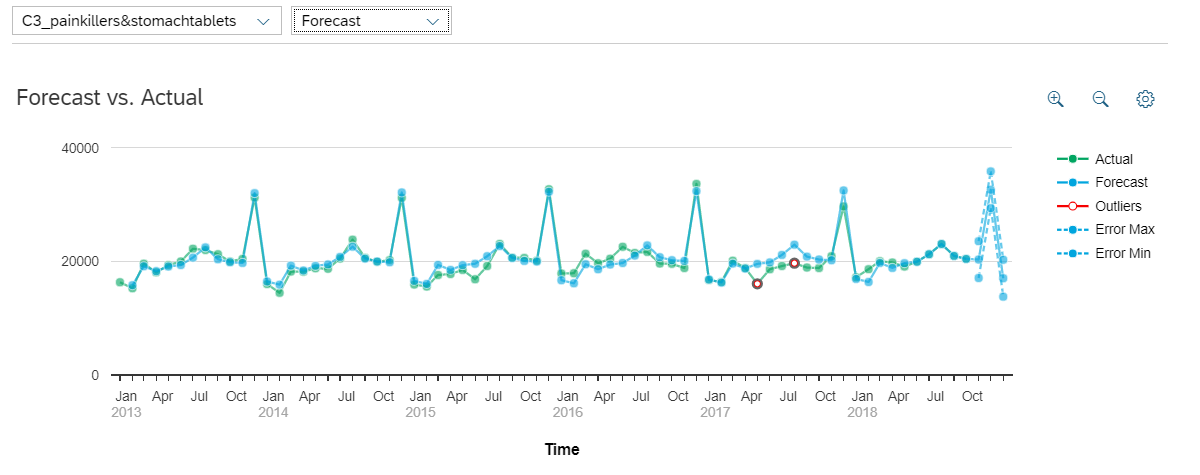
Upon completion of the training process, the status of forecasting is updated to "Succeeded”. Among others, the horizon-Wide MAPE (Mean Absolute Percentage Error) is shown. It is the evaluation of the "error" made when using the model to estimate the future values of the signal. In this case you see the mean MAPE value of all the segments, the average quality of the segmented time series is 3.24%.
We select one from the top segments.

When forwarded to the next screen we see the detailed time series chart as well as all forecasts.
We see the following information in the line chart:

We go back and have a look at the bottom segments to see the prediction here. We can also check the other time series of interest. For some you may find outliers that have been detected by the tool. Outliers are values that we could not explain with the given data. These are indicators that we might include more explanatory variables like information about special events, marketing campaigns etc.
The outliers are points where the predictive curve is very distant from the real curve. They are represented by a red circle on the plot.
An outlier is detected when the absolute value of the residuals is over twice the standard deviation computed on the estimation dataset.
We could also use the drop-down menu on the top left to switch the segment. We select a time series there.

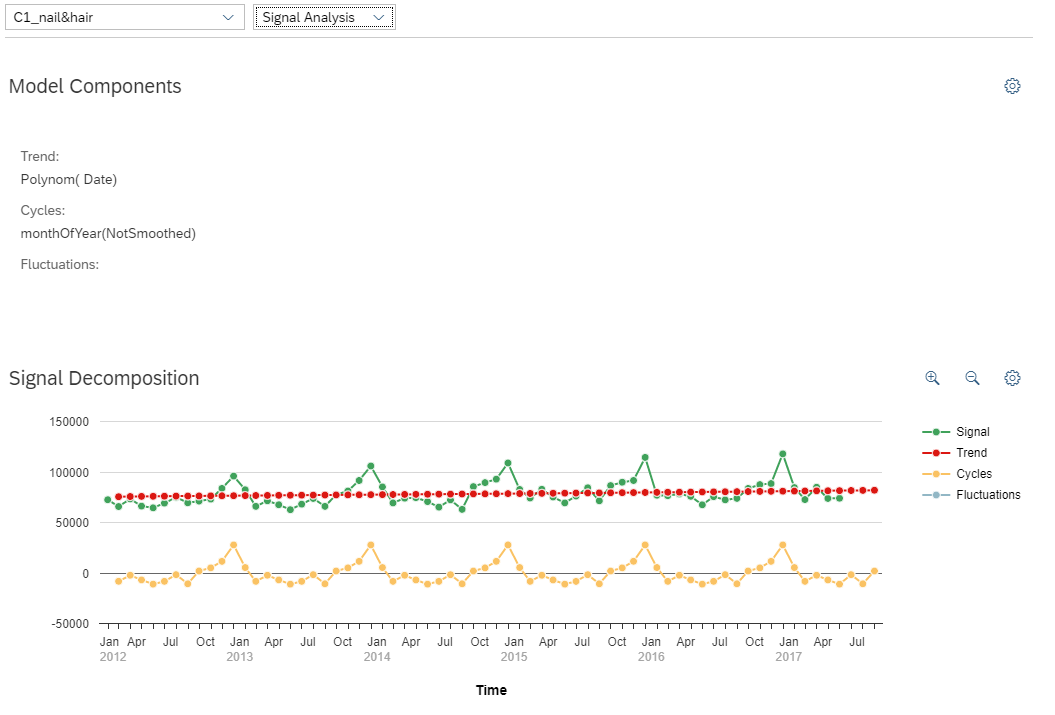
We can also select signal analysis which displays the descriptive and statistical information about our model and shows the detected signals like cycles, trend and fluctuation.
The trend is the general orientation of the signal.
The cycles are periodic elements that can be found at least twice in the training dataset.
The fluctuation is what is left when the trend and the cycles have been extracted.
After we had a deeper look at the forecast and were convinced of its quality we now can save our forecast. We click on the little factory icon on the top left to select our folder and a name like “product_forecast_results” for the output.

On the bottom we can see that the model is being applied. When it is finished we have a look at the result.
We navigate to the menu and select “Browse”, followed by “Files”.

We navigate to the folder where we saved our output dataset and click on it.
This is a preview of the dataset. We will see the output columns, including “kts_1” which is the forecast and the error bar of the forecast “kts_1_lowerlimit_95%” and “kts_1_lowerlimit_95%”.

While it is great to see each individual forecast, it may be easier for us to consume this information through visualizations. Or it might be a great help if we could compare some time series for similar products directly. For visualizing the result in an SAP Analytics Cloud story, we first need to build a model on the dataset
We navigate to the menu and select “Modeler” followed by “From a Data Source”.
On the Pop-Up we select “Dataset”.
We navigate to the folder where we saved our output dataset and select it.
We click “Create Model” in the bottom right and select “Create”.
Once our model has been built, we now want to build a hierarchy for our Product Categories.
To do so we select Model on the top right and then click on Product Category.

After this we go to "Dimension Setting" on the right and selection on the bottom "Create Hierarchy" and select "Parent-Child Hierarchy".

Our segments represent the product categories gift_sets, nail&hair, painkiller&stomachtablets and perfume and the product category from C1 to C6. We want to generate a hierarchy that represents our product groups so we give it a name like “ProductGroup” on the Pop-Up window.

We write these names into the fields under “ProductGroup” according to the segment names just without the C1_, C2_ etc.
First we need to add our ProductGroups as roots. We select Add in the top an then specify the name like "gift_set" and under ProductGroup specify it as a <root>.

This gives us the option to select it later as a hierarchy. So for example when we select now C1_gift_sets, we can now choose gift_set as the parent under hierarchies on the pop-up window.


we can now continue following this steps until all members are assigned to their related Productgroup, which should look like this:

Now we save the adjustments we made to our model. We click on the icon on the top left

After we saved the model we navigate back to the story.
We want to compare the time series forecast of product groups or different product categories from the same product group.
To do this we add an object to canvas. Here we select “Chart”, the model we just built and then we click ok.

In the builder tap on the right we select “Line”.

For the axis we select the following measures and dimensions:

Now our graph looks like this. If it is too small, we can flexible make it bigger or smaller like we are used to from power point. The time axis is only one value, so we should change this.

We click on “+filter” and select “Date(Range)”.

On the Pop Up, we can select the range that should be displayed on the time axis. In this case we want to see the complete history, so we click on ok.


Now the graph goes more into direction we want to. We still see only the aggregated forecasts for all product categories. But since we want to compare different time series we now add a trellis. To do this we select the three dots on the top right corner of the graph and select “Add Trellis”.

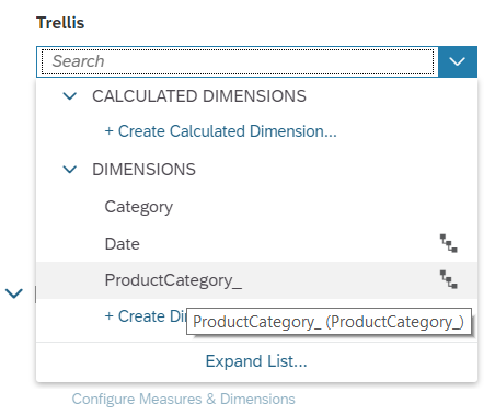
Under “+trellis” we select “ProductCategory”.
Now the page looks like this but we don’t have an option yet to select the forecast that we want to compare in a flexible way.
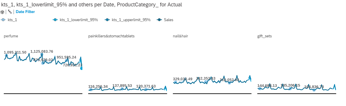
This now gives us the option to compare the forecast for the different product groups.
Since we want to go on a deeper level we click on the little hierarchy icon on the trellis field and select level 2.

We want a flexible filter, so we need to add an input control. We can select this in the toolbar on the top.

When a page filter appears on the page we click it and select “ProductCategory” as “Dimension”.

On the Pop Up, we select “All Members” and we make sure the Multiple Selection Hierarchy is selected on the bottom left. When this is correct we can click ok.

We now select the filter and make it a bit bigger so we can see the selection Options.
We can extend each product group to see the categories. Now we can select flexibly e.g. category 1 or category 3 of the gift sets products. It can be very useful to compare the sales of one product in different countries or similar products in different regions.

Be creative and add the company logo or adjust the styling to the company’s corporate identity, add more data, nice charts or a RSS feed. Just try it out.
The official SAP analytics Cloud tutorial and the playlist are very helpful
https://www.sapanalytics.cloud/learning/
https://wiki.scn.sap.com/wiki/display/BOC/SAP+Analytics+Cloud+-+Official+Product+Tutorials
https://www.youtube.com/playlist?list=PLs5htBIwERYWSixKSqQHzndop33aBCz1U
Have fun with doing your own predictions and building nice dashboards.
This guide will walk us through the process of forecasting sales for an online shopping portal that sells beauty and pharma products in 24 different product categories.
| Date | Date monthly |
| Sales | Amount of sales by product category |
| ProductCategory | The product category. The description shows the product category and the code (e.g. C1) shows the subcategory |
First log on to a SAP analytics Cloud instance.
After the logon the dataset needs to be uploaded. To do this we click on the menu on the left, select “Dataset” followed by "Bring data from CSV or Excel files".

We select the source file “product_forecast.csv”, click “Import” and then “Ok”.
Now that we have uploaded the data set we can start to build our predictive scenario. We select “... More” and then “Predictive Scenario” on the menu.

A predictive scenario set of use cases with common characteristics. SAP Analytic Cloud’s Smart Predict currently offers 3 predictive Scenarios:
- Classification scenarios predict the value of a (target) variable that can only have two values like yes and no or 0 and 1. Examples for classification scenarios are
- customer churn with the target variable predicting whether a customer will leave or not
- Propensity to buy with the target variable predicting whether a customer will buy a product offered to him or not
- Fraud with the target variable indicating whether a transaction or claim was fraudulent or not
- Regression scenarios predict the numerical value of a target variable depending on variables describing it. Example for regression scenarios are the prediction of
- The number of customers visiting a shop during lunch time
- The revenue of a customer in the next quarter
- The sales price of a used cars
- Time Series scenarios predict the value of a variable over time taking into account further descriptive variables. Examples of time series scenarios are the prediction of
- Revenue for a product line over the next few quarters
- The number of bicycles hired in a city over the next few days
- Travel expenses in the next few months
The user now has to follow 3 simple steps:
- Choose the predictive scenario that matches his use case.
- Train the model with historic data, i.e. use a data set where sales figures are known. The statistical algorithm will “learn” from this data set, i.e. find trends, seasonal variations and fluctuations that characterize the sale of a certain product. There should be enough (3-5 years) data available to learn from.
- Apply the model to a new data set, i.e. forecast sales for a given period of times. The statistical algorithm will apply the patterns learnt in the previous step to the new data and predict sales for the chosen number of time periods.
The variable that contains sales in the learning phase and is predicted in the application phase is called the target variable.
The following screen shot shows the three options classification, regression and time series. Under each option there is a description to make it easier for the user to select the right scenario for each use case. In this exercise, we want to do a sales forecast for each product. Based on the descriptions of predictive scenario types, you can see that a time series will be able to address our needs. So, we select it.

On the pop up we give the model a name, e.g. “product_planning_forecast” and save it in our preferred folder.
Now we can create our Predictive Model.

We will need to select an input data source for our model. The input data set contains historical data that we use to train the predictive model.
Select “Product_Forecast” from the folder.
Now we need to select the variable roles:
The signal variable is our target variable, i.e. the variable to predict. We select “Sales” as the signal variable.
The date variable contains the time dimension. In this example the date variable refers to the date column in the data set.
The “Entity” variable allows us to automatically create one time series per Entity. In our example we want to create one time series per product category and the product category is contained in column ProductCategory of the data set. Therefore we use this column as variable ”Entity”.
Variables that have no influence on the target can be excluded from the modeling process. Excluding variable can speed up the execution process but keeping them does not interfere with the modelling process. IDs are typical variables to exclude.
However, you must exclude variables that are directly related to the target variables such as transformations of the target variables and variables that contain the same information as the target variable indirectly. For example, if a dataset contains two fields that contain the sales number maybe just in different currencies you need to exclude one variable.
We could define the last date for the training dataset, but we stick with the default setting so we select “Process” as “All Observations” and “Until” as “Last Observation”.
We can choose the date of the last observation and we can define the last date.
Finally, we set the number of forecasting periods e.g. to 3.
Let’s run the predictive model with these Settings.

We click “Train&Forecast”.
Please be patient since this might take a couple of minutes.
Upon completion of the training process, the status of forecasting is updated to "Succeeded”. Among others, the horizon-Wide MAPE (Mean Absolute Percentage Error) is shown. It is the evaluation of the "error" made when using the model to estimate the future values of the signal. In this case you see the mean MAPE value of all the segments, the average quality of the segmented time series is 3.24%.
We select one from the top segments.
When forwarded to the next screen we see the detailed time series chart as well as all forecasts.
We see the following information in the line chart:
| Signal | The green curve | The information contained in the training dataset |
| Predicted Signal | The blue curve | The signal predicted by the generated model |
| Error Bars | The blue area around the end of the blue curve | The zone of possible error where the predicted signal could be. The error bars are only displayed for the forecasts. Note - The error bars are equal to twice the standard deviation computed on the Validation dataset. |
| Outlier | A red circle | A point where the predictive curve is very distant from the real curve. Note - An outlier is detected when the absolute value of the residuals is over three times the value of the standard deviation computed on the Estimation dataset. |
We go back and have a look at the bottom segments to see the prediction here. We can also check the other time series of interest. For some you may find outliers that have been detected by the tool. Outliers are values that we could not explain with the given data. These are indicators that we might include more explanatory variables like information about special events, marketing campaigns etc.
The outliers are points where the predictive curve is very distant from the real curve. They are represented by a red circle on the plot.
An outlier is detected when the absolute value of the residuals is over twice the standard deviation computed on the estimation dataset.
We could also use the drop-down menu on the top left to switch the segment. We select a time series there.
We can also select signal analysis which displays the descriptive and statistical information about our model and shows the detected signals like cycles, trend and fluctuation.
The trend is the general orientation of the signal.
The cycles are periodic elements that can be found at least twice in the training dataset.
The fluctuation is what is left when the trend and the cycles have been extracted.
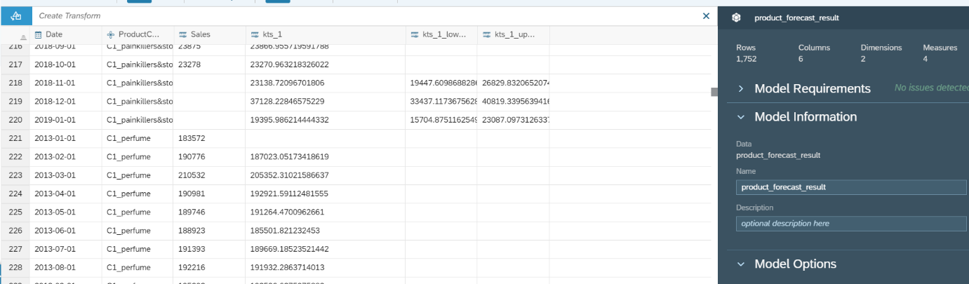
After we had a deeper look at the forecast and were convinced of its quality we now can save our forecast. We click on the little factory icon on the top left to select our folder and a name like “product_forecast_results” for the output.
On the bottom we can see that the model is being applied. When it is finished we have a look at the result.

We navigate to the menu and select “Browse”, followed by “Files”.
We navigate to the folder where we saved our output dataset and click on it.
This is a preview of the dataset. We will see the output columns, including “kts_1” which is the forecast and the error bar of the forecast “kts_1_lowerlimit_95%” and “kts_1_lowerlimit_95%”.
While it is great to see each individual forecast, it may be easier for us to consume this information through visualizations. Or it might be a great help if we could compare some time series for similar products directly. For visualizing the result in an SAP Analytics Cloud story, we first need to build a model on the dataset
We navigate to the menu and select “Modeler” followed by “From a Data Source”.

On the Pop-Up we select “Dataset”.
We navigate to the folder where we saved our output dataset and select it.
We click “Create Model” in the bottom right and select “Create”.
Once our model has been built, we now want to build a hierarchy for our Product Categories.
To do so we select Model on the top right and then click on Product Category.
After this we go to "Dimension Setting" on the right and selection on the bottom "Create Hierarchy" and select "Parent-Child Hierarchy".
Our segments represent the product categories gift_sets, nail&hair, painkiller&stomachtablets and perfume and the product category from C1 to C6. We want to generate a hierarchy that represents our product groups so we give it a name like “ProductGroup” on the Pop-Up window.
We write these names into the fields under “ProductGroup” according to the segment names just without the C1_, C2_ etc.
First we need to add our ProductGroups as roots. We select Add in the top an then specify the name like "gift_set" and under ProductGroup specify it as a <root>.
This gives us the option to select it later as a hierarchy. So for example when we select now C1_gift_sets, we can now choose gift_set as the parent under hierarchies on the pop-up window.
we can now continue following this steps until all members are assigned to their related Productgroup, which should look like this:
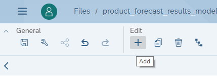
Now we save the adjustments we made to our model. We click on the icon on the top left
After we saved the model we navigate back to the story.
We navigate to the menu and select “Stories” followed by “Canvas".

We want to compare the time series forecast of product groups or different product categories from the same product group.
To do this we add an object to canvas. Here we select “Chart”, the model we just built and then we click ok.
In the builder tap on the right we select “Line”.
For the axis we select the following measures and dimensions:
Now our graph looks like this. If it is too small, we can flexible make it bigger or smaller like we are used to from power point. The time axis is only one value, so we should change this.
We click on “+filter” and select “Date(Range)”.
On the Pop Up, we can select the range that should be displayed on the time axis. In this case we want to see the complete history, so we click on ok.
Now the graph goes more into direction we want to. We still see only the aggregated forecasts for all product categories. But since we want to compare different time series we now add a trellis. To do this we select the three dots on the top right corner of the graph and select “Add Trellis”.
Under “+trellis” we select “ProductCategory”.
Now the page looks like this but we don’t have an option yet to select the forecast that we want to compare in a flexible way.
This now gives us the option to compare the forecast for the different product groups.
Since we want to go on a deeper level we click on the little hierarchy icon on the trellis field and select level 2.
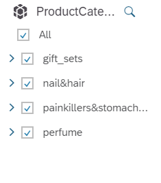
We want a flexible filter, so we need to add an input control. We can select this in the toolbar on the top.
When a page filter appears on the page we click it and select “ProductCategory” as “Dimension”.
On the Pop Up, we select “All Members” and we make sure the Multiple Selection Hierarchy is selected on the bottom left. When this is correct we can click ok.
We now select the filter and make it a bit bigger so we can see the selection Options.
We can extend each product group to see the categories. Now we can select flexibly e.g. category 1 or category 3 of the gift sets products. It can be very useful to compare the sales of one product in different countries or similar products in different regions.
Be creative and add the company logo or adjust the styling to the company’s corporate identity, add more data, nice charts or a RSS feed. Just try it out.
The official SAP analytics Cloud tutorial and the playlist are very helpful
https://www.sapanalytics.cloud/learning/
https://wiki.scn.sap.com/wiki/display/BOC/SAP+Analytics+Cloud+-+Official+Product+Tutorials
https://www.youtube.com/playlist?list=PLs5htBIwERYWSixKSqQHzndop33aBCz1U
Have fun with doing your own predictions and building nice dashboards.
- SAP Managed Tags:
- SAP Analytics Cloud
Labels:
18 Comments
You must be a registered user to add a comment. If you've already registered, sign in. Otherwise, register and sign in.
Labels in this area
-
ABAP CDS Views - CDC (Change Data Capture)
2 -
AI
1 -
Analyze Workload Data
1 -
BTP
1 -
Business and IT Integration
2 -
Business application stu
1 -
Business Technology Platform
1 -
Business Trends
1,658 -
Business Trends
91 -
CAP
1 -
cf
1 -
Cloud Foundry
1 -
Confluent
1 -
Customer COE Basics and Fundamentals
1 -
Customer COE Latest and Greatest
3 -
Customer Data Browser app
1 -
Data Analysis Tool
1 -
data migration
1 -
data transfer
1 -
Datasphere
2 -
Event Information
1,400 -
Event Information
66 -
Expert
1 -
Expert Insights
177 -
Expert Insights
296 -
General
1 -
Google cloud
1 -
Google Next'24
1 -
Kafka
1 -
Life at SAP
780 -
Life at SAP
13 -
Migrate your Data App
1 -
MTA
1 -
Network Performance Analysis
1 -
NodeJS
1 -
PDF
1 -
POC
1 -
Product Updates
4,577 -
Product Updates
342 -
Replication Flow
1 -
RisewithSAP
1 -
SAP BTP
1 -
SAP BTP Cloud Foundry
1 -
SAP Cloud ALM
1 -
SAP Cloud Application Programming Model
1 -
SAP Datasphere
2 -
SAP S4HANA Cloud
1 -
SAP S4HANA Migration Cockpit
1 -
Technology Updates
6,873 -
Technology Updates
420 -
Workload Fluctuations
1
Related Content
- New Machine Learning features in SAP HANA Cloud in Technology Blogs by SAP
- Top Picks: Innovations Highlights from SAP Business Technology Platform (Q1/2024) in Technology Blogs by SAP
- Consuming SAP with SAP Build Apps - Connectivity options for low-code development - part 2 in Technology Blogs by SAP
- Cloud Integration: Manually Sign / Verify XML payload based on XML Signature Standard in Technology Blogs by SAP
- SAP Cloud Integration: Understanding the XML Digital Signature Standard in Technology Blogs by SAP
Top kudoed authors
| User | Count |
|---|---|
| 36 | |
| 25 | |
| 17 | |
| 13 | |
| 8 | |
| 7 | |
| 6 | |
| 6 | |
| 6 | |
| 6 |