

- SAP Community
- Products and Technology
- Technology
- Technology Blogs by SAP
- Data visualisation with Focused Insights: Chart De...
Technology Blogs by SAP
Learn how to extend and personalize SAP applications. Follow the SAP technology blog for insights into SAP BTP, ABAP, SAP Analytics Cloud, SAP HANA, and more.
Turn on suggestions
Auto-suggest helps you quickly narrow down your search results by suggesting possible matches as you type.
Showing results for
Product and Topic Expert
Options
- Subscribe to RSS Feed
- Mark as New
- Mark as Read
- Bookmark
- Subscribe
- Printer Friendly Page
- Report Inappropriate Content
07-02-2018
6:09 PM
Learn about the different options for data visualization available in SAP Focused Insights for SAP Solution Manager?
In this blog, we give a quick description of each chart type and show you what it looks like in practice.
An introduction for the data visualisation options is available here: https://blogs.sap.com/2018/07/02/data-visualisation-with-focused-insights/
Trend: This chart is typically used to show trends over time. Depending on your needs, a single Scale or a Double Scale or a Table chart can be used.
Comparison: This type of chart shows comparisons between two or more categorical values.
Distribution: It focuses on displaying the distribution of values within a dataset.
Compliance: It Indicates compliancy of dimensions towards an objective.
Table: The table chart shows raw data in a structured row/column format. You can choose between a dynamic table or an alert tree table. Tables offers usually break-down functionality with jump-in to detailed charts.
Focused Insights provides the following charts:
With line charts you get an overall picture of your selected data. Line charts can also be used to track more than one data series on the same chart. This helps to reveal any correlation in trends.

An optional feature of the line chart is the possibility to highlight trend with a trend line derived from the data points of individual serie.

Back to Top
With the Line-column chart you can underline specific data series in your graph. In addition, displaying the value of each measurements will accentuate the message passed by your dashboard.

Back to Top
You use dual scale charts when you want to display and correlate data series having different scales. Two y-axis are available: One on the left for lines and one on the right for the column.
This chart allows to combine multiple time series with two different scales.

Back to Top

Back to Top
History Table Renderer charts display the value of each data points under the time dimension.
Queries are distributed over the different rows of the table and are grouped by dimensions using the “primary / drilldown” legend pattern.
This chart reports the compliance history of your indicators over a predefined time period.

Color rating for each cell is used to facilitate the interpretation of your measures.

Back to Top
Trend Table History charts add a trend indicator based on linear regression for each series. The rating is based on the trend attributes defined for each series.
The Trend Table chart is used to monitor and control your key performance indicators over a period of time in order to proactively correct any deviations from your objectives.

Back to Top
Comparison charts show comparisons between two or more categorical values. They are used to compare measures based on dimensions.
When bars are horizontal the visualization is considered a bar chart, vertical bars are considered a column chart.
The value of a measure is represented by the length of the bar, while dimensions provide the axis of the chart.

Back to Top
Back to Top
Dual bar chart adds an additional scale to display the value of your dimensions

Back to Top
When bars/columns are stacked, they show the total measure divided into selected dimensions.


Back to Top
Distribution Charts show the distribution of values within a dataset.
Pie Charts are used to show both part-to-whole relationships and distribution of measures.

Back to Top
Numerical thresholds can also be added to donut charts to show a quick view of a status of a dimension in relation to an objective.

Back to Top
This chart includes an additional dimension clustered in columns to show the breakdown of the measures over this dimension.
The dimension is added to the chart based on the “primary / drilldown” attribute or each query.

Back to Top
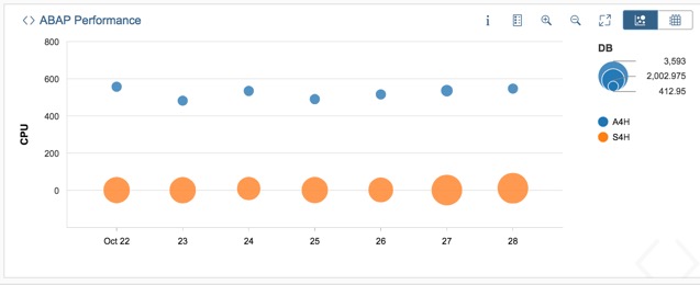
To see the correlation between three measures use a bubble chart. They display a measure on each axis and a third measure is reflected in the size of the bubble.
Time dimension can also be used for the x-axis.
Back to Top
Use a waterfall chart when you want to show the positive and negative changes that a measure goes through according to a dimension.
Waterfall charts are useful to show projects progress based on documents status.

Back to Top
You use compliance charts when you want to report the compliance of a dimension in relation to a goal. With the compliance charts you have a quick access to the status of your key indicators.
The SLR chart computes a single measure out of a set of data points to transform individual series into key performance indicators. It reports the status of a dimension related to a goal.
You use it to provide to your organization or your customers, the performances of your services in one single aggregated view.

Back to Top
The SLR Table is used to reports multiple series compliances in one single view.
Each ‘Primary / Drilldown’ dimension is projected into a ‘row / column’ format to show the status of each indicator in the table’s cells.
Each cell of the table is clickable and will open the details of each series. The jump-in attribute will determine the type of chart used during the jump-in.
Back to Top
Tables are used to provide detailed information for your measurements and dimensions. Combined with graphical charts in single dashboards, you can build powerful view showing detailed information in a row/column format along with charts.
Alert Table charts are used to display the alert status of SAP systems.

This chart is used by operators and SAP administrators to get an overview of the alerts situation of their landscapes.
From the Alert Table chart, you can drilldown down to the metrics views generating the alerts.
Back to Top
You use the dynamic table when you need to display the content of your data in a structured way with the deep level of details.
Dynamic table is a powerful renderer when linked from a graphical chart with the ‘Jump-in’ property of the series.


Back to Top
In this blog, we give a quick description of each chart type and show you what it looks like in practice.
An introduction for the data visualisation options is available here: https://blogs.sap.com/2018/07/02/data-visualisation-with-focused-insights/
Chart Description
Focused Insights charts are divided into the following categories:
Trend: This chart is typically used to show trends over time. Depending on your needs, a single Scale or a Double Scale or a Table chart can be used.
Comparison: This type of chart shows comparisons between two or more categorical values.
Distribution: It focuses on displaying the distribution of values within a dataset.
Compliance: It Indicates compliancy of dimensions towards an objective.
Table: The table chart shows raw data in a structured row/column format. You can choose between a dynamic table or an alert tree table. Tables offers usually break-down functionality with jump-in to detailed charts.
Focused Insights provides the following charts:
- Trend Single scale: Line Chart, Line-Column Chart
- Trend Double scale: Dual Line Chart, Dual Line-Column Chart
- Trend Table: History Table, Trend Table
- Comparison: Column Chart, Bar Chart, Dual Bar chart, Stack Bar/Column Chart
- Distribution: Cluster Stack Column Chart (2 Labels), Pie Chart, Donut Chart, Waterfall Chart, Bubble Chart
- Compliance: SLR, SLR Table
- Table: Dynamic Table, Alert Table
Trend Chart
Line Chart
With line charts you get an overall picture of your selected data. Line charts can also be used to track more than one data series on the same chart. This helps to reveal any correlation in trends.
An optional feature of the line chart is the possibility to highlight trend with a trend line derived from the data points of individual serie.
Back to Top
Line-Column Chart
With the Line-column chart you can underline specific data series in your graph. In addition, displaying the value of each measurements will accentuate the message passed by your dashboard.
Back to Top
Dual Scale Trend
You use dual scale charts when you want to display and correlate data series having different scales. Two y-axis are available: One on the left for lines and one on the right for the column.
This chart allows to combine multiple time series with two different scales.
Dual Line Chart
Back to Top
Dual Line-Column chart
Back to Top
Trend Table Chart
History Table
History Table Renderer charts display the value of each data points under the time dimension.
Queries are distributed over the different rows of the table and are grouped by dimensions using the “primary / drilldown” legend pattern.
This chart reports the compliance history of your indicators over a predefined time period.
Color rating for each cell is used to facilitate the interpretation of your measures.
Back to Top
Trend Table History
Trend Table History charts add a trend indicator based on linear regression for each series. The rating is based on the trend attributes defined for each series.
The Trend Table chart is used to monitor and control your key performance indicators over a period of time in order to proactively correct any deviations from your objectives.
Back to Top
Comparison
Comparison charts show comparisons between two or more categorical values. They are used to compare measures based on dimensions.
When bars are horizontal the visualization is considered a bar chart, vertical bars are considered a column chart.
Bar Chart
The value of a measure is represented by the length of the bar, while dimensions provide the axis of the chart.
Back to Top
Column Chart
Back to Top
Dual Bar Chart
Dual bar chart adds an additional scale to display the value of your dimensions
Back to Top
Stacked Bar/Column
When bars/columns are stacked, they show the total measure divided into selected dimensions.
Back to Top
Distribution
Distribution Charts show the distribution of values within a dataset.
Pie Chart
Pie Charts are used to show both part-to-whole relationships and distribution of measures.
Back to Top
Donut Chart
Numerical thresholds can also be added to donut charts to show a quick view of a status of a dimension in relation to an objective.
Back to Top
Stacked Column 2 Labels (Cluster Stack Column Chart)
This chart includes an additional dimension clustered in columns to show the breakdown of the measures over this dimension.
The dimension is added to the chart based on the “primary / drilldown” attribute or each query.
Back to Top
Bubble chart
To see the correlation between three measures use a bubble chart. They display a measure on each axis and a third measure is reflected in the size of the bubble.
Time dimension can also be used for the x-axis.
Back to Top
Waterfall chart
Use a waterfall chart when you want to show the positive and negative changes that a measure goes through according to a dimension.
Waterfall charts are useful to show projects progress based on documents status.
Back to Top
Compliance
You use compliance charts when you want to report the compliance of a dimension in relation to a goal. With the compliance charts you have a quick access to the status of your key indicators.
SLR
The SLR chart computes a single measure out of a set of data points to transform individual series into key performance indicators. It reports the status of a dimension related to a goal.
You use it to provide to your organization or your customers, the performances of your services in one single aggregated view.
Back to Top
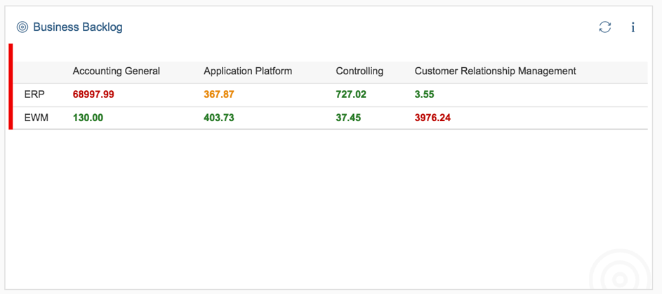
SLR Table
The SLR Table is used to reports multiple series compliances in one single view.
Each ‘Primary / Drilldown’ dimension is projected into a ‘row / column’ format to show the status of each indicator in the table’s cells.
Each cell of the table is clickable and will open the details of each series. The jump-in attribute will determine the type of chart used during the jump-in.
Back to Top
Table
Tables are used to provide detailed information for your measurements and dimensions. Combined with graphical charts in single dashboards, you can build powerful view showing detailed information in a row/column format along with charts.
Alert Table
Alert Table charts are used to display the alert status of SAP systems.
This chart is used by operators and SAP administrators to get an overview of the alerts situation of their landscapes.
From the Alert Table chart, you can drilldown down to the metrics views generating the alerts.
Back to Top
Dynamic Table
You use the dynamic table when you need to display the content of your data in a structured way with the deep level of details.
Dynamic table is a powerful renderer when linked from a graphical chart with the ‘Jump-in’ property of the series.
Back to Top
- SAP Managed Tags:
- SAP Solution Manager
3 Comments
You must be a registered user to add a comment. If you've already registered, sign in. Otherwise, register and sign in.
Labels in this area
-
ABAP CDS Views - CDC (Change Data Capture)
2 -
AI
1 -
Analyze Workload Data
1 -
BTP
1 -
Business and IT Integration
2 -
Business application stu
1 -
Business Technology Platform
1 -
Business Trends
1,661 -
Business Trends
87 -
CAP
1 -
cf
1 -
Cloud Foundry
1 -
Confluent
1 -
Customer COE Basics and Fundamentals
1 -
Customer COE Latest and Greatest
3 -
Customer Data Browser app
1 -
Data Analysis Tool
1 -
data migration
1 -
data transfer
1 -
Datasphere
2 -
Event Information
1,400 -
Event Information
64 -
Expert
1 -
Expert Insights
178 -
Expert Insights
273 -
General
1 -
Google cloud
1 -
Google Next'24
1 -
Kafka
1 -
Life at SAP
784 -
Life at SAP
11 -
Migrate your Data App
1 -
MTA
1 -
Network Performance Analysis
1 -
NodeJS
1 -
PDF
1 -
POC
1 -
Product Updates
4,577 -
Product Updates
325 -
Replication Flow
1 -
RisewithSAP
1 -
SAP BTP
1 -
SAP BTP Cloud Foundry
1 -
SAP Cloud ALM
1 -
SAP Cloud Application Programming Model
1 -
SAP Datasphere
2 -
SAP S4HANA Cloud
1 -
SAP S4HANA Migration Cockpit
1 -
Technology Updates
6,886 -
Technology Updates
403 -
Workload Fluctuations
1
Related Content
- Empowering Retail Business with a Seamless Data Migration to SAP S/4HANA in Technology Blogs by Members
- Enhanced Data Analysis of Fitness Data using HANA Vector Engine, Datasphere and SAP Analytics Cloud in Technology Blogs by SAP
- Trustable AI thanks to - SAP AI Core & SAP HANA Cloud & SAP S/4HANA & Enterprise Blockchain 🚀 in Technology Blogs by Members
- SAP Datasphere - Space, Data Integration, and Data Modeling Best Practices in Technology Blogs by SAP
- SAP Datasphere News in March in Technology Blogs by SAP
Top kudoed authors
| User | Count |
|---|---|
| 12 | |
| 10 | |
| 9 | |
| 7 | |
| 7 | |
| 7 | |
| 6 | |
| 6 | |
| 5 | |
| 4 |