Learn how to extend and personalize SAP applications. Follow the SAP technology blog for insights into SAP BTP, ABAP, SAP Analytics Cloud, SAP HANA, and more.
Microcopy are the snippets of text that guide you through a user interface. Great microcopy pays off in a big way by delighting users, saving time, and improving the rate of task completion. Profit from our experiences and find out what to consider when writing microcopy for your own SAP Fiori app.
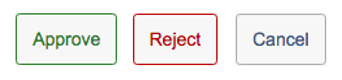
1) Buttons… and action!
If the text on a button begins with a verb, it calls to action, most likely a decision. Best to use text for core actions (such as Edit, Delete, and Copy) rather than icons.
Buttons that take you to another app provide most clarity if they consist of an active verb formulation combined with an object, for example “Create Sales Order” instead of “Sales Order” or “Create”.
2) Consistent terminology
Use consistent terminology across your app and with other apps in the same app family for buttons, labels, tooltips, screen/dialog titles. For example, the text on a button or tile should match the heading of the screen that is opened, such as a dialog or the app itself.
Also, consistent patterns for similar texts makes it easier to understand the UI. For example, use “Created On” and “Changed On”, but not “Creation Date” in combination with “Changed On”.
3) Explain errors with empathy
Use distinct error messages for each error case by offering solutions. Avoid generic texts, such as “Invalid entry.” Also, error messages give you a chance to express your brand’s voice in microcopy.
The same applies for inline error messages which appear directly next to the entry. Use a concise instruction.
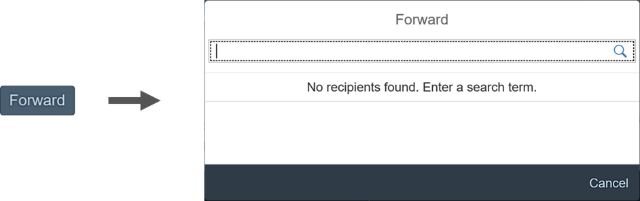
4) Tooltips
Tooltips show the labels for elements that have no text, such as icons. Tooltips are a must for icon-only buttons.
The icon within an icon-only button usually comes with a default tooltip. The technical icon name can be easily adapted to suit your specific use case.
5) Text labels are responsive
Whereas tooltips can’t be displayed on mobile devices, text labels allow users to view the full text on all devices. Instead of abbreviating, ask development/UX to allow enough space for texts in all languages to avoid truncation.
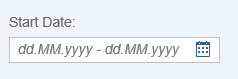
6) Simplify with placeholders
Placeholders are used for input fields to offer additional help rather than just repeating the field label. The placeholder in the example below informs the user about the format requirements of the start date.
In search fields, the layout can be simplified by using a placeholder instead of a label. The same applies for easily understood form patterns and short forms with less than three input fields.
7) Message toasts
A message toast is a small popup for success messages that disappear after a few seconds.
Even though they indicate a success, do not use the word “successfully” in the message text. This is implicit in a success message. The standard duration is 3 seconds. Keep the text short and sweet.
Consider that long object names increase the length of the message toast. If long or multiple object names make the toast too cumbersome to read, use the success message box instead.
😎 Please? Please use judiciously.
Avoid overusing “please” in message texts. Including “please” adds length to copy, might make your brand seem to lack confidence, and wastes room for important info.
Simply use “please” if you would also use it in a spoken conversation or if you are inconveniencing the user.
9) Consistent capitalization
Keep capitalization rules in mind when creating UI texts. For example, in English, unless otherwise specified for individual UI elements, SAP Fiori uses title case (Title Case) for short texts (buttons, tooltips, labels, headings, value help texts, and so on), and sentence case (Sentence case) for messages and explanations.


