Ready to ring in Spring by cleaning up your data visualizations? Believe it or not, it’s almost that time of year again!
It’s no secret that organizations today are having a tough time driving results from cluttered, hard-to-read data visualizations. However, by using the following takeaways from a recent hands-on workshop led by Jacob Stark, Director of SAP Cloud Analytics Product Management, you may come to find that creating meaningful visualizations is just a matter of sprucing up a few things within your tool. These are just a few of the tips that customers today are using to help create meaningful visualizations, specifically within SAP Analytics Cloud and Digital Boardroom.
Start with decluttering:
- Stay away from redundant data to avoid complication and improve data integrity.
- Eliminate 3D charts which can distort and misrepresent the data.
- Refrain from using lots of text with heavy, bold fonts in order to avoid illegibility.
- Remember, less is always more! Simplify your visualizations.
Messy Visualizations ....
[caption id="attachment_15125" align="aligncenter" width="574"]
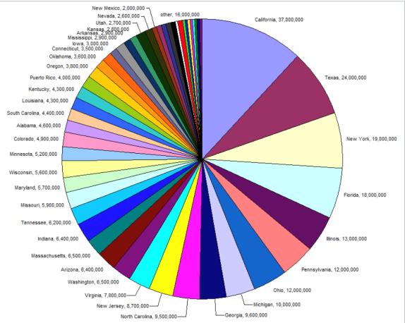
Source: National and State Population Estimates 2008. U.s. Census Bureau, Population Division[/caption]
...versus Clean Visualizations
[caption id="attachment_15126" align="aligncenter" width="660"]

SAP Analytics Cloud demo[/caption]
Work from top to bottom and left to right:
- Stack rank the data to easily read highs and lows.
- Rotate charts (like a horizontal bar chart) as needed to effectively communicate certain types of data.
- Ensure your story is straightforward and easy to draw conclusions from.
Don’t be scared of your data:
- Normalize it to eliminate the units of measurement, enabling you to more easily compare datafrom different places.
- Let your data tell the full story by choosing metrics that matter, allowing the audience to extract and communicate insights through compelling visualizations.
- Although you may have a lot of really great data, don’t let it consume you. Not all data is important data for the insights to be taken away from the visualizations. Keep it clearly understood and concise to lower the mental efforts of the audience, for more attention overall to the bigger picture.
Set a new tone:
- Ensure your visualizations are stimulating and attractive to your audience.
- Keep the color pallet clean and insert some dark areas (otherwise known as “rest areas”). But, avoid filling your charts with “chart junk,” which affect the readability of your data.
- Give the data a voice by adding red or green color to indicate thresholds and highlight your insights
[caption id="attachment_15127" align="aligncenter" width="660"]

SAP Analytics cloud demo[/caption]
In conclusion, ensure you are maintaining distinct data that you can garner valuable, business-impacting insights from. Always strive for accurate, effective, and powerful data visualizations to make your analytics work for you.
Learn More
This is by no means a comprehensive list and are only my opinions and conclusions drawn from the workshop that was held. You can get even more information at:
