
Last year, we introduced
Responsive Lane Pages to SAP Analytics Cloud, enabling the creation of dashboards and Digital Boardrooms that adapt to various screen sizes and devices. Below, is a list of our favorite tips for creating effective responsive designs.
Before jumping into the tips, be sure to check our posts on
the difference between canvas and responsive pages, and
how responsive layout break-points work.
Tips for Effective Responsive Dashboard Design
1. Copy and paste your canvas content - If you’re trying to move from a canvas to responsive layout, you can easily copy and paste multiple objects from your canvas pages by selecting all objects and using
ctrl+c to copy and ctrl+v to paste. Alternately, you can also copy and paste using the menu bar.
 Copying…
 Pasting…
NOTE (and super cool feature):
Pasting…
NOTE (and super cool feature): You can copy and paste multiple objects BETWEEN stories as well, so long as you remain within the same browser tab.
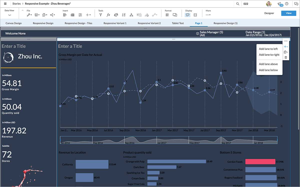
2. Use lanes to group content - Lanes can be used to section the content of a responsive page, and to create a structured layout. Tiles within a responsive lane stay together when the responsive page is resized, ensuring that the order your charts appear within the story will not change. Lanes may move and reflow based upon the device screen size. You can use rows of both horizontal and vertical lanes to create a compelling design.
 NOTE:
NOTE: You can reorder lanes by dragging and dropping them to the top or side of another lane on the page.
3. Leverage your lane and page background colors - Lane colors make it easy for end consumers to tell how content is reflowing on different devices. Avoid having a background color for each chart, and instead try unifying a collection of tiles on a single shaded lane.
 4. Avoid overt decoration (lines, shapes, images) -
 On small screen sizes, elements will stretch to fit the width of the screen. Sometimes that looks great, and sometimes it doesn’t. The most notable issue are lines, images, and other decorative elements, which may resize in unexpected ways. To avoid any issues, reduce decorative elements as much as possible, and rely on a cleaner, more responsive-friendly design. If you do want to have dividing lines, try using a side border of an existing chart or text header, instead of having an additional element on the page.
 5. Use header images instead of placing images -
 One way to prevent an image from spanning the entire width, is to include it as part of a Text Header. Use the Text Header styling panel to adjust the image size and alignment.
 6. Use vector (SVG) images -
 As PNG and JPG images resize, they may appear pixelated. To have your images appear crisp and clean, regardless of the screen size, try using SVG (Scalable Vector Graphics) images instead.
 7. Hide images, text, and charts on mobile devices -
 If you have an image, text, or chart you wish to display on desktop but not mobile mode, consider hiding it on mobile devices by deselecting Mobile>Enabled.
 8. Provide ample “breathing room” -
 Instead of having charts that are edge-to-edge with each other and the corners of the page, try leaving a grid block of space between elements. To adjust the size of the grid blocks (which appear when moving objects), select the responsive page background, and adjust the grid spacing under the Styling panel.
 9. Test screen sizes using Device Preview -
 Your best friend throughout the design process will be

Device Preview, found on the story toolbar. Device Preview allows you to see how a responsive page will look on different screen sizes and device types.
 10. Use custom font sizes -
 Because text fonts can appear too small or too large on different screen sizes, you can adjust the font size for each screen size using the Designer mode within the Device Preview.

As you can see, our finished product isn’t an exact recreation of our canvas design, but an equally appealing, more flexible layout.

And as a bonus, here are a few more ways we could have designed our story using responsive layouts:


 Resources:
Have additional tips or resources? Let us know in the comments!
