
- SAP Community
- Products and Technology
- Technology
- Technology Blogs by SAP
- SAP Analytics Cloud & IBCS Top 10 (Part 6)
Technology Blogs by SAP
Learn how to extend and personalize SAP applications. Follow the SAP technology blog for insights into SAP BTP, ABAP, SAP Analytics Cloud, SAP HANA, and more.
Turn on suggestions
Auto-suggest helps you quickly narrow down your search results by suggesting possible matches as you type.
Showing results for
IngoH
Active Contributor
Options
- Subscribe to RSS Feed
- Mark as New
- Mark as Read
- Bookmark
- Subscribe
- Printer Friendly Page
- Report Inappropriate Content
02-28-2018
10:54 AM
In the previous blogs we looked that Top 1 to Top 8 from the IBCS Top 10 recommendations. So this time we look at Top 9 - Scaling and Top 10 - Highlighting.

This one should be a pretty obvious step, but it is often forgotten. In case you have multiple charts as part of your story board / dashboard, you should make sure that you are representing the values on an identical scale, as otherwise people might make assumptions just based on the visual appearance.
Lets take a "bad" example.

Above you can see the Gross Margin for 2016 and you can see the scale shown for the Y-Axis and the measure is shown in Million USD, which is mentioned as part of the title.
Next to it we see the Revenue for the same timeframe, and without really paying attention my eyes might move from left and right and start comparing the column height, not noticing that the right chart is scaled to Billions USD.
So there are some simple changes I could do now, such as removing the Y-Axis and enabled the display of data labels....
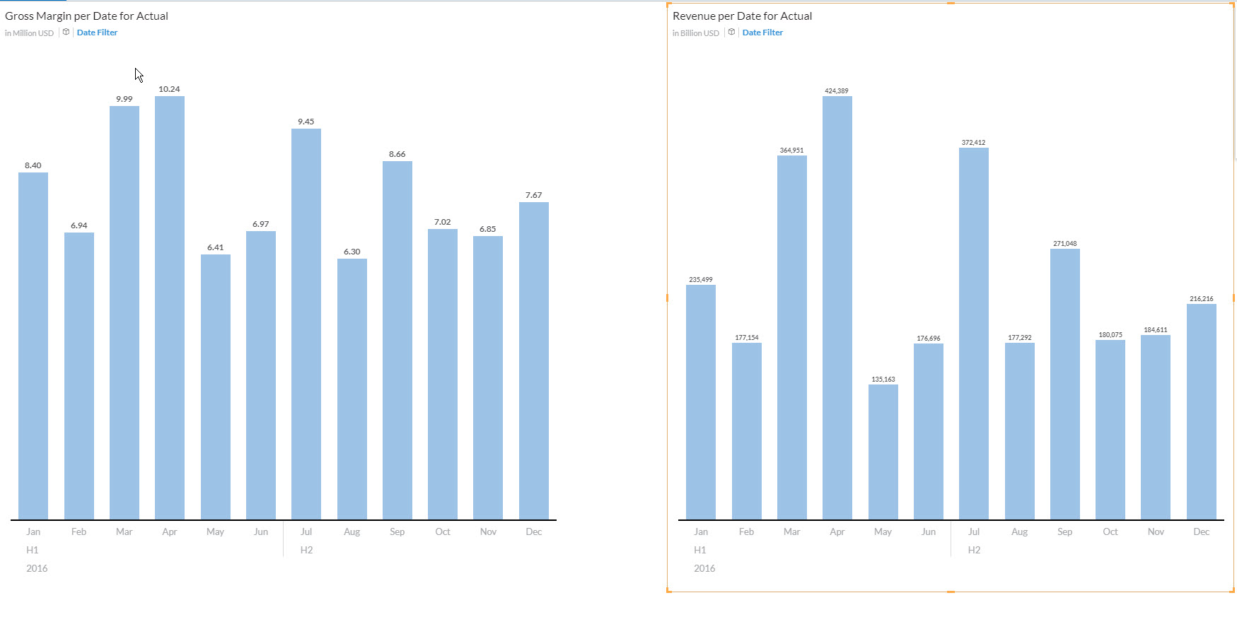
... which then brings us to the image above and I still might not realize that the 8.4 Million USD Margin is based on a 235 Billion USD and not 235 Million USD (just a small difference....=:) ).
In SAP Analytics Cloud we can easily resolve this, but setting both charts to an identical scaling. In the Tools menu, we select the Chart Scaling option...

.. .and we can then choose the list of measures that should be scaled in an identical way.

For my example the initial result would then look like shown below, because I did set the scaling manually to Millions and Billions, so the scaling will use those manually configured scaling for the measures and adjust the chart scaling accordingly.

In the given example, perhaps we set the number formatting back to Millions, but if you compare now our starting point and the chart we look at now, I am sure your "assumptions" are different.
Looking at the first chart you might be very happy with the gross margin you making when your eyes are moving from left to right, but looking at it now, I am sure that changes.
But obviously in this case perhaps an identical scaling for the chart is not as "perfect" as we thought in the beginning, because the scale is hugely different - but still we do not want to mislead our users.
So what other options do we have ?
This is where a "Scale Indication" might help and we can add that in SAP Analytics Cloud by using a Reference line.
Here the example with the reference line added for both charts


With Top 10 the topic of highlighting is being recommended and there are different ways to highlight elements in your chart, such as the option to highlight a difference and to highlight a trend.
So lets go back to our first example, where we see the Gross Margin per month for the year 2016.
The ability to highlight differences is something as easy as selecting the two months that you would like to see the difference off.

Other options to highlight a specific area would be to add a Reference Line in SAP Analytics Cloud, which could be based on the average, min, or max from a measure in the chart.
I hope you enjoyed the series on the Top 10 recommendations. As next step we will look at how we can design a table and a chart in SAP Analytics Cloud following these recommendations.
Additional Information:
SAP Analytics Cloud and Visualization Standards - Why ?
SAP Analytics Cloud and IBCS - Part 1
SAP Analytics Cloud and IBCS - Part 2
SAP Analytics Cloud and IBCS - Part 3
SP Analytics Cloud and IBCS - Part 4
SAP Analytics Cloud and IBCS - Part 5
openSAP - Semantic Notations
Hichert
Top 9 - Scaling
This one should be a pretty obvious step, but it is often forgotten. In case you have multiple charts as part of your story board / dashboard, you should make sure that you are representing the values on an identical scale, as otherwise people might make assumptions just based on the visual appearance.
Lets take a "bad" example.
Above you can see the Gross Margin for 2016 and you can see the scale shown for the Y-Axis and the measure is shown in Million USD, which is mentioned as part of the title.
Next to it we see the Revenue for the same timeframe, and without really paying attention my eyes might move from left and right and start comparing the column height, not noticing that the right chart is scaled to Billions USD.
So there are some simple changes I could do now, such as removing the Y-Axis and enabled the display of data labels....
... which then brings us to the image above and I still might not realize that the 8.4 Million USD Margin is based on a 235 Billion USD and not 235 Million USD (just a small difference....=:) ).
In SAP Analytics Cloud we can easily resolve this, but setting both charts to an identical scaling. In the Tools menu, we select the Chart Scaling option...
.. .and we can then choose the list of measures that should be scaled in an identical way.
For my example the initial result would then look like shown below, because I did set the scaling manually to Millions and Billions, so the scaling will use those manually configured scaling for the measures and adjust the chart scaling accordingly.
In the given example, perhaps we set the number formatting back to Millions, but if you compare now our starting point and the chart we look at now, I am sure your "assumptions" are different.
Looking at the first chart you might be very happy with the gross margin you making when your eyes are moving from left to right, but looking at it now, I am sure that changes.
But obviously in this case perhaps an identical scaling for the chart is not as "perfect" as we thought in the beginning, because the scale is hugely different - but still we do not want to mislead our users.
So what other options do we have ?
This is where a "Scale Indication" might help and we can add that in SAP Analytics Cloud by using a Reference line.
Here the example with the reference line added for both charts
Top 10 - Highlighting
With Top 10 the topic of highlighting is being recommended and there are different ways to highlight elements in your chart, such as the option to highlight a difference and to highlight a trend.
So lets go back to our first example, where we see the Gross Margin per month for the year 2016.
The ability to highlight differences is something as easy as selecting the two months that you would like to see the difference off.
Other options to highlight a specific area would be to add a Reference Line in SAP Analytics Cloud, which could be based on the average, min, or max from a measure in the chart.
I hope you enjoyed the series on the Top 10 recommendations. As next step we will look at how we can design a table and a chart in SAP Analytics Cloud following these recommendations.
Additional Information:
SAP Analytics Cloud and Visualization Standards - Why ?
SAP Analytics Cloud and IBCS - Part 1
SAP Analytics Cloud and IBCS - Part 2
SAP Analytics Cloud and IBCS - Part 3
SP Analytics Cloud and IBCS - Part 4
SAP Analytics Cloud and IBCS - Part 5
openSAP - Semantic Notations
Hichert
You must be a registered user to add a comment. If you've already registered, sign in. Otherwise, register and sign in.
Labels in this area
-
ABAP CDS Views - CDC (Change Data Capture)
2 -
AI
1 -
Analyze Workload Data
1 -
BTP
1 -
Business and IT Integration
2 -
Business application stu
1 -
Business Technology Platform
1 -
Business Trends
1,658 -
Business Trends
92 -
CAP
1 -
cf
1 -
Cloud Foundry
1 -
Confluent
1 -
Customer COE Basics and Fundamentals
1 -
Customer COE Latest and Greatest
3 -
Customer Data Browser app
1 -
Data Analysis Tool
1 -
data migration
1 -
data transfer
1 -
Datasphere
2 -
Event Information
1,400 -
Event Information
66 -
Expert
1 -
Expert Insights
177 -
Expert Insights
295 -
General
1 -
Google cloud
1 -
Google Next'24
1 -
Kafka
1 -
Life at SAP
780 -
Life at SAP
13 -
Migrate your Data App
1 -
MTA
1 -
Network Performance Analysis
1 -
NodeJS
1 -
PDF
1 -
POC
1 -
Product Updates
4,577 -
Product Updates
341 -
Replication Flow
1 -
RisewithSAP
1 -
SAP BTP
1 -
SAP BTP Cloud Foundry
1 -
SAP Cloud ALM
1 -
SAP Cloud Application Programming Model
1 -
SAP Datasphere
2 -
SAP S4HANA Cloud
1 -
SAP S4HANA Migration Cockpit
1 -
Technology Updates
6,873 -
Technology Updates
419 -
Workload Fluctuations
1
Related Content
- LLM, RAG and Cloud Foundry: No space left on device in Technology Q&A
- Consuming SAP with SAP Build Apps - Mobile Apps for iOS and Android in Technology Blogs by SAP
- 入門!SAP Analytics Cloud for planning 機能紹介シリーズ - データアクションとマルチアクション in Technology Blogs by SAP
- Composite Data Source Configuration in Optimized Story Experience in Technology Blogs by SAP
- Need Info on System Owner Permissions for SAC,DSP in Technology Q&A
Top kudoed authors
| User | Count |
|---|---|
| 36 | |
| 25 | |
| 17 | |
| 13 | |
| 8 | |
| 7 | |
| 6 | |
| 6 | |
| 6 | |
| 6 |