
Last year, we introduced
Responsive Lane Pages to SAP Analytics Cloud, enabling the creation of dashboards and Digital Boardrooms that adapt to various screen sizes and devices.
To provide greater design flexibility when creating responsive pages, we are pleased to announce improved lane reflow logic for tablet devices and smaller web browsers coming in the 2018.03 release.
Improved lane reflow logic
Logic for small and large screens remain the same. For large screens, each lane and widget proportionally shrinks. On very small screens, or phone-sized devices, a single widget spans the full page-width, with any additional widgets flowing below.

On medium-size screens (web browser resolutions between 768pm and 1024px, or viewed on medium tablet-sized devices) we have made the following improvements:
- Medium-size screens now support up to three lanes, side-by-side, with multiple break-point options.

- In most cases, large lanes (larger than 50% of the screen) reflow to fill the full page-width. Notable exceptions include three-lane layouts where a large center lane has a smaller lane on each side, and six-lane layouts, where instead of a large lane, the page reflows with either two or three lanes per width.

- Small lanes (anything smaller than 50% of the screen) should never span to fill the full page-width, and are displayed next to one or two other lanes.

- Tiles (Charts, Tables, Text, Shape…) placed in a lane will stay together and resize proportionally when the screen size is reduced.
- If a user chooses to disable a widget from displaying on mobile devices, nearby impacted widgets will resize to fill in the missing space.
 When choosing the hide the bar chart on mobile view, the time series chart to the right fills in the open space.
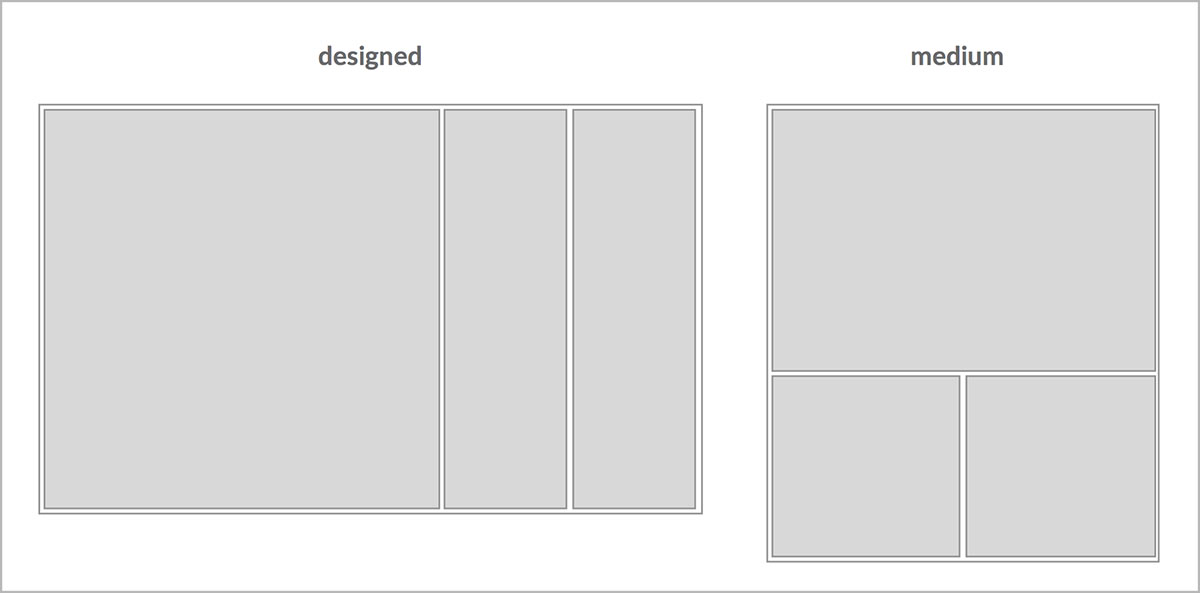
Lane reflow examples
When choosing the hide the bar chart on mobile view, the time series chart to the right fills in the open space.
Lane reflow examples
While not comprehensive of all layout possibilities, the following examples illustrate how a responsive page may appear when designed on a desktop, versus how it is displayed on a medium-sized screen. For one or two-lane pages, there is no lane reflow for medium-sized screens, and content scales proportionally.
Three Lanes
 Four Lanes

 Five Lanes

 Six Lanes
 What will happen to my existing responsive pages?
The improved lane reflow logic will be automatically applied to your existing responsive pages. You can use the

Device Preview Mode (located on the top menu bar) to review how your designs may appear on different screen sizes and devices, and to assess any potential issues.
--
Bonus Feature! Customizable font sizes per device, screen size
We’re glad you’re still reading, because we have one more very cool responsive feature! For those looking for greater control and accuracy on how their fonts display on different devices and screen sizes, one can now select specific sizes from within the
Device Preview mode. Fonts may be changed per device, per widget, and changes can be made either to all text, or a specific text selection (chart title, subtitle, legend, etc.). We’ve also included a “Reset” button, which appears after a text change has been made, to make it easier to return to default sizes.

Enjoy, and please do let us know of any comments or questions!
Additional Resources:
