
- SAP Community
- Groups
- Interest Groups
- Application Development
- Blog Posts
- General rules of good interface
Application Development Blog Posts
Learn and share on deeper, cross technology development topics such as integration and connectivity, automation, cloud extensibility, developing at scale, and security.
Turn on suggestions
Auto-suggest helps you quickly narrow down your search results by suggesting possible matches as you type.
Showing results for
Advisor
Options
- Subscribe to RSS Feed
- Mark as New
- Mark as Read
- Bookmark
- Subscribe
- Printer Friendly Page
- Report Inappropriate Content
12-05-2017
12:12 PM
You probably heard about general concept of FIORI: role-based, simple, adaptive, coherent and delightful. To achieve delightfulness FIORI design guidelines were created and published (experience.sap.com/fiori-design/). So when UX designer is creating a new Fiori application he always follows these guidelines alongside customer requirements.
But following our design guidelines is not enough. Here are my 4 general rules for creating good interface.
Always pay attention to controls placement. General rule – the easier the better. Try to avoid complex constructions, different alignments and content overload.
You don’t have to be an expert in Russian or UX to see the actual difference between these 2 interfaces of the same app.
Before
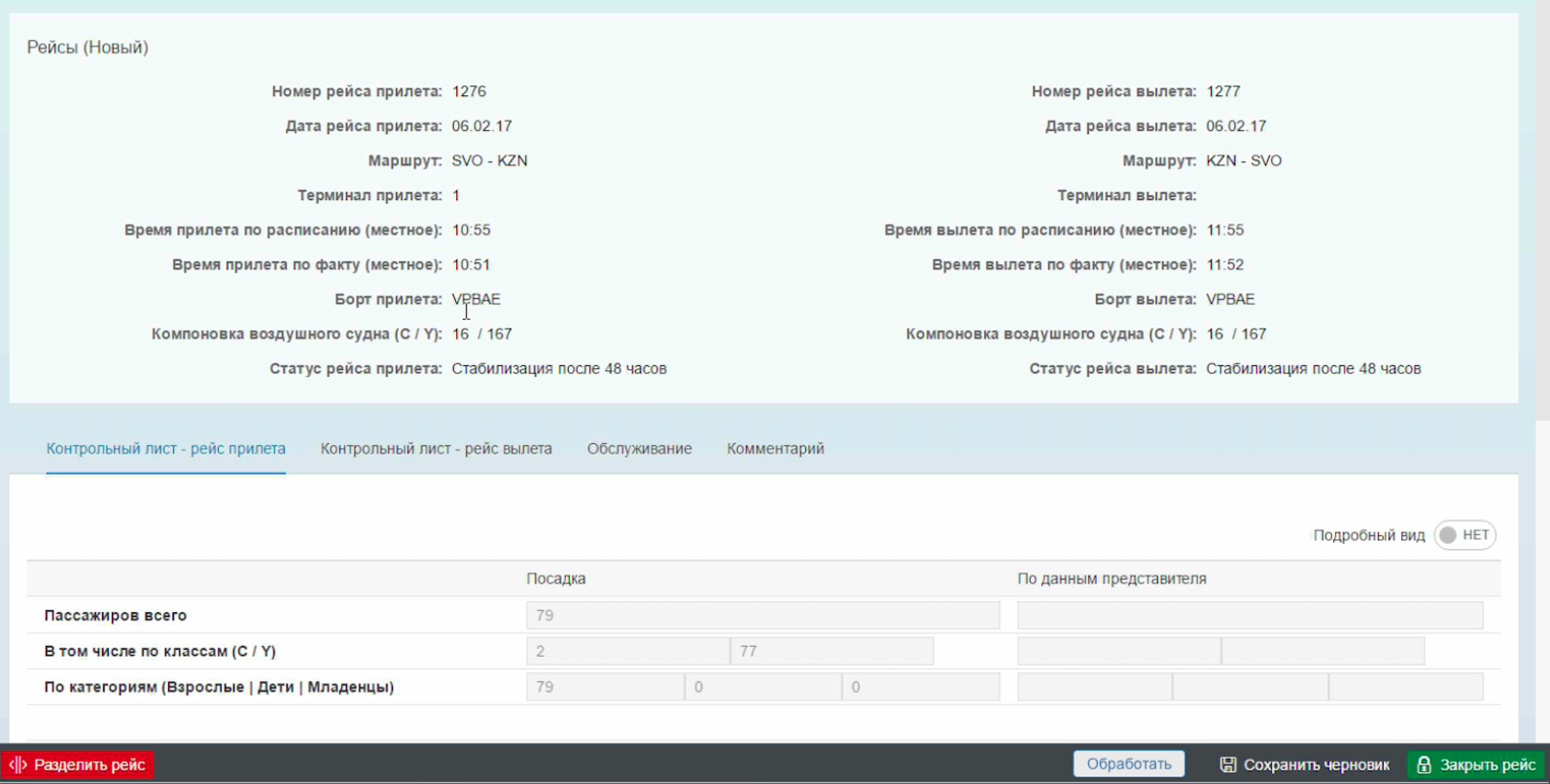
and after
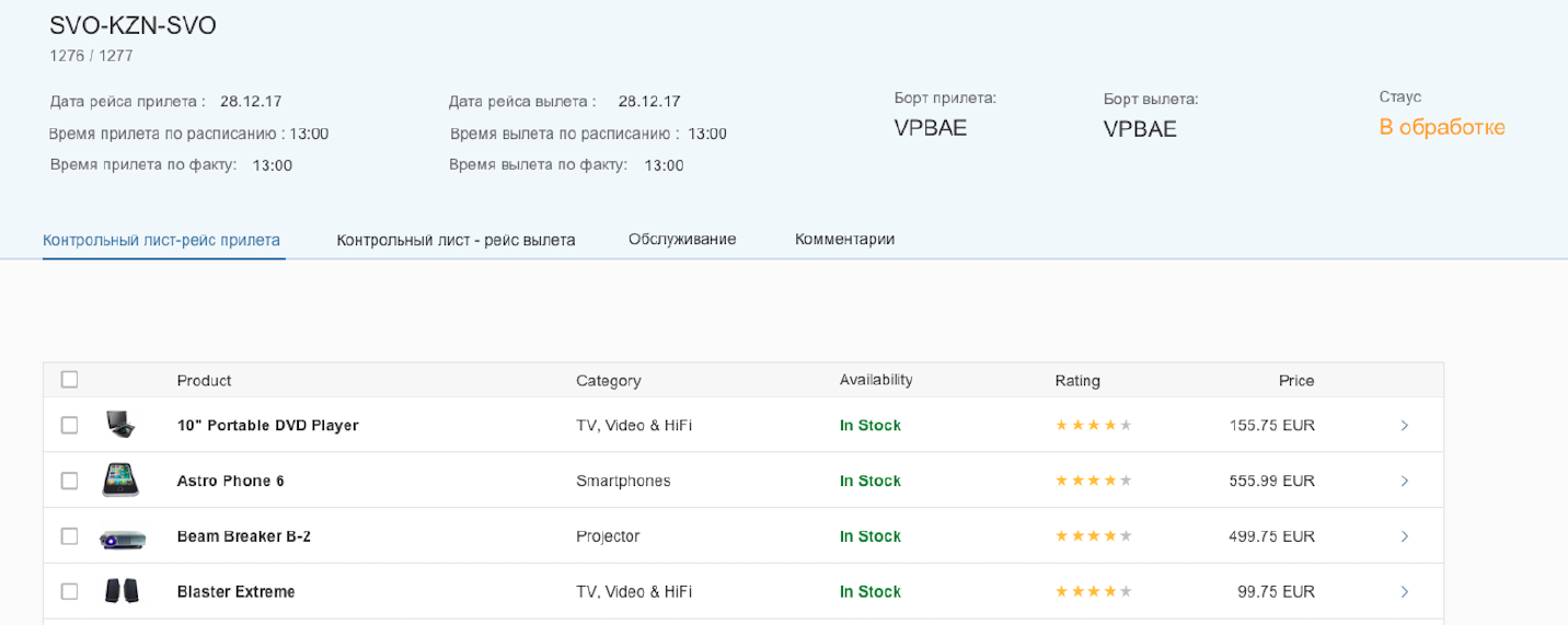
And there was no loss of information, just “cleaning” of the interface. The alignment was corrected, excess labels were excluded, form with unstructured fields was replaced with a table. And it made a huge difference already.
Also keep in mind the proximity principle. Label should be closer to its field than to another label or field. Here comes an example:
 looks like a girl is a convinced felon and being escorted
 looks like a guy looking at a happy couple
Indents matter!
Words are the very big part of the interface. Even if interface is designed very good, but texts are written very poorly, there won’t be a great user experience. I defined 2 general rules regarding texts:
When you click on a button and don’t see any reaction you click it again. And again. And again. And that what normal person does. If you can’t see the reaction on your actions you think there is none. System response should be instant and continuous and then users will be happy and won’t click on buttons like crazy. BTW this is not only about buttons, system response is also required for clicks on links, tabs, table row and anything clickable.
I tend to use toasts messages and popups a lot in my applications as a response to button clicks. But this is probably not the best way to give response. Users tend not to read any warning popups and to forget that there was a toast couple of seconds later. If you have better solutions please share it in the comments below.
Modality is the quality or state of being modal. Interface is modal if it has different states and user doesn’t know which state he uses. For example, the home screen of your iPhone is modal – you have to actually pay attention to the icons to start the right application. There are different applications in the same places on different pages of your home screen, so you might start Shazam instead of App Store for example.


I know 4 different ways to solve this.
 vs.
vs. 
But following our design guidelines is not enough. Here are my 4 general rules for creating good interface.
1. Layout
Always pay attention to controls placement. General rule – the easier the better. Try to avoid complex constructions, different alignments and content overload.
You don’t have to be an expert in Russian or UX to see the actual difference between these 2 interfaces of the same app.
Before
and after
And there was no loss of information, just “cleaning” of the interface. The alignment was corrected, excess labels were excluded, form with unstructured fields was replaced with a table. And it made a huge difference already.
Also keep in mind the proximity principle. Label should be closer to its field than to another label or field. Here comes an example:
looks like a girl is a convinced felon and being escorted looks like a guy looking at a happy coupleIndents matter!
2. Content
Words are the very big part of the interface. Even if interface is designed very good, but texts are written very poorly, there won’t be a great user experience. I defined 2 general rules regarding texts:
- Always review interfaces like you’ve never seen them before. And I mean always, even on intermediate steps – user might work with your application, then get distracted by urgent e-mail and then return and still should understand what he is doing, which step he is on. So review interfaces on each step separately and maybe even in different order.
 What software exactly was installed?
- Edit all your content. Avoid words like “General”, “Additional”, “Data”, “Useful” etc. They don’t give any information to user, so try to replace them with something meaningful. Also do not overload him with technical information – he doesn’t need to know technical numbers and random codes to use application. There is a great post about texts, check it out, really useful: https://jam4.sapjam.com/blogs/show/JJWKY0oTV4ARTTRAfswfP8?_lightbox=true
3. System response
When you click on a button and don’t see any reaction you click it again. And again. And again. And that what normal person does. If you can’t see the reaction on your actions you think there is none. System response should be instant and continuous and then users will be happy and won’t click on buttons like crazy. BTW this is not only about buttons, system response is also required for clicks on links, tabs, table row and anything clickable.
I tend to use toasts messages and popups a lot in my applications as a response to button clicks. But this is probably not the best way to give response. Users tend not to read any warning popups and to forget that there was a toast couple of seconds later. If you have better solutions please share it in the comments below.
4. Modality
Modality is the quality or state of being modal. Interface is modal if it has different states and user doesn’t know which state he uses. For example, the home screen of your iPhone is modal – you have to actually pay attention to the icons to start the right application. There are different applications in the same places on different pages of your home screen, so you might start Shazam instead of App Store for example.
I know 4 different ways to solve this.
- Use a different gesture for each control. Like when you use a map in your interface scrolling affects different areas differently depending of cursor placement – zooming in/out while cursor is on the map and regular scrolling when it’s not. It could be solved by changing gesture for zooming in/out – adding CTRL button with scrolling, for example. Or using 2 fingers instead of 1 on touch devices.
- Show user what state the interface is. Great example of that is Fiori Launchpad in edit/display modes. You won’t be able not to see what state you are cause it was made so obvious (even in unknown language):
vs. - Use quasi-mode. Make user pay attention to what he does. Good example of this is using SHIFT for uppercase instead of CAPS LOCK. CAPS LOCK creates modality, and using SHIFT creates a quasi-mode.
- Change the sequence of steps. This is a more complex decision that you probably should discuss with end users of your interface first cause it might change your interface exceedingly.
- SAP Managed Tags:
- User Interface
7 Comments
You must be a registered user to add a comment. If you've already registered, sign in. Otherwise, register and sign in.
Labels in this area
-
A Dynamic Memory Allocation Tool
1 -
ABAP
8 -
abap cds
1 -
ABAP CDS Views
14 -
ABAP class
1 -
ABAP Cloud
1 -
ABAP Development
4 -
ABAP in Eclipse
1 -
ABAP Keyword Documentation
2 -
ABAP OOABAP
2 -
ABAP Programming
1 -
abap technical
1 -
ABAP test cockpit
7 -
ABAP test cokpit
1 -
ADT
1 -
Advanced Event Mesh
1 -
AEM
1 -
AI
1 -
API and Integration
1 -
APIs
8 -
APIs ABAP
1 -
App Dev and Integration
1 -
Application Development
2 -
application job
1 -
archivelinks
1 -
Automation
4 -
BTP
1 -
CAP
1 -
CAPM
1 -
Career Development
3 -
CL_GUI_FRONTEND_SERVICES
1 -
CL_SALV_TABLE
1 -
Cloud Extensibility
8 -
Cloud Native
7 -
Cloud Platform Integration
1 -
CloudEvents
2 -
CMIS
1 -
Connection
1 -
container
1 -
Debugging
2 -
Developer extensibility
1 -
Developing at Scale
4 -
DMS
1 -
dynamic logpoints
1 -
Eclipse ADT ABAP Development Tools
1 -
EDA
1 -
Event Mesh
1 -
Expert
1 -
Field Symbols in ABAP
1 -
Fiori
1 -
Fiori App Extension
1 -
Forms & Templates
1 -
General
1 -
Getting Started
1 -
IBM watsonx
1 -
Integration & Connectivity
10 -
Introduction
1 -
JavaScripts used by Adobe Forms
1 -
joule
1 -
NodeJS
1 -
ODATA
3 -
OOABAP
3 -
Outbound queue
1 -
Product Updates
1 -
Programming Models
13 -
Restful webservices Using POST MAN
1 -
RFC
1 -
RFFOEDI1
1 -
SAP BAS
1 -
SAP BTP
1 -
SAP Build
1 -
SAP Build apps
1 -
SAP Build CodeJam
1 -
SAP CodeTalk
1 -
SAP Odata
1 -
SAP UI5
1 -
SAP UI5 Custom Library
1 -
SAPEnhancements
1 -
SapMachine
1 -
security
3 -
text editor
1 -
Tools
17 -
User Experience
5
Top kudoed authors
| User | Count |
|---|---|
| 3 | |
| 3 | |
| 3 | |
| 2 | |
| 2 | |
| 2 | |
| 2 | |
| 1 | |
| 1 | |
| 1 |