
- SAP Community
- Products and Technology
- Technology
- Technology Blogs by SAP
- Customizing a Network Graph to Create an Org Chart
Technology Blogs by SAP
Learn how to extend and personalize SAP applications. Follow the SAP technology blog for insights into SAP BTP, ABAP, SAP Analytics Cloud, SAP HANA, and more.
Turn on suggestions
Auto-suggest helps you quickly narrow down your search results by suggesting possible matches as you type.
Showing results for
former_member50
Explorer
Options
- Subscribe to RSS Feed
- Mark as New
- Mark as Read
- Bookmark
- Subscribe
- Printer Friendly Page
- Report Inappropriate Content
12-04-2017
1:58 PM
Network graph is a new control introduced in version 1.50 that allows you to display data as a network of nodes connected by lines. The nodes can be circular or rectangular and can be joined into groups. You can define custom attributes for nodes and groups of nodes as well as apply layout algorithms that define the graph's appearance. Standard application of this controls looks like this:

Moreover, network graph is highly customizable and can be used in a variety of ways. I would like to show one of such customization variants for which this control was not primarily designed but can be used – Org Chart.
Imagine we have data with employees, their managers and colleagues, and we want to display this data as an organization hierarchy.
Let’s take a look at the key features of the network graph. With a network graph, you can:
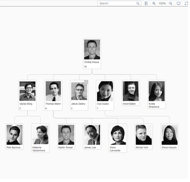
By the end of this tutorial, our org chart will look like this.
This example uses simulated dynamic loading (through JSON model) but you can just as well use it with OData service. In this example, each node can be collapsed and the root employee node has an upward arrow button that expands the tree one level up.
Let’s start with layout.
Layout algorithm
Network graph supports several layout algorithms. In this example, we use the default “layered“ algorithm with some small adjustments.
Node customization
By default, the graph supports two node shapes
In our example, we will use the box shape, with a few adjustments. By default, a box-shaped node has an icon, a title, and attributes arranged as shown in the image below.
On the other hand, we want to have a single employee picture with a name below it. We also need to use attributes to display the number of this employee’s direct reports. We need to leave the title empty and use the description to hold the employee’s name.

Important settings for the node:
We need to bind the node to more data from model that is not available in the properties. For such cases, we can use the customData binding.
Using this data, we can show additional information about the employee, such as the team or location in the form of a popup.
Attributes are used to display team size.
Line customization
With the lines, there is not much to customize in this example. We just hide the arrows by using the ‘arrowOrientation’ property.
To disable the default line popover we attach a ‘press’ event and set ‘bPreventDefault’.
Dynamic data loading
As mentioned before, we are trying to simulate an OData service. Even though our data is stored in one JSON model, we manipulate it using filters the same way as you would do with OData service. To do so, we store an array of already loaded managers.
For every manager node, we create a special action button that triggers additional data loading. To achieve this, we attach an event handler to the “beforeLayouting” event where we manipulate all nodes. This event is triggered before the data is sent to the layout algorithm and rendered.
We add an “Up one level” button to the root manager node. Every manager has a “key” of his manager stored in the custom data, so we call “_loadMore” with this key.
Filtering
To simulate OData, we use filter objects. For each binding (nodes, lines), we create a filter representing the condition, such asid=’Boss1’, or manager =’Boss1’, or id=’Boss2’, or manager=’Boss2’, or a similar condition. The same applies to the lines. This narrows down the dataset and allows us to return only the managers and their teams that were already loaded.
Collapsing / expanding nodes

There are two ways to handle the expand/collapse behavior. Either the data is already loaded, so we simply hide the child nodes (this is the default network graph behavior), or the child nodes have to be loaded manually (as managers are not loaded with their team by default). In both cases, we need different buttons as shown in the code snippet below.
As you can see, there are three cases we need to handle:
Custom popover
To display a custom popover, we must hide the default detail button, create a new one, and react to its press event. Again, we will use the ‘beforeLayouting’ event.
We create an XML fragment which contains ‘QuickView’ to display employee details. We only need to create a new JSON model and bind it to the fragment. We use custom data bound to every node from the model (as described in the before in the beginning of the article). For more information about ‘QuickView’ , see the API Reference.
Custom search

By default, search works only with the data that the network graph has already loaded. Of course, when the data has to be loaded incrementally, this might be not sufficient, as the graph cannot display all data for the whole company (only maybe for a smaller company).
Fortunately, the Network Graph provides two events that allow us to fully customize how search works:
The suggest function is called whenever a user wants to display data matching the filter condition. In this case, we simply go through all data in the JSON model. . In such a case, one would have to create a custom function accepting search parameters.
The important part is, once you obtain the data you should call the ‘setSearchSuggestionItems’ method with an array of items to be displayed in the search field. Don’t forget to enable ‘preventDefault’, as calling OData service is asynchronous and we want to prevent default behavior until the data has been fully loaded.
Search is triggered after the user selects an item from the suggested items. It resets all current items and display only the item that the user selected.
Additional customization and usage
There are several events provided by the Network Graph control that you can use for further customization. Moreover, most of the events support ‘preventDefault’ , so you can prevent the default behavior, as shown in this table.
In this example, I’ve shown you how to customize network graph to edge cases it was not primary designed for. I hope you found this tutorial useful. If you have any questions or suggestions, please share them in the comments below. To explore other samples of network graph usage, see this link.
Moreover, network graph is highly customizable and can be used in a variety of ways. I would like to show one of such customization variants for which this control was not primarily designed but can be used – Org Chart.
Imagine we have data with employees, their managers and colleagues, and we want to display this data as an organization hierarchy.
Let’s take a look at the key features of the network graph. With a network graph, you can:
- Display tree-like org structure with all employees
- For every employee, load employee’s manager
- Easily search for all employees
- Display members of the teams individually or as a single group
- Apply color-coding to different teams or departments (not implemented in this example)
By the end of this tutorial, our org chart will look like this.
This example uses simulated dynamic loading (through JSON model) but you can just as well use it with OData service. In this example, each node can be collapsed and the root employee node has an upward arrow button that expands the tree one level up.
Let’s start with layout.
Layout algorithm
<layoutAlgorithm>

   <layout:LayeredLayout

         mergeEdges="true"

         nodePlacement="Simple"

         nodeSpacing="40"/>

</layoutAlgorithm>
Network graph supports several layout algorithms. In this example, we use the default “layered“ algorithm with some small adjustments.
- mergeEdges: This flag merges all lines leading from node into single line. The graph looks more compact with this setting
- nodePlacement: There are 3 ways to position nodes within a layered algorithm. “Simple” node placement attempts to place nodes as close to each other as possible to achieve a “tree-like” overall appearance.
- nodespacing: We will set this option to 40 to make spaces between the nodes smaller. Because it looks better, the org chart appears lighter and more elegant
Node customization
By default, the graph supports two node shapes
- Box (rectangular)
- Circle (circular)
In our example, we will use the box shape, with a few adjustments. By default, a box-shaped node has an icon, a title, and attributes arranged as shown in the image below.
On the other hand, we want to have a single employee picture with a name below it. We also need to use attributes to display the number of this employee’s direct reports. We need to leave the title empty and use the description to hold the employee’s name.
<image>

   <NodeImage src="{src}"

            width="80"

            height="100"/>

</image>
Important settings for the node:
<Node description="{title}"

     width="90"

     attributes="{attributes}"

     showActionLinksButton="false"

     showDetailButton="false"

     descriptionLineSize="0"

     shape="Box">
- description: By default, a rectangular node displays an image and a title next to it (to the right). To modify this, we use an empty title and set the employee name as the description, which will be rendered below the image.
- width: You must adjust the node’s width manually to the image size. In our case, the image is 80px wide, while the node’s width is 90px.
- attributes: Attributes display information about the team size. This option bind to its aggregation.
- showActionLinksButton, showDetailButton: Hides the default action buttons (they are rendered after the user clicks the node), we will use custom buttons for all actions.
- shape: Displays the node as a rectangle.
We need to bind the node to more data from model that is not available in the properties. For such cases, we can use the customData binding.
<customData>

   <core:CustomData key="supervisor" value="{supervisor}"/>

   <core:CustomData key="team" value="{team}"/>

   <core:CustomData key="location" value="{location}"/>

</customData>
Using this data, we can show additional information about the employee, such as the team or location in the form of a popup.
Attributes are used to display team size.
<attributes>

   <ElementAttribute label="{label}" />

</attributes>
Line customization
With the lines, there is not much to customize in this example. We just hide the arrows by using the ‘arrowOrientation’ property.
<lines>

   <Line from="{from}" to="{to}" arrowOrientation="None" press="linePress" />

</lines>
To disable the default line popover we attach a ‘press’ event and set ‘bPreventDefault’.
GraphController.prototype.linePress = function (oEvent) {

   oEvent.bPreventDefault = true;

};
Dynamic data loading
As mentioned before, we are trying to simulate an OData service. Even though our data is stored in one JSON model, we manipulate it using filters the same way as you would do with OData service. To do so, we store an array of already loaded managers.
For every manager node, we create a special action button that triggers additional data loading. To achieve this, we attach an event handler to the “beforeLayouting” event where we manipulate all nodes. This event is triggered before the data is sent to the layout algorithm and rendered.
this._graph.attachEvent("beforeLayouting", function (oEvent) {


...


if (oNode.getKey() === this._sTopSupervisor) {

   sSupervisor = this._getCustomDataValue(oNode, "supervisor");

   if (sSupervisor) {

      oUpOneLevelButton = new ActionButton({

         title: "Up one level",

         icon: "sap-icon://arrow-top",

         press: function () {

            var aSuperVisors = oNode.getCustomData().filter(function (oData) {

                  return oData.getKey() === "supervisor";

               }),

               sSupervisor = aSuperVisors.length > 0 && aSuperVisors[0].getValue();


            this._loadMore(sSupervisor);

            this._sTopSupervisor = sSupervisor;

         }.bind(this)

      });

      oNode.addActionButton(oUpOneLevelButton);

   }

}
We add an “Up one level” button to the root manager node. Every manager has a “key” of his manager stored in the custom data, so we call “_loadMore” with this key.
Filtering
GraphController.prototype._setFilter = function () {

   var aNodesCond = [],

      aLinesCond = [];

   var fnAddBossCondition = function (sBoss) {

      aNodesCond.push(new sap.ui.model.Filter({

         path: 'id',

         operator: sap.ui.model.FilterOperator.EQ,

         value1: sBoss

      }));


      aNodesCond.push(new sap.ui.model.Filter({

         path: 'supervisor',

         operator: sap.ui.model.FilterOperator.EQ,

         value1: sBoss

      }));

   };


   var fnAddLineCondition = function (sLine) {

      aLinesCond.push(new sap.ui.model.Filter({

         path: "from",

         operator: sap.ui.model.FilterOperator.EQ,

         value1: sLine

      }));

   };


   this._mExplored.forEach(function (oItem) {

      fnAddBossCondition(oItem);

      fnAddLineCondition(oItem);

   });


   this._graph.getBinding("nodes").filter(new sap.ui.model.Filter({

      filters: aNodesCond,

      and: false

   }));


   this._graph.getBinding("lines").filter(new sap.ui.model.Filter({

      filters: aLinesCond,

      and: false

   }));

};
To simulate OData, we use filter objects. For each binding (nodes, lines), we create a filter representing the condition, such asid=’Boss1’, or manager =’Boss1’, or id=’Boss2’, or manager=’Boss2’, or a similar condition. The same applies to the lines. This narrows down the dataset and allows us to return only the managers and their teams that were already loaded.
Collapsing / expanding nodes
There are two ways to handle the expand/collapse behavior. Either the data is already loaded, so we simply hide the child nodes (this is the default network graph behavior), or the child nodes have to be loaded manually (as managers are not loaded with their team by default). In both cases, we need different buttons as shown in the code snippet below.
var sTeamSize = this._getCustomDataValue(oNode, "team");


if (!sTeamSize) {

   // employees without team - hide expand buttons

   oNode.setShowExpandButton(false);

} else {

   if (this._mExplored.indexOf(oNode.getKey()) === -1) {

      // managers with team but not yet expanded

      // we create custom expand button with dynamic loading

      oNode.setShowExpandButton(false);


      // this renders icon marking collapse status

      oNode.setCollapsed(true);

      oExpandButton = new ActionButton({

         title: "Expand",

         icon: "sap-icon://sys-add",

         press: function () {

            oNode.setCollapsed(false);

            this._loadMore(oNode.getKey());

         }.bind(this)

      });

      oNode.addActionButton(oExpandButton);

   } else {

      // manager with already loaded data - default expand button

      oNode.setShowExpandButton(true);

   }

}
As you can see, there are three cases we need to handle:
- An employee without a team (the employee is not a manager) – we hide the expand/collapse button as there is nothing to expand.
- A manager whose team has not been loaded yet - we create a new action button. In its press event, we call the already mentioneded “_loadMore” but with key of this node. This will load this manager’s team members.
- A manager with already loaded team members – we show the default collapse/expand button and let the network graph run the show.
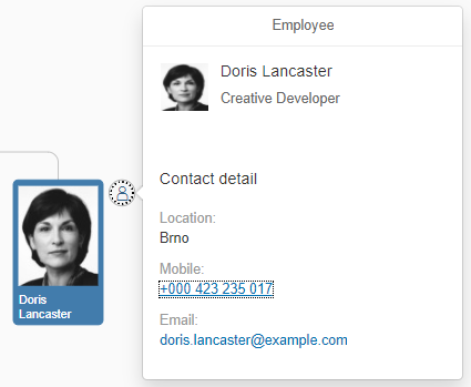
Custom popover
To display a custom popover, we must hide the default detail button, create a new one, and react to its press event. Again, we will use the ‘beforeLayouting’ event.
oDetailButton = new ActionButton({

   title: "Detail",

   icon: "sap-icon://person-placeholder",

   press: function (oEvent) {

      this._openDetail(oNode, oEvent.getParameter("buttonElement"));

   }.bind(this)

});
We create an XML fragment which contains ‘QuickView’ to display employee details. We only need to create a new JSON model and bind it to the fragment. We use custom data bound to every node from the model (as described in the before in the beginning of the article). For more information about ‘QuickView’ , see the API Reference.
GraphController.prototype._openDetail = function (oNode, oButton) {

   var sTeamSize = this._getCustomDataValue(oNode, "team");


   if (!this._oQuickView) {

      this._oQuickView = sap.ui.xmlfragment("sap.suite.ui.commons.sample.NetworkGraphOrgChart.TooltipFragment", this);

   }


   this._oQuickView.setModel(new JSONModel({

      icon: oNode.getImage() && oNode.getImage().getProperty("src"),

      title: oNode.getDescription(),

      description: this._getCustomDataValue(oNode, "position"),

      location: this._getCustomDataValue(oNode, "location"),

      showTeam: !!sTeamSize,

      teamSize: sTeamSize,

      email: this._getCustomDataValue(oNode, "email"),

      phone: this._getCustomDataValue(oNode, "phone")

   }));


   jQuery.sap.delayedCall(0, this, function () {

      this._oQuickView.openBy(oButton);

   });

};
Custom search
By default, search works only with the data that the network graph has already loaded. Of course, when the data has to be loaded incrementally, this might be not sufficient, as the graph cannot display all data for the whole company (only maybe for a smaller company).
Fortunately, the Network Graph provides two events that allow us to fully customize how search works:
<Graph

…

searchSuggest="suggest"

search="search">

</Graph>
GraphController.prototype.suggest = function (oEvent) {

   var aSuggestionItems = [],

      aItems = this._oModel.getData().nodes,

      aFilteredItems = [],

      sTerm = oEvent.getParameter("term");


   sTerm = sTerm ? sTerm : "";


   aFilteredItems = aItems.filter(function (oItem) {

      var sTitle = oItem.title ? oItem.title : "";

      return sTitle.toLowerCase().indexOf(sTerm.toLowerCase()) !== -1;

   });


   aFilteredItems.sort(function (oItem1, oItem2) {

      var sTitle = oItem1.title ? oItem1.title : "";

      return sTitle.localeCompare(oItem2.title);

   }).forEach(function (oItem) {

      aSuggestionItems.push(new sap.m.SuggestionItem({

         key: oItem.id,

         text: oItem.title

      }));

   });


   this._graph.setSearchSuggestionItems(aSuggestionItems);

   oEvent.bPreventDefault = true;

};
The suggest function is called whenever a user wants to display data matching the filter condition. In this case, we simply go through all data in the JSON model. . In such a case, one would have to create a custom function accepting search parameters.
The important part is, once you obtain the data you should call the ‘setSearchSuggestionItems’ method with an array of items to be displayed in the search field. Don’t forget to enable ‘preventDefault’, as calling OData service is asynchronous and we want to prevent default behavior until the data has been fully loaded.
GraphController.prototype.search = function (oEvent) {

   var sKey = oEvent.getParameter("key");


   if (sKey) {

      this._mExplored = [sKey];

      this._sTopSupervisor = sKey;

      this._graph.destroyAllElements();

      this._setFilter();


      oEvent.bPreventDefault = true;

   }

};
Search is triggered after the user selects an item from the suggested items. It resets all current items and display only the item that the user selected.
Additional customization and usage
There are several events provided by the Network Graph control that you can use for further customization. Moreover, most of the events support ‘preventDefault’ , so you can prevent the default behavior, as shown in this table.
| Object | Event | Result |
| Node | press | Action buttons won’t be shown. |
| Node | collapseExpand | Nodes won’t expand (collapse). |
| Node | hover | Hover class won’t be added. |
| Line | press | Dialog is not shown |
| Line | hover | Hover class won’t be added. |
| Group | showDetail | Detail dialog won’t be shown. |
In this example, I’ve shown you how to customize network graph to edge cases it was not primary designed for. I hope you found this tutorial useful. If you have any questions or suggestions, please share them in the comments below. To explore other samples of network graph usage, see this link.
- SAP Managed Tags:
- SAPUI5
39 Comments
You must be a registered user to add a comment. If you've already registered, sign in. Otherwise, register and sign in.
Labels in this area
-
ABAP CDS Views - CDC (Change Data Capture)
2 -
AI
1 -
Analyze Workload Data
1 -
BTP
1 -
Business and IT Integration
2 -
Business application stu
1 -
Business Technology Platform
1 -
Business Trends
1,661 -
Business Trends
87 -
CAP
1 -
cf
1 -
Cloud Foundry
1 -
Confluent
1 -
Customer COE Basics and Fundamentals
1 -
Customer COE Latest and Greatest
3 -
Customer Data Browser app
1 -
Data Analysis Tool
1 -
data migration
1 -
data transfer
1 -
Datasphere
2 -
Event Information
1,400 -
Event Information
64 -
Expert
1 -
Expert Insights
178 -
Expert Insights
273 -
General
1 -
Google cloud
1 -
Google Next'24
1 -
Kafka
1 -
Life at SAP
784 -
Life at SAP
11 -
Migrate your Data App
1 -
MTA
1 -
Network Performance Analysis
1 -
NodeJS
1 -
PDF
1 -
POC
1 -
Product Updates
4,577 -
Product Updates
325 -
Replication Flow
1 -
RisewithSAP
1 -
SAP BTP
1 -
SAP BTP Cloud Foundry
1 -
SAP Cloud ALM
1 -
SAP Cloud Application Programming Model
1 -
SAP Datasphere
2 -
SAP S4HANA Cloud
1 -
SAP S4HANA Migration Cockpit
1 -
Technology Updates
6,886 -
Technology Updates
403 -
Workload Fluctuations
1
Related Content
- SAP Document and Reporting Compliance - 'Colombia' - Contingency Process in Technology Blogs by SAP
- What’s New in SAP Datasphere Version 2024.8 — Apr 11, 2024 in Technology Blogs by Members
- explore the business continuity recovery sap solutions on AWS DRS in Technology Blogs by Members
- Consume Ariba APIs using Postman in Technology Blogs by SAP
- How can we create a customer influence in S/4HANA for P2P in Technology Q&A
Top kudoed authors
| User | Count |
|---|---|
| 12 | |
| 10 | |
| 9 | |
| 7 | |
| 7 | |
| 7 | |
| 6 | |
| 6 | |
| 5 | |
| 4 |