
- SAP Community
- Products and Technology
- Technology
- Technology Blogs by SAP
- Accessibility & Fiori – Introducing SAP High Contr...
Technology Blogs by SAP
Learn how to extend and personalize SAP applications. Follow the SAP technology blog for insights into SAP BTP, ABAP, SAP Analytics Cloud, SAP HANA, and more.
Turn on suggestions
Auto-suggest helps you quickly narrow down your search results by suggesting possible matches as you type.
Showing results for
Product and Topic Expert
Options
- Subscribe to RSS Feed
- Mark as New
- Mark as Read
- Bookmark
- Subscribe
- Printer Friendly Page
- Report Inappropriate Content
10-18-2017
6:04 AM
Some time ago I discussed SAP High Contrast Black, a theme that SAP has been providing in many solutions for decades. A matching SAP High Contrast White has been long desired and with SAPUI5 version 1.48 has finally become a reality. This blog brings you a first glance at High Contrast White and how it impacts your Fiori Launchpad and Fiori apps.
High Contrast White is an important new theme for anyone working on mobile devices in bright environments where there is dazzling and glare, such as on a mining site, or on a farm, or in city park, or on a container wharf.
High Contrast White also helps anyone who find higher contrast helps them to see more details, such as people with severe short-sightedness, macular degeneration, glaucoma, and floaters/clouds in the eye. While these sorts of conditions can affect anyone at any age, they are particularly prevalent as we age. So you may find your mature talent employees (over 45 years of age) may be particularly appreciative of a high contrast screen.
SAP High Contrast White is one of SAP’s newest addition to the Fiori Design Guidelines for accessibility users. SAP High Contrast White is available for all Fiori and SAPUI5 apps in SAPUI5 and OPENUI5 as of version 1.48.

Given that version 1.48 has only been released very recently most customers are yet to upgrade to SAPUI5 1.48, so the easiest place you can see this is in the recently released SAP S/4HANA 1709 and also in SAP S/4HANA Cloud 1708.
In this blog you will see some brief examples of:
And you will also find out how you can set select this theme:
The screenshots you will see are taken from S/4HANA 1709.
In the Fiori Launchpad, you can see in this example primarily white tiles are shown with a black border.The currently selected tab appears as a mid-blue.

The focus indicator that shows you where the cursor is currently placed appears as black dotted line on white (to make it easier to see the cursor indicator is also 2 pixels wide rather than the usual 1 pixel used for Belize and Belize Deep). In the example below, you can see the cursor indicator on the Unused Contracts tile.

Notice that semantic colors on analytics tiles still apply, and are just subtly adjusted shades.
Greens are #006362 (0% red, 38.8% green, 38.4% blue) compared to Belize's #2B7D2B (16.9% red, 49% green and 16.9% blue). Reds are #AB0000 (67% red) compared to Belize's #BB0000 (73% red).
Naturally the colors of your corporate logo and any other images are unaffected.
On static tiles, you can see icons are in minimalist black on white, as in the following example.

In the example below you can see high contrast white applied to one of the S/4HANA Fiori Manage apps. This particular app, like many of the Manage apps, uses the popular List Report floorplan. Here we see the list shown with a grid table. Once again you can see minimalist black text and lines on primarily white screen. The position of the cursor is highlighted in orange – here we see the cursor selecting a whole row to expand it to see more details.

Often details are shown using an Object Page – another very common Fiori floorplan. On an object page again you can see High Contrast White appears as black text on primarily white screen. The current tab is emphasized with a bold underline. Major section (aka facet) headings have a grey background.
Thumbnail images are unaffected.

In analytical charts, a deep color palette is applied to make comparison of charts and lines clearer, and a little more interesting.
This new color palette is particularly obvious on Overview Pages.

It's easy to turn on this new theme. Just to go to the Me Area of your Fiori Launchpad and open the Settings dialog. You’ll find the settings for themes in the section Appearance. Simply choose SAP High Contrast White.
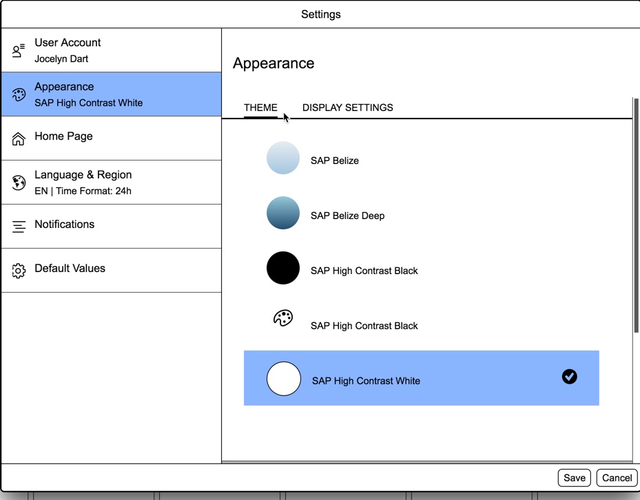
Hint: You might notice there are 2 SAP High Contrast Blacks. The older sap_hcb (marked with an artist pallet icon) and the newer sap_belize_hcb (showing the theme background colour in a circle icon). You are recommended to use the updated sap_belize_hcb for Fiori to pick up on the latest Fiori settings and to smoothly navigate to classic UIs.
You can switch on the High Contrast White theme by appending the URL parameter to your Fiori Launchpad URL:
sap-ui-theme=sap_belize_hcw
And of course, just like High Contrast Black you can add sap_belize_hcw as a supported theme in your manifest.json file.
You’ll find more in the SAP Fiori Accessibility wiki.
Screenshots from S/4HANA 1709
Brought to you by the SAP S/4HANA RIG
High Contrast White is an important new theme for anyone working on mobile devices in bright environments where there is dazzling and glare, such as on a mining site, or on a farm, or in city park, or on a container wharf.
High Contrast White also helps anyone who find higher contrast helps them to see more details, such as people with severe short-sightedness, macular degeneration, glaucoma, and floaters/clouds in the eye. While these sorts of conditions can affect anyone at any age, they are particularly prevalent as we age. So you may find your mature talent employees (over 45 years of age) may be particularly appreciative of a high contrast screen.
SAP High Contrast White is one of SAP’s newest addition to the Fiori Design Guidelines for accessibility users. SAP High Contrast White is available for all Fiori and SAPUI5 apps in SAPUI5 and OPENUI5 as of version 1.48.
Given that version 1.48 has only been released very recently most customers are yet to upgrade to SAPUI5 1.48, so the easiest place you can see this is in the recently released SAP S/4HANA 1709 and also in SAP S/4HANA Cloud 1708.
In this blog you will see some brief examples of:
- High Contrast White in the Fiori Launchpad
- High Contrast White in Fiori apps
And you will also find out how you can set select this theme:
- Setting High Contrast White as a user
- Setting High Contrast White as a developer
The screenshots you will see are taken from S/4HANA 1709.
High Contrast White in the Fiori Launchpad
In the Fiori Launchpad, you can see in this example primarily white tiles are shown with a black border.The currently selected tab appears as a mid-blue.
The focus indicator that shows you where the cursor is currently placed appears as black dotted line on white (to make it easier to see the cursor indicator is also 2 pixels wide rather than the usual 1 pixel used for Belize and Belize Deep). In the example below, you can see the cursor indicator on the Unused Contracts tile.
Notice that semantic colors on analytics tiles still apply, and are just subtly adjusted shades.
Greens are #006362 (0% red, 38.8% green, 38.4% blue) compared to Belize's #2B7D2B (16.9% red, 49% green and 16.9% blue). Reds are #AB0000 (67% red) compared to Belize's #BB0000 (73% red).
Naturally the colors of your corporate logo and any other images are unaffected.
On static tiles, you can see icons are in minimalist black on white, as in the following example.
High Contrast White in Fiori apps
In the example below you can see high contrast white applied to one of the S/4HANA Fiori Manage apps. This particular app, like many of the Manage apps, uses the popular List Report floorplan. Here we see the list shown with a grid table. Once again you can see minimalist black text and lines on primarily white screen. The position of the cursor is highlighted in orange – here we see the cursor selecting a whole row to expand it to see more details.
Often details are shown using an Object Page – another very common Fiori floorplan. On an object page again you can see High Contrast White appears as black text on primarily white screen. The current tab is emphasized with a bold underline. Major section (aka facet) headings have a grey background.
Thumbnail images are unaffected.
In analytical charts, a deep color palette is applied to make comparison of charts and lines clearer, and a little more interesting.
This new color palette is particularly obvious on Overview Pages.
Setting High Contrast White as a User
It's easy to turn on this new theme. Just to go to the Me Area of your Fiori Launchpad and open the Settings dialog. You’ll find the settings for themes in the section Appearance. Simply choose SAP High Contrast White.
Hint: You might notice there are 2 SAP High Contrast Blacks. The older sap_hcb (marked with an artist pallet icon) and the newer sap_belize_hcb (showing the theme background colour in a circle icon). You are recommended to use the updated sap_belize_hcb for Fiori to pick up on the latest Fiori settings and to smoothly navigate to classic UIs.
Setting High Contrast White as a Developer or Administrator
You can switch on the High Contrast White theme by appending the URL parameter to your Fiori Launchpad URL:
sap-ui-theme=sap_belize_hcw
And of course, just like High Contrast Black you can add sap_belize_hcw as a supported theme in your manifest.json file.
Becoming a SAP Fiori Accessibility guru
You’ll find more in the SAP Fiori Accessibility wiki.
Screenshots from S/4HANA 1709
Brought to you by the SAP S/4HANA RIG
- SAP Managed Tags:
- SAP Fiori,
- SAP Fiori Cloud,
- HTML5,
- SAPUI5,
- SAP Fiori for SAP S/4HANA,
- SAP S/4HANA,
- UI theme designer,
- SAP Fiori Launchpad,
- SAP S/4HANA Public Cloud
3 Comments
You must be a registered user to add a comment. If you've already registered, sign in. Otherwise, register and sign in.
Labels in this area
-
ABAP CDS Views - CDC (Change Data Capture)
2 -
AI
1 -
Analyze Workload Data
1 -
BTP
1 -
Business and IT Integration
2 -
Business application stu
1 -
Business Technology Platform
1 -
Business Trends
1,661 -
Business Trends
87 -
CAP
1 -
cf
1 -
Cloud Foundry
1 -
Confluent
1 -
Customer COE Basics and Fundamentals
1 -
Customer COE Latest and Greatest
3 -
Customer Data Browser app
1 -
Data Analysis Tool
1 -
data migration
1 -
data transfer
1 -
Datasphere
2 -
Event Information
1,400 -
Event Information
64 -
Expert
1 -
Expert Insights
178 -
Expert Insights
274 -
General
1 -
Google cloud
1 -
Google Next'24
1 -
Kafka
1 -
Life at SAP
784 -
Life at SAP
11 -
Migrate your Data App
1 -
MTA
1 -
Network Performance Analysis
1 -
NodeJS
1 -
PDF
1 -
POC
1 -
Product Updates
4,577 -
Product Updates
328 -
Replication Flow
1 -
RisewithSAP
1 -
SAP BTP
1 -
SAP BTP Cloud Foundry
1 -
SAP Cloud ALM
1 -
SAP Cloud Application Programming Model
1 -
SAP Datasphere
2 -
SAP S4HANA Cloud
1 -
SAP S4HANA Migration Cockpit
1 -
Technology Updates
6,886 -
Technology Updates
406 -
Workload Fluctuations
1
Related Content
- Responsive vs. Canvas in SAP Analytics Cloud with Optimized Design Experience in Technology Blogs by Members
- User Experience Advances with SAP S/4HANA 2023 FPS01 (Private Cloud and On-Premise) in Technology Blogs by SAP
- Pioneering Datasphere: A Consultant’s Voyage Through SAP’s Data Evolution in Technology Blogs by Members
- OUT NOW: SAP Signavio February 2024 release in Technology Blogs by SAP
- Deep dive into Q3 2023, What’s New in SAP Cloud ALM for Implementation Blog Series in Technology Blogs by SAP
Top kudoed authors
| User | Count |
|---|---|
| 13 | |
| 10 | |
| 10 | |
| 7 | |
| 7 | |
| 6 | |
| 5 | |
| 5 | |
| 5 | |
| 4 |