
- SAP Community
- Products and Technology
- Technology
- Technology Blogs by SAP
- SAP Lumira 2.0 – Visualization Tips & Tricks: Addi...
Technology Blogs by SAP
Learn how to extend and personalize SAP applications. Follow the SAP technology blog for insights into SAP BTP, ABAP, SAP Analytics Cloud, SAP HANA, and more.
Turn on suggestions
Auto-suggest helps you quickly narrow down your search results by suggesting possible matches as you type.
Showing results for
Former Member
Options
- Subscribe to RSS Feed
- Mark as New
- Mark as Read
- Bookmark
- Subscribe
- Printer Friendly Page
- Report Inappropriate Content
07-24-2017
9:20 PM
This blog is part of a series to highlight useful features, tips and tricks to assist with good data visualization practice in Lumira 2.0 Discovery.
The first blog in the series can be found here: SAP Lumira 2.0 Visualization Tips & Tricks: Adding Context with Reference Lines
Displaying visualizations with context is one of the key attributes to good and meaningful presentation. Very often, a chart or other visualization on its own can convey only part of the overall “data story”. One of the easiest ways to bring additional context and meaning to visualizations is by using the Lumira Conditional Formatting feature. This feature can be used to quickly highlight areas of concern (or success) in your data.
Consider the following sample Lumira Crosstab (table) visualization, which lists North American sales territories, sales regions and their number of “Units Sold”.
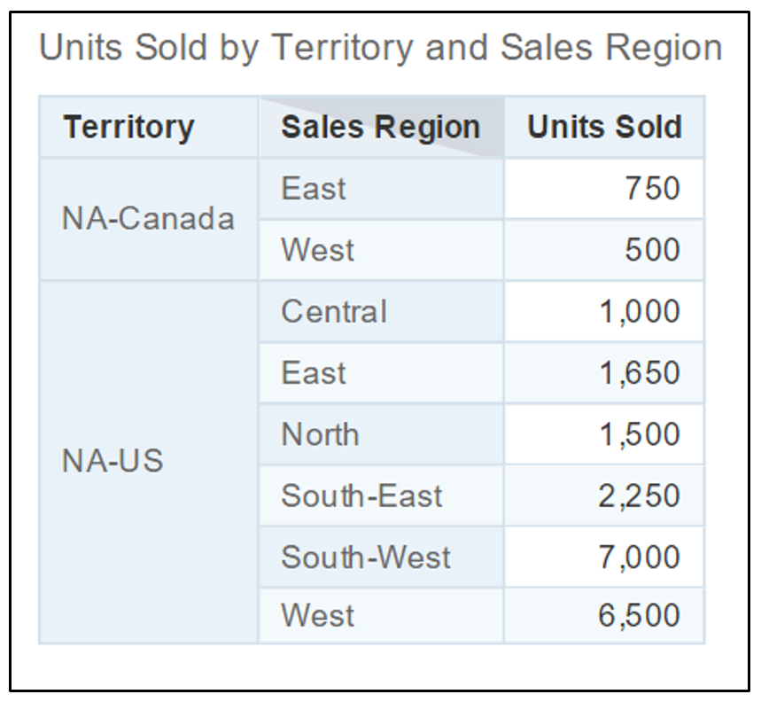
A simple list of numbers like this is informative but key insights and items for attention may not present themselves well on first glance – even with a comparatively small list like this.
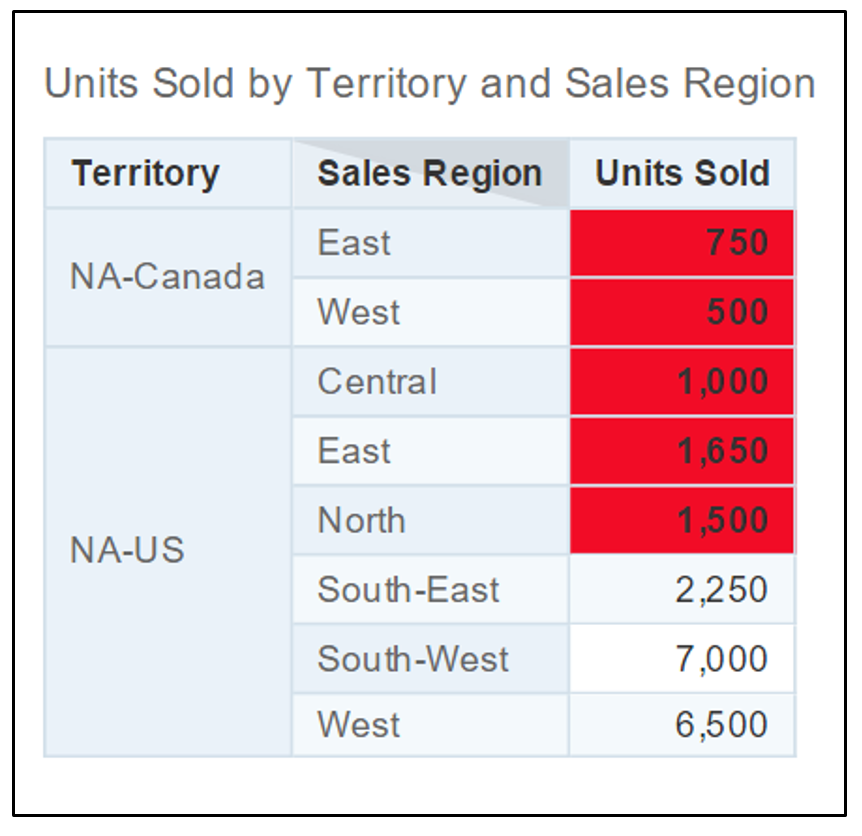
If, for example, we wanted to call to attention any sales regions which had low amounts of Units Sold (say, 2,000 or less Units Sold) we could do this easily by using the Conditional Formatting capability in Lumira.
To implement this, we need to first create a Conditional Formatting rule by right-clicking on the original crosstab visualization and selecting Conditional Formatting:

This will produce the Conditional Formatting Settings dialog:

Press the “+” icon at the top-left to create a new Conditional Formatting rule.
On the resulting New Formatting Rule pop-up dialog, supply the following:

This would then produce the required result in the original crosstab (i.e. identifying and highlighting “Units Sold” values of 2,000 or less) as follows:
Conditional formatting in Lumira is not limited to tabular visualizations, other visualizations support this useful feature also. To illustrate, simply right-click on the crosstab visualization and choose another chart (say, a column chart from the Chart Picker) :

This will result in the previous crosstab visualization being converted to a column chart – but with the conditional formatting rules still applied and reflected by highlighted chart columns instead of table cells:

Multiple Conditional Formatting rules can be created and applied to a visualization if compound logical conditions are needed. For instance, if we switched the chart back to the crosstab from the example above:

Now, if we were no longer concerned about sales regions in Canada, we would need to exclude the formatting update from being applied to Canadian rows in the crosstab. One way of doing this is to create another rule to identify the Territory Dimension with value “NA-Canada” as follows:

This rule, would identify rows in the crosstab, which had a Territory value of “NA-Canada” and then apply a white background color to the measure for that row. If this rule were positioned to follow the previous (red background) rule, we should arrive at the desired crosstab result.
The rule order can be applied in the Conditional Formatting Settings dialog (which is displayed once any Conditional Formatting rule is created) as shown below:

You can vary the order of the rules to match your desired logical conditions by using the Up/Down arrows on the top-right of the Rule Manager. The rules are enforced from bottom order to top.
Therefore, in the example above, the “LE 2000” rule would be applied first to identify any “Units Sold” cells with a value less than or equal to 2,000 and color them with a red background. Then the “Canada” rule would be applied to identify any rows with a Territory of “NA-Canada” and revert their “Units Sold” cells back to a white color background. This would then achieve the desired crosstab result – i.e.:

Usage of this simple Conditional Formatting feature in SAP Lumira can bring so much more value to your visualizations by immediately highlighting specific results that may need priority follow-up actions.
Additional useful references for good visualization best practices in SAP Lumira can be found here:
“Creating High Impact Data Visualizations with SAP Lumira” – a recording of the webinar, presented by SAP’s jacob.stark (for Lumira 1.x).
The “SAP Lumira Data Storytelling Handbook”
The first blog in the series can be found here: SAP Lumira 2.0 Visualization Tips & Tricks: Adding Context with Reference Lines
Displaying visualizations with context is one of the key attributes to good and meaningful presentation. Very often, a chart or other visualization on its own can convey only part of the overall “data story”. One of the easiest ways to bring additional context and meaning to visualizations is by using the Lumira Conditional Formatting feature. This feature can be used to quickly highlight areas of concern (or success) in your data.
Conditional Formatting in Lumira
Consider the following sample Lumira Crosstab (table) visualization, which lists North American sales territories, sales regions and their number of “Units Sold”.
A simple list of numbers like this is informative but key insights and items for attention may not present themselves well on first glance – even with a comparatively small list like this.
If, for example, we wanted to call to attention any sales regions which had low amounts of Units Sold (say, 2,000 or less Units Sold) we could do this easily by using the Conditional Formatting capability in Lumira.
To implement this, we need to first create a Conditional Formatting rule by right-clicking on the original crosstab visualization and selecting Conditional Formatting:
This will produce the Conditional Formatting Settings dialog:
Press the “+” icon at the top-left to create a new Conditional Formatting rule.
On the resulting New Formatting Rule pop-up dialog, supply the following:
- A Conditional Formatting rule Name (“LE 2000” in the example below)
- The Measure or Dimension on which you want to apply the formatting update (the Measure “Units Sold” in the example below)
- A conditional operator and value (“less than or equal to” and “2000” in the example below)
- The desired formatting change if the above condition is met (red background fill color in the example below).
- Save and apply the new rule by pressing OK.
This would then produce the required result in the original crosstab (i.e. identifying and highlighting “Units Sold” values of 2,000 or less) as follows:
Conditional Formatting in Different Charts
Conditional formatting in Lumira is not limited to tabular visualizations, other visualizations support this useful feature also. To illustrate, simply right-click on the crosstab visualization and choose another chart (say, a column chart from the Chart Picker) :
This will result in the previous crosstab visualization being converted to a column chart – but with the conditional formatting rules still applied and reflected by highlighted chart columns instead of table cells:
Applying Multiple Conditional Formatting Rules
Multiple Conditional Formatting rules can be created and applied to a visualization if compound logical conditions are needed. For instance, if we switched the chart back to the crosstab from the example above:
Now, if we were no longer concerned about sales regions in Canada, we would need to exclude the formatting update from being applied to Canadian rows in the crosstab. One way of doing this is to create another rule to identify the Territory Dimension with value “NA-Canada” as follows:
This rule, would identify rows in the crosstab, which had a Territory value of “NA-Canada” and then apply a white background color to the measure for that row. If this rule were positioned to follow the previous (red background) rule, we should arrive at the desired crosstab result.
The rule order can be applied in the Conditional Formatting Settings dialog (which is displayed once any Conditional Formatting rule is created) as shown below:
You can vary the order of the rules to match your desired logical conditions by using the Up/Down arrows on the top-right of the Rule Manager. The rules are enforced from bottom order to top.
Therefore, in the example above, the “LE 2000” rule would be applied first to identify any “Units Sold” cells with a value less than or equal to 2,000 and color them with a red background. Then the “Canada” rule would be applied to identify any rows with a Territory of “NA-Canada” and revert their “Units Sold” cells back to a white color background. This would then achieve the desired crosstab result – i.e.:
Usage of this simple Conditional Formatting feature in SAP Lumira can bring so much more value to your visualizations by immediately highlighting specific results that may need priority follow-up actions.
Additional useful references for good visualization best practices in SAP Lumira can be found here:
“Creating High Impact Data Visualizations with SAP Lumira” – a recording of the webinar, presented by SAP’s jacob.stark (for Lumira 1.x).
The “SAP Lumira Data Storytelling Handbook”
7 Comments
You must be a registered user to add a comment. If you've already registered, sign in. Otherwise, register and sign in.
Labels in this area
-
ABAP CDS Views - CDC (Change Data Capture)
2 -
AI
1 -
Analyze Workload Data
1 -
BTP
1 -
Business and IT Integration
2 -
Business application stu
1 -
Business Technology Platform
1 -
Business Trends
1,658 -
Business Trends
91 -
CAP
1 -
cf
1 -
Cloud Foundry
1 -
Confluent
1 -
Customer COE Basics and Fundamentals
1 -
Customer COE Latest and Greatest
3 -
Customer Data Browser app
1 -
Data Analysis Tool
1 -
data migration
1 -
data transfer
1 -
Datasphere
2 -
Event Information
1,400 -
Event Information
66 -
Expert
1 -
Expert Insights
177 -
Expert Insights
296 -
General
1 -
Google cloud
1 -
Google Next'24
1 -
Kafka
1 -
Life at SAP
780 -
Life at SAP
13 -
Migrate your Data App
1 -
MTA
1 -
Network Performance Analysis
1 -
NodeJS
1 -
PDF
1 -
POC
1 -
Product Updates
4,577 -
Product Updates
342 -
Replication Flow
1 -
RisewithSAP
1 -
SAP BTP
1 -
SAP BTP Cloud Foundry
1 -
SAP Cloud ALM
1 -
SAP Cloud Application Programming Model
1 -
SAP Datasphere
2 -
SAP S4HANA Cloud
1 -
SAP S4HANA Migration Cockpit
1 -
Technology Updates
6,873 -
Technology Updates
420 -
Workload Fluctuations
1
Related Content
- router Non-xml condition error as Invalid format of condition expression in Technology Q&A
- Excel Export in SAP Lumira, the Lumira Conditional Formating not works in Technology Q&A
- Replace a Model in the Optimized (Unified) Experience in Technology Blogs by SAP
- SAP Analytics Cloud's Optimized Design Experience (ODE): New Features and Improvements in Technology Blogs by Members
- CSS Designs for a Stylish and Optimized SAP Analytics Cloud Experience in Technology Blogs by Members
Top kudoed authors
| User | Count |
|---|---|
| 37 | |
| 25 | |
| 17 | |
| 13 | |
| 7 | |
| 7 | |
| 7 | |
| 6 | |
| 6 | |
| 6 |