
- SAP Community
- Products and Technology
- Technology
- Technology Blogs by SAP
- (Hands-On) How to Leverage R Visualization Feature...
Technology Blogs by SAP
Learn how to extend and personalize SAP applications. Follow the SAP technology blog for insights into SAP BTP, ABAP, SAP Analytics Cloud, SAP HANA, and more.
Turn on suggestions
Auto-suggest helps you quickly narrow down your search results by suggesting possible matches as you type.
Showing results for
former_member20
Explorer
Options
- Subscribe to RSS Feed
- Mark as New
- Mark as Read
- Bookmark
- Subscribe
- Printer Friendly Page
- Report Inappropriate Content
05-26-2017
2:41 AM
SAP Analytics Cloud R Visualization feature allows users to integrate their own R environment into SAP Analytics Cloud. R is an open-source programming language that includes packages for advanced visualizations, statistics, Machine Learning and much more.
With this new integration in SAP Analytics Cloud, you can now:
With the R visualization capability, users are able to perform statistical and analytical analyses and create truly captivating visuals to reflect these analyses. Also, it is important to note that these visualizations remain interactive and consider the row-level security of users.
Let’s take a look at a use case how an analyst in an international software company can use the R Visualization feature in SAP Analytics Cloud for their sales analysis and forecast.
Prerequisites:
In order to perform the analysis with R visualization, you will need to set up and configure your R Server to connect to SAP Analytics Cloud. Please refer to this blog on the detailed steps to set up your R server connection.
You will also need to download the model file SoftwareSales_ABCCompany_Model.xlsx and the data file SoftwareSales_ABCCompany_Data.csv here:
Create Model:
As the first step, we need to create a Sales model that has the following dimensions (Please make sure your dimension description is same as the list below):
Import Data:
Now we need to import the sales data into the model we just created.
Now, we have finished all the preparation steps for us to start doing sales analysis with BOC R Visualization.
Analysis #1: Sales/Cost Trend via Time
As the technology industry moving from traditional on-premise software to the cloud, the analyst wants to take a look how that trend affects the sales of the company.
First, the analyst wants to explore the Sales Trend over time for Software and Service, and he follows the steps below in order to leverage its data with R visualization:
From the chart above, we can see that in the recent years, the Software sales has been relatively flat, where the Service sales has been increasing steadily over the last five year. This aligns with the typical trend in a cloud environment where revenue recognition is delayed, and it also shows the increasing demand in the market for professional software service.
Next, let's take a deep dive in the software sales to see how each component of it has been changed over years.
Follow the same steps in our previous section to generate a new chart by using the following R-Code
From chart above, we can easily found out that the traditional on premise software sales has been going down and the cloud software sales is taking the lead in sales during the last five years.
In Conclusion, same with the industry trend, Cloud software as well as services associated with it are driving the revenue of the company.
Analysis #2: Customer analysis
As an analyst, you may also want to see the details of the company’s customer base and how it changes over time based on different measures.
First, we can follow the same steps as mentioned previously to execute the following R-Code in SAP Analytics Cloud.
and you will be able to generate a chart shown below
From the chart above, we can see that On-Premise software sales still count for large chunk sales for traditional value industries such as Industrial, where the growth industries such as High Tech are moving faster to the cloud.
Second, we can also take look at customer size VS customer number in terms of revenue contribution to the company.
Again, we can follow the same steps and following R-code to see the insight.
and the generated chart will look like the screenshot below:

From the chart, we can see that even though the large size customers (Fortune 500) are only a small portion of the entire customer base, it actually generate the majority revenue of the company. It will give the higher management of the company some hints on how to better manage their customers and diversify their revenue sources.
It is a small story to tell regarding to how to leverage the R-Visualization feature of SAP Analytics Cloud to do real business analysis. As we can see, the feature is able to provide a lot more flexibility on visualization and business intelligence.
With this new integration in SAP Analytics Cloud, you can now:
- Insert R-visualizations into your story
- Interact with R-visualizations using SAP Analytics Cloud-controls (such as filters)
- Share these SAP Analytics Cloud stories, which include R-visualizations, with other users.
With the R visualization capability, users are able to perform statistical and analytical analyses and create truly captivating visuals to reflect these analyses. Also, it is important to note that these visualizations remain interactive and consider the row-level security of users.
Let’s take a look at a use case how an analyst in an international software company can use the R Visualization feature in SAP Analytics Cloud for their sales analysis and forecast.
Prerequisites:
In order to perform the analysis with R visualization, you will need to set up and configure your R Server to connect to SAP Analytics Cloud. Please refer to this blog on the detailed steps to set up your R server connection.
You will also need to download the model file SoftwareSales_ABCCompany_Model.xlsx and the data file SoftwareSales_ABCCompany_Data.csv here:
Create Model:
As the first step, we need to create a Sales model that has the following dimensions (Please make sure your dimension description is same as the list below):
- Accounts ABCCompany
- Customer Names ABCCompany
- Customer Segments ABCCompany
- Customer Sectors ABCCompany
- Sales Regions ABCCompany
- Time (created automatically during model generation)
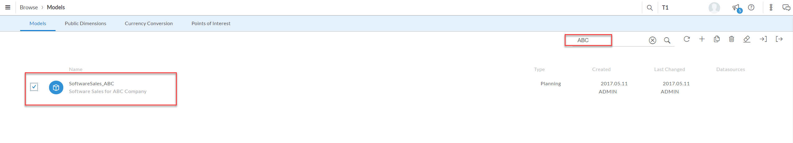
- Login to BOC, and go to Create -> Model

- In the next page, choose to create a blank model

- Enter the model name and description and click OK. Make sure you click "Enable Planning" Option.

- Make adjustment of your time dimension horizon to include periods between 2012 - 2016. And make sure the Lowest Granularity is set to Day level.

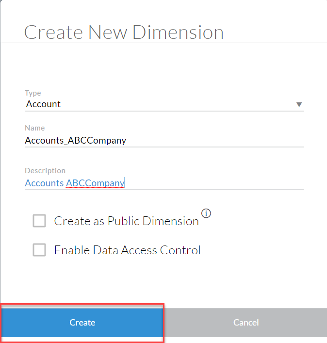
- Now we need to create the dimensions. Let's start with account dimension. Go to Account - Create new Dimension.

- Choose dimesion type "Account", enter the dimension name and description.
- Open the Excel File SoftwareSales_ABCCompany_Model.xlsx, and navigate to the first tab. Copy the content except for the first row.

- Paste the content into the Account dimension in Analytics Cloud, fix any highlighted error.

- Repeat Step 5 - 8 and create the rest of dimensions. (Choose Organization as dimension type for Region, and Generic as dimension type for other dimensions).
- Click Save to save the model.

Import Data:
Now we need to import the sales data into the model we just created.
- Go to Modeler page.

- Find the model we just created and Select it.
- Choose to import data to the model from file
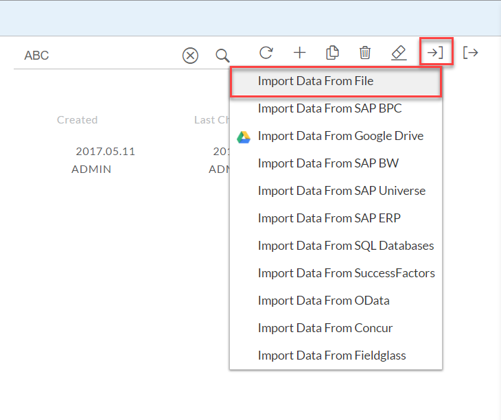
- On the pop-up window, browse and select file SoftwareSales_ABCCompany_Data.csv, and click Import.


- You will then land on the wrangling page. Choose the yearMonth Column and set the time format to MM/DD/YYYY.

- Choose the first unmatched column and match it to Measure.

- On the pop-up window, choose "Sales software On Premise" and click OK.

- Repeat step 5-6 to finish mapping the remaining unmatched columns to Sales Software Cloud, Sales Service Consulting, and Sales Service Customer Success.
- Go to "View Model Details" - View all option and make sure the options are selected as shown below.

- After everything is matched, click Finish Mapping to import the data

Now, we have finished all the preparation steps for us to start doing sales analysis with BOC R Visualization.
Analysis #1: Sales/Cost Trend via Time
As the technology industry moving from traditional on-premise software to the cloud, the analyst wants to take a look how that trend affects the sales of the company.
First, the analyst wants to explore the Sales Trend over time for Software and Service, and he follows the steps below in order to leverage its data with R visualization:
- Create a new story

- Add a new Canvas Page.

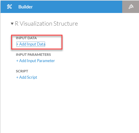
- Create an R Visualization on the Story Canvas.

- In the Story page, click on “+ Input Data” and select the data model of your choice (in this case, it will be SoftwareSales_ABCCompany).

- Add Dimensions as shown below, Filters (e.g. from the Data Frame Panel, Story and Page Filters). Click on the “Fullscreen” button on the Data Frame Panel to see the Table Preview (view-only)

- Click “OK” or “Cancel” button to close the panel.

- Click on “Add Script” and expand the panel to full screen.

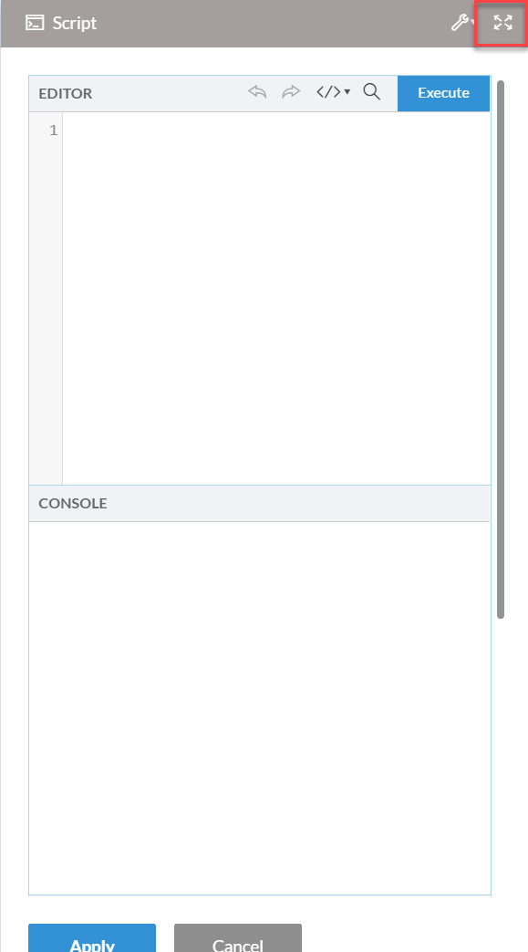
- Input R Script in the “Editor” section. Below is a sample R code you could use:
library(dplyr)
library(ggplot2)
SoftwareSales_ABCCompany$Time = as.Date(SoftwareSales_ABCCompany$Time)
bytime <- SoftwareSales_ABCCompany %>%
group_by(Time) %>%
summarise(Sales_On_Premise = sum(Sales_Software_On_Premise), Sales_Cloud = sum(Sales_Software_Cloud),
Sales_Software = sum(Sales_Software_On_Premise + Sales_Software_Cloud),
Sales_Service = sum(Sales_Service_Consulting + Sales_Service_Customer_Success))
ggplot(bytime, aes(x = Time)) +
geom_line(aes(y = Sales_Software/1000, colour = "Software"), size = 1) +
geom_line(aes(y = Sales_Service*4/1000, colour = "Service"), size = 1) +
scale_y_continuous(sec.axis = sec_axis(~./4, name = "Sales Service ($000)")) +
scale_colour_manual(values = c("turquoise3", "salmon")) +
labs(y = "Sales Sofware ($000)", x = "Year", colour = "Category")
- Click “Execute” button to run the script and you will see the chart generated in the "Preview" section of the window

- Click “Apply” to insert the chart in to your story.


From the chart above, we can see that in the recent years, the Software sales has been relatively flat, where the Service sales has been increasing steadily over the last five year. This aligns with the typical trend in a cloud environment where revenue recognition is delayed, and it also shows the increasing demand in the market for professional software service.
Next, let's take a deep dive in the software sales to see how each component of it has been changed over years.
Follow the same steps in our previous section to generate a new chart by using the following R-Code
library(dplyr)
library(ggplot2)
SoftwareSales_ABCCompany$Time = as.Date(SoftwareSales_ABCCompany$Time)
bytime <- SoftwareSales_ABCCompany %>%
group_by(Time) %>%
summarise(Sales_On_Premise = sum(Sales_Software_On_Premise), Sales_Cloud = sum(Sales_Software_Cloud),
Sales_Software = sum(Sales_Software_On_Premise + Sales_Software_Cloud),
Sales_Service = sum(Sales_Service_Consulting + Sales_Service_Customer_Success))
ggplot(bytime, aes(x = Time)) +
geom_line(aes(y = Sales_Cloud/1000, colour = "Cloud Software"), size = 1) +
geom_line(aes(y = Sales_On_Premise/1000, colour = "On Premise Software"), size = 1) +
scale_colour_manual(values = c("turquoise3", "salmon")) +
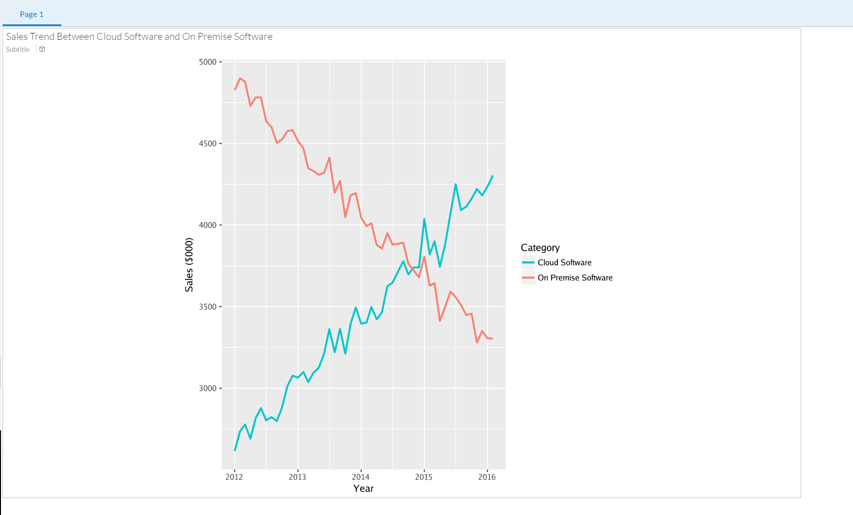
labs(y = "Sales ($000)", x = "Year", colour = "Category")From chart above, we can easily found out that the traditional on premise software sales has been going down and the cloud software sales is taking the lead in sales during the last five years.
In Conclusion, same with the industry trend, Cloud software as well as services associated with it are driving the revenue of the company.
Analysis #2: Customer analysis
As an analyst, you may also want to see the details of the company’s customer base and how it changes over time based on different measures.
First, we can follow the same steps as mentioned previously to execute the following R-Code in SAP Analytics Cloud.
library(ggplot2)
library(reshape2)
library(dplyr)
SoftwareSales_ABCCompany$Time = as.Date(SoftwareSales_ABCCompany$Time)
bysector <- SoftwareSales_ABCCompany %>%
filter(Time == max(SoftwareSales_ABCCompany$Time)) %>%
group_by(`Customer Sectors ABCCompany`) %>%
summarise(Sales_On_Premise = sum(Sales_Software_On_Premise), Sales_Cloud = sum(Sales_Software_Cloud))
mbysector <- melt(bysector, id.vars = "Customer Sectors ABCCompany")
ggplot(mbysector, aes(x = factor(`Customer Sectors ABCCompany`, levels = bysector$`Customer Sectors ABCCompany`[order(-bysector$Sales_On_Premise/bysector$Sales_Cloud)]),
y = value, fill = factor(variable))) +
geom_bar(position="fill", width = 0.8, stat="identity") + coord_flip() + labs(x = "Sector", y = "Proportion") +
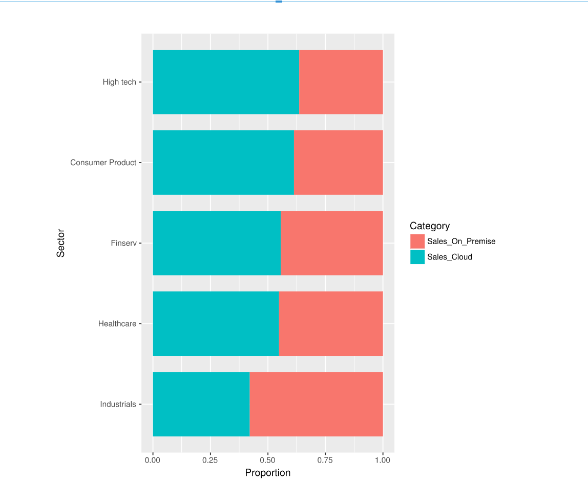
scale_fill_discrete(name = "Category")and you will be able to generate a chart shown below
From the chart above, we can see that On-Premise software sales still count for large chunk sales for traditional value industries such as Industrial, where the growth industries such as High Tech are moving faster to the cloud.
Second, we can also take look at customer size VS customer number in terms of revenue contribution to the company.
Again, we can follow the same steps and following R-code to see the insight.
library(dplyr)

library(ggplot2)

library(grid)

library(gridExtra)


bysegment <- SoftwareSales_ABCCompany %>%

  group_by(`Customer Segments ABCCompany`) %>%

  summarise(customer_number = n()/50, sales = sum(Sales_Software_On_Premise + Sales_Service_Consulting,

                                                  Sales_Software_Cloud, Sales_Service_Customer_Success))


bysegment$Customer.Segment <-  factor(bysegment$`Customer Segments ABCCompany`,

                                    levels = bysegment$`Customer Segments ABCCompany`[order(-bysegment$customer_number)])


g.mid <- ggplot(bysegment, aes(x = 1, y = Customer.Segment)) + geom_text(aes(label = Customer.Segment))+

  geom_segment(aes(x = 0.94, xend = 0.96, yend = Customer.Segment)) +

  geom_segment(aes(x = 1.04, xend = 1.065, yend = Customer.Segment)) +

  ggtitle("") + ylab(NULL) + scale_x_continuous(expand = c(0, 0), limits = c(0.94, 1.065)) +

  theme(axis.title = element_blank(), panel.grid = element_blank(), axis.text.y = element_blank(),

        axis.ticks.y = element_blank(), panel.background = element_blank(), axis.text.x = element_text(color = NA),

        axis.ticks.x = element_line(color = NA), plot.margin = unit(c(1, -1, 1, -1), "mm"))


g1 <- ggplot(data = bysegment, aes(x = Customer.Segment, y = customer_number)) +

  geom_bar(stat = "identity", width = 0.8, fill = "turquoise3") + ggtitle("Number of Customers") +

  theme(axis.title.x = element_blank(), axis.title.y = element_blank(), axis.text.y = element_blank(),

        axis.ticks.y = element_blank(), plot.margin = unit(c(1, -1, 1, 0), "mm")) +

  scale_y_reverse() + coord_flip()


g2 <- ggplot(data = bysegment, aes(x = Customer.Segment, y = sales/1000)) + xlab(NULL)+

  geom_bar(stat = "identity", width = 0.8, fill = "salmon") + ggtitle("Sales Total ($000)") +

  theme(axis.title.x = element_blank(), axis.title.y = element_blank(), axis.text.y = element_blank(),

        axis.ticks.y = element_blank(), plot.margin = unit(c(1, 0, 1, -1), "mm")) +

  coord_flip()


gg1 <- ggplot_gtable(ggplot_build(g1))

gg2 <- ggplot_gtable(ggplot_build(g2))

gg.mid <- ggplot_gtable(ggplot_build(g.mid))


grid.arrange(gg1, gg.mid, gg2, ncol = 3, widths = c(4/9, 1/9, 4/9))
and the generated chart will look like the screenshot below:
From the chart, we can see that even though the large size customers (Fortune 500) are only a small portion of the entire customer base, it actually generate the majority revenue of the company. It will give the higher management of the company some hints on how to better manage their customers and diversify their revenue sources.
It is a small story to tell regarding to how to leverage the R-Visualization feature of SAP Analytics Cloud to do real business analysis. As we can see, the feature is able to provide a lot more flexibility on visualization and business intelligence.
See Also
- Using R with SAP Analytics Cloud
- Adding R Visualizations to Stories
- Connecting to an R Environment
- Best practices for connecting and running your R environment
- Setup R server for use with SAP Analytics Cloud
- (Part I) Preparation to Use R Visualization in SAP Analytics Cloud for Your Sales Analysis
- (Part II)How to Use R Visualization in SAP Analytics Cloud for Your Sales Analysis
- SAP Managed Tags:
- SAP Analytics Cloud
6 Comments
You must be a registered user to add a comment. If you've already registered, sign in. Otherwise, register and sign in.
Labels in this area
-
ABAP CDS Views - CDC (Change Data Capture)
2 -
AI
1 -
Analyze Workload Data
1 -
BTP
1 -
Business and IT Integration
2 -
Business application stu
1 -
Business Technology Platform
1 -
Business Trends
1,661 -
Business Trends
88 -
CAP
1 -
cf
1 -
Cloud Foundry
1 -
Confluent
1 -
Customer COE Basics and Fundamentals
1 -
Customer COE Latest and Greatest
3 -
Customer Data Browser app
1 -
Data Analysis Tool
1 -
data migration
1 -
data transfer
1 -
Datasphere
2 -
Event Information
1,400 -
Event Information
65 -
Expert
1 -
Expert Insights
178 -
Expert Insights
280 -
General
1 -
Google cloud
1 -
Google Next'24
1 -
Kafka
1 -
Life at SAP
784 -
Life at SAP
11 -
Migrate your Data App
1 -
MTA
1 -
Network Performance Analysis
1 -
NodeJS
1 -
PDF
1 -
POC
1 -
Product Updates
4,577 -
Product Updates
330 -
Replication Flow
1 -
RisewithSAP
1 -
SAP BTP
1 -
SAP BTP Cloud Foundry
1 -
SAP Cloud ALM
1 -
SAP Cloud Application Programming Model
1 -
SAP Datasphere
2 -
SAP S4HANA Cloud
1 -
SAP S4HANA Migration Cockpit
1 -
Technology Updates
6,886 -
Technology Updates
408 -
Workload Fluctuations
1
Related Content
- Unify your process and task mining insights: How SAP UEM by Knoa integrates with SAP Signavio in Technology Blogs by SAP
- Kyma Integration with SAP Cloud Logging. Part 2: Let's ship some traces in Technology Blogs by SAP
- 10+ ways to reshape your SAP landscape with SAP Business Technology Platform – Blog 4 in Technology Blogs by SAP
- Top Picks: Innovations Highlights from SAP Business Technology Platform (Q1/2024) in Technology Blogs by SAP
- ad-hoc analysis on BW Querys in SAP Analytics Cloud on iOS mobile devices in Technology Q&A
Top kudoed authors
| User | Count |
|---|---|
| 13 | |
| 10 | |
| 10 | |
| 9 | |
| 7 | |
| 6 | |
| 5 | |
| 5 | |
| 5 | |
| 4 |