
- SAP Community
- Products and Technology
- Technology
- Technology Blogs by SAP
- Principles of visual perception
Technology Blogs by SAP
Learn how to extend and personalize SAP applications. Follow the SAP technology blog for insights into SAP BTP, ABAP, SAP Analytics Cloud, SAP HANA, and more.
Turn on suggestions
Auto-suggest helps you quickly narrow down your search results by suggesting possible matches as you type.
Showing results for
krishnan_raghup
Discoverer
Options
- Subscribe to RSS Feed
- Mark as New
- Mark as Read
- Bookmark
- Subscribe
- Printer Friendly Page
- Report Inappropriate Content
05-24-2017
5:19 PM
Preamble
Thanks for taking the time to read about my views on data visualization. Data visualization is a topic that I have always been fascinated about and is something that I continue to learn about with each passing day. This blog provides me (and hopefully others) a forum for discussing ideas, opinions and literature related to data visualization.
Introduction
We are all quite familiar with the English idiom “A picture is worth a thousand words”. This refers to the notion that a complex idea can be conveyed more effectively with an image instead of a textual description. The deeper significance of this idiom can be appreciated if we understand how our brains support visual processing. 70% of the sense receptors in our bodies are dedicated to vision. How we see is closely tied to how we think.
Colin Ware, in his book “Information Visualization: Perception for Design”, explains beautifully why we should be interested in studying about visualization:
“Because the human visual system is a pattern seeker of enormous power and subtlety. The eye and the visual cortex of the brain form a massively parallel processor that provides the highest-bandwidth channel into human cognitive centers. At higher levels of processing, perception and cognition are closely related interrelated … However, the visual system has its own rules. We can easily see patterns presented in certain ways, but if they are presented in other ways, they become invisible… The more general point is that when data is presented in certain ways, the patterns can be readily perceived. If we can understand how perception works, our knowledge can be translated into rules for displaying information. Following perception-based rules, we can present our data in such a way that the important and informative patterns stand out. If we disobey the rules, our data will be incomprehensible or misleading.”
Before we delve into the principles of visual perception, it is important to understand the inner workings of the human memory and its limitations.
Human memory and its limitations
In reality, we actually see with our brains. Visual perception – the process of interpreting what our eyes see actually takes place in our brains. The world around us is filled with a kaleidoscope of rich colors and images. However contrary to popular belief our eyes do not sense everything that is visible around us. The process of visual perception goes through the following filters:
These built-in filters in our cognitive system ensures that we don’t get overwhelmed by what we perceive.
The visual memory system consists of the following three components:
1. Iconic memory: This is a very brief (< 1000 ms), pre-categorical, high capacity memory store. Pre-attentive processing – the body’s processing of sensory information at an extraordinarily high speed that occurs before the conscious mind starts to pay attention to any specific objects in its vicinity – happens during this stage.
Examples:
2. Working memory: Unlike iconic memory which are fragile and decay rapidly, working memories are more robust and can temporarily hold information available for processing for many seconds (18-30 seconds). This also allows for manipulation of stored information. With enough practice and training, information is moved from working memory to long-term memory where it is stored more permanently for later recall.
3. Long term memory: This can be used to store informative knowledge for long periods of time.
Of all the above 3 components, it is the impact on the working memory that determines the effective of data visualization as well as dashboard design. The working memory has the following important characteristics that can guide us in our quest for effective visual design:
Based on extensive studies and research on the capacity of the working memory, here are a few observations on the characteristics of the working memory that significantly impacts the visual design process:
Observation: Only 3 or 4 chunks of visual information can be stored at a time in working memory
Impact:
Observation: The composition of a chunk depends on the nature of the object and our familiarity with them
Impact:
Pre-attentive processing vs Attentive processing
During the visual perception process, a seamless transition takes place between the pre-attentive processing and the attentive processing. The difference between the two types of processing can be easily explained with the following example
Scan the following list of numbers and quickly find out how many times the number zero appears in the list.

This process took you quite some time as it required to sequentially scan the numbers. In the absence of any pre-attentive attributes in the data that distinguished zero from the other numbers, your built-in visual perception process transitioned from pre-attentive processing to sequential attentive processing of the numbers in the list.
Now try the same again with the numbers listed below.

It was much easier this time, right? In this case the data display used a pre-attentive attribute (color intensity) to make the zeroes stand out in clear contrast to the other numbers. This ensured that the desired information (zeroes in this case) was perceived much earlier by the reader during the pre-attentive processing stage. Unlike certain attributes like color intensity, complex shapes like numbers are not attributes that can be perceived pre-attentively.
Gestalt Principles of Visual Perception
In the early 1900s, a group of researchers belonging to the Gestalt school of psychology came up with a set of principles of visual perception that determine the way we tend to group things together. These principles of visual perception offer valuable insights that can be applied to the process of visual design. Here are the six Gestalt principles:
1. The Principle of proximity
This principle states that objects or shapes that are close to one another appear to form groups. Even if the objects are very different from each other they will appear as a group by virtue of being close together.
 2. The Principle of Similarity
This principle states that objects which share visual characteristics such as shape, size, color, texture, value or orientation will be seen as belonging together.

In the figure above, the filled squares give us the impressions of three horizontal lines even though all the squares are equidistant from each other.
3. The Principle of Enclosure
This principle states that when objects are enclosed by anything that forms a boundary around them like a line or a background color the objects will be seen as belonging to one group.

In the figure above the visual enclosure around the circles makes us see the circles as belonging to one group.
4. The Principle of Closure
This principle states that individuals tend to see open structures as closed even when they are not. When parts of the whole picture is missing, our perception fills the visual gap.

In the figure above, we perceive a circle on the left side and a rectangle on the right side even though there are gaps in the shapes.
5. The Principle of Continuity
The principle states that elements of objects tend to be grouped together and therefore integrated into perceptual wholes if they are aligned within an object.

In the figure above, the alignment of the curved line segments makes us see this a single curved line.
6. The Principle of Connection
This principle states that we tend to perceive connected objects as being part of the same group.
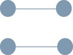
In the figure above, the connecting lines between the pair of circles makes us see the circles as grouped by rows even though the rows are nearer to one another vertically than horizontally.
What we covered above was just a brief introduction to Gestalt’s principles. In subsequent blogs, we’ll take a more in-depth look at how these principles can be applied to solve real-world dashboard design problems.
I conclude today’s blog with a question for my readers to think about.
A Question for Readers
What do you think is wrong with the following variance chart?

Thanks for taking the time to read about my views on data visualization. Data visualization is a topic that I have always been fascinated about and is something that I continue to learn about with each passing day. This blog provides me (and hopefully others) a forum for discussing ideas, opinions and literature related to data visualization.
Introduction
We are all quite familiar with the English idiom “A picture is worth a thousand words”. This refers to the notion that a complex idea can be conveyed more effectively with an image instead of a textual description. The deeper significance of this idiom can be appreciated if we understand how our brains support visual processing. 70% of the sense receptors in our bodies are dedicated to vision. How we see is closely tied to how we think.
Colin Ware, in his book “Information Visualization: Perception for Design”, explains beautifully why we should be interested in studying about visualization:
“Because the human visual system is a pattern seeker of enormous power and subtlety. The eye and the visual cortex of the brain form a massively parallel processor that provides the highest-bandwidth channel into human cognitive centers. At higher levels of processing, perception and cognition are closely related interrelated … However, the visual system has its own rules. We can easily see patterns presented in certain ways, but if they are presented in other ways, they become invisible… The more general point is that when data is presented in certain ways, the patterns can be readily perceived. If we can understand how perception works, our knowledge can be translated into rules for displaying information. Following perception-based rules, we can present our data in such a way that the important and informative patterns stand out. If we disobey the rules, our data will be incomprehensible or misleading.”
Before we delve into the principles of visual perception, it is important to understand the inner workings of the human memory and its limitations.
Human memory and its limitations
In reality, we actually see with our brains. Visual perception – the process of interpreting what our eyes see actually takes place in our brains. The world around us is filled with a kaleidoscope of rich colors and images. However contrary to popular belief our eyes do not sense everything that is visible around us. The process of visual perception goes through the following filters:
- Focus – Only a part of what our eyes see becomes an object of focus
- Attention – Only a small part of what we focus on becomes the object of our attention
- Conscious thought – Only a small part of what we attend to is processed as conscious thought
- Memory – A small part of what we think about is stored in our memory for future use
These built-in filters in our cognitive system ensures that we don’t get overwhelmed by what we perceive.
The visual memory system consists of the following three components:
1. Iconic memory: This is a very brief (< 1000 ms), pre-categorical, high capacity memory store. Pre-attentive processing – the body’s processing of sensory information at an extraordinarily high speed that occurs before the conscious mind starts to pay attention to any specific objects in its vicinity – happens during this stage.
Examples:
- When a person walks out of their home, the first thing that is noticed is whether it is day or night
- Awareness that a particular set of objects are grouped together on a page without conscious thought
2. Working memory: Unlike iconic memory which are fragile and decay rapidly, working memories are more robust and can temporarily hold information available for processing for many seconds (18-30 seconds). This also allows for manipulation of stored information. With enough practice and training, information is moved from working memory to long-term memory where it is stored more permanently for later recall.
3. Long term memory: This can be used to store informative knowledge for long periods of time.
Of all the above 3 components, it is the impact on the working memory that determines the effective of data visualization as well as dashboard design. The working memory has the following important characteristics that can guide us in our quest for effective visual design:
- It is temporary
- It has limited capacity
- A part of it is dedicated to visual information
Based on extensive studies and research on the capacity of the working memory, here are a few observations on the characteristics of the working memory that significantly impacts the visual design process:
Observation: Only 3 or 4 chunks of visual information can be stored at a time in working memory
Impact:
- Information that should be seen together should never be fragmented into different dashboards
- Scrolling should not be required to view all the related information
Observation: The composition of a chunk depends on the nature of the object and our familiarity with them
Impact:
- Several numbers on a dashboard are stored as separate chunks
- A chart representing the pattern formed by several numerical values is stored as a single chunk
Pre-attentive processing vs Attentive processing
During the visual perception process, a seamless transition takes place between the pre-attentive processing and the attentive processing. The difference between the two types of processing can be easily explained with the following example
Scan the following list of numbers and quickly find out how many times the number zero appears in the list.
This process took you quite some time as it required to sequentially scan the numbers. In the absence of any pre-attentive attributes in the data that distinguished zero from the other numbers, your built-in visual perception process transitioned from pre-attentive processing to sequential attentive processing of the numbers in the list.
Now try the same again with the numbers listed below.
It was much easier this time, right? In this case the data display used a pre-attentive attribute (color intensity) to make the zeroes stand out in clear contrast to the other numbers. This ensured that the desired information (zeroes in this case) was perceived much earlier by the reader during the pre-attentive processing stage. Unlike certain attributes like color intensity, complex shapes like numbers are not attributes that can be perceived pre-attentively.
Gestalt Principles of Visual Perception
In the early 1900s, a group of researchers belonging to the Gestalt school of psychology came up with a set of principles of visual perception that determine the way we tend to group things together. These principles of visual perception offer valuable insights that can be applied to the process of visual design. Here are the six Gestalt principles:
1. The Principle of proximity
This principle states that objects or shapes that are close to one another appear to form groups. Even if the objects are very different from each other they will appear as a group by virtue of being close together.
2. The Principle of SimilarityThis principle states that objects which share visual characteristics such as shape, size, color, texture, value or orientation will be seen as belonging together.
In the figure above, the filled squares give us the impressions of three horizontal lines even though all the squares are equidistant from each other.
3. The Principle of Enclosure
This principle states that when objects are enclosed by anything that forms a boundary around them like a line or a background color the objects will be seen as belonging to one group.
In the figure above the visual enclosure around the circles makes us see the circles as belonging to one group.
4. The Principle of Closure
This principle states that individuals tend to see open structures as closed even when they are not. When parts of the whole picture is missing, our perception fills the visual gap.
In the figure above, we perceive a circle on the left side and a rectangle on the right side even though there are gaps in the shapes.
5. The Principle of Continuity
The principle states that elements of objects tend to be grouped together and therefore integrated into perceptual wholes if they are aligned within an object.
In the figure above, the alignment of the curved line segments makes us see this a single curved line.
6. The Principle of Connection
This principle states that we tend to perceive connected objects as being part of the same group.
In the figure above, the connecting lines between the pair of circles makes us see the circles as grouped by rows even though the rows are nearer to one another vertically than horizontally.
What we covered above was just a brief introduction to Gestalt’s principles. In subsequent blogs, we’ll take a more in-depth look at how these principles can be applied to solve real-world dashboard design problems.
I conclude today’s blog with a question for my readers to think about.
A Question for Readers
What do you think is wrong with the following variance chart?
- SAP Managed Tags:
- SAP Data Visualization
3 Comments
You must be a registered user to add a comment. If you've already registered, sign in. Otherwise, register and sign in.
Labels in this area
-
ABAP CDS Views - CDC (Change Data Capture)
2 -
AI
1 -
Analyze Workload Data
1 -
BTP
1 -
Business and IT Integration
2 -
Business application stu
1 -
Business Technology Platform
1 -
Business Trends
1,658 -
Business Trends
93 -
CAP
1 -
cf
1 -
Cloud Foundry
1 -
Confluent
1 -
Customer COE Basics and Fundamentals
1 -
Customer COE Latest and Greatest
3 -
Customer Data Browser app
1 -
Data Analysis Tool
1 -
data migration
1 -
data transfer
1 -
Datasphere
2 -
Event Information
1,400 -
Event Information
66 -
Expert
1 -
Expert Insights
177 -
Expert Insights
299 -
General
1 -
Google cloud
1 -
Google Next'24
1 -
Kafka
1 -
Life at SAP
780 -
Life at SAP
13 -
Migrate your Data App
1 -
MTA
1 -
Network Performance Analysis
1 -
NodeJS
1 -
PDF
1 -
POC
1 -
Product Updates
4,577 -
Product Updates
344 -
Replication Flow
1 -
RisewithSAP
1 -
SAP BTP
1 -
SAP BTP Cloud Foundry
1 -
SAP Cloud ALM
1 -
SAP Cloud Application Programming Model
1 -
SAP Datasphere
2 -
SAP S4HANA Cloud
1 -
SAP S4HANA Migration Cockpit
1 -
Technology Updates
6,873 -
Technology Updates
423 -
Workload Fluctuations
1
Related Content
- SAP Cloud Integration: Understanding the XML Digital Signature Standard in Technology Blogs by SAP
- Design of the new Apple Vision Pro App for SAP Mobile Start in Technology Blogs by SAP
- User Experience Advances with SAP S/4HANA 2023 FPS01 (Private Cloud and On-Premise) in Technology Blogs by SAP
- CSS Designs for a Stylish and Optimized SAP Analytics Cloud Experience in Technology Blogs by Members
- AN INTRODUCTION TO QUADRATIC UNCONSTRAINED BINARY OPTIMIZATION (QUBO) in Technology Blogs by SAP
Top kudoed authors
| User | Count |
|---|---|
| 40 | |
| 25 | |
| 17 | |
| 14 | |
| 8 | |
| 7 | |
| 7 | |
| 7 | |
| 6 | |
| 6 |