
- SAP Community
- Products and Technology
- Technology
- Technology Blogs by SAP
- SAP Lumira Extensions: ABC Analysis
Technology Blogs by SAP
Learn how to extend and personalize SAP applications. Follow the SAP technology blog for insights into SAP BTP, ABAP, SAP Analytics Cloud, SAP HANA, and more.
Turn on suggestions
Auto-suggest helps you quickly narrow down your search results by suggesting possible matches as you type.
Showing results for
Former Member
Options
- Subscribe to RSS Feed
- Mark as New
- Mark as Read
- Bookmark
- Subscribe
- Printer Friendly Page
- Report Inappropriate Content
01-24-2017
10:06 AM
Hi everyone!
My name is Denzale “Wolf” Reese and, a few weeks ago, I had the honor of joining the SAP Analytics team. The opportunity to support our Developer Community is truly a dream come true, and I am thrilled to be publishing my first blog post. Due to a very supportive team, I have already learned a ton. So far I have been focusing on maintaining the existing open-source visualization extensions for SAP Lumira, as well as creating new ones. Since I came in with little knowledge of the D3.js JavaScript library and no experience with Lumira, I want to help others get started by sharing a bit about the path I took to modify an existing open-source visualization extension (Extended Bar Chart).
Learning Resources
I started by learning about the D3.js (Data-Driven Documents) JavaScript Library that the visualization extensions are built with (Note: The current SAP Web IDE Plugin uses version 3 of D3.js, not yet the recent version 4. They’re very different!). I found the following resources to be helpful:
- D3.js in Action by Elijah Meeks (book)
- “Data Visualization and D3.js” online Udacity course
- D3.js YouTube Tutorial Playlist by d3Vienno
- D3.js documentation (for version 3.x) via Github
After gaining a fundamental understanding of D3.js, I began to learn more specifically about using this to build visualization extensions for SAP Lumira using these:
- Community Wiki and Github pages for visualization extensions to view examples, explore their code, and downloading/installing them to check out in Lumira
- dong.pan?start=20 “Creating Cool Lumira Visualization Extensions with SAP Web IDE”
- suantak.niangneihoi (special shout-out to Annie for leaving so many helpful resources behind 🙂!)
I built some simple “Hello world” bar and bubble chart extensions just to test out the process, before receiving a request to build an extension that could visualize ABC Analysis ---- similar to this example from Wikipedia:

ABC Analysis
Before I get into building the extension, I want to give you a brief overview of ABC Analysis itself. I learned that ABC Analysis is a technique typically used to categorize and efficiently manage items in an inventory. Items are divided into 3 categories (A, B, C) based on the following characteristics:
- A items make up the top ~70-80% of the value of the inventory, but only 10-20% of the inventory items
- B items make up ~15-25% of the value, and ~30% of the items
- C items make up the bottom ~5% of the value, but ~50% of the items
The value of each item is found by finding the proportion of that item’s annual cost, out of the total cost of the inventory (annual cost / total inventory cost = item value). The annual cost for each item is calculated by multiplying (cost per item x annual demand = annual cost). This technique helps managers determine which items are highly important/need to be tracked closely (A), moderately important (B), and least important/can be more loosely attended to (C).
References:
- https://www.lokad.com/abc-analysis-(inventory)-definition
- https://en.wikipedia.org/wiki/ABC_analysis
Extension
The extension is built on top of the existing Extended Bar Chart extension by jay.thodenvanvelzen on this). This extension features a bar chart where both the height and width of the bars have meaning; a good base to start from for the ABC Analysis chart since it does the same.

Data Mapping & Plot Setup
First, store the dimension names in variables since the column names for “value” and “classification” may differ depending on the dataset used.

Next add a SVG element to the container, setting the width and height of the plot to be within the margins (A great practice that was already in the code!).

Scales
Create scales for color and x-y values. The color scale will use the built-in color palette array to map indexes to hex codes. The x scale will map the width of the plot to the values 0 to 100%. The y scale will map the height of the plot to the values 0 to 100%.

Functions & Variables
The sortABC() function separates the data into three arrays based on each record’s value for the classification dimension: A, B, or C. It then returns those three arrays.

We now have an array containing arrays of the data classified as A, B, and C at the indexes 0, 1, and 2 respectively. Find the lengths of each of these arrays to determine how many items each classification comprises, and add them all to get the total items.
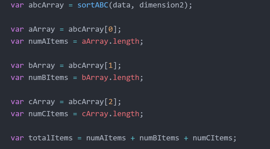
The calcUsageValue() function sums all of the item values for each classification array.

Here store the total values for each classification, as well as the percentage of total items the classification makes up.

Bars
Append our bars to the plot with a width corresponding to the percentage of the total items it represents, and a height matching the total value of its items. The getStartX() and getStartY() helper functions are what make the bars render right after each other on the x-axis, and stack on the y-axis.

Data
Included in the repo are two sample CSV’s, as well as the following Excel file with functions to help you do your own ABC Analysis:
![]()
The Excel file has the necessary columns. You just need to add rows with the item’s id (if applicable), the item’s cost per unit, and the annual demand for the item. The Excel sheet will calculate the annual cost for each item, total cost of the inventory, and each item’s value as a percentage. Lastly, in the “classification” column you need to label each item as A, B, or C. To do this, I recommend sorting the table rows by descending usage value. Then label the items as close as you see fit to the criteria for each classification: A items making up the top ~70-80% of the value, B items the middle ~15-25%, and C items the bottom ~5%.
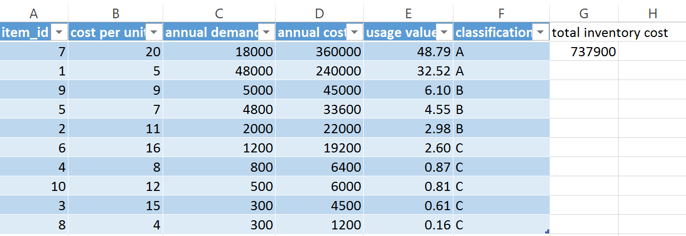
The sample CSV's also contain columns for item id, cost per unit, annual demand, annual cost, value, and classification (A, B, C). To use the extension in Lumira you need to add the dimension corresponding to value, followed by the dimension for classification. Any measure can be added.

and voilà! We have successfully modified an existing visualization extension to fit our specific use case.

Future Iterations
In the future, I would love to see this extension gain the ability to do the ABC Analysis itself without relying on the user to classify the items. It is a somewhat tricky problem, as ABC Analysis is often arbitrary. The criteria for each classification group is often left to what works best for a particular inventory, or the preference of the manager. If you are up for that challenge, or see any more contributions you would like to make, feel free to further build on this open-source project.
Thank you for reading 🙂!
- SAP Managed Tags:
- SAP Lumira
2 Comments
You must be a registered user to add a comment. If you've already registered, sign in. Otherwise, register and sign in.
Labels in this area
-
ABAP CDS Views - CDC (Change Data Capture)
2 -
AI
1 -
Analyze Workload Data
1 -
BTP
1 -
Business and IT Integration
2 -
Business application stu
1 -
Business Technology Platform
1 -
Business Trends
1,658 -
Business Trends
93 -
CAP
1 -
cf
1 -
Cloud Foundry
1 -
Confluent
1 -
Customer COE Basics and Fundamentals
1 -
Customer COE Latest and Greatest
3 -
Customer Data Browser app
1 -
Data Analysis Tool
1 -
data migration
1 -
data transfer
1 -
Datasphere
2 -
Event Information
1,400 -
Event Information
66 -
Expert
1 -
Expert Insights
177 -
Expert Insights
299 -
General
1 -
Google cloud
1 -
Google Next'24
1 -
Kafka
1 -
Life at SAP
780 -
Life at SAP
13 -
Migrate your Data App
1 -
MTA
1 -
Network Performance Analysis
1 -
NodeJS
1 -
PDF
1 -
POC
1 -
Product Updates
4,577 -
Product Updates
344 -
Replication Flow
1 -
RisewithSAP
1 -
SAP BTP
1 -
SAP BTP Cloud Foundry
1 -
SAP Cloud ALM
1 -
SAP Cloud Application Programming Model
1 -
SAP Datasphere
2 -
SAP S4HANA Cloud
1 -
SAP S4HANA Migration Cockpit
1 -
Technology Updates
6,873 -
Technology Updates
422 -
Workload Fluctuations
1
Related Content
- ABAP Cloud Developer Trial 2022 Available Now in Technology Blogs by SAP
- 10+ ways to reshape your SAP landscape with SAP Business Technology Platform – Blog 4 in Technology Blogs by SAP
- First hand experience at SAP Build Code - Learn, Try it out, Get a badge, SAP Discovery Centre in Technology Blogs by SAP
- 10+ ways to reshape your SAP landscape with SAP Business Technology Platform - Blog 3 in Technology Blogs by SAP
- Augmenting SAP BTP Use Cases with AI Foundation: A Deep Dive into the Generative AI Hub in Technology Blogs by SAP
Top kudoed authors
| User | Count |
|---|---|
| 40 | |
| 25 | |
| 17 | |
| 13 | |
| 8 | |
| 7 | |
| 7 | |
| 7 | |
| 6 | |
| 6 |