
- SAP Community
- Products and Technology
- Technology
- Technology Blogs by SAP
- What’s New in SAP BusinessObjects Cloud and SAP Di...
Technology Blogs by SAP
Learn how to extend and personalize SAP applications. Follow the SAP technology blog for insights into SAP BTP, ABAP, SAP Analytics Cloud, SAP HANA, and more.
Turn on suggestions
Auto-suggest helps you quickly narrow down your search results by suggesting possible matches as you type.
Showing results for
cchoy
Participant
Options
- Subscribe to RSS Feed
- Mark as New
- Mark as Read
- Bookmark
- Subscribe
- Printer Friendly Page
- Report Inappropriate Content
11-27-2016
7:53 PM
This blog covers some of the latest new features and enhancements in SAP BusinessObjects Cloud and SAP Digital Boardroom release 2016.23. Please refer to the release notes for more details.
Highlights of this release include:
In Release 2016.20, we increased the file upload size limit to 250 MB for CSV files, and 100 MB for Excel files. Now in Release 2016.23, this same upload size limit has been extended to uploads from Google Drive as well as for scheduled file uploads from a file server.
We’ve made a few improvements to help you more easily build queries for importing data into new or existing models, including:
As a modeler, you may at times need to create an intermediate calculation based on measures that can be used as the input for another calculated measure. You now have the option to hide these intermediate calculated account members if you don’t want other users to add them to their stories.
You can now link multiple models to create blended tables in the Story environment. These tables have the ability to show accounts and measures from the linked models.

If you have multiple charts in a story that show the same dimensions, it makes sense for the dimensions to be displayed in the same color so that they're easily recognizable from one chart to the next. You now have the ability to sync and unsync colors for linked dimensions in individual charts. Please note you will need to have common color dimensions for your charts in order to synchronize colors.

By default, you start with zero as the minimum axis value on a chart with all positive values. But what if you have values that are all significantly above zero? In this release, you have the option to let the application dynamically set the min/max for you based on the data that is currently displayed in the chart. That way, your chart will adjust itself even when, for example, you decide to apply a new filter. The option to dynamically set the minimum and maximum can be done for the x-axis and y-axis separately.

Now in addition to year, half-year, quarter, and month, you can choose week and day granularity (assuming your model has these levels of granularity) when you create a filter on a date dimension.

To help you understand the context of your story, story-wide and chart-specific variables are now included when you export to PDF with an appendix.

You can now include or exclude data points on a geo map when you are using the polygon filter or choropleth layers. We have also added support for linked analysis on your geo maps.

The Assign feature is one of three different ways you can allocate values in a table to one or more target cells. In this release, you can use the Assign feature from the Allocate Values menu to choose an amount to assign as well as a target dimension and hierarchy level. Additionally when you use this feature, you can choose to either append or overwrite values in the target cells.

The value driver tree is a powerful tool you can use for budgeting and forecasting based on different scenarios, and to explore the relationship between drivers like head count and average contract value. Now, you can more easily see if any nodes have overlapping outputs; you’ll see a warning icon for each node that outputs data to the same account and has overlapping filters.

Highlights of this release include:
- Improved query builder UI for data acquisition
- Create tables with data from different models
- Synchronize colors for a dimension across multiple charts
- Day and week granularity for story and page filters
- Support for the exclude filter on geo maps
- Allocations: Use the Assign feature to allocate a value across multiple cells
- Value Driver Trees: Identify nodes with overlaps
Core: Data Acquisition & Integration
Larger Excel and CSV file uploads from Google Drive and scheduled from a file server
In Release 2016.20, we increased the file upload size limit to 250 MB for CSV files, and 100 MB for Excel files. Now in Release 2016.23, this same upload size limit has been extended to uploads from Google Drive as well as for scheduled file uploads from a file server.
- As we are working to bring you improvements with every release, be sure to check the “System Requirements and Technical Prerequisites” page in the SAP BusinessObjects Cloud Help under the “Data Connectivity – Import” section for the latest updates.
Improved query builder UI for data acquisition
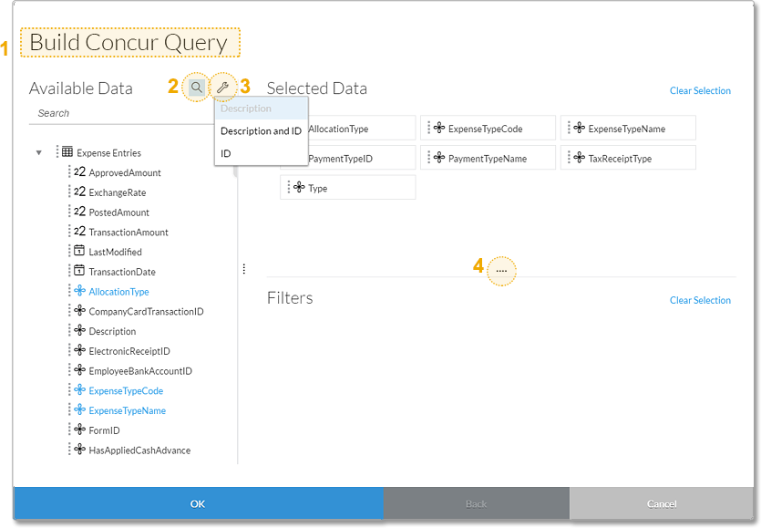
We’ve made a few improvements to help you more easily build queries for importing data into new or existing models, including:
- The name of the data source is now shown in the query builder title (1)
- You can search for available fields by clicking the magnifying glass icon (2)
- You can click the wrench icon to change how metadata names are displayed: Description, Description and ID, or ID (3)
- You can drag the handles to resize the Available Data, Selected Data, and Filters areas (4)
Core: Modeling
Set the visibility of members of the account dimension
As a modeler, you may at times need to create an intermediate calculation based on measures that can be used as the input for another calculated measure. You now have the option to hide these intermediate calculated account members if you don’t want other users to add them to their stories.
Core: Data Analysis, Stories, and Tables
Create tables with data from different models
You can now link multiple models to create blended tables in the Story environment. These tables have the ability to show accounts and measures from the linked models.
Synchronize colors for a dimension across multiple charts
If you have multiple charts in a story that show the same dimensions, it makes sense for the dimensions to be displayed in the same color so that they're easily recognizable from one chart to the next. You now have the ability to sync and unsync colors for linked dimensions in individual charts. Please note you will need to have common color dimensions for your charts in order to synchronize colors.
- Learn how to synchronize colors for a dimension across multiple charts
- Learn how to create linked dimensions
Dynamically set the minimum and maximum on a chart axis
By default, you start with zero as the minimum axis value on a chart with all positive values. But what if you have values that are all significantly above zero? In this release, you have the option to let the application dynamically set the min/max for you based on the data that is currently displayed in the chart. That way, your chart will adjust itself even when, for example, you decide to apply a new filter. The option to dynamically set the minimum and maximum can be done for the x-axis and y-axis separately.
Day and week granularity for story and page filters
Now in addition to year, half-year, quarter, and month, you can choose week and day granularity (assuming your model has these levels of granularity) when you create a filter on a date dimension.
Include model variables in the appendix of a PDF export
To help you understand the context of your story, story-wide and chart-specific variables are now included when you export to PDF with an appendix.
Core: Location Analytics
Support for the exclude filter on geo maps
You can now include or exclude data points on a geo map when you are using the polygon filter or choropleth layers. We have also added support for linked analysis on your geo maps.
- Learn how to create a geo map
- Learn how to create a linked analysis
- Learn more about analyzing geographical data
Planning
Allocations: Use the Assign feature to allocate a value across multiple cells
The Assign feature is one of three different ways you can allocate values in a table to one or more target cells. In this release, you can use the Assign feature from the Allocate Values menu to choose an amount to assign as well as a target dimension and hierarchy level. Additionally when you use this feature, you can choose to either append or overwrite values in the target cells.
Value Driver Trees: Identify nodes with overlaps
The value driver tree is a powerful tool you can use for budgeting and forecasting based on different scenarios, and to explore the relationship between drivers like head count and average contract value. Now, you can more easily see if any nodes have overlapping outputs; you’ll see a warning icon for each node that outputs data to the same account and has overlapping filters.
Additional resources:
- Release notes for SAP BusinessObjects Cloud 2016.23
- Video tutorials
- SAP BusinessObjects Help Resources
- Official roadmap contains more info on future plans, subject to change.
Previous feature summary blogs:
- SAP BusinessObjects Cloud release 2016.22
- SAP BusinessObjects Cloud release 2016.21
- SAP BusinessObjects Cloud release 2016.20
- SAP BusinessObjects Cloud release 2016.19
- SAP BusinessObjects Cloud release 2016.18
- Summary of new features for SAP BusinessObjects Cloud - July/Aug 2016
- SAP Managed Tags:
- SAP Analytics Cloud
You must be a registered user to add a comment. If you've already registered, sign in. Otherwise, register and sign in.
Labels in this area
-
ABAP CDS Views - CDC (Change Data Capture)
2 -
AI
1 -
Analyze Workload Data
1 -
BTP
1 -
Business and IT Integration
2 -
Business application stu
1 -
Business Technology Platform
1 -
Business Trends
1,661 -
Business Trends
87 -
CAP
1 -
cf
1 -
Cloud Foundry
1 -
Confluent
1 -
Customer COE Basics and Fundamentals
1 -
Customer COE Latest and Greatest
3 -
Customer Data Browser app
1 -
Data Analysis Tool
1 -
data migration
1 -
data transfer
1 -
Datasphere
2 -
Event Information
1,400 -
Event Information
64 -
Expert
1 -
Expert Insights
178 -
Expert Insights
273 -
General
1 -
Google cloud
1 -
Google Next'24
1 -
Kafka
1 -
Life at SAP
784 -
Life at SAP
11 -
Migrate your Data App
1 -
MTA
1 -
Network Performance Analysis
1 -
NodeJS
1 -
PDF
1 -
POC
1 -
Product Updates
4,577 -
Product Updates
325 -
Replication Flow
1 -
RisewithSAP
1 -
SAP BTP
1 -
SAP BTP Cloud Foundry
1 -
SAP Cloud ALM
1 -
SAP Cloud Application Programming Model
1 -
SAP Datasphere
2 -
SAP S4HANA Cloud
1 -
SAP S4HANA Migration Cockpit
1 -
Technology Updates
6,886 -
Technology Updates
403 -
Workload Fluctuations
1
Related Content
- What’s New in SAP Analytics Cloud Release 2024.08 in Technology Blogs by SAP
- What’s New in SAP Analytics Cloud Release 2024.07 in Technology Blogs by SAP
- What’s New in SAP Analytics Cloud Release 2024.06 in Technology Blogs by SAP
- Align Elements In WebI Like My Oven Timer in Technology Blogs by Members
- What’s New in SAP Analytics Cloud Release 2024.05 in Technology Blogs by SAP
Top kudoed authors
| User | Count |
|---|---|
| 12 | |
| 10 | |
| 9 | |
| 7 | |
| 7 | |
| 7 | |
| 6 | |
| 6 | |
| 5 | |
| 4 |