
- SAP Community
- Products and Technology
- Technology
- Technology Blogs by SAP
- Creating a Fiori OVP Application with CDS view ann...
Technology Blogs by SAP
Learn how to extend and personalize SAP applications. Follow the SAP technology blog for insights into SAP BTP, ABAP, SAP Analytics Cloud, SAP HANA, and more.
Turn on suggestions
Auto-suggest helps you quickly narrow down your search results by suggesting possible matches as you type.
Showing results for
 jamie_cawley
Advisor
Options
- Subscribe to RSS Feed
- Mark as New
- Mark as Read
- Bookmark
- Subscribe
- Printer Friendly Page
- Report Inappropriate Content
07-05-2016
9:09 PM
In this blog we will add some OVP Cards to the application we created in the previous blog. If you haven't already done so, please review part 1 of the blog series which can be found at
Creating a Fiori OVP Application with CDS view annotations - Part 1
ADDING CARDS TO THE OVP APPLICATION
TABLE CARD
For the first card we will define the properties necessary to display a Table card. This card presents three fields in a table with the first two columns showing the first two DataFields and the third column shows either the first existing DataPoint or the third DataField. The annotation @UI.lineItem is used to define DataFields. Within this annotation we can specify the position to be shown, a qualifier which allows us to identify an associated set of values, and a label. With this knowledge lets start with a basic example by specifying lineItems for the sales_order_id, customer.company_name and the net_amount. Notice how the position defers from the order of the fields. We will use the qualifier in the OVP application when we define the associated card. Save and activate the changes.
@AbapCatalog.sqlViewName: 'zovpdemo'

@AbapCatalog.compiler.compareFilter: true

@AccessControl.authorizationCheck: #CHECK

@EndUserText.label: 'OVP Demo App'

@OData.publish: true

define view Z_Ovp_Demo as select from sepm_cds_sales_order as so {

key so.sales_order_key,

 @UI.selectionField: [ { position: 10 } ]

 @UI.lineItem: { position: 10, qualifier:'ordOverView', label: 'Sales Order'  }

so.sales_order_id,

so.created_by,

so.created_at,

so.changed_by,

so.changed_at,

so.note_guid,

so.currency_code,

so.gross_amount,

 @UI.lineItem:  { position: 30, qualifier:'ordOverView', label: 'Net Amount'}

so.net_amount,

so.tax_amount,

so.lifecycle_status,

so.billing_status,

so.delivery_status,

so.buyer_guid,

 /* Associations */

so.customer,

so.items,

 @UI.selectionField: [ { position: 20 } ]

 @UI.lineItem:  { position: 20, qualifier:'ordOverView', label: 'Customer' }

so.customer.company_name

}
Now in Web IDE right click on the project and select New -> Card. Choose the datasource as shown and press Next.

Choose the Table Card and then press Next.
To define the card view provide the values as shown, making sure to include the qualifier ordOverView that we defined in the CDS view in the annotation path.
com.sap.vocabularies.UI.v1.LineItem#ordOverView
Press Next and Finish to complete the process.

Selecting the Component.js file and choosing Run should result.

Take note that using the smart filter can be used to filter out the displayed results.
TARGET VALUES
Taking this a step further, we can also use the @UI.lineItem to specify a DataPoint. Notice in the example below the @UI.lineItem defined for net_amount specifies a type of #AS_DATAPOINT. In addition to this we have now defined the annotation @UI.dataPoint on the net_amount field. Using the targetValue as well as the criticalityCalculation we can now color code the values shown in the table as they fit in the defined ranges.
@AbapCatalog.sqlViewName: 'zovpdemo'

@AbapCatalog.compiler.compareFilter: true

@AccessControl.authorizationCheck: #CHECK

@EndUserText.label: 'OVP Demo App'

@OData.publish: true

define view Z_Ovp_Demo as select from sepm_cds_sales_order as so {

key so.sales_order_key,

 @UI.selectionField: [ { position: 10 } ]

 @Consumption.semanticObject: 'Action'

 @UI.lineItem: { position: 10, qualifier:'ordOverView', label: 'Sales Order'}

so.sales_order_id,

so.created_by,

so.created_at,

so.changed_by,

so.changed_at,

so.note_guid,

so.currency_code,

so.gross_amount,

 @UI.dataPoint: {title: 'Net Amt',

    criticalityCalculation: {

    improvementDirection: #TARGET,

    deviationRangeLowValue: 100,

    toleranceRangeLowValue: 400,

    toleranceRangeHighValue: 800,

    deviationRangeHighValue: 1200

    }}

 @UI.lineItem:  { position: 30, qualifier:'ordOverView', label: 'Net Amount', type: #AS_DATAPOINT}

so.net_amount,

so.tax_amount,

so.lifecycle_status,

so.billing_status,

so.delivery_status,

so.buyer_guid,

 /* Associations */

so.customer,

so.items,

@UI.selectionField: [ { position: 20 } ]@UI.lineItem:  { position: 20, qualifier:'ordOverView', label: 'Customer' }

so.customer.company_name

}
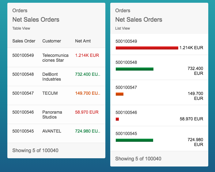
After saving and activating the changes to the CDS view, refreshing the OVP Application should now show the card as

First notice how the net amount label is now being taken from the label defined in the data point. Also, each value shows with a color indicating how it fits in our range. TECUM's Net Amt shows in orange which is the range between deviationRangeLowValue and toleranceRangeLowValue.
NAVIGATION
Now at this we may want to navigate to another app. In addition to navigating to other sites we can also used intent based navigation which relies on semantic objects and actions. Web IDE provides a launchpad sandbox which has a few apps that we can call using this approach, so lets navigate to one of these from the card. The annotation @UI.lineItem supports an array of objects assignment in which we can define multiple assignment for the same field. For this reason lets just add it to the sales_order_id annotations. For this to work we will need to assign the type of #FOR_INTENT_BASED_NAVIGATION and also a semanticObjectAction which we can assign to toappnavsample to call the sample app. In addition it is also required to define the Semantic Object using the annotation @Consumption.semanticObject which we will assign Action.
With these changes our view will now look like
@AbapCatalog.sqlViewName: 'zovpdemo'

@AbapCatalog.compiler.compareFilter: true

@AccessControl.authorizationCheck: #CHECK

@EndUserText.label: 'OVP Demo App'

@OData.publish: true

define view Z_Ovp_Demo as select from sepm_cds_sales_order as so {

key so.sales_order_key,

 @UI.selectionField: [ { position: 10 } ]

 @Consumption.semanticObject: 'Action'

 @UI.lineItem:  [{ label: 'salesOrd', qualifier:'ordOverView',type: #FOR_INTENT_BASED_NAVIGATION, semanticObjectAction: 'toappnavsample'},

    { position: 10, qualifier:'ordOverView', label: 'Sales Order'}]

so.sales_order_id,

so.created_by,

so.created_at,

so.changed_by,

so.changed_at,

so.note_guid,

so.currency_code,

so.gross_amount,

 @UI.dataPoint: {title: 'Net Amt',

    criticalityCalculation: {

    improvementDirection: #TARGET,

    deviationRangeLowValue: 100,

    toleranceRangeLowValue: 400,

    toleranceRangeHighValue: 800,

    deviationRangeHighValue: 1200

    }}

 @UI.lineItem:  { position: 30, qualifier:'ordOverView', label: 'Net Amount', type: #AS_DATAPOINT}

so.net_amount,

so.tax_amount,

so.lifecycle_status,

so.billing_status,

so.delivery_status,

so.buyer_guid,

 /* Associations */

so.customer,

so.items,

@UI.selectionField: [ { position: 20 } ]

@UI.lineItem:  { position: 20, qualifier:'ordOverView', label: 'Customer' }

so.customer.company_name

}
Save and activate the CDS view changes and then refresh the OVP application. Choosing one of the items in the table should now navigate you to the sample app. In my case I selected the entry for Telecomunicaciones Star which you can see in the passed parameters list as well as all of the other values.

ADDING A LIST CARD
Normally for each card you add, you would define additional annotations in your CDS view and assign them a unique qualifier. For the sake of simplicity, lets just reuse what we have already defined and define a List Card as shown

and this will yield

or it we choose the List Flavor Bar, which can be adjusted in the manifest.json which is part of the Web IDE project located under the webapp.
"card01": {

  "model": "Z_OVP_DEMO_CDS",

  "template": "sap.ovp.cards.list",

  "settings": {

  "title": "{{card01_title}}",

  "category": "{{card01_category}}",

  "subTitle": "{{card01_subTitle}}",

  "entitySet": "Z_Ovp_Demo",

  "listType": "condensed",

  "listFlavor": "bar",

  "sortBy": "changed_at",

  "sortOrder": "descending",

  "annotationPath": "com.sap.vocabularies.UI.v1.LineItem#ordOverView"

  }
it would result in
In the list flavor bar we are now only seeing two fields. This view is expecting just one data field and two data points, so if we add another data point and set a value format each field as shown
@AbapCatalog.sqlViewName: 'zovpdemo'

@AbapCatalog.compiler.compareFilter: true

@AccessControl.authorizationCheck: #CHECK

@EndUserText.label: 'OVP Demo App'

@OData.publish: true

define view Z_Ovp_Demo as select from sepm_cds_sales_order as so {

key so.sales_order_key,

 @UI.selectionField: [ { position: 10 } ]

 @Consumption.semanticObject: 'Action'

 @UI.lineItem:  [{ label: 'salesOrd', qualifier:'ordOverView',type: #FOR_INTENT_BASED_NAVIGATION, semanticObjectAction: 'toappnavsample'},

    { position: 10, qualifier:'ordOverView', label: 'Sales Order'}]

so.sales_order_id,

so.created_by,

so.created_at,

so.changed_by,

so.changed_at,

so.note_guid,

so.currency_code,

so.gross_amount,

 @UI.dataPoint: {title: 'Net Amt',

    criticalityCalculation: {

    improvementDirection: #TARGET,

    deviationRangeLowValue: 100,

    toleranceRangeLowValue: 400,

    toleranceRangeHighValue: 800,

    deviationRangeHighValue: 1200

    },

    valueFormat:{

        numberOfFractionalDigits: 1

    }}

@UI.lineItem:  { position: 30, qualifier:'ordOverView', label: 'Net Amount', type: #AS_DATAPOINT}

so.net_amount,

 @UI.dataPoint: {title: 'Tax Amt', valueFormat:{

    numberOfFractionalDigits: 1

}}

 @UI.lineItem:  { position: 40, qualifier:'ordOverView', label: 'Tax Amount', type: #AS_DATAPOINT}

so.tax_amount,

so.lifecycle_status,

so.billing_status,

so.delivery_status,

so.buyer_guid,

 /* Associations */

so.customer,

so.items,

@UI.selectionField: [ { position: 20 } ]

@UI.lineItem:  { position: 20, qualifier:'ordOverView', label: 'Customer' }

so.customer.company_name

}
After adjusting the card01_title in the i18n properties to Net/Tax Sales Orders, this will yield

Now if we wanted more fields we could change the List View to show in the list type extended which again we can just change in the manifest.json.
"card01": {

  "model": "Z_OVP_DEMO_CDS",

  "template": "sap.ovp.cards.list",

  "settings": {

  "title": "{{card01_title}}",

  "category": "{{card01_category}}",

  "subTitle": "{{card01_subTitle}}",

  "entitySet": "Z_Ovp_Demo",

  "listType": "extended",

  "listFlavor": "bar",

  "sortBy": "changed_at",

  "sortOrder": "descending",

  "annotationPath": "com.sap.vocabularies.UI.v1.LineItem#ordOverView"

  }

  }
The extended list card presents five fields, on the top left side it shows the first two data fields and on the bottom it present the first data point value in a bar and the second and third data point on the right side of the card if they exist. To max out the fields shown we can add one additional field in our cds view. This time we will add the lifecycle status field. Modify your cds view as shown below and save and activate your changes.
@AbapCatalog.sqlViewName: 'zovpdemo'

@AbapCatalog.compiler.compareFilter: true

@AccessControl.authorizationCheck: #CHECK

@EndUserText.label: 'OVP Demo App'

@OData.publish: true

define view Z_Ovp_Demo as select from sepm_cds_sales_order as so {

key so.sales_order_key,

 @UI.selectionField: [ { position: 10 } ]

 @Consumption.semanticObject: 'Action'

 @UI.lineItem:  [{ label: 'salesOrd', qualifier:'ordOverView',type: #FOR_INTENT_BASED_NAVIGATION, semanticObjectAction: 'toappnavsample'},

    { position: 10, qualifier:'ordOverView', label: 'Sales Order'}]

so.sales_order_id,

so.created_by,

so.created_at,

so.changed_by,

so.changed_at,

so.note_guid,

so.currency_code,

so.gross_amount,

 @UI.dataPoint: {title: 'Net Amt',

    criticalityCalculation: {

    improvementDirection: #TARGET,

    deviationRangeLowValue: 100,

    toleranceRangeLowValue: 400,

    toleranceRangeHighValue: 800,

    deviationRangeHighValue: 1200

    },

    valueFormat:{

        numberOfFractionalDigits: 1

    }}

@UI.lineItem:  { position: 30, qualifier:'ordOverView', label: 'Net Amount', type: #AS_DATAPOINT}

so.net_amount,

 @UI.dataPoint: {title: 'Tax Amt', valueFormat:{

    numberOfFractionalDigits: 1

}}

 @UI.lineItem:  { position: 40, qualifier:'ordOverView', label: 'Tax Amount', type: #AS_DATAPOINT}

so.tax_amount,

  @UI.dataPoint: {title: 'Lifecycle'}

 @UI.lineItem:  { position: 50, qualifier:'ordOverView', label: 'Lifecycle', type: #AS_DATAPOINT}

so.lifecycle_status,

so.billing_status,

so.delivery_status,

so.buyer_guid,

 /* Associations */

so.customer,

so.items,

@UI.selectionField: [ { position: 20 } ]

@UI.lineItem:  { position: 20, qualifier:'ordOverView', label: 'Customer' }

so.customer.company_name

}
After refreshing the OVP application your should now see the additional fields showing.

In the next blog we will explore the use of the Stack Card and a Chart Card.
Creating a Fiori OVP Application with CDS view annotations - Part 3
- SAP Managed Tags:
- SAPUI5,
- SAP Enterprise Portal
19 Comments
You must be a registered user to add a comment. If you've already registered, sign in. Otherwise, register and sign in.
Labels in this area
-
ABAP CDS Views - CDC (Change Data Capture)
2 -
AI
1 -
Analyze Workload Data
1 -
BTP
1 -
Business and IT Integration
2 -
Business application stu
1 -
Business Technology Platform
1 -
Business Trends
1,661 -
Business Trends
88 -
CAP
1 -
cf
1 -
Cloud Foundry
1 -
Confluent
1 -
Customer COE Basics and Fundamentals
1 -
Customer COE Latest and Greatest
3 -
Customer Data Browser app
1 -
Data Analysis Tool
1 -
data migration
1 -
data transfer
1 -
Datasphere
2 -
Event Information
1,400 -
Event Information
65 -
Expert
1 -
Expert Insights
178 -
Expert Insights
280 -
General
1 -
Google cloud
1 -
Google Next'24
1 -
Kafka
1 -
Life at SAP
784 -
Life at SAP
11 -
Migrate your Data App
1 -
MTA
1 -
Network Performance Analysis
1 -
NodeJS
1 -
PDF
1 -
POC
1 -
Product Updates
4,577 -
Product Updates
330 -
Replication Flow
1 -
RisewithSAP
1 -
SAP BTP
1 -
SAP BTP Cloud Foundry
1 -
SAP Cloud ALM
1 -
SAP Cloud Application Programming Model
1 -
SAP Datasphere
2 -
SAP S4HANA Cloud
1 -
SAP S4HANA Migration Cockpit
1 -
Technology Updates
6,886 -
Technology Updates
408 -
Workload Fluctuations
1
Related Content
- Unify your process and task mining insights: How SAP UEM by Knoa integrates with SAP Signavio in Technology Blogs by SAP
- Kyma Integration with SAP Cloud Logging. Part 2: Let's ship some traces in Technology Blogs by SAP
- SAP scripting findbyID in Technology Q&A
- Capture Your Own Workload Statistics in the ABAP Environment in the Cloud in Technology Blogs by SAP
- Top Picks: Innovations Highlights from SAP Business Technology Platform (Q1/2024) in Technology Blogs by SAP
Top kudoed authors
| User | Count |
|---|---|
| 13 | |
| 10 | |
| 10 | |
| 9 | |
| 7 | |
| 6 | |
| 5 | |
| 5 | |
| 5 | |
| 4 |