Scorecard: Step by Step to Nice Visualization (Tre...
Technology Blogs by SAP
Learn how to extend and personalize SAP applications. Follow the SAP technology blog for insights into SAP BTP, ABAP, SAP Analytics Cloud, SAP HANA, and more.
Step-by-Step to define a Scorecard with Trend Charts visualizations. We will try to go through all possible charts.
First, we start with a data source, using a CSV will allow you to reproduce this locally (app will be available for download). Our data source is looking like this:
To show more features, we will allow 2 free dimensions for charts.
1. As usual, add scorecard, attach data source and pay attention on selection of the row scope... 2 dimensions should be free, 3 dimensions are in the data source rows, it means we can select only the first dimensions.
2. the initial generated scorecard looks like this:
3. we will concentrate on column 3 (currently bar chart). Even you cannot see this in the selection dialog for Actual Values, the selection is as below. The generated selection cannot be displayed correctly in the dialog.
I have marked the dimension which is not selected in the dialog. When you follow the initial blog, Design Studio 1.6 - View on Scorecard Component you can analyze what this selection means.
* Scope is the first dimension (regions), so this will get removed as this is controlled by rows.
* We do not select the second dimensions (product groups), therefore from this dimension we get selected all members - this can be later controlled by "with results" or "without results".
* In the third dimension (quarters) we select the "Summe" member, it means there will be all sums selected.
* Last part are the measures - we select billed quantity
The effect are 5 product groups as bar chart.
4. now we will switch to the line chart. to make the selection a bit more interesting, we will select line chart (in the example I have copied the column to column 5).
Desription: Billed Quantity for Internet by Quarters
Selection:
In this case, I want to show a line on Internet as product (dimension 2) group and all quarters (dimension 3). Still, as the dimension 1 is controlled by row scope, the selection in this dialog is only to visualize it better.
As in the property "" we select "All Members, skip results", the visualization will show only 4 quarters:
5. to make bettter comparison across rows, you can always deactivate the automatic scale, then it looks like this.
Now, you can see that some lines are at the bottom of the row (e.g. 657T in row 2) and some are very hight (e.g. 5347T in row 3). This is because I have set the scale to:
6. LIne chart has one additional function - you can set a fix value for target, then the properties look like:
and then additional line for target will be placed:
7. now we go a bit further, we will change to Bubbles Chart. This chart can handle 3 measures - X Y and Z axis, where Z is the size of the buble.
8. We will select the data for X axis additionally, basically the second measure.
and very important...
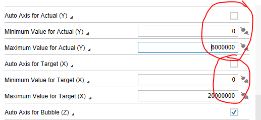
9. set again fixed axes minimum and maximum values, this will allow you to compare between rows.
10. then the effect is like this:
(red marked are the points)
- so this chart can bring you the distribution based on 2 dimensions.
11. of course, you can put also third dimension for size - I will use the first dimension as this query has only 2 dimensions.
do not forget to adjust also the manual max and min for the bubbles. now the bubles are a bit different, the size is changing.