Design Studio 1.6 – Visualizing Row Selections in Scorecard
Starting u with the scorecard component (Design Studio 1.6 – View on Scorecard Component) and understanding the property selection models (Design Studio 1.6 – Advanced Selection in Scorecard) brings us to next topic – customization of the visualization.
Introduction
Basically, the scorecard component primary use is nice visualization of data with flexibility in column definition. For this reason, some “table” properties (as scorecard “runtime” is sap UI5 table) have been overwritten in the component specific CSS. Otherwise many properties on cell level would be not possible to overwrite (borders, backgrounds).
Now, there is also selection option in scorecard, actually 4:
* cell
* single row
* multiple row
* multiple row (toggle) – this is like multiple, but you can toggle the rows.
When you switch on the selection, you get a scorecard like this one:
On left side, you can see additional column which allows you to select the complete row. This is, in comparison to the cell selection (which is handled actually as cell click and does not “select” anything) a way for selection of the row – and by that it is reflected also in the scorecard model.
The Question
Is it possible to visualize the selected row?
In standard, scorecard is only visualizing selection in the first column, which is specially there for the marking of selected row. But, as there is information of the selected row, and all cells know that they are in “selected” mode, you can change the behavior.
How to Visualize Selection?
First,
you need to pay attention that the cells have possibility to define background. default is white, so you need change this definition. -> put all cell backgrounds on “transparent”. This is what you get:
ok, not exactly nice – but important for the first step. Explanation is technical, so only for those who want… the background of the cell is in DIV inside of TR>TD, and the row is actually TR element.
Second,
let us make the scorecard again nice – I put on scorecard additional css class:
.myCustomScorecard .sapXTableMain {
background-color: white!important;
}
the class “sapXTableMain” is assigned to scorecard component, so when you define overwrite rule, you can change some properties.
do not forget to assign new class to the component itself.
what this will change? now the background is set on scorecard component, and the cells are transparent. result:
ok, now our scorecard is looking same as in the beginning, but is prepared for more changes.
Third,
now, I give you 2 mode classes, which you can overwrite to bring:
1/ the hover effect
2/ the row selection effect
HOVER
.myCustomScorecard .sapXTableMain tr.sapUiTableRowHvr>td {
background-color: red!important;
}
.myCustomScorecard .sapXTableMain tr.sapUiTableRowHvr {
background-color: red!important;
}
SELECTION
.myCustomScorecard .sapXTableMain .sapUiTableCtrl tr:not(.sapUiTableGroupHeader).sapUiTableRowSel > td {
background-color: green!important;
}
Making this changes, you get following result:
and animated..
Now, the hover effect is RED and row selection is GREEN. So you can better mark the selected row(s) and visualize it for the users.
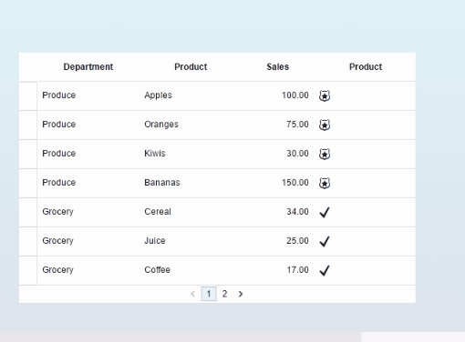
How the Icons come to Scorecard?
There is a property “Icon”, this one is active only when property “Display Mode” is not “Text Only”.
Icon can have a link to image (must be stored on server) or use the “sap-icon://<name>” notation for access to SAP UI5 library.
Here is an example how to make icons depending on status:
In addition, you can add also similar conditional display to property “Color” and then the icon will be also formatted (works firs in 1.6 SP2 release)
Example
The example can be downloaded here:
hope it helps
Thanks Karol. That is exactly we are looking for! 🙂
Hi Karol,
Nice post.
I've a requirement to place alerters based on some measure values.
Is it possible in design studio scorecard component? If so can you please help me in getting alerters?
Thanks,
Preethi
Hi Karol,
Wanted to know if we can hide the additional column which is added to the start on enabling the selection option. If yes, then how? I searched a bit but was not able to find anything related.
Thanks,
Ragesh
Hi,
yes, sure you can make this.
just define new style "hideSelectionColumn" and overwrite the original one:
.hideSelectionColumn .sapUiTableRowHdrScr {
display: none;
}
with this, you need to assign the class "hideSelectionColumn" to scorecard.
Karol
Hi Karol,
Any advise
Thanks
Hi Ragesh,
how you mean "Any advice"? is it working for you with the answer above or is it still qustion for help?
Karol
Hi Karol,
I tried the mentioned approach for hiding the column but was not working for me. I created the following CSS and assigned the class to the scorecard but I could still see the selection column.
.hideSelectionColumn .sapUiTableRowHdrScr {
display: none;
}
My another doubt is if this works would I still be able to make a selection on scorecard and add hover & selection effect mentioned in this thread. I have mentioned what else I tried in my earlier revert (below).
Thanks,
Ragesh
Hi Karol,
Thanks for the revert. I tried it but wouldn't work. I tried it with the css for highlighting as well as independently. Both didn't work
Try 1:
.myCustomScorecard .sapXTableMain {
background-color: white!important;
}
.myCustomScorecard .sapXTableMain tr.sapUiTableRowHvr>td {
background-color: #EEBFB8!important;
}
.myCustomScorecard .sapXTableMain tr.sapUiTableRowHvr {
background-color: #EEBFB8!important;
}
.myCustomScorecard .sapXTableMain .sapUiTableCtrl tr:not(.sapUiTableGroupHeader).sapUiTableRowSel > td {
background-color: #DE7C77!important;
}
.hideSelectionColumn .sapUiTableRowHdrScr {
display: none;
}
Had 3 different scorecards so assigned myCustomScorecard to 2 and hideSelectionColumn to 1. The first 2 scorecard works with the highlighting trick and the additional selection column. The third one behaves as a normal scorecard with the selection column still visible and no highlighting feature.
Try 2:
.hideSelectionColumn .sapUiTableRowHdrScr {
display: none;
}
Assigned it to the scorecards, behaves as a normal scorecard with the selection column still visible
Try 3:
Same css
.hideSelectionColumn .sapUiTableRowHdrScr {
display: none;
}
Reverted the cell background to white instead of transparent used on the highlighting feature. Still no luck.
Apologies, I am very new to Design Studio. What I am trying to achieve is a scorecard similar to one in the SAP Dashboards tool where a user can select the entire row by clicking anywhere on the row, row color change on selection / hover and no additional column in the beginning for selection. I hope that would be possible.
Thanks,
Ragesh
Hi Karol
I meet a requirement which user wish "only" hover the 2nd & 3rd column of scorecard, not the whole row of whole column.
Can it realize by using the Css?
Thank you!
Willy
actually, you need only to skipt the step 1, putting the background on "transparent". if you keep it on "white", it should cover the cell and the hoover effect should not be visible.
does this work for you?
Hi Karol
After I try to realize my requirement.
.myCustomScorecard .sapXTableMain tr.sapUiTableRowHvr>td:nth-child(3)
.sapXTableCellWrapperTop:hover {
Background-color: yellow!important;
}
The css can realize my requirement: the sc only have the hover effect on the 3rd column .
Thank you!
Willy
also a good solution 😉
Hi Karol,
I have a question regarding the badges you have next to the scorecard's sales amount. Were you able to dynamically call the icon (sap-icon://badge) or did you have to download and store it in a folder. I am looking for a way to dynamically point to the UI5IconPool / avoid having to safe off each icon.
Thanks,
Hezena
Hi,
the sap icons are accessible via placing the string:
sap-icon://badge
in the "Icon" property.
make sure, you change the Property "Display Mode" to "Icon" or "Icon+Text" or "Text+Icon".
then, you can use standard definition of conditional display, I have placed update in the blog with example.
Karol
Hi Karol,
I thought I did it like that but apparently not correctly 🙂 The example you gave was perfect and it is now working!
Thanks,
Hezena
HI Karol,
Can we give some dynamic values in the conditional display?
Cell content < (user input) then sap-icon://arrow-bottom
Cell content > (user input) then sap-icon://arrow-top
How can we get this.
Thanks,
Arjun PL
Thanks,
Arjun PL
Hi,
dynamic values here are not possible. the correct implementation for such checks are the BEx Exceptions which can be defined in BW backend. Then you can pick up the exception level 1-9 and react on this. In case of HANA as data source this (Bex Exceptions) is not available yet as far I know.
Regards, Karol
Hi Karol,
I have specific requirement for my business user in scorecard component.
Is there any way that I can add Hyper link to a particular cell of a measure value??
As I am new to design studio 1.6 please guide me on this.
EX:-
lets say from your score card component u had sales key figure.
For each value of key figure I want to embed a url by creating hyperlink connecting to webi report. In your case the first value of key figure is 100.
can I create a Hyperlink on 100?? and so on for second value of 75 and so on so forth.
Thanking you in advance
Karthik Kumar C V
Hi Karthik,
hyperlinks from cells can be made by binding 2 "features".
1. you need to use the cell selection and react on "cell click" event, then you can read out the selection (see blog Design Studio 1.6 - Using Multiselect in Scorecard - but for you do not use multiple, but only the cell selection).
2. you can overwrite the cell content to visualize it as a link. For that, check in chrome which classes are used for the texts and modify the CSS to have this displayed as hyperlink.
Does this help, or too less technical?
Karol
Hello Karol,
Thanks for quick response !!!
I have less of java coding experience when it contains array structure and so on...
Can you provide step by step analysis guide in order to achieve this(.Hope i am not asking too much)
Attaching the screenshot for the same how the output should like
Hi Karol,
Thank you for the detailed posts - very helpful for DS beginners. 🙂
Unlike your previous posts which dealt with scorecards, this time I am unable to import the ZIP file attached and receive the following error:
I have the 1.6 version. Would you know what the issue would be? It has worked perfectly fine in your previous two posts.
Thank you in advance.
Hi,
this example is using data source from the community package, you would need to install the SCN SDK package as here SCN Design Studio SDK Development Community to get it running.
probably the other have used the build in CSV data source.
Anyway, you can install this locally only for this scenario.
Karol
Hi,
How to make cell background as transparent ?.
Regards,
Shanthakumar.
Hi Karlos, thanks for the post. I am able to achieve the same with the hover on the scorecard , changing the background colour for the row on hover. also i need to change the colour of the text for the same hover row. I put the below code but its not applying the colour to the text
.myCustomScorecard .sapXTableMain tr.sapUiTableRowHvr>td
{ background-color: red!important;
color: #ff8000; }
.myCustomScorecard .sapXTableMain tr.sapUiTableRowHvr
{ background-color: red!important;
color: #ff8000;}
Let me know your feedback
Thanks,
Ram
Hi Karol,
Very informative article on Scorecard component, it helped me a lot so far in fulfilling my requirement but as per you example i want to bind two icons with one of my measure field and i am unable to do so.
I downloaded your example and went through it but still i cannot analyze how you popped up the badge and tick icon beside your third column?
Thanks
Arpit Arora
Hi,
i've tried your code but for me doesn't work on selection so after i click the cell remains white.
I've try this code:
.myCustomScorecard .sapXTableMain tr.sapUiTableRowHvr>td {
background-color: red!important;
}
.myCustomScorecard .sapXTableMain tr.sapUiTableRowHvr {
background-color: red!important;
}
.myCustomScorecard .sapXTableMain .sapUiTableCtrl tr:not(.sapUiTableGroupHeader).sapUiTableRowSel > td {
background-color: green!important;
}
I entered the name of the css class both in the display "css class" and on select with the command
"SCORECARD_1.setCSSClass("myCustomScorecard");"
Can someone help me?
Hi,
Thank you Karol for the informative article.
I tried the row selection and hover effect, it works well on desktop but it doesn't work on mobile.
Has anyone tried it on mobile ?
Thanks,