Last month, my colleague adrian.paul/contentfind an interesting chart to show how the auto brands rank based on the average of their models’ predicted reliability scores. The data comes from the latest Consumer Reports’ 2015 Annual Auto Survey.

Blog: How car brands compare for realiability?
I got inspiration from this sample and built a new horizontal bar chart to show the value range of items, which include multiple sub-items, and the percentage more or less than themselves mean point and total average of all items. The use case for this extension is the students' transcript for their courses.
Use case and data
The use case presents the score‘s range of 31 different students, and this table shows how the scores rank based on the average of their scores from 4 different semesters. A measure of the student's grades can be seen in the span with a yellow mean point, cross-referenced by how many different courses they attend totally. The blue bars illustrate a student's grades by showing the reliability range between its top and bottom score. The numerals indicate the number of courses included.
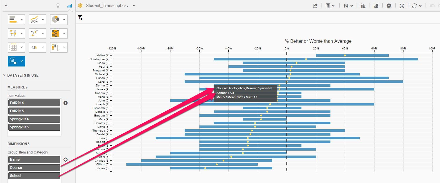
This extension creates a horizontal bar chart to show a series of parent data point each of them including several children data points on the Y axis. Each row uses a bar to represent their children’s range between top to bottom, and there is a mean point appear as a yellow point on top of per bar. The dotted line on x-axis shows the average for all of the data points. The measures input field of this extension could include an unlimited number of measure, and x-axis only shows based on the total of each data.
The tooltip will show when your mouse hovers on top of the blue bar. It shows three rows of information: the course and school from the second and third input of dimensions, and the third row including min, mean and max scores of student.
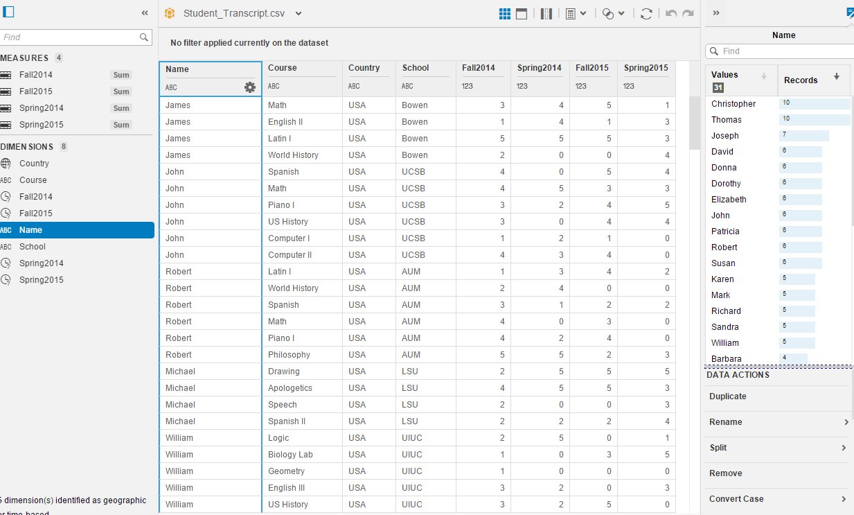
Now the data set has to involve at least three critical columns, which includes the name of the student, courses and scores.
Nest Data Set
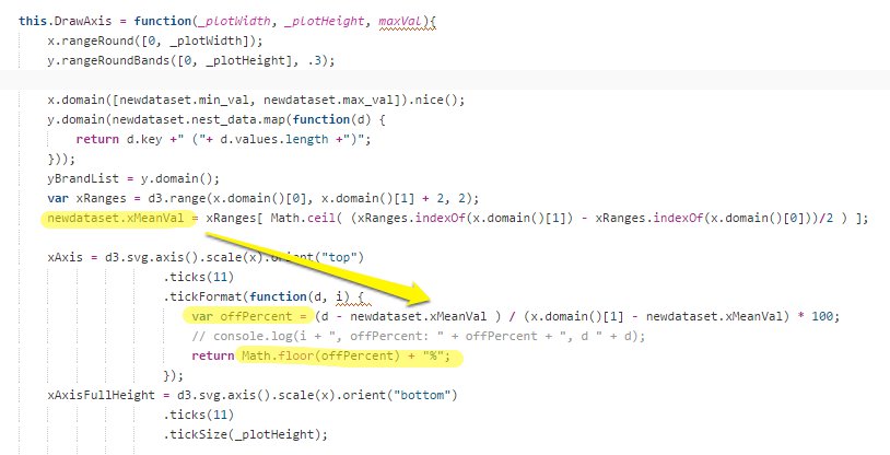
In this extension, you need to do quite lots of calculating to prepare for data to visualize chart. The first step is to nest it by student's name.

The second step is to calculate the mean value for each student and all students.


The last step is to calculate the midpoint value of the dataset to draw the %better or worse on the x-axis.
This extension is now available on Github at SAP/lumira-extension-viz
