
- SAP Community
- Products and Technology
- Additional Blogs by SAP
- Does Your Website Make People Want To Stay?
Additional Blogs by SAP
Turn on suggestions
Auto-suggest helps you quickly narrow down your search results by suggesting possible matches as you type.
Showing results for
bernard_rummel
Explorer
Options
- Subscribe to RSS Feed
- Mark as New
- Mark as Read
- Bookmark
- Subscribe
- Printer Friendly Page
- Report Inappropriate Content
02-01-2016
2:20 PM
In a previous post, I wrote about survival analysis methods for analyzing task completion times. The present post is about applying those methods to visit duration on websites, where the goal is exactly opposite to task completion times: after all, you want users to stay on your site! Here, “Survivors” are those who stay, not the ones who keep fiddling with a task.
In the online marketing industry, visit duration has become an increasingly popular metric for user engagement: if users are interested in a web site’s content, they will read it, and they will need time to do so. If the content is not attractive in a very literal sense, they will stop reading and leave after a short time. Only half-joking, Farhad Manjoo writes in his Slate blogpost You Won’t Finish This Article: Why People Online Don’t Read To The End that less than 60 percent will read more than half of an article. Pete Davies once called Total Time Reading “the only metric that matters”. So how can you know how much time users spend reading, and whether they stay this extra time that tells you that your website works?
Google Analytics, Chartbeat, Piwik, or other web behavior trackers typically give you average dwell times for each page. While this is useful information, the choice of the average as a parameter is unfortunate. When dealing with time data, averages are among the most easily skewed parameters around: they can be greatly inflated by overly long times, which are typical for time data. Medians or geometric means would be way more robust metrics, and standard deviations would help a lot to assess the amount of overly long times, if not to reconstruct more useful distribution parameters.
Well, on the site level, Google Analytics offers an actually quite interesting report: under Audience > Behavior > Engagement, it lists the number of sessions and page views that lasted longer than a certain time, together with histograms. Figure 1 shows the result of this report for this website, for the first week in May. The histogram is already quite informative (note the spike below 10s!), but you can do much more with these data: a Weibull analysis – and it’s not even difficult!
In 2010, Liu and colleagues published a paper on applying Weibull analysis on web page dwell times. Weibull analysis, a special method in survival analysis, lets you explore the dynamics underlying a survival process. In particular, you can tell whether individuals “survive” for a longer or shorter time than you would expect by chance. “Positive aging” indicates that individuals “die” (i.e., leave the web site) earlier than expected. “Negative aging” indicates that they live – stay – longer than expected by chance, i.e., that they actually do spend this extra time on your site.
This means you can check whether your web site not only attracts users, but also keeps them engaged – and you even can quantify how much it does so!
Weibull analysis involves fitting a statistical Weibull distribution model to the observed times, and inspecting its parameters (Excuse my math. Bear with me for two more lines). The Weibull’s scale parameter α indicates the magnitude of times involved – it is equal to the time when 63.2% of individuals “died”, that is, left the site. The second, shape parameter γ, is the actually interesting one. A shape parameter γ>1 indicates positive aging: individuals “die” faster than expected by chance, a shape parameter γ< 1 the opposite. On a website, a small shape parameter (negative aging) indicates that the site is attractive in a very literal sense: the longer people stay, the longer they will keep around. (With γ =1 the Weibull is equal to an exponential distribution, which I discussed in a previous post. Exponential-distributed times are typical for purely random processes.)
Liu and colleagues did their work on full dwell time records collected via a browser plugin, which are not available to most of us. What I’d like to show here is how to do a Weibull analysis with the data the more common Google Analytics platform has to offer in its Engagement report. If you are not interested in the math involved, you can skip the next section and go directly to the practical part.
This analysis approach makes use of a so-called probability plot. Probability plots are incredibly useful tools for all questions surrounding time in usability and user experience work. Technically, the observed survival function is plotted using scale settings that are specific for the distribution type to be analyzed. If the data points in the plot appear along a straight line, this is an indication that the data follow the respective – here Weibull – distribution. The parameters of the distribution then can be read from the plot.
Google Analytics does not give us exact session duration times, but the number of sessions that end within a certain time interval. This data collection pattern is called interval censoring or readout data. For each readout time Tj, the corresponding survival function value Sj can be estimated simply as the sum of observed “deaths” before that time (i.e., the sum of sessions alive up to that time), divided by the sum of all sessions.
For a Weibull probability plot, we simply plot times Tj against survival percentages Sj, with the scale settings specific for the Weibull distribution. That is, we plot ln(Tj ) against ln(ln(1/Sj)). Since the time “1801+” is not known and S here would be asymptotic, we leave it out of the plot.
Next, we fit a regression line to the plot. If the data follow a Weibull distribution, the model fit of that regression should be quite good. The intersection point of the regression line with the time axis indicates the Weibull’s scale parameter α; its shape parameter γ is the regression equation’s offset divided by ln(α).
Let’s grab the Weibull by its horns! For convenience, I prepared an Excel spreadsheet that does the calculating and plotting for us (download). The spreadsheet generates two plots, one to check for exponential distributions, one for Weibull distributions. All you have to do is to paste your Google Analytics data into the white part of the spreadsheet and see what happens. I did so with the data in Figure 1 – see Figure 2.
Let’s look first at the Weibull plot on the right hand side. The closer the data points align straight along the regression line, the better the Weibull model fits the data. There is also a regression equation displayed; the closer the value of R² is to 1, the better the model fits. The box “Weibull distribution parameters” at the top of the worksheet gives the distribution parameters α and γ. The smaller γ, the more do users tend to stay on your site, the “stickier” it is. α, the “characteristic life”, may seem shortish at first, but mind that typically a high number of very short sessions is also included. For γ close to 1, α actually would be the average session duration.
The second, Exponential plot on the left hand side is a fallback to make sense out of cases where the Weibull model does not fit. Remember, exponential-distributed times are generated from purely random processes (well, this is oversimplified, but let’s assume that for now). The Exponential plot is set up so that data following an exponential distribution would show up close to the regression line with an R² value close to 1. Regardless of the model fit, data points on the left hand side of the regression line indicate instances where sessions were shorter than expected by chance; those to the right indicate longer sessions. Note that this rule also holds for the Weibull plot, but respective to the Weibull distribution model that has been estimated from the data.
With this you can not only identify the distribution model that holds for your data and determine its parameters. You can also virtually see at a glance where the shorter or longer sessions are located: At the beginning of the distribution or the end? In the initial “screening” phase where users scan pages to decide whether they are worth reading, or on a later phase where visitors actually peruse content?
Why don’t we just apply the method on the website you’re looking at right now, www.experience.sap.com. I picked a week in May, ran the report, generated two separate Weibull plots for new and returning users and overlaid them in one plot for easier comparison (Figure 3). Let’s see what we can see in the plot.
Not only do returning users stay longer than new users (characteristic life α= 31.4s vs. 5,7s), the site for them is also slightly “stickier”, i.e. reading for a while makes them read on for an even longer time (γ = 0,245 vs. 0,250). Good news!
Well, the survival functions in both groups show a little “infant mortality”: the data points under 10s are clearly left of the regression line. Apparently folks who visited us by mistake can tell so immediately. That’s also good!
We also have a little reader “fatigue” in the 601-1800s segment: after 10 minutes’ reading, more users leave the site than expected by the Weibull model. A plausible explanation is that 10min is the maximum reading time their job allows, if they are reading in the office. Well, apparently you can talk about anything, but about 10 min is enough… so I should wrap up right now!
This is just a tiny facette of what survival analysis methods can do for you. Unfortunately, most of the applied literature is focusing on medical research and reliability engineering, not on user experience problems. If you want to learn more, the following resources might help getting started:
How Slow Users Drive ROI gives a first impression what makes time data so special.
When Time Matters: It’s All About Survival! provides a first introduction into analyzing process times, comparing them against the exponential distribution.
Probability Plotting: A Tool for Analyzing Task Completion Times is an in-depth treatment of the analysis of task completion times in business processes and usability tests (lab tests and unmoderated tests).
NIST/SEMATECH e-Handbook of Statistical Methods, in particular the section on Probability Plotting, gives very practical and hands-on explanations with real-world, down-to-earth examples. The target audience are reliability engineers, so expect some math. It’s available online for free!
The ultimate source however is a traditional book:
Survival analysis: Techniques for censored and truncated data (second edition) Klein JP, Moeschberger ML (2003) ISBN 038795399X Springer
If you want to get really serious with survival analysis, you may want to use the R package survival. Since R documentation is notoriously hard to read, this intro will help.
In the online marketing industry, visit duration has become an increasingly popular metric for user engagement: if users are interested in a web site’s content, they will read it, and they will need time to do so. If the content is not attractive in a very literal sense, they will stop reading and leave after a short time. Only half-joking, Farhad Manjoo writes in his Slate blogpost You Won’t Finish This Article: Why People Online Don’t Read To The End that less than 60 percent will read more than half of an article. Pete Davies once called Total Time Reading “the only metric that matters”. So how can you know how much time users spend reading, and whether they stay this extra time that tells you that your website works?
Google Analytics, Chartbeat, Piwik, or other web behavior trackers typically give you average dwell times for each page. While this is useful information, the choice of the average as a parameter is unfortunate. When dealing with time data, averages are among the most easily skewed parameters around: they can be greatly inflated by overly long times, which are typical for time data. Medians or geometric means would be way more robust metrics, and standard deviations would help a lot to assess the amount of overly long times, if not to reconstruct more useful distribution parameters.
Well, on the site level, Google Analytics offers an actually quite interesting report: under Audience > Behavior > Engagement, it lists the number of sessions and page views that lasted longer than a certain time, together with histograms. Figure 1 shows the result of this report for this website, for the first week in May. The histogram is already quite informative (note the spike below 10s!), but you can do much more with these data: a Weibull analysis – and it’s not even difficult!
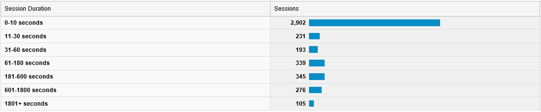
Figure 1: Engagement report from Google Analytics (from screenshot)
In 2010, Liu and colleagues published a paper on applying Weibull analysis on web page dwell times. Weibull analysis, a special method in survival analysis, lets you explore the dynamics underlying a survival process. In particular, you can tell whether individuals “survive” for a longer or shorter time than you would expect by chance. “Positive aging” indicates that individuals “die” (i.e., leave the web site) earlier than expected. “Negative aging” indicates that they live – stay – longer than expected by chance, i.e., that they actually do spend this extra time on your site.
This means you can check whether your web site not only attracts users, but also keeps them engaged – and you even can quantify how much it does so!
Weibull analysis involves fitting a statistical Weibull distribution model to the observed times, and inspecting its parameters (Excuse my math. Bear with me for two more lines). The Weibull’s scale parameter α indicates the magnitude of times involved – it is equal to the time when 63.2% of individuals “died”, that is, left the site. The second, shape parameter γ, is the actually interesting one. A shape parameter γ>1 indicates positive aging: individuals “die” faster than expected by chance, a shape parameter γ< 1 the opposite. On a website, a small shape parameter (negative aging) indicates that the site is attractive in a very literal sense: the longer people stay, the longer they will keep around. (With γ =1 the Weibull is equal to an exponential distribution, which I discussed in a previous post. Exponential-distributed times are typical for purely random processes.)
Liu and colleagues did their work on full dwell time records collected via a browser plugin, which are not available to most of us. What I’d like to show here is how to do a Weibull analysis with the data the more common Google Analytics platform has to offer in its Engagement report. If you are not interested in the math involved, you can skip the next section and go directly to the practical part.
Technical Section: How & Why It Works
This analysis approach makes use of a so-called probability plot. Probability plots are incredibly useful tools for all questions surrounding time in usability and user experience work. Technically, the observed survival function is plotted using scale settings that are specific for the distribution type to be analyzed. If the data points in the plot appear along a straight line, this is an indication that the data follow the respective – here Weibull – distribution. The parameters of the distribution then can be read from the plot.
Google Analytics does not give us exact session duration times, but the number of sessions that end within a certain time interval. This data collection pattern is called interval censoring or readout data. For each readout time Tj, the corresponding survival function value Sj can be estimated simply as the sum of observed “deaths” before that time (i.e., the sum of sessions alive up to that time), divided by the sum of all sessions.
For a Weibull probability plot, we simply plot times Tj against survival percentages Sj, with the scale settings specific for the Weibull distribution. That is, we plot ln(Tj ) against ln(ln(1/Sj)). Since the time “1801+” is not known and S here would be asymptotic, we leave it out of the plot.
Next, we fit a regression line to the plot. If the data follow a Weibull distribution, the model fit of that regression should be quite good. The intersection point of the regression line with the time axis indicates the Weibull’s scale parameter α; its shape parameter γ is the regression equation’s offset divided by ln(α).
Practical Part
Let’s grab the Weibull by its horns! For convenience, I prepared an Excel spreadsheet that does the calculating and plotting for us (download). The spreadsheet generates two plots, one to check for exponential distributions, one for Weibull distributions. All you have to do is to paste your Google Analytics data into the white part of the spreadsheet and see what happens. I did so with the data in Figure 1 – see Figure 2.

Figure 2: Probability plots for the example data in Figure 1.
Let’s look first at the Weibull plot on the right hand side. The closer the data points align straight along the regression line, the better the Weibull model fits the data. There is also a regression equation displayed; the closer the value of R² is to 1, the better the model fits. The box “Weibull distribution parameters” at the top of the worksheet gives the distribution parameters α and γ. The smaller γ, the more do users tend to stay on your site, the “stickier” it is. α, the “characteristic life”, may seem shortish at first, but mind that typically a high number of very short sessions is also included. For γ close to 1, α actually would be the average session duration.
The second, Exponential plot on the left hand side is a fallback to make sense out of cases where the Weibull model does not fit. Remember, exponential-distributed times are generated from purely random processes (well, this is oversimplified, but let’s assume that for now). The Exponential plot is set up so that data following an exponential distribution would show up close to the regression line with an R² value close to 1. Regardless of the model fit, data points on the left hand side of the regression line indicate instances where sessions were shorter than expected by chance; those to the right indicate longer sessions. Note that this rule also holds for the Weibull plot, but respective to the Weibull distribution model that has been estimated from the data.
With this you can not only identify the distribution model that holds for your data and determine its parameters. You can also virtually see at a glance where the shorter or longer sessions are located: At the beginning of the distribution or the end? In the initial “screening” phase where users scan pages to decide whether they are worth reading, or on a later phase where visitors actually peruse content?
Example: How attractive is experience.sap.com?
Why don’t we just apply the method on the website you’re looking at right now, www.experience.sap.com. I picked a week in May, ran the report, generated two separate Weibull plots for new and returning users and overlaid them in one plot for easier comparison (Figure 3). Let’s see what we can see in the plot.

Figure 3: Weibull probability plot for new vs. returning users of this website, first week of May.
Not only do returning users stay longer than new users (characteristic life α= 31.4s vs. 5,7s), the site for them is also slightly “stickier”, i.e. reading for a while makes them read on for an even longer time (γ = 0,245 vs. 0,250). Good news!
Well, the survival functions in both groups show a little “infant mortality”: the data points under 10s are clearly left of the regression line. Apparently folks who visited us by mistake can tell so immediately. That’s also good!
We also have a little reader “fatigue” in the 601-1800s segment: after 10 minutes’ reading, more users leave the site than expected by the Weibull model. A plausible explanation is that 10min is the maximum reading time their job allows, if they are reading in the office. Well, apparently you can talk about anything, but about 10 min is enough… so I should wrap up right now!
Learn More?
This is just a tiny facette of what survival analysis methods can do for you. Unfortunately, most of the applied literature is focusing on medical research and reliability engineering, not on user experience problems. If you want to learn more, the following resources might help getting started:
How Slow Users Drive ROI gives a first impression what makes time data so special.
When Time Matters: It’s All About Survival! provides a first introduction into analyzing process times, comparing them against the exponential distribution.
Probability Plotting: A Tool for Analyzing Task Completion Times is an in-depth treatment of the analysis of task completion times in business processes and usability tests (lab tests and unmoderated tests).
NIST/SEMATECH e-Handbook of Statistical Methods, in particular the section on Probability Plotting, gives very practical and hands-on explanations with real-world, down-to-earth examples. The target audience are reliability engineers, so expect some math. It’s available online for free!
The ultimate source however is a traditional book:
Survival analysis: Techniques for censored and truncated data (second edition) Klein JP, Moeschberger ML (2003) ISBN 038795399X Springer
If you want to get really serious with survival analysis, you may want to use the R package survival. Since R documentation is notoriously hard to read, this intro will help.
- SAP Managed Tags:
- User Experience
Related Content
- 1H 2024 - Release highlights of SuccessFactors Career Development Planning in Human Capital Management Blogs by Members
- First Half 2024 Release: What’s New in SAP SuccessFactors HCM in Human Capital Management Blogs by SAP
- Implementation journey of SAP ECTR at OSG EX-CELL-O Coldforming Technologies in Product Lifecycle Management Blogs by SAP
- AI shaping the future of HR: Is your organisation ready to embrace the change? in Human Capital Management Blogs by Members
- SAP Cloud Integration: Understanding the XML Digital Signature Standard in Technology Blogs by SAP